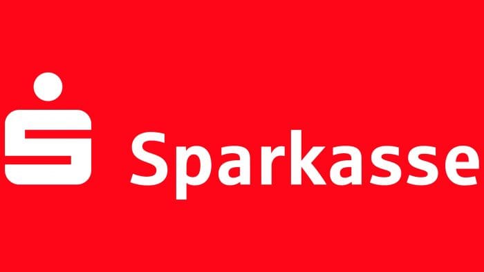
The sign is associated with accumulation and investment. It shows versatile but honest ways to increase money. The Sparkasse logo guarantees that passing through the bank’s system, the funds will work for the client’s benefit and bring pleasing dividends.
Sparkasse: Brand overview
| Founded: | 1925 |
| Headquarters: | Germany |
| Website: | sparkasse.de |
Meaning and History
The name “Sparkasse,” taken as the basis for the personal logo, appeared in German society incredibly long ago – it dates back to the 18th century. It denotes government institutions for storing savings with the accumulation and issuance of interest.
The word is compound and includes two stems from the German language. The first is “sparen” (that is, to save, not fully use, to postpone). The second is “kasse” (money box, lockable box). This name reflects a financial institution’s key goal: accepting savings by depositing cash into a cash vault. All this is directly conveyed in the corporate logo.
Thus, savings banks are universal institutions with permission to conduct transactions with money, and they can serve all customers. But they also have some limitations, which are also reflected in the logo. Local authorities run this institution, and the scope of its activities is limited only to the administrative territory.
Also, savings banks do not generate income, adhere to the principle of non-profitability, and conduct non-profit activities. They are mainly engaged in all kinds of payments, deposit issues, securities, and loans. The key goals and objectives of such organizations are reflected in the branding.
What is Sparkasse?
Sparkasse refers to the German name for savings banks operating in Germany. In this case, it means a network of banks that are part of the Sparkassen-Finanzgruppe system. This group of financial institutions was formed in 1975. Each member operates independently and offers its range of services, including investments, insurance, mortgages, and loans.
1925 – 1938
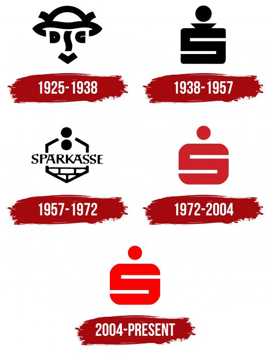
Karl Schulpig designed the debut emblem. He schematically depicted a satisfied client who rejoices at the opportunity to save money or take out a loan. Instead of eyes, he has the letters “D” and “G,” which are separated by a short, winding stripe reminiscent of “S.” And the mouth is drawn in a “V” shape. At the top, there is a hat in the form of a piggy bank. The logo is monochrome and consists of black lines on a white background.
1938 – 1957
Lois Gaigg designed the second personal mark. He proposed a radically different concept. First, the designer has moved away from the comic image of the client. Secondly, he made the symbolism in a serious style. Now the emblem is a single “S,” which is a letter and a piggy bank. As proof – the coin pictured above. Interestingly, at first, it was a poster, and only then did it become a full-fledged sign of personal identification. In the early years, it served for the internal purposes of the Sparkassenverlag, and in 1948 it was used by most savings banks.
1957 – 1972
The DDR used a logo designed by Siegfried Riediger. He made a basic emphasis on the usefulness and accessibility of financial services. The artist chose a different form of the piggy bank with a wider hole and two coins. Below he depicted brickwork, personifying a building’s wall – both a personal house and some enterprise kind. That is, the icon said: penny to penny – and you will save up for your home or business. In the middle of the hexagon was the inscription “Sparkasse.” For its geometric shape, this option was named “beehive.”
1972 – 2004
This stage became very important in the emblem’s history, as it was unified for all Germany regions. The author of the legendary icon is Otl Aicher. He brought back the 1938 version and redesigned it by removing the extension at the top of the “S” and replacing the black with the red HKS 13. Since then, this shade has been considered a trademark.
2004 – today
The existing logo has been optimized by Interbrand Zintzmeyer & Lux. No further changes were made. The same single “S” is used – the first letter from the name of the service.
The logo’s design was continuously improved, for which different designers made their adjustments and alterations. The opening version was too difficult to understand, so it was gradually modernized, improved, and simplified. Now the laconic red emblem is used, which is well known to all residents of Germany.
Sparkasse: Interesting Facts
Sparkasse is a well-known banking group in Germany and Austria, playing a significant role in both countries’ financial and community life.
- Origins: Sparkasse started in 1778 in Hamburg, making it one of Germany’s oldest banks. It was created to help people who couldn’t use traditional banks, focusing on saving money and including more people in the banking system.
- Owned by the Public: These banks are owned by local governments, which differs from private or cooperative banks. This means they focus more on helping their local areas and people than just making profits.
- Widespread Network: Sparkasse has a huge network of branches across Germany, ensuring that even those in rural areas can access banking services.
- Supports Local Economies: They’re key in helping local businesses and projects, boosting regional growth, and adding to public funds through taxes and profits.
- Community Involvement: Sparkasse is heavily involved in local social, cultural, and sports activities, supporting various clubs and events and showing dedication to community welfare.
- Part of a Big Group: They belong to the Sparkassen-Finanzgruppe, one of the world’s largest financial groups, which includes state banks, public insurance companies, and more.
- Savings Focused: Staying true to their roots, they still emphasize savings and financial planning, often being the place where young people open their first savings accounts.
- Embracing Digital: Despite its history and local emphasis, Sparkasse is up to date with digital banking, offering online and mobile services to compete with private banks and fintechs.
- Education and Training: They have educational programs to ensure their staff can provide excellent customer service, including a well-known academy for professional development in banking.
- International Footprint: Sparkasse mainly serves local communities in Germany and Austria but also operates internationally to help customers with overseas transactions.
Sparkasse stands out in the banking world for its blend of local dedication, public ownership, and broad financial services. It’s focused on financial stability, social responsibility, and local economic support, making it unique compared to other banks.
Font and Colors
In 1972, the developers chose the Helvetica typeface for the text part – grotesque, even, smooth. Until then, the logo used a serif typeface.
The palette has always been monochrome and consisted of white with black (formerly) or red (now). The latter has a shade of HKS 13. In 2007, the management officially registered it with the patent office as a single color for the emblems of all national Sparkasse services.
Sparkasse color codes
| Red | Hex color: | #ff0000 |
|---|---|---|
| RGB: | 255 0 0 | |
| CMYK: | 0 100 100 0 | |
| Pantone: | PMS 1655 C |

