


 Student Clearinghouse Logo PNG
The Student Clearinghouse logo represents a crucial branch within the education sector, an organization focused on pressing issues in the education of school and college students. The emblem highlights strong connections with educational institutions for their successful development and reliable knowledge acquisition.
The National Student Clearinghouse was founded in 1993 by US colleges and universities as a nonprofit service for verifying enrollment, mainly for student-loan providers. By 1995, it covered more than 1,300 institutions and about 32% of American students. An online verification system followed in 1997, reducing processing time for lenders and schools.
DegreeVerify launched in 2000, allowing employers to confirm degrees and diplomas. StudentTracker followed in 2004, helping institutions trace graduates’ academic paths and evaluate programs. eTranscript arrived in 2007 to automate record transfers, GED verification was added in 2009, and a reverse-transfer program began in 2010 for students moving from two-year colleges to four-year universities.
The organization published its first enrollment report in 2012. Income-data verification for financial aid appeared in 2014, followed by high-school diploma checks in 2016. Myhub launched in 2018, giving students a place to store and share academic records. By 2020, the service covered more than 3,600 institutions and over 97% of US college students.
Enhanced Transcript Services and analytics arrived in 2021. Enrollment verification was updated in 2022 for insurance, housing, and employment, while services for school districts expanded. In 2023, a research platform opened access to anonymized education data, and the Lifelong Learning Passport created digital portfolios covering degrees, certificates, skills, and other learning records.
Meaning and History
What is Student Clearinghouse?
A nonprofit organization brings together businesses, students, and educational institutions as a key link in the academic ecosystem. It serves as a central repository of student records, verifying the enrollment status and academic qualifications of millions of people. Employers can more easily verify a student’s degree, simplifying the sometimes complex process of transcript exchange between schools and providing crucial information for educational research and legislation. Preventing academic fraud and optimizing student loan deferments are important tasks for the firm, which maintains a large database, including over 3,600 institutions and universities.
1993 – 2023
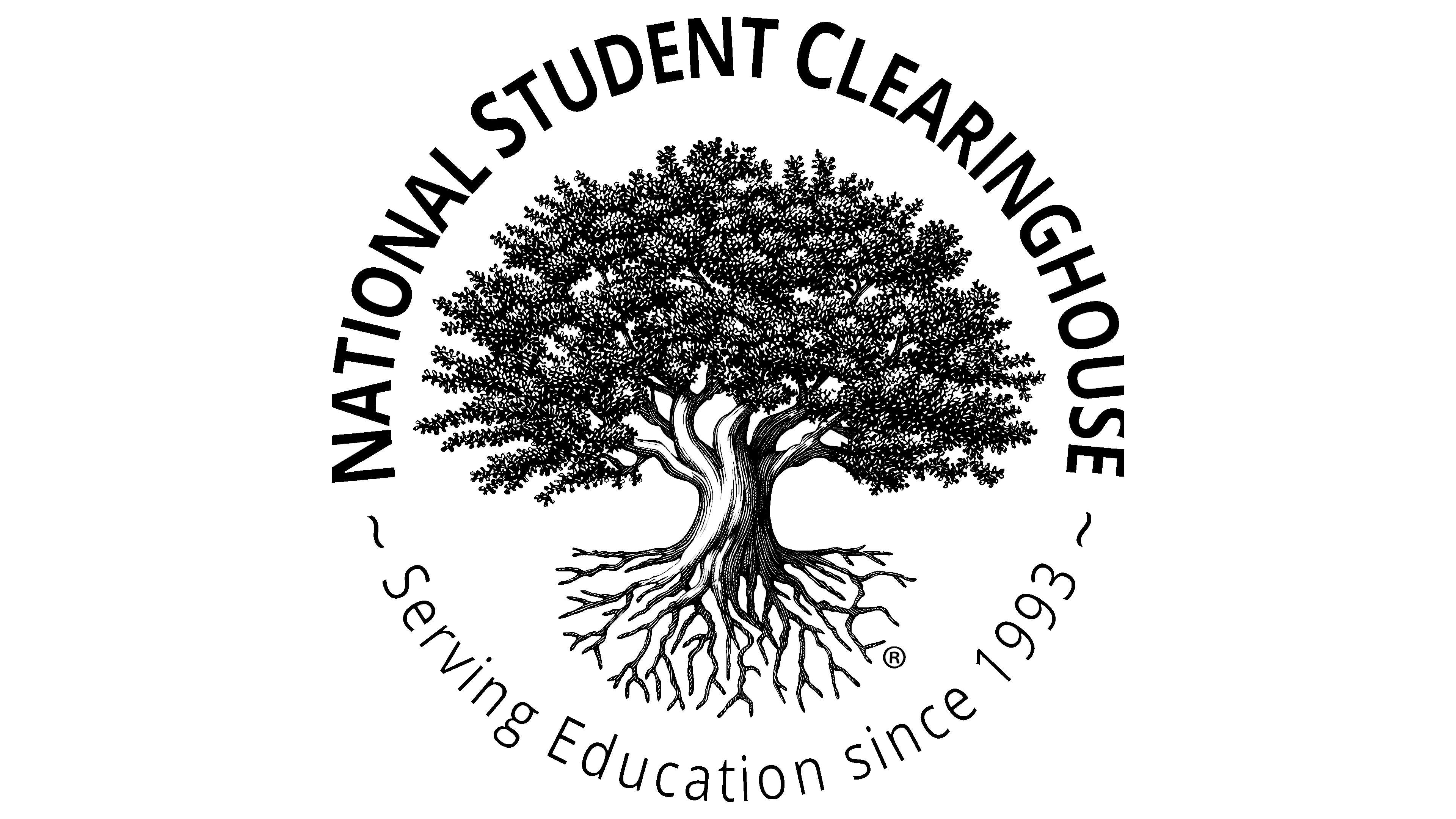
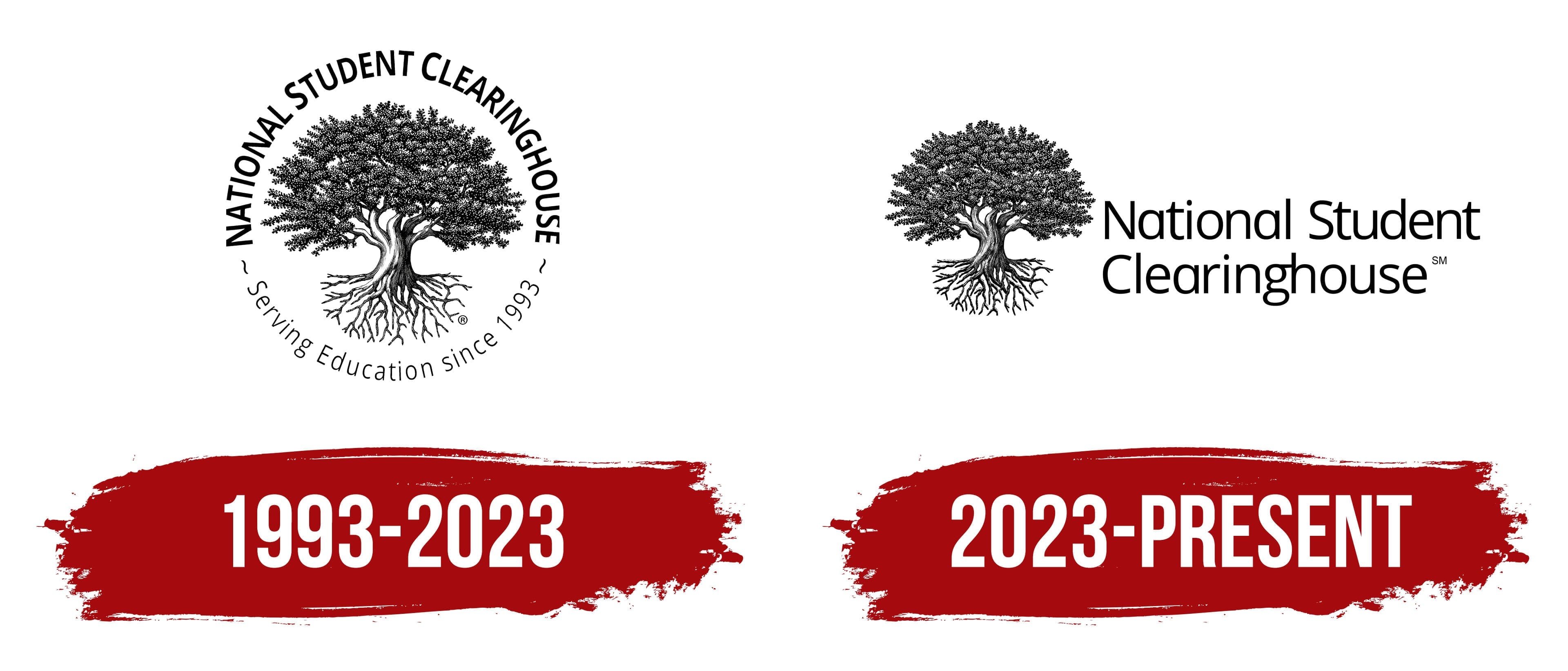
The image of a tree with a dense crown and a strong root system is ideal for monitoring organizations in education. It originates from Celtic culture, where a similar symbol represents endless existence, cycles, and the unified circle of life. The past (roots) is connected to the future (leaves, fruits). It is the tree of life, the foundation of society and humanity. This symbol conveys the potential for successful human development through acquired knowledge.
- The roots stretch from the ancient past. They embody the foundation of education, which has already been created, understood, discovered, and systematized. A strong and healthy root system nourishes the trunk, strengthening it and enabling it to produce a beautiful, viable tree. Roots that delve deep symbolize stability and the unbreakable connection between generations.
- The branches grow upward, reaching for the sun, forming a powerful crown. The more roots there are, the more developed the branches become, which bear leaves and flowers that lead to fruits. The crown represents the gradual development of society based on knowledge absorbed from ancestral experience. It symbolizes growth and continuous progress.
In this case, the tree signifies stability and years of educational effort invested in every child so that a small, vulnerable sapling can grow into a large, strong tree. This organization provides all the necessary conditions to protect educational institutions from challenges they may face.
Another symbolic element is the ring formed by two inscriptions. It harmoniously complements the image, continuing the idea of infinity and presenting education as an eternal process without which a successful future is impossible. Education is always in demand, and this organization monitors its quality. At the top is the full name, “National Student Clearinghouse,” and at the bottom is the founding year, “Serving Education since 1993.”
The lines are shaped as arches that meet in the middle. At each end, they are separated by narrow, wavy lines. To prevent the two texts with different meanings from merging into a single one, the designers distinguished them using distinct fonts. In the first case, it is tall and semi-bold; in the second, it is low and thin. The only unifying element is the uppercase format.
The Student Clearinghouse emblem’s palette is simple: it features a classic black-and-white combination. These traditional colors can convey difficulty and ease, complexity and simplicity, darkness and light, everything that participants in the educational process often encounter.
2023 – today
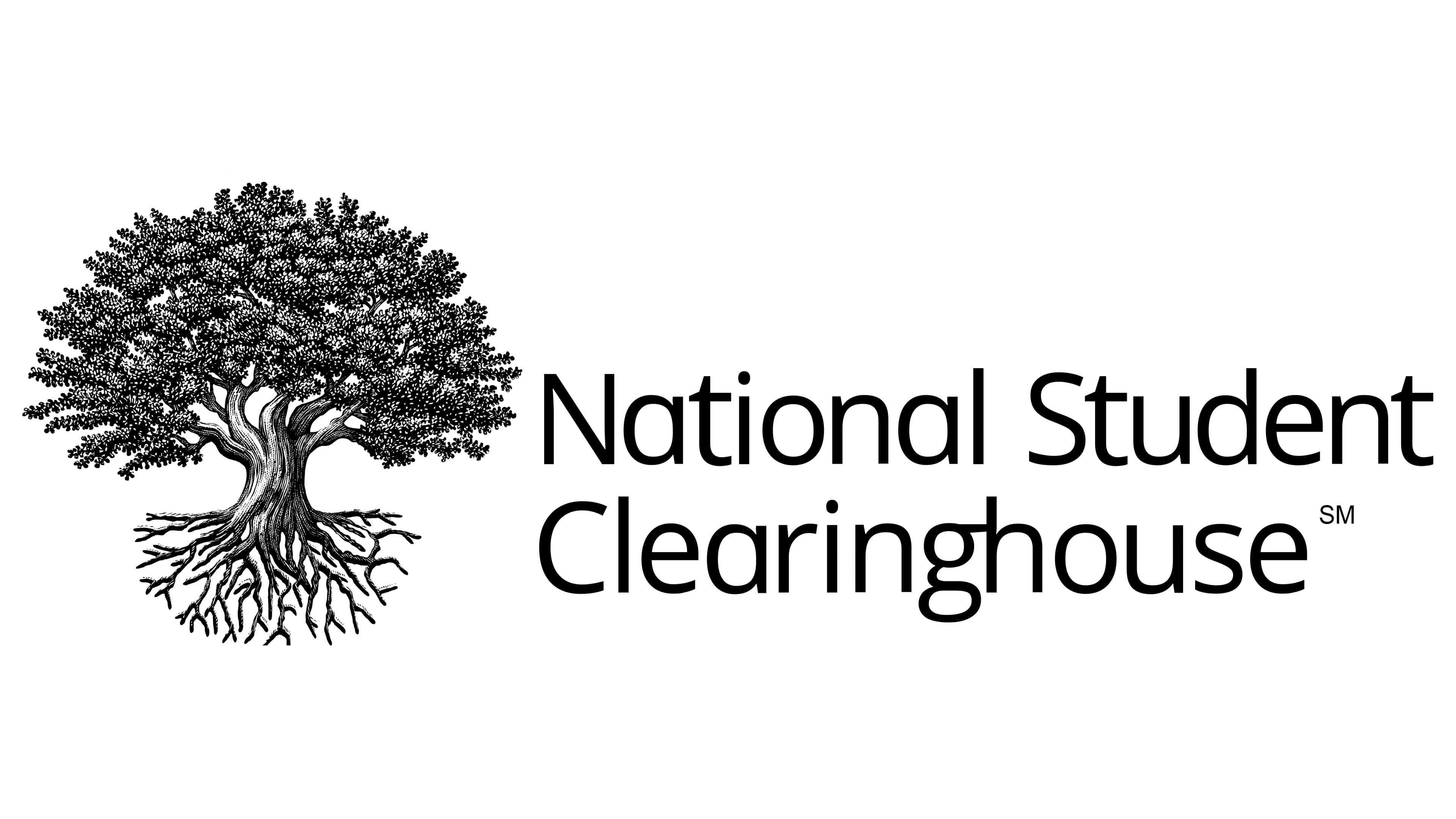
The Student Clearinghouse logo from this period largely repeats the previous version. The key elements remain the same: the tree and the name. Although they have preserved the original style, the emblem’s structure has significantly changed. The designers made minimal adjustments to the identity to achieve a sense of novelty without harming the deep concept.
- The first change concerns the tree’s scaling. The proportion between the illustration and the text became much smaller. This was done to highlight the nonprofit organization’s important role in the educational process.
- The second change affected the ring-shaped text. The text arcs are separated: the lower arch disappeared entirely, while the upper one was stretched into two horizontal lines and significantly enlarged, emphasizing the brand’s value.
However, the dense crown and massive roots remained untouched, ensuring the symbol closely aligns with the Celtic representation of generational continuity and retains its recognizability. In this emblem, the tree is placed in front of the name. The chosen font remains smooth and semi-bold. The difference now is that it has more rounded corners and softer lines, creating a favorable impression of an organization involved in education, which is extremely important.
Overall, the logo exudes confidence, reliability, and calmness, demonstrating the company’s ability to address pressing issues. The monochromatic palette underscores its practical significance for educational institutions, hinting at discipline and the staff’s ability to distinguish between black and white. This indicates that the organization clearly understands the educational process and distinguishes good from bad.