Telcel: Brand overview
Telcel was founded in 1989 as a branch of Radiomóvil Dipsa, a Teléfonos de México (Telmex) subsidiary, marking the beginning of its history. The creation of this provider was part of a plan to advance mobile communications, which was just starting to develop as a distinct industry in Mexico at that time.
1990 the company established Mexico’s first mobile network using analog AMPS (Advanced Mobile Phone System) technology. This was a major step in the country’s telecommunications infrastructure, giving Mexicans access to mobile communications for the first time. Initially, the network was limited to Mexico’s largest cities, but coverage quickly expanded.
1995, the provider transitioned to digital TDMA (Time Division Multiple Access) technology. This upgrade increased network capacity, improved call quality, and introduced new services like SMS. The switch to digital technology also contributed to rapid customer growth.
A major milestone occurred in 1996 when América Móvil was created as a separate entity to manage Grupo Carso’s mobile assets, including this brand. This move was made to focus on the fast-growing mobile market.
2000, the company began using GSM technology, which rapidly became the global mobile communications standard. This allowed for improved communication quality and a wider range of customer services.
2002 GPRS service was introduced, marking the first step toward providing mobile internet. This innovation opened up new possibilities for users and laid the groundwork for future advancements in data services.
In 2004, the firm made further progress by adopting the EDGE network, which increased data transfer speeds and improved the quality of mobile internet.
In 2008, 3G UMTS/HSDPA technology was launched, a major advancement that significantly boosted mobile internet speeds and enabled features like video calls and media streaming.
In 2010, the company introduced 4G LTE in certain parts of Mexico, becoming the first operator in the country to offer this advanced technology. This helped maintain its leading market position and provide faster data speeds.
By 2012, the 4G LTE network had expanded to cover most of Mexico’s major cities, aligning with the growing use of smartphones and a surge in mobile internet usage.
2015 was a year of innovation, as VoLTE (Voice over LTE) was introduced, allowing voice calls over the 4G network: this improved call quality and reduced connection times.
Preparations for the rollout of 5G technology began in 2017, and extensive testing and trials were conducted before the commercial network was launched.
In 2019, 4.5G, also known as LTE-Advanced, was introduced in several major Mexican cities. This technology provided clearer calls and even faster internet speeds.
Throughout 2020, the 4.5G network continued expanding while active preparations for 5G were underway. Significant investments were made in modernizing the infrastructure to support new technology.
In 2021, the company made history by launching its first commercial 5G network in Mexico. Initially available in a few of the country’s largest cities, plans for rapid coverage expansion were announced.
In 2022, the 5G network expanded to more cities and regions across Mexico. New 5G services and plans were introduced.
By 2023, the provider remained Mexico’s top mobile operator, continuing to invest in its 5G network and new digital services. The focus was extending high-speed internet to rural areas and developing Internet of Things (IoT) solutions.
Over the years, the company has evolved from one of Mexico’s first mobile service providers into one of the largest operators in Latin America. Its success has been driven by constant innovation, rapid adoption of new technologies, and the ability to adapt to changing consumer needs. The company has played a key role in the growth of Mexico’s telecommunications infrastructure, contributing to the country’s digital transformation.
Meaning and History
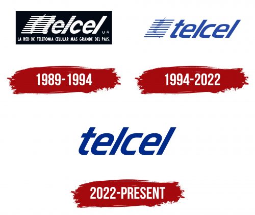
1989 – 1994
1994 – 2022
The Telcel logo is dynamic and modern. The primary focus is on the company name, written in an italicized font that conveys a sense of speed and motion. The slanted letters give the visual identity a feeling of lightness and agility, highlighting the company’s core mission of providing fast communication.
The font is smooth, with lowercase letters that make it visually soft yet confident. The rounded edges give the logo a friendly appearance, while the sharper angles in some letters add a touch of character, symbolizing precision and technological advancement. The balance between rounded and sharp lines reflects that the company remains reliable and stable despite its speed and modernity.
On the left side of the logo, there is an abstract element—lines arranged in horizontal rows that resemble radio waves or an antenna. This symbol immediately evokes the concept of wireless communication. It is a visual metaphor for the company’s promise to keep you connected anywhere. The thin antenna-like shape extending from the top further complements this idea, suggesting constant connectivity and readiness to transmit signals.
The logo’s color is blue, symbolizing reliability, calmness, and confidence. This color choice reinforces the idea that Telcel provides a stable and dependable connection you can rely on anytime. The blue hue also evokes the vastness of the sky and the ocean, enhancing the feeling of freedom and accessibility, which are key values for the brand.
2022 – today
The updated Telcel logo changed to become more minimalistic. The abstract symbols on the left were removed, shifting the focus entirely to the company name. The font has been slightly thickened and made more uniform, giving the emblem a stricter and more modern appearance. These changes reflect the company’s desire to remove unnecessary details and concentrate on simplicity and brand recognizability.
The italicized letters remain, maintaining the sense of dynamism and forward motion. This crucial element emphasizes the company’s commitment to growth and development. The consistency of the lines adds confidence and stability, signifying that the brand remains reliable and strong despite the design evolution.
The color has stayed almost the same, a deep blue that symbolizes trust, confidence, and calmness. Blue is traditionally associated with reliability and stability. It also evokes high technology and the future, reinforcing the company’s readiness to provide modern, cutting-edge solutions to its customers.
By removing the antenna symbols, Telcel has taken a step towards minimalism and simplification of its visual identity. The logo now looks more universal and contemporary, aligning with the company’s expanded influence and strengthened position in the telecommunications market. These changes underscore the brand’s strategy during this period: fewer distractions and a clearer, more focused message.
