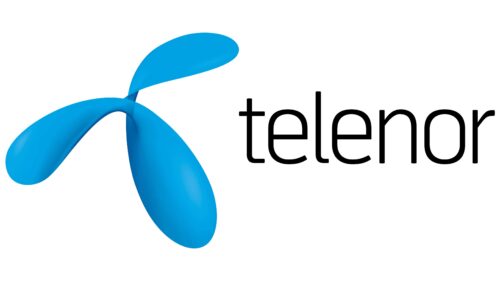
Telenor Logo, a creation of Keshen Teo of Wolff Olins in London, represents a notable departure from its predecessor. Its design, more abstract n nature, features a rounded, flowing shape seemingly inspired by the dynamic nature and continuous innovations occurring in the telecommunications industry.
The flowing shape of the emblem symbolizes the seamless connectivity and the ongoing evolution that is inherent in the field of telecommunications. This dynamic design could also represent the flexibility and adaptability of the company, mirroring its commitment to stay at the forefront of technological advancements and meet the ever-changing needs of its customers.
Additionally, the roundness of the logo’s design might convey a sense of completeness, unity, and inclusivity, indicating Telenor’s comprehensive approach to providing telecommunications solutions and its mission to connect people across different regions and communities. Overall, the abstract nature of the logo allows for various interpretations, underscoring the company’s broad reach and diverse offerings.
Telenor: Brand overview
| Founded: | 1855 |
| Founder: | Government of Norway and Free float |
| Headquarters: | Fornebu, Norway |
| Website: | telenor.com |
Hailing from the Scandinavian shores, Telenor ASA stands as a global force in the realm of telecommunications. With its roots in Norway, the multinational company operates from its headquarters at Fornebu in Bærum, near Oslo, extending its services and innovations across numerous countries.
As a telecommunications company, its core is centered on connecting people. Be it through voice calls, data services, or innovative digital solutions, Telenor strives to bridge distances and ensure seamless communication. Its commitment to excellence and customer satisfaction sets it apart in the crowded telecommunications sector, with a focus on quality, reliability, and innovation.
Meaning and History
The brand identity of Telenor is a blend of simplicity and strength. The logo, a blue sphere symbolizing the world, accompanied by the brand name, reflects Telenor’s global reach and aspirations. The choice of blue signifies trust, depth, and stability, attributes closely associated with this Norwegian telecom giant.
Telenor’s tagline, “Connect to what matters most,” encapsulates its mission to empower societies and enable customers to stay connected with what’s most important to them. It emphasizes the role of the company as a facilitator of communication and connectivity in an increasingly digital world.
Overall, Telenor’s robust brand identity and its dedication to bringing people closer together continue to strengthen its status as a leading player in the global telecommunications arena.
What is Telenor?
Telenor is a multinational telecommunications company based in Fornebu, Norway, founded in 1855. Initially a state-operated monopoly, it has since grown into one of the world’s largest mobile telecommunications companies with operations in Scandinavia, Eastern Europe, and Asia. Its services include fixed-line telephony, mobile telephony, broadband, and cable television. With a commitment to improving communication and internet access across the globe, Telenor has played a crucial role in the development and proliferation of digital communication services.
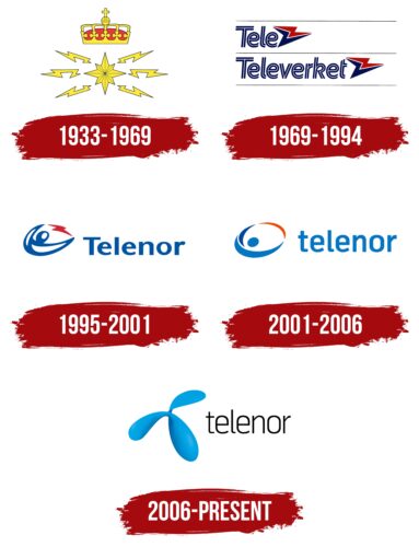
1933 – 1969
1969 – 1994
1995 – 2001
2001 – 2006
2006 – today
Telenor color codes
| Spanish Sky Blue | Hex color: | #26afe8 |
|---|---|---|
| RGB: | 38 175 232 | |
| CMYK: | 84 25 0 9 | |
| Pantone: | PMS 306 C |
| Black | Hex color: | #000000 |
|---|---|---|
| RGB: | 0 0 0 | |
| CMYK: | 0 0 0 100 | |
| Pantone: | PMS Process Black C |
