


A Scottish lion holding a glass of whisky welcomes members to The Rampant Club, which opened in Ho Chi Minh City in August 2026. Vietnamese agency M-N Associates developed the private club’s name and identity. Membership is limited to 99 people, with new members admitted by invitation or referral.
The Vietnamese division of whisky house Duncan Taylor transformed a five-story showroom and restaurant into a series of bars, galleries, and dining spaces. The club brings people together through conversation and a shared interest in whisky. Plans include gatherings and competitions in golf, tennis, padel, and running. The designers were tasked with conveying an intimate atmosphere while connecting the project’s Scottish roots with contemporary life in Ho Chi Minh City.
The name Rampant comes from heraldry and describes an animal rearing on its hind legs. The emblem takes its inspiration from the Lion Rampant on Scotland’s royal banner. The club’s lion retains its raised forelegs, with a glass of whisky added to one paw. That small detail connects the historic figure to the club’s purpose.
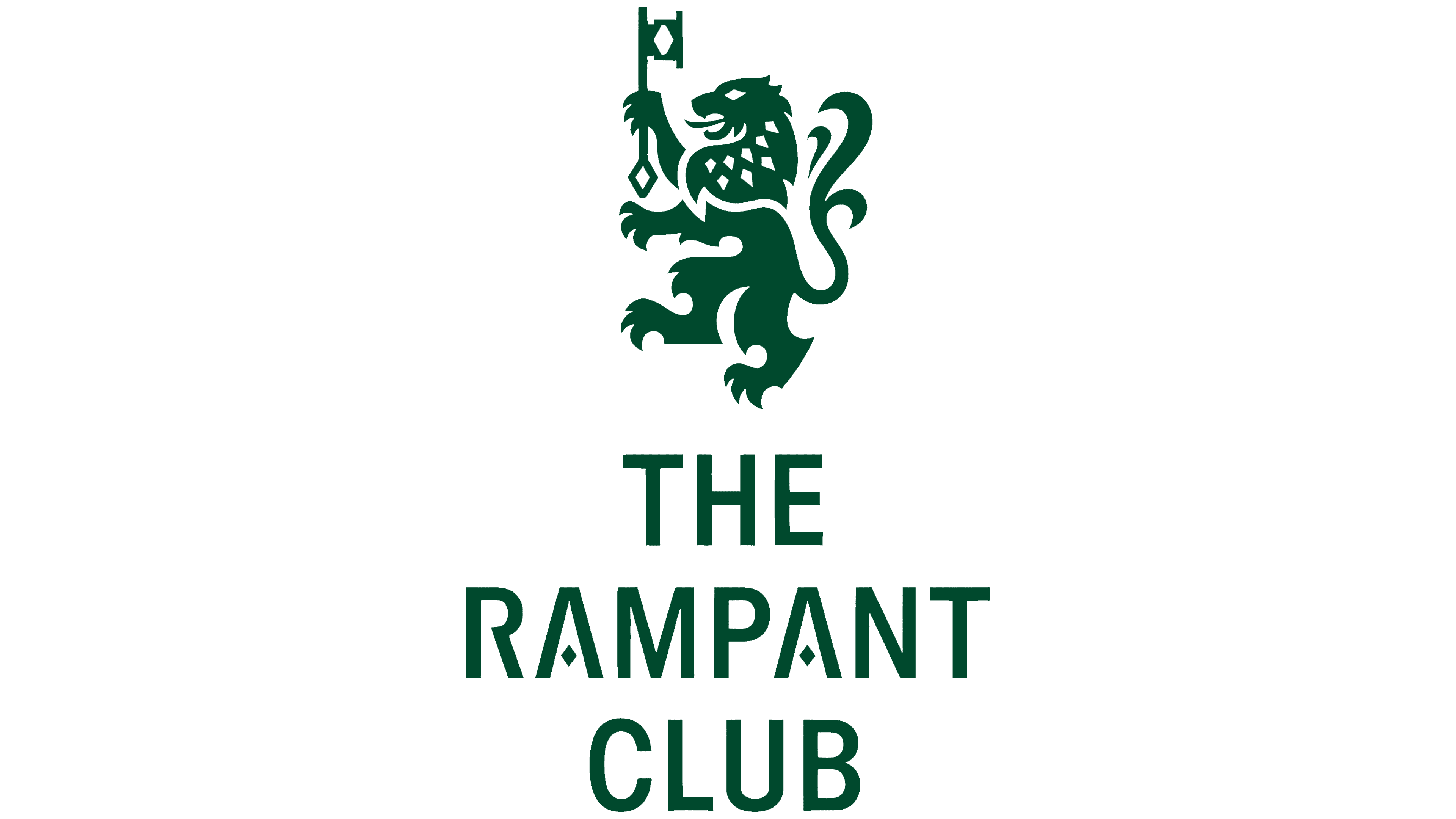
The lion incorporates references to other Scottish symbols. Its mane draws on the shapes of the Great Highland Bagpipe. The decorative tail and triangular details derive from the Duncan Taylor Whisky emblem, preserving a connection to the whisky house. Flowing lines in the fur meet angular cuts, while an elongated diamond recurs in the eye and mane.
The designers borrowed the diamond shape from the cut-glass pattern of a traditional whisky tumbler. It references the club’s drinking ritual and echoes Scottish argyle patterns. The motif extends from the emblem into lettering and ornamentation, tying the club’s materials together.
The Scottish figure also takes on a Vietnamese meaning. The lion serves as a guardian at the entrance, referencing the protective figures found outside local homes and temples. Placing the emblem above the door reinforces its role as a guardian of the members’ space.
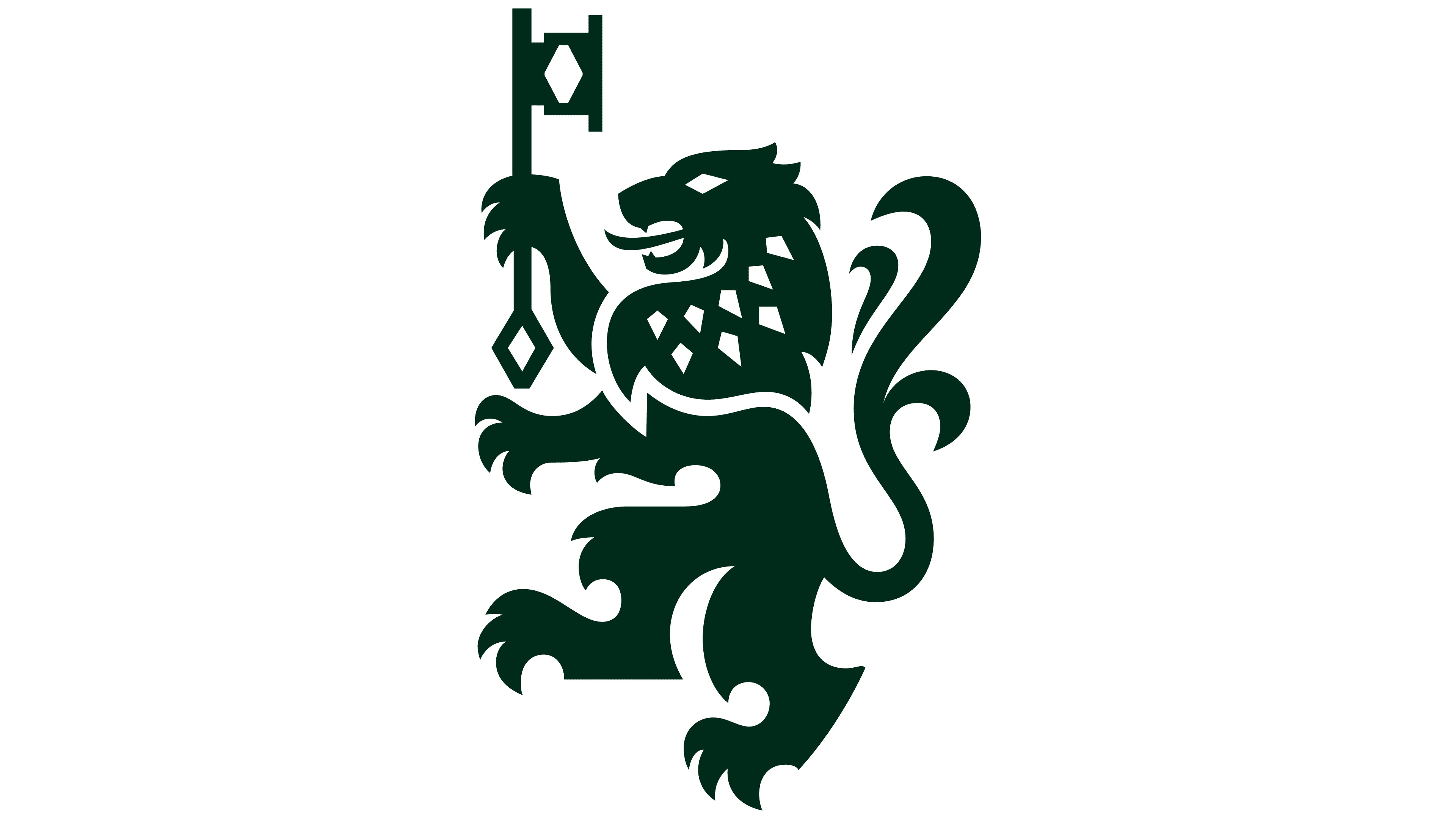
The primary THE RAMPANT CLUB wordmark uses slightly condensed sans-serif capitals. The designers note Gothic influences in the letterforms. Tight spacing evokes a discreet private entrance and a close-knit membership. In the “A,” a diamond inspired by the glass’s faceting replaces the conventional crossbar. The abbreviation T.R.C. and a handwritten version of the full name provide options for different types of communication. The latter is used for informal gatherings and messages.
The project features a custom typeface, MN Rampant Sans. The curve of the lion’s tail, its rounded paw tips, and the contours of its body informed individual strokes. The diamond appears in dots, the ampersand, and other symbols. The typeface includes a full set of Vietnamese diacritics, adapting the Scottish motifs for a local audience. Bảo Trương and Duy-N developed it under the Type Associates name. Duy-N also served as the project’s executive creative director.
For the club’s 5 themed rooms, the lion mascot appears in different outfits and with different accessories. Illustrator Amanda Moeller created drawings centered on golf, tennis, art, and shared meals. Orange accents complement the primary green, while repeating diamonds extend across the club’s materials.