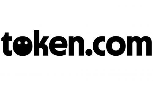
Token.com logo piques curiosity with its enigmatic smiley face, ingeniously replacing the first letter “o.” The emotive symbol is entirely black, except for two white dots where the eyes would be, making it resemble a peculiar emoji without a mouth or nose. All the letters are in lowercase, slightly squished from the sides, making them appear tall. The ‘c’ and the ‘e’ have short ends and vertical cuts, rendering them distinctive. The glyphs are grotesque, bold, black, and rounded.
Despite lacking a mouth and nose, the logo’s smiley face symbol emits subtle playfulness and intrigue. This atypical choice hints at a culture of innovation and unique solutions the brand offers. The absence of traditional facial features on the smiley face symbol serves as a blank canvas for interpretation, inviting engagement and curiosity rather than prescribing a singular emotion.
The choice of a fully black palette symbolizes authority and sophistication. Black is often associated with a sense of power and control, qualities that resonate well with a company operating in a space that demands security and trust. The white dots in the smiley face symbol could signify clarity and transparency within this realm of authority, conveying that while Token.com is a robust platform, it is also user-friendly and approachable.
The use of lowercase letters creates a sense of accessibility. Their slightly squished, tall appearance provides a modern, sleek aesthetic. They also contribute to an image of efficiency, as their slender form takes up less horizontal space, reflecting the platform’s focus on streamlined operations. This is further accentuated by the shortened ends of ‘c’ and the vertical cuts in both ‘c’ and ‘e,’ which add a touch of flair to the otherwise standard characters. These specific design choices in the lettering make the brand more relatable and give a nod to creative ingenuity.
Grotesque and bold typography emphasize the robustness and strength of the brand. The rounded features of the letters and the smiley face symbol add a touch of softness, balancing the strong, bold characteristics and making the logo less intimidating.
The subtleties in this logo—from the enigmatic smiley face symbol to the specific tweaks in the typography—build a complex narrative around the brand. They speak to a balance between power, approachability, innovation, and reliability. Through its unique combination of elements, the logo tells a compelling story about what the platform represents, creatively encapsulating the ethos of technology, trust, and user-centric design.
Token.com: Brand overview
| Founded: | 2017 |
| Founder: | Andrew Kiguel, Trevor Koverko |
| Website: | token.com |
First established in 2017 by Andrew Kiguel and Trevor Koverko, Token.com was created to simplify and secure investing in cryptocurrencies and blockchain-related assets. Initially operating under the radar while its platform underwent beta testing, Token.com made a splash in 2021 when it launched publicly and had its initial public offering (IPO), listing on Canada’s NEO Exchange.
Beyond its original focus on staking and investing in tokens, Token.com has diversified into intriguing avenues like virtual real estate within metaverses and non-fungible tokens (NFTs). In a landmark transaction in November 2021, the firm’s subsidiary, Metaverse Group, orchestrated the largest acquisition of virtual land to date, snapping up 116 parcels in the digital realm of Decentraland. The following year, Token.com further extended its reach into the NFT space by establishing a specialized investment division, Hulk Labs.
In 2023, Token.com’s staff roster has swelled to around 50 employees, and the company continues to broaden its asset base, venturing deeper into decentralized finance (DeFi) and NFT holdings. At the core of its business ethos is demystifying investments in cryptocurrencies and Web3 technologies for mainstream investors. CEO Andrew Kiguel leads the company in its ongoing mission to evolve and enlarge its portfolio of digital and Web3 assets in a straightforward, safe, and transparent manner for all stakeholders.


