


![]() TomTom Logo PNG
TomTom Logo PNG
In navigation, the most important step is identifying key waypoints that will form the basis of the route. The TomTom logo reflects this principle. At the same time, it looks global, as it is associated with the planet’s expanses.
TomTom began in 1991 in Amsterdam as Palmtop Software, founded by Peter-Frans Pauwels and Pieter Geelen. The company developed business applications for handheld devices and worked closely with Psion to create software for the Psion Series 3. In 1994, Corinne Vigreux joined and led the international expansion.
In 1996, the team released its first mobile routing software. After Palm, Inc. launched the Palm Pilot, Palmtop shifted to that platform and to Microsoft Windows CE. In 1999, Harold Goddijn joined as an investor and later became CEO.
In 2001, the company rebranded as TomTom and focused on car navigation. That year, it launched TomTom Navigator for PDAs with GPS, generating €8 million in revenue by 2002. The turning point came in March 2004 with the launch of TomTom GO, a standalone GPS device with maps and voice guidance. About 250,000 units were sold in the first year, accounting for 60% of revenue, while Garmin accelerated its automotive line.
In May 2005, TomTom went public in Amsterdam, raising €469 million and achieving a valuation of €2 billion. The founders retained control without venture funding.
In 2006, TomTom introduced Rider and traffic services. In 2008, it acquired Tele Atlas for €2.9 billion, gaining access to its map data and competing with NAVTEQ. From 2009, Google Maps and Apple Maps on smartphones reduced demand for standalone devices, pushing the company toward enterprise mapping and automotive software.
Meaning and History
![]()
TomTom wasn’t always called that; until 2001, it was known as Palmtop and used a logo with the corresponding inscription. Its main activity was developing software applications for PDAs.
In 2001, the company entered the navigation device market and changed its name to TomTom. From that moment on, the history of a series of emblems with the imprints of two palms began, hinting that car GPS navigators help keep everything under control.
However, the era of hands ended in 2022, when the company created the first global map that covered the entire planet and reflected real-time changes. Announcing its intention, TomTom introduced a new logo, which became the main marketing tool in the race for popularity. It contains a stylized pin, a symbol denoting a location on a map.
What is TomTom?
TomTom is a company that manufactures satellite navigation devices for various types of transport. These devices help navigate to destinations and provide information about road conditions. They are used in cars from popular manufacturers such as Mazda, Fiat Chrysler, and Toyota. In addition, TomTom develops online maps, software, GPS-supported sports watches, and action cameras.
1991 – 2001
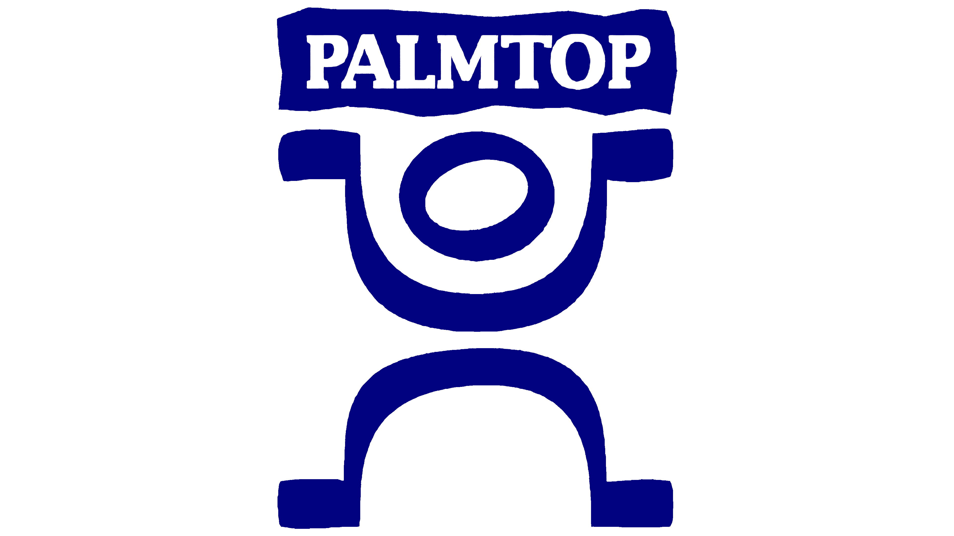
When TomTom bore its previous name, it had a completely different visual style, which was subsequently not adopted. Only the idea with palms was retained. They are traced in the bold sidelines of the inverted arch. Such an element is located below and represents legs. In the middle of the upper arch is an oval. It has a wide ring and an empty center. Together, they depict a person holding a banner with the brand name above his head. The inscription consists of serif letters. The logo is in blue and white colors.
2001 – 2007
![]()
The brand’s logo, associated with its name, consists of two parts. The first is graphical, in the form of a picture. The second is textual. It contains only one word: “TOMTOM,” written in large, bold uppercase letters. At the same time, the letters are reproduced in lowercase. This is because “m” has a streamlined shape without characteristic angles, and “o” looks the same regardless of orientation. The name is arranged in a line.
2007 – today
![]()
The designers took the previous version as a basis and added a few new touches. They increased the size of the hands, reduced the letter thickness, and added a silver ball. According to the concept, this is planet Earth without identifying marks. TomTom guarantees that with its navigators, you can get to any point in the world, even without maps, and determine your location with its devices. The developers also removed the lowercase letters and replaced them with uppercase ones.
2019 – 2022
![]()
This version retained the idea of combining lowercase and uppercase letters and left two red arrows superimposed on a white ball. The changes mainly concerned the image’s three-dimensionality. At the same time, everything else remained the same. The palms, printed on a light background, became two-dimensional: flat and simple.
2022 – today
![]()
After TomTom made minor changes to the logo, the ball disappeared. Therefore, the red arrows now appear suspended in the air, having lost their visual support. They form a semblance of a round object. Their arrangement evidences this.
The graphic part is a semi-transparent white ball with light gray-blue highlights on the edges. This stylistic trick makes it semi-transparent. Two hands are holding the ball (presumably, our planet). The Earth is in safe hands and is visible through, which corresponds to the manufacturer of GPS navigators. It also speaks of its global nature and high significance.
A classic color palette balances the creative icon’s color palette. The font is black, the arrows are bright red, and the globe is almost transparent gray. The company’s slogan is present on the logo in some versions (depending on the place of use and purpose).
2022 – today
![]()
The caring hands holding an imaginary planet have gone into the past. The TomTom brand is now represented by a more business-like and pragmatic sign, unofficially called The Pin. The two palms symbolize a navigator, a faithful assistant pointing in the direction. However, the company changed its priorities and began developing a global map, so it needed a new symbol system.
The emblem is a stylized pin on the left side, a large dark red ring, and a small triangle. A similar icon is used in online maps to denote location. Of course, the logo’s creators had no specific place in mind. It’s rather an abstract destination that can be anywhere. To the right of the icon is the company’s name. Both parts of the word are translated into lowercase, as on the 2001 emblem. But now “tomtom” has a completely different design: the letters have a clear shape and original oblique cuts at the ends.
Font and Colors

Until 2022, the brand name was set in a rounded-corner font. Its closest analog is Arista 2.0, devised by Francesco Canovaro. An alternative option is Majel Bold, inspired by Art Deco-style book titles.

After the 2022 redesign, a custom font was used in the logo. It’s similar to the free YagiUhfNo2 Regular by ClaudeP. They perfectly combine round “o” letters with an unconventional “m” that lacks the upper-left stroke. But both “t”s in TomTom have sharp ends, making them unique. The brand name is translated into lowercase – another difference from the previous word mark.

The palette consists of just three colors: red (#DF1B12), white (#FFFFFF), and black (#000000). It’s a classic, no-fail combination that attracts attention, and the Dutch company has been using it for over twenty years.