![]() Topgolf Logo PNG
Topgolf Logo PNG
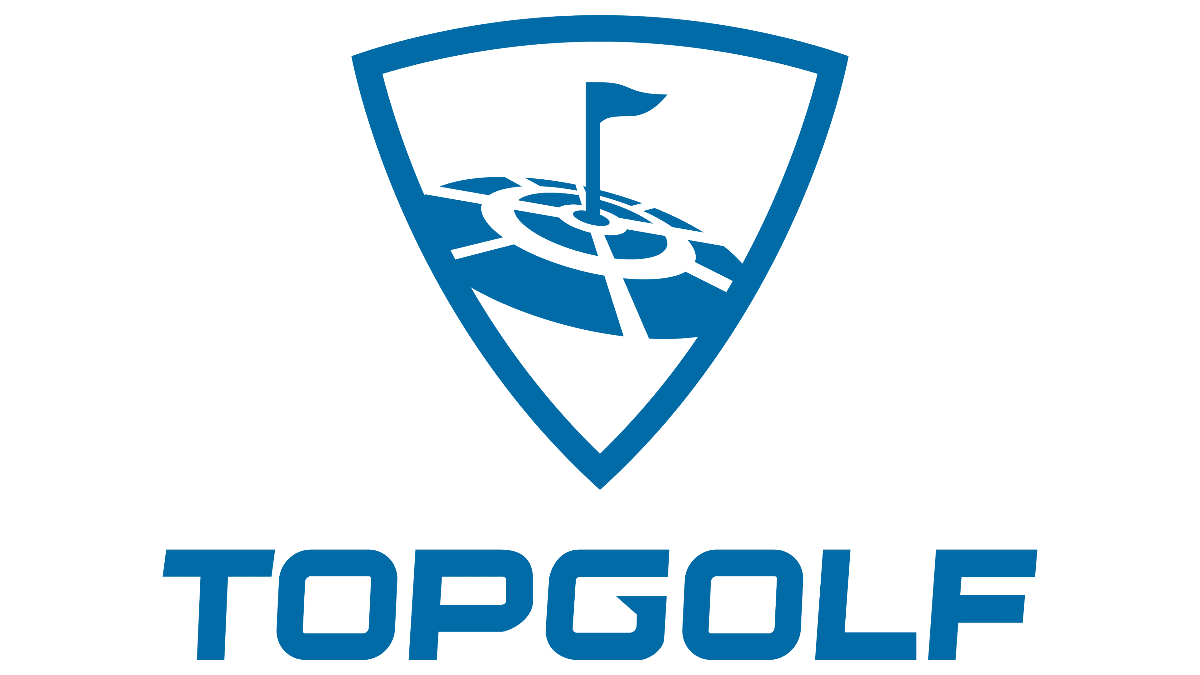
The designers who created the Topgolf logo depicted a stylized golf hole with a flag. They surrounded it with concentric rings of quadrilaterals to show the use of high technology on the playing fields.
Meaning and History
![]()
Twins Dave and Steve Jolliffe were the first to adopt modern technology for playing golf. In 2000, they built the first Topgolf venue, named after the phrase “Target Oriented Practice Golf.” The idea of embedding contactless radio tags into balls initially received little support. But the brothers did not give up: they managed to find investors and expand their business, opening new locations in different countries.
The entire visual identity of the progressive sports and entertainment company is built around the logo. It adorns advertising signs, building facades, and interior elements, and, in most cases, is decorated with bright backlighting. This symbol has not changed for many years, except for a minor adjustment made in 2014.
What is Topgolf?
Topgolf is an American company specializing in sports entertainment. Its trade name is Topgolf Entertainment Group. It is a subsidiary of golf equipment manufacturer Topgolf Callaway Brands Corp. Their merger was completed in 2021.
2000 – 2014
![]()
The emblem features a large triangular shield with rounded sides. Designers used negative space to depict a small flag within the hole and two concentric rings formed by bent quadrilaterals. These elements are colored in a gray gradient, and the inner part of the shield is white. The shield is outlined with a double border and a gray shadow along its entire contour. At the bottom, the word “TopGolf” is written in white letters with a semi-transparent gray border.
2014 – today
![]()
After the redesign, the shield remained white, and the other elements of the emblem, including the letters, became dark gray. The gradient disappeared. Moreover, the designers slightly altered the flag’s shape and the size of the quadrilaterals that form the two rings around it. The inscription was also updated: all glyphs are now in uppercase and set in a bold italic font.
The Topgolf symbol demonstrates the high-tech nature of the golf playgrounds. This is hinted at by the futuristic rings around the hole, which resemble elements from a computer game. The coat-of-arms shield is a traditional basis for many sports logos.
Font and Colors
Previously, the Topgolf name was set in a grotesque, geometric, rounded font. In 2014, the Public graphic design team created a new custom font for the company’s logo. In this version, all letters have square outlines. Glyphs are uppercase, bold, and italic. Both the wordmark and the emblem are presented in dark gray. Meanwhile, the shield’s empty part is painted white.