


Udi’s returns to its bakery roots with a redesign by Haystack Studios. The American gluten-free baked goods brand has added “Bakery” to its logo and reshaped its yellow emblem into a circle. The company aims to renew interest among longtime customers by emphasizing the flavor and appetizing appearance of its bread, rolls, and other products.
The bakery theme draws on the brand’s history. Named after founder Udi Bar-On, the possessive form evokes a family business. Udi’s grew out of a sandwich business, café, and bakery in Colorado. In 2008, its gluten-free baked goods became a separate business with national reach. Today, Conagra Brands owns the brand, which produces bread, bagels, rolls, muffins, pizza crusts, and cookies.
Haystack Studios built on features customers already knew. The previous logo felt friendly, and its yellow background helped shoppers find the products on store shelves. The studio retained the color, focusing on the emblem’s shape and lettering. Haystack Studios founder and creative director Mitch Tennison developed the project with Conagra.
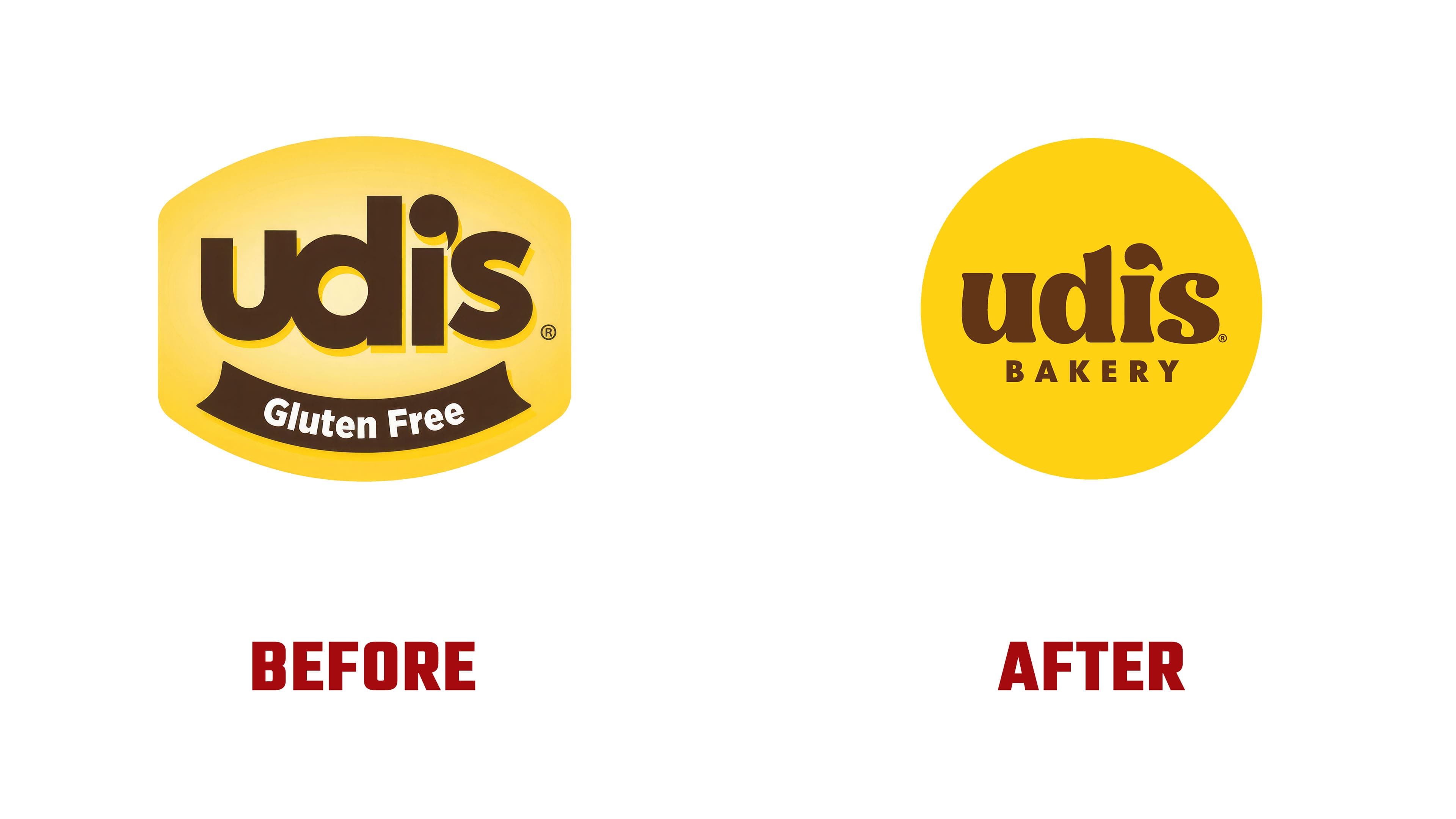
Previously, the name appeared on a yellow panel with outward-curving top and bottom edges. A lighter center and shading created depth. Beneath the lettering, a brown ribbon carried the words “Gluten Free” in white. The new logo uses a circle with a uniform yellow fill. The designers compare it to a bakery seal applied to finished packaging.
The brown “udi’s” lettering remains lowercase. Rounded forms with soft serifs replace the heavy geometric sans serif. The stroke endings of the “u” and “i” flare outward, while the top of the “d” ends in an angled cut. The terminals of the “s” are now rounded and almost teardrop-shaped. Wider spacing separates letters that previously sat close together. The lettering recalls traditional bakery signs, reinforcing associations with craftsmanship and home warmth.
The apostrophe still serves two purposes. The teardrop-shaped mark above the “i” functions as punctuation in the name and as the letter’s dot. Previously elongated with a thin tail, it is now shorter and fuller. Beneath the name, “BAKERY” appears in small, widely spaced sans-serif capitals. The gluten-free information has moved outside the emblem and appears nearby on the packaging.
The yellow circle with brown lettering appears across the product range as a standalone sticker. Its shape and text arrangement remain consistent as the surrounding design changes. The logo’s flat color contrasts with product names that use shadows and decorative dimensional effects.
Conagra paired the packaging update with product changes. Larger transparent sections let shoppers see the bread’s crust and texture. Soft White was renamed Bakehouse White, with the descriptor “Artisan-Style Bread.” The packaging also features colored areas with irregular edges and characters shaped like baked goods. Early sketches included a baker, but the studio later turned to personified products, including a smiling slice of bread.