 Conagra Brands Logo PNG
Ready-to-eat and semi-prepared foods make quick meal prep at home easier. Frozen meals, snacks, and canned goods help reduce cooking time and support daily nutrition. The Conagra Brands logo is associated with a company that manages a portfolio of brands and produces mass-market food products.
Conagra Brands traces its origins to September 1919, when Frank Little and Alva Kinney founded Nebraska Consolidated Mills in Grand Island. The first successes came in 1922. During that period, the company moved to Omaha and earned $175,000 in profit. In the 1940s, production began to expand. Mills were opened outside Nebraska, and livestock feed production was launched.
In 1951, the Duncan Hines brand appeared, making Nebraska Consolidated Mills the third-largest flour producer in the United States. In 1971, the company changed its name to ConAgra and was listed on the stock exchange. Since the late 20th century, the brand has focused on food products. The company exited the meat segment and strengthened its position in the frozen and packaged goods market.
In the 2000s, ConAgra expanded its brand portfolio. It acquired Watts Brothers Farms, Ralcorp, and the licensed brands P.F. Chang’s and Bertolli. In 2016, the company’s headquarters were moved to Chicago. At that time, the name was changed to Conagra Brands.
In 2017, the company acquired the popcorn producer Angie’s Boomchickapop. In 2018, it completed its largest deal: acquiring Pinnacle Foods for $8.1 billion. As a result, Conagra regained control of the Duncan Hines brand.
In the years that followed, the company continued to update its product lineup. It sold the Peter Pan brand to Post Holdings and announced a transition to cage-free eggs by 2024.
The company released the Future of Snacking 2025 report. The document highlighted the U.S. snack market’s growth to $148.6 billion. It also noted emerging flavor trends, with multicultural tastes and healthy ingredients becoming key areas of development.
Meaning and History
What is Conagra Brands?
An American packaged food manufacturer based in Chicago, operating in four areas: grocery and snacks, frozen and refrigerated foods, foodservice, and international distribution. Its portfolio includes more than one hundred brands, including Birds Eye, Banquet, Healthy Choice, Slim Jim, and Duncan Hines.
1969 – 1971
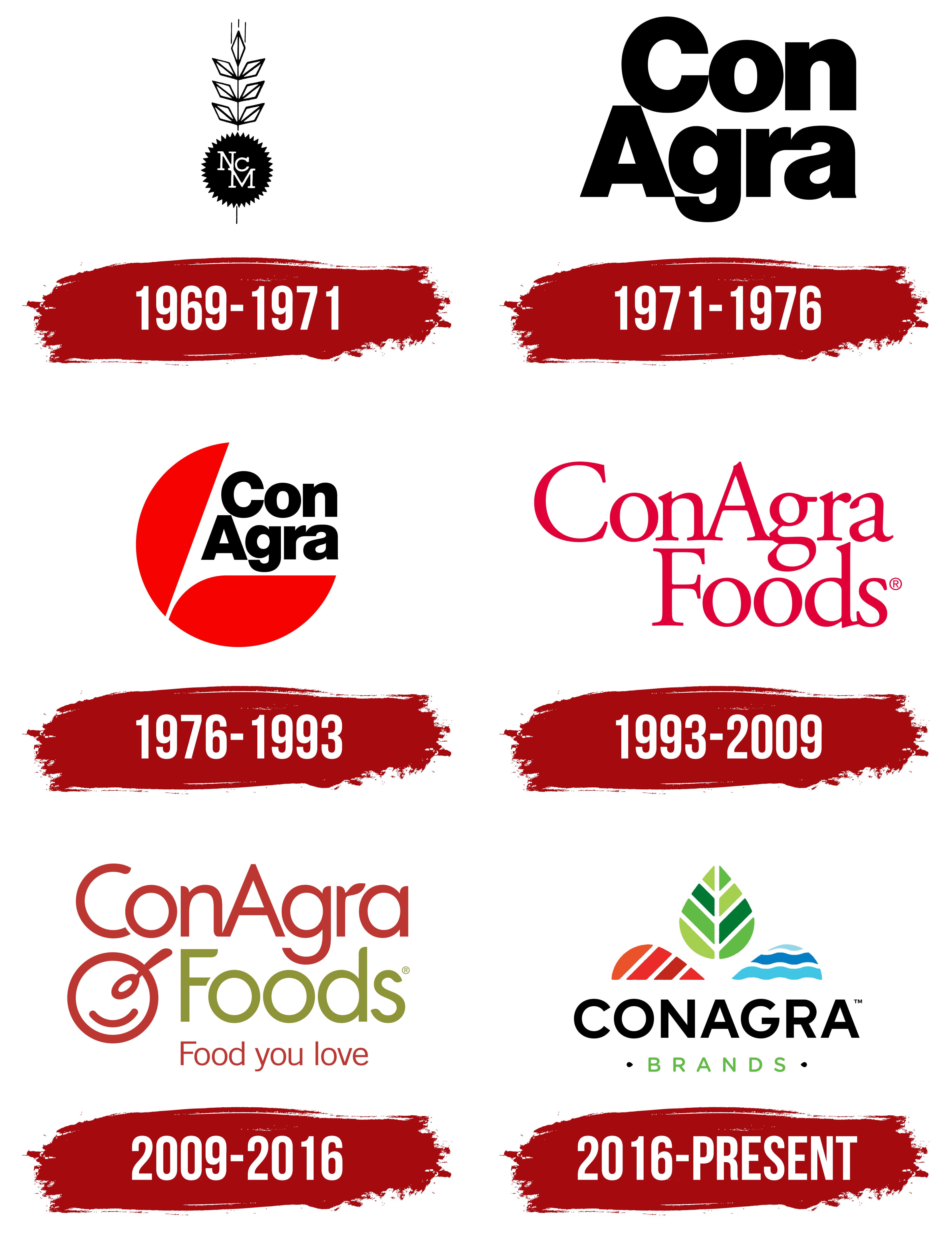
Four flour milling operations formed the foundation of Nebraska Consolidated Mills, established on September 29, 1919, in Grand Island, Nebraska. The name described the business’s origins as a group of mills brought together in the state. It grew into Conagra Brands, the company behind American food brands including Hunt’s, Healthy Choice, Banquet, and Orville Redenbacher’s. Over time, the business expanded geographically and broadened its product range, outgrowing its original name.
The early emblem featured a wheat head representing flour milling, while the initials “NCM” stood for the company’s name. A thin vertical stem ran through the entire design and extended below it. Above the letters, three symmetrical pairs of angular kernels appeared on either side of the stem. Their outlines resembled elongated diamonds split by diagonal lines. A pointed diamond with an internal division formed the top, with three thin vertical lines above it.
A black circle with a serrated edge filled the lower portion, giving it a seal-like appearance. Inside, white capital letters “N,” “C,” and “M” partially overlapped at different heights. The “N” and “M” followed a descending diagonal, while the smaller “C” sat to the right of center. The tightly interwoven lettering contrasted with the wheat head’s thin, angular outlines. The monogram stood in for the full name, preserving the reference to Nebraska Consolidated Mills within the grain emblem.
1971 – 1976
Nebraska Consolidated Mills became ConAgra on February 25, 1971. The former name referred to mills in a single state, while the company was already active in several areas of agriculture and food production. In the new name, “Con” retained a connection to “Consolidated,” while “Agra” referred to “agriculture.” The name also drew on Latin roots and the phrase “in partnership with the land.” The capital “C” and “A” divided it into two parts.
Sandgren & Murtha designed the first wordmark using Helvetica as its basis. Large black lettering replaced the wheat head and the seal containing the NCM initials. The name was split across two lines, with “Con” above “Agra.” The initial letters remained uppercase, with the rest lowercase. The lines were right-aligned. The lower line started farther left, so the “A” extended beyond the left edge of the “C.”
The bold sans-serif letters had thick strokes and tight spacing. Rounded forms in the “o,” “g,” and “a” combined with the heavy vertical strokes of the “n” and “r.” A narrow gap between the lines brought the name together into a dense block of lettering. The lower portion of the “g” extended below the baseline of the neighboring letters. The new name filled the emblem.
1976 – 1993
On October 1, 1976, the ConAgra logo gained a red surround. The name remained split into “Con” and “Agra.” A circular shape, open at the upper right, enclosed the two-line wordmark.
Two large sections formed the red circle. The first curved around the left side of the name and extended diagonally upward. The second ran beneath the lettering, continuing the rounded outer contour. A white diagonal cut separated the shapes. The curves surrounded the text on two sides, while the name occupied the open space to the right.
The black lettering remained in Helvetica, with lighter strokes. “Con” sat above “Agra,” retaining the uppercase “C” and “A” and lowercase letters elsewhere. The red surround and closely positioned lines formed a compact emblem.
1993 – 2009
The red ConAgra logo introduced in 1993 grew out of an annual report design. Designer Drew Davis created the cover lettering, and the company adopted it as its logo. The separate circular emblem was removed, leaving only the name.
The heavy lettering of the earlier versions gave way to serif forms with fine connecting strokes and contrasting line weights. Large capital letters “C” and “A” divided the name, while the remaining letters stayed lowercase. The “g” became a double-story form with a lower loop. The entire wordmark was red, and its serif lettering resembled Times New Roman or Georgia.
On September 28, 2000, the company changed its legal name to ConAgra Foods, signaling its focus on food consumers. In the logo, “Foods” appeared on a second line beneath “ConAgra,” offset to the right. Both lines retained the red color and serif lettering. A large “F” joined the uppercase “C” and “A,” with the remaining letters on the lower line in lowercase. A small registered trademark symbol appeared to the right of “Foods.”
2009 – 2016
Consumers recognized ConAgra Foods’ product brands separately from the company behind them. Research involving shoppers and other stakeholders revealed a disconnect between familiar products and the corporate name. Omaha agency Bailey Lauerman was commissioned to strengthen that connection. The new identity was unveiled on June 1, 2009. The logo remained in use for seven years.
The two-line name was retained, with rounded sans-serif lettering replacing the serif typeface. Its forms resembled VAG Rounded or Avenir Rounded. “ConAgra” became brick red, while “Foods” below it was olive green. The “C,” “A,” and “F” remained uppercase, with the other letters lowercase. The tall “A” preserved the name’s familiar two-part division. Some stroke endings were rounded, and the short upper arm of the “r” was widened to resemble a leaf.
A red plate-and-spoon symbol resembling a smiling face appeared to the left of “Foods.” A circular outline represented the plate. The spoon consisted of an oval and an elongated curve with a rounded end. It crossed the upper-right portion of the plate diagonally and extended beyond the circle. An inner semicircular line suggested a smile. The plate and spoon connected the emblem to prepared food. Beneath “Foods,” the tagline “Food you love” appeared on a separate line in small letters, using the same red as “ConAgra” and the symbol.
Building signs retained the company’s colors, emblem, and tagline. ASI Signage Innovations helped design and install the headquarters signs. ImageFirst manufactured the internally illuminated aluminum structures. The main sign had a curved face, and the logo also appeared on individual building signs.
2016 – today
In 2016, frozen potato products manufacturer Lamb Weston was spun off as a separate company, and ConAgra Foods became Conagra Brands. The remaining business focused on products sold under the group’s brands and on serving foodservice businesses. The rebrand coincided with moving headquarters to Chicago and increasing its focus on product brands in international markets. “Brands” clarified the company’s role.
Duffy developed the new identity. The logo was unveiled on October 20, 2016. A multicolored emblem above a two-line name replaced the red plate and spoon and the “Food you love” tagline.
An upright green leaf made of eight segments occupied the upper part of the symbol. A white line divided it down the middle, while diagonal veins separated areas ranging from light to dark green. At the lower left, a rounded shape resembling half a leaf appeared. Its four segments shifted from red to orange and were separated by diagonal gaps. On the right, a blue shape consisted of three horizontal bands in different shades of blue. White wavy lines suggested a water surface. Both lower shapes had flat horizontal bases and formed a foundation for the green leaf. White gaps separated the three parts.
Beneath the emblem, “CONAGRA” appeared in large, bold, black sans-serif capitals. The lettering resembled Gotham or Proxima Nova. Setting the entire name in capitals brought together the two parts previously distinguished by the internal uppercase “A.” Below it, “BRANDS” appeared in smaller, light green letters with thin strokes and increased spacing. Two small black teardrop-shaped symbols flanked the lower line.