


![]() Tillamook Logo PNG
Tillamook Logo PNG
The Tillamook logo reflects the quality of dairy products grown from farming traditions and natural methods. The brand is recognized for its meticulous attention to detail and respect for the environment, which it has consistently upheld for many years.
The history of Tillamook began in 1909 in Tillamook County, Oregon. Ten local farmers formed a cooperative to produce cheese based on a recipe from Canadian cheesemaker Peter McIntosh.
The valley’s climate allowed cows to graze year-round, but poor roads complicated the delivery of products to Portland. Therefore, residents built Oregon’s first schooner, the “Morning Star,” which is depicted on the company’s packaging.
The construction of a railroad in 1911 helped Tillamook access West Coast markets. During both World Wars, the company supplied cheese to the U.S. military.
In 1949, a large plant opened, becoming a popular tourist destination. Another factory started operations in Boardman in 2001, producing most of Tillamook’s cheese.
Today, Tillamook produces cheese, yogurt, ice cream, and butter. It remains the largest employer in the county and sells its products across all 50 U.S. states.
Meaning and History
![]()
What is Tillamook?
It is an American farming cooperative producing high-quality dairy products. The company controls the entire production process, from animal care to finished goods. The brand is famous for its aged cheeses with rich flavors and dense ice cream high in natural cream content. The cooperative also operates a museum for tourists, offering product tastings and tours.
1909 – 2019
![]()
The Tillamook logo was deeply rooted in the regional identity and brand history as an Oregon-based farmer cooperative.
The central element of the composition was a circular medallion featuring a three-masted ship symbolically representing the historical vessel “Morning Star.” In the late 19th century, local farmers used this ship to deliver dairy products from the Tillamook region to Portland. The ship’s image was rendered with detailed sails and a distinct hull silhouette, emphasizing authenticity and historical significance.
Encircling the central image was the inscription “Tillamook County Creamery Assn.,” presented in a serif typeface typical of early 20th-century advertising signs. Below the ship, an additional ribbon banner read “Farmer Owned,” indicating the brand’s cooperative management structure. The bottom part of the logo featured the company’s founding date, “Since 1909,” emphasizing its long and stable history.
Below the medallion, the brand name “Tillamook” appeared in a large uppercase typeface featuring heavy serifs and layered typography. The primary dark-blue letters were combined with white highlights and a gold-colored outline, providing volume and contrast. The font, reminiscent of Victorian-era typefaces, evoked associations with reliability, tradition, and high-quality products.
The logo’s color palette consisted primarily of dark blue and creamy gold, symbolizing trust, natural quality, and the brand’s premium nature. The circular shape of the medallion, resembling a seal or quality mark, emphasized the cooperative’s authority and reliability.
For more than a century, this logo remained unchanged across the entire Tillamook product range, from cheese and butter to ice cream and yogurt. Besides product packaging, it was also used in the interior design of the legendary Tillamook Creamery tourist center, where a full-scale replica of the symbolic ship was on display. Additionally, the emblem appeared on vintage vans and souvenirs, creating an atmosphere of authentic Oregon heritage.
The historical Tillamook logo embodied a unique blend of local traditions, farming heritage, and maritime trade symbolism, serving as a strong brand identity tool up until its visual update in 2019.
2019 – today
![]()
The Tillamook logo, in use since 2019, is part of an extensive redesign aimed at strengthening the company’s national positioning; the company has a history spanning over a century (founded in 1909). The new visual identity emphasizes the brand’s connection to local history and regional specificity.
The updated version retains the image of a three-masted ship stylized as a weather vane placed atop the company’s headquarters building in Tillamook, Oregon. Following the redesign, the ship’s silhouette adopted simplified, minimalist contours that emphasize flat shapes and clean lines. These changes improved logo readability, especially across digital platforms.
The brand name “Tillamook” is set in a custom calligraphic font featuring a slanted style, distinctive smooth strokes, and rounded letter endings. Particularly expressive is the symbolic swirl of the capital “T” and the linkage between the two “o” letters. The selection of this typeface aims to highlight the brand’s artisanal character while introducing modern visual dynamics. Stylistically, the font evokes retro American signage from the mid-20th century, resembling commercial typefaces like Gastromond and Tilda Script.
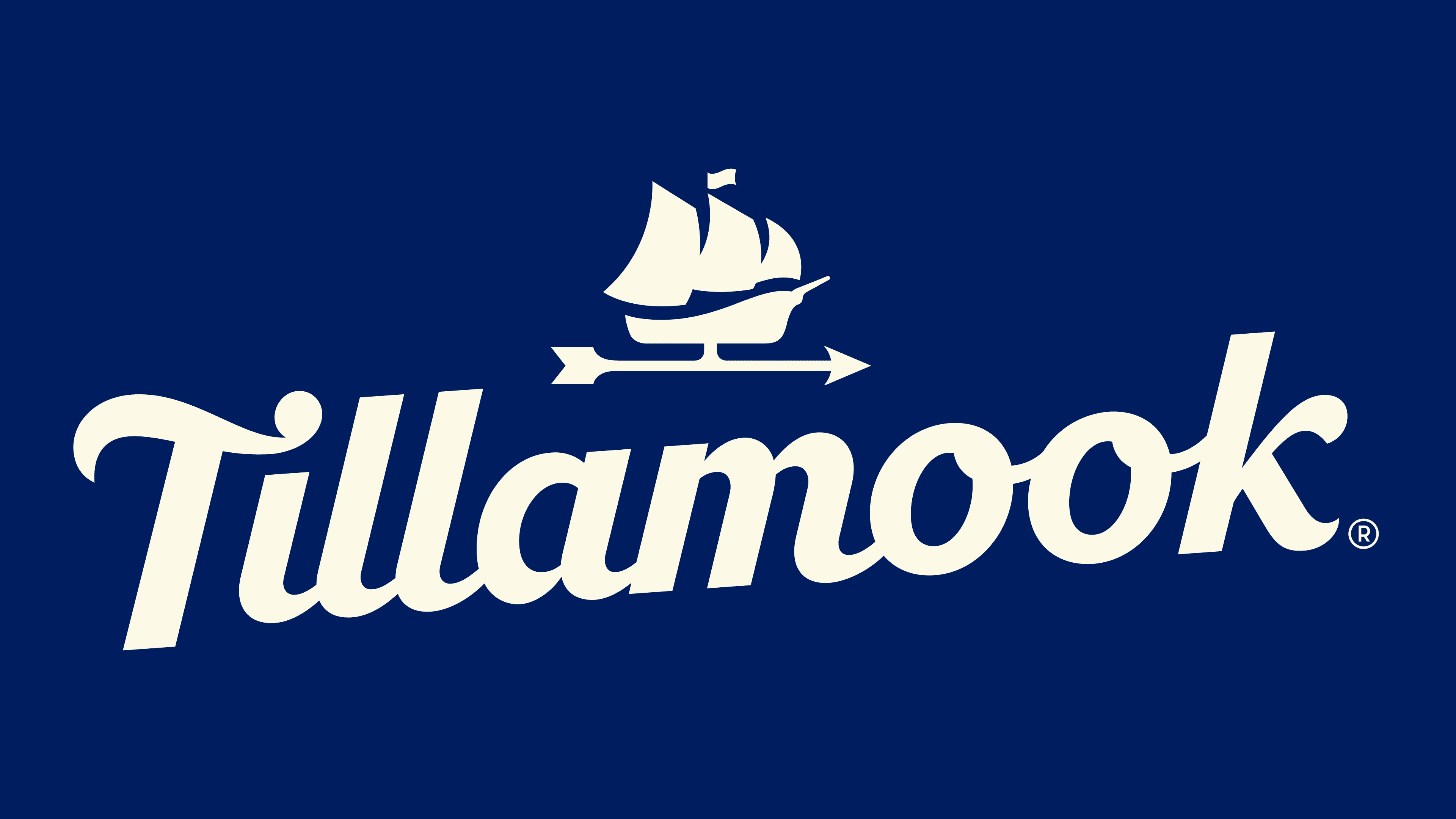
The foundation of the new logo is a deep, dark purple hue that emphasizes the products’ premium status and evokes associations with the quality and natural origins of dairy products. This color plays a central role in emotional perception, enhancing brand recognition and attractiveness among younger consumers.
The logo was created by the agency Turner Duckworth, known for its extensive experience with major brands such as Coca-Cola, Levi’s, and Amazon. The designers focused on balancing the historical identity of the agricultural cooperative with ambitious goals for nationwide expansion.
Interestingly, the logo refresh coincided with a complete packaging relaunch across the entire product line, from cheese to ice cream. The new design system introduced additional illustrations, references to Oregon’s natural landscapes, and textural elements highlighting the company’s handcrafted approach.