 Lamb Weston Logo PNG
Potato product production involves growing raw materials, processing them, and supplying finished products to restaurants and stores. This process integrates agriculture and the food industry into a single supply chain. The Lamb Weston logo represents a company that produces frozen potato products and supplies them to the foodservice industry and retail outlets.
F. Gilbert Lamb founded Lamb Weston in 1950 in Weston, Oregon. The company began as a small business that stored and sold potatoes. Over time, it shifted to producing frozen French fries. In the 1950s, Lamb Weston products became popular among restaurants because they significantly reduced cooking time.
In the 1960s, as fast-food chains grew, the company signed contracts with McDonald’s and Burger King. In 1965, Lamb Weston became part of Ore-Ida Foods. Later, the enterprise became part of the Heinz Corporation. In the 1970s and 1980s, the company built plants in the United States and abroad. The company opened its first European facility in the Netherlands.
By the 1990s, the company had expanded its product line to include new forms of potato products. In 2000, it established a joint venture with Meijer. In 2004, ConAgra Foods acquired the company for $2.8 billion. After the deal, the brand strengthened its position in the global market.
In 2016, Lamb Weston became an independent public company under the name Lamb Weston Holdings. Its shares began trading on the New York Stock Exchange under the ticker LW. After going public, the company made major investments in expanding capacity. Among the projects was a plant in Idaho worth $ 450 million.
In 2019, the company bought out its partner, Meijer, for 1.6 billion euros, gaining full control of its European business.
From 2021 to 2024, the company invested in automation and the implementation of artificial intelligence systems. Production lines in Asia were expanded.
The company is among the world’s leading producers of frozen potatoes. It supplies products to hundreds of countries and continues to strengthen its international presence.
Meaning and History
What is Lamb Weston?
An American company from Idaho, a leading producer of frozen French fries and potato products. Founded by the Lamb brothers in Oregon, it later became an independent manufacturer with revenue exceeding $ 6 billion. The product range includes French fries, wedges, waffles, hash browns, and mashed potatoes. Operations include supplying fast-food chains and restaurants, retail sales under the Alexia brand, and exports to Europe, Asia, and Latin America.
1980 – 2015

Lamb Weston was named after its founder and the city where the company began. In 1950, F. Gilbert “Gib” Lamb purchased a closed cooperative plant in Weston, Oregon. The combination of Lamb and Weston became the company name. After reconstruction, the facility became a major pea processing plant and later began producing frozen potato products.
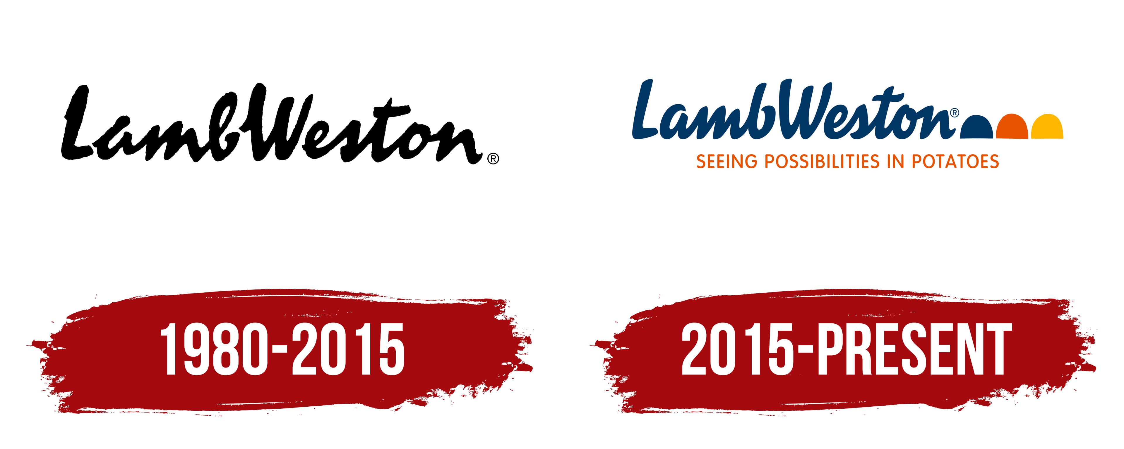
In the early logo, the words “Lamb” and “Weston” appeared close together, forming an almost continuous handwritten wordmark. The tall uppercase “L” and “W” marked the beginning of the two words, while the remaining letters joined into a dense line. The black strokes transitioned from thick to thin sections and resembled marks made with a brush or marker. The letters had a slight rightward slant that varied throughout the wordmark. Rounded curves were combined with angular sections, creating the appearance of a handwritten name.
Potato production grew alongside new inventions. In 1960, Gilbert Lamb created the Water Gun Knife, a system that cut potatoes using a stream of high-pressure water. The invention became an industry standard. In 1961, the company began processing potatoes at a new plant in American Falls, Idaho. Its product range later expanded with different cut styles. Twister Fries appeared in 1983, followed by lattice-cut CrissCut Fries in 1984. The company’s product-development history later formed the basis of the inventiveness theme used during the identity update.
On frozen potato products from the 1980s, a separate geometric emblem appeared alongside the handwritten name. It combined a six-pointed star, diamonds, quadrilaterals, and other polygonal shapes. The name appeared separately from the image. The black wordmark remained the main corporate logo.
Lamb Weston became part of ConAgra Foods in 1988 and continued using the handwritten wordmark, including in international markets. Regional identity differences emerged as the company expanded internationally. In 1994, Lamb Weston / Meijer began operating in Europe as a joint venture with the Dutch family-owned company Meijer Frozen Foods. The American and European divisions used different versions of the identity, packaging, and customer communication materials.
2015 – today
Lamb Weston unveiled a unified identity for its divisions in different countries on June 22, 2015. The company called it the first major brand update in more than 50 years. The project followed customer research in seven countries. Participants identified inventiveness as a defining quality of Lamb Weston. It became the foundation of the positioning and the phrase “Seeing Possibilities in Potatoes.”
The London agency Williams Murray Hamm created the project, later renamed WMH&I. Creative partner Garrick Hamm led the work. The team drew on the company’s product-development history, including the Water Gun Knife, spiral-cut Twister Fries, and lattice-cut CrissCut Fries. Through the theme of inventiveness, the team presented potatoes as the basis for new cuts, recipes, technologies, and customer-service approaches.
The handwritten name was retained, while the rough black strokes were replaced with smooth dark blue lines. “LambWeston” remained an almost continuous wordmark with a rightward slant and tall uppercase “L” and “W.” Rounded curves were combined with transitions between thin and thick strokes. The connections between the lowercase letters became tighter and more even. The wordmark still resembled brush calligraphy, but its contours became more refined.
Three dome-shaped figures with flat bases and rounded tops appeared on the right. Williams Murray Hamm called them “potato ellipses.” The first was dark blue, the second orange, and the third yellow. Their arrangement resembled an ellipsis and suggested the search would continue. The potato-like form referred to the company’s products, while the sequence of three figures raised an open question about future possibilities.
The orange phrase “SEEING POSSIBILITIES IN POTATOES” appeared beneath the name. It was set in uppercase sans-serif letters with uniform stroke widths. The upright letters contrasted with the slanted handwritten name. The lower line explained the brand idea by connecting the logo with the search for new ways to work with a familiar product.
The team prepared an official presentation and manifesto for the launch. The text began by referring to potatoes as one of the world’s major crops. It then discussed technology, recipes, production processes, and ideas for customers. The theme was carried into Lamb Weston’s headquarters in Boise. Williams Murray Hamm designed the interior as an exhibition space dedicated to the updated brand.
ConAgra completed the separation of Lamb Weston into an independent publicly traded company on November 9, 2016. The international logo was retained. In a later version intended for practical use, the lower line was shortened to “POSSIBILITIES IN POTATOES” and changed to dark blue. The three colored figures were moved below the wordmark and placed after the text, while the handwritten name remained above them.
The specified logo colors are dark blue (#003855), orange (#E35205), and yellow (#FFAF00). Dark blue appears in the name and the first semi-oval, while orange and yellow appear in the next two figures.