The United Airlines emblem represents stability, reliability, and scale. The emblem promises regular flights around the world. The sky blue is hidden behind the slender symbols, evoking a sense of flight and freedom.
United Airlines: Brand overview
United Airlines is an American airline company, the third largest in the world and the largest in the United States. It emerged due to the merger of several airlines, the largest of which was Varney Air Lines, founded in 1926. The official time of its appearance on the professional market is considered the early 30s of the last century. It is a powerful aviation corporation headquartered in Willis Tower in Chicago (Illinois).
The story of United Airlines traces back to 1926 when Walter Varney founded Varney Air Lines. Initially, the company focused on mail transport between Pasco, Washington, and Elko, Nevada, marking the dawn of commercial aviation in the United States.
In 1931, several airlines, including Boeing Air Transport, National Air Transport, Varney Air Lines, and Pacific Air Transport, merged to form United Air Lines. This merger created one of the largest aviation enterprises in the country, capable of providing services nationwide.
1933, the airline made history by hiring the first female flight attendant. Ellen Church, a registered nurse, pioneered this role, paving the way for women in the aviation industry.
The airline was heavily involved in military transport operations during World War II. Post-war, the company quickly resumed and expanded its civilian services to meet the growing demand for air travel.
In 1954, the company became the first U.S. carrier to order jet aircraft for commercial use, placing an order for 30 Douglas DC-8 jets. This move ushered in a new era of jet-powered aviation.
The merger with Capital Airlines in 1961 made it the largest airline in the Western world. This consolidation significantly extended its route network and market presence.
Throughout the 1970s, the airline continued its expansion, adding numerous international destinations. The company introduced the first computerized ticket reservation system, a major innovation in the industry.
The acquisition of Pan American World Airways’ Pacific routes in 1985 strengthened the airline’s presence in the Asia-Pacific market and expanded its international reach.
The 1990s saw the airline pushing for global expansion, establishing new routes worldwide. In 1997, it became a founding member of Star Alliance, enhancing its collaboration with other international carriers.
Following the September 11, 2001, terrorist attacks, the company faced severe financial challenges and filed for bankruptcy in 2002. After significant restructuring, the airline emerged from bankruptcy in 2006.
The announcement of a merger with Continental Airlines in 2010 led to the creation of United Continental Holdings, which resulted in one of the world’s largest airlines.
By 2012, the company completed the integration with Continental, unifying operations under the United Airlines brand.
Between 2015 and 2019, the airline focused on fleet modernization, enhancing passenger services, and expanding its route network. The company introduced the Premium Plus class on international flights, offering an upgraded travel experience.
In 2020, facing unprecedented challenges in the aviation industry, the airline adapted its operations to the new market conditions, prioritizing passenger safety and maintaining essential routes.
Meaning and History
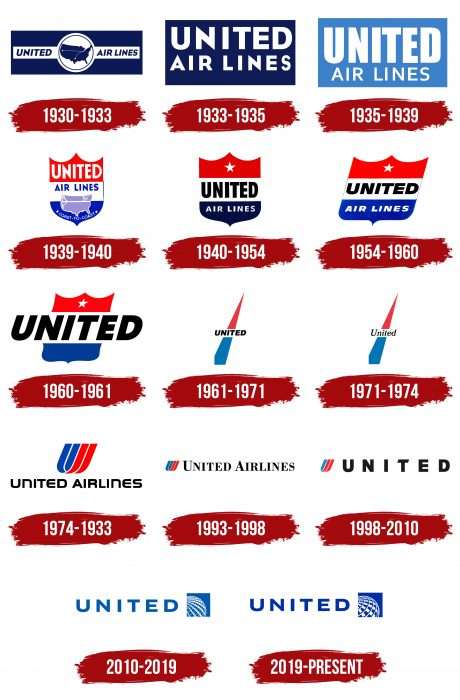
The company’s identification mark has changed several times throughout its long history. In total, fifteen logo variants were used during its career. This diversity is due to the carrier’s constant mergers and expansions.
What is United Airlines?
This is one of the largest American airlines, based in Chicago, known for its extensive global route network and innovative passenger service. The company operates a diverse fleet, including Boeing 787 Dreamliner and Airbus A350, serving hundreds of destinations on six continents. It is renowned for its Polaris program, offering a premium business-class experience with private luxury pods. The carrier stands out for its MileagePlus loyalty program, one of the most flexible in the industry, allowing miles to be used for a wide range of services.
1930 – 1933
It starts with a dark blue rectangle showing a map of the United States with two airlines labeled. The center element is enclosed in a light circle surrounded by a thin dark band. To the right and left is the then-current company name, United Air Lines, in italics.
1933 – 1935
The redesign resulted in radically reconfigured elements of the emblem. The developers enlarged the name and placed it in two rows on a wide dark blue rectangle. The map of the United States was removed, and the typography of the inscriptions was changed: now, the letters are classic, without a slope.
1935 – 1939
Until the end of this period, the logo was still dominated by a rectangular shape, giving it a standardized look. The designers replaced the dark blue with a lighter color, increased the size of the first word in the name (“United”), and reduced the second part (“Air Lines”).
1939 – 1940
In 1939, the era of the shield-shaped emblem began. It is divided into three parts, both in color and configuration. The top one is the monarchical crown, the sign of authority, with the basic elements of the name. The middle is the traditional rectangle; one-third is the map, and the other half is the name. At the bottom is the remaining portion of the administrative map of the United States, with the inscription “Coast-to-Coast” framed by two stars. And this is also where the colors of the American flag first appeared.
1940 – 1954
The company’s management felt that the logo was overloaded with various details and approved a new version. It contains only the most important elements – the informative ones. These are the full name of the air carrier and the star (a symbol of belonging to the sky). The shape of the shield remained the same, as well as the color ratio, but the blue color became much darker.
1954 – 1960
The United Airlines logo used from 1954 to 1960 is a striking example of how symbolism and design can reflect a company’s values and aspirations during a specific historical period. The logo is shaped like a shield, symbolizing protection, reliability, and tradition. The shield is divided into three horizontal stripes: red, white, and blue. These colors are reminiscent of the American flag, emphasizing the company’s patriotism and national pride.
The name “UNITED” is written in large, black capital letters in the central white stripe. The sans-serif font is bold and clear, creating a sense of confidence and stability. Below “UNITED,” the words “AIR LINES” appear in white on a blue background, making them easily readable and adding contrast.
The upper part of the shield has a white star on the red stripe. The star symbolizes the company’s high goals and ambitions and its pursuit of excellence and leadership in the aviation industry. The logo’s overall composition is strict and memorable, making it easily recognizable.
The 1950s was a period of rapid development for civil aviation in the United States. United Airlines was actively expanding its routes and improving service quality by introducing new technologies and safety standards. The logo created during these years reflects the spirit of the time—striving for progress, innovation, and national pride.
The shield shape and patriotic colors underscore the company’s commitment to high standards and its significance in the national context. The white star symbolizes hope and the pursuit of future achievements, highlighting the company’s ambitious plans for further development.
The logo symbolizes confidence, reliability, and progress, reflecting the company’s core values and aspirations during significant change and growth in the aviation industry.
1960 – 1961
After the merger with Capital Airlines, the company redesigned its logo. It removed the second part of the name, shortening it to “United.” It remained in the middle part of the shield but was enlarged.
1961 – 1971
The United Airlines logo, used from 1961 to 1971, reflects the spirit of the era and the company’s drive for dynamic development and innovation.
The logo has two main elements: the company name and a stylized symbol. The name “UNITED” is written in black capital letters, emphasizing the company’s serious and rigorous approach to air transportation.
The sans-serif font is bold and clear, creating a sense of confidence and reliability. The simplicity of the font makes the logo easily recognizable and memorable.
The primary element of the logo is a dynamic line divided into two parts: the upper part is red, and the lower part is blue. This element symbolizes the company’s aspirations, progress, and forward movement. Red represents energy, passion, and strength, while blue signifies stability, reliability, and professionalism. The upward-moving line reflects the company’s ambitious goals and drive to lead the aviation industry.
United Airlines expanded its routes and improved service quality during this period. The 1960s were a time of significant changes and technological breakthroughs in the aviation industry. The introduction of jet aircraft made flights faster and more accessible, requiring airlines to innovate and adapt to new market conditions.
The logo created during these years captures the spirit of innovation and forward-looking ambition. It symbolizes the company’s readiness to face challenges and aspiration to become a leader in global aviation. The dynamic line and bold use of colors highlight the determination and energy with which United Airlines approached its mission of providing quality and safe air transportation.
The logo is a visual expression of the company’s ambitions and values during an era of significant change and progress in the aviation industry.
1971 – 1974
Minor changes were made during this period: the name is now spelled differently.
1974 – 1993
In 1974, the era of the so-called “tulips” began. This nickname was given for the shape that the emblem received. It resembles an elongated flower bowl at an inclination of 68 degrees. Its author was the artist Sol Bass. He embodied the brand’s new image in the first letter of the word “United.” The lines symbolize movement and flight. The full name of the aviation company appeared at the bottom of the pictogram.
1993 – 1998
The graphic icon has been reduced and moved to the left of the word United Airlines. The author of this version is CKS Partners Studio.
1998 – 2010
Designers at British studio Pentagram removed the second part of the airline’s name and returned the 1933 font to the first, making a wide inter-character break.
2010 – 2019
In 2010, after the merger with Continental Airlines, the era of the sky-blue logo with a fragment of the globe began. Because the companies agreed that the visual identity mark would remain with Continental while the name would remain with United.
2019 – today
The United Airlines logo embodies minimalism and symbolism, reflecting the company’s values and aspirations in the modern world.
The logo consists of two main parts: text and a symbol. The name “UNITED” is in capital letters in rich blue, symbolizing trust, stability, and professionalism, which are crucial for an airline committed to providing safety and comfort to its passengers.
The logo’s font is sans-serif, strict, and modern. Its simplicity emphasizes the company’s transparent and straightforward approach to its commitments and services. Each character in the logo appears clear and confident, creating an impression of reliability and high quality.
To the right of the text is a stylized globe, rendered as a grid of rectangular elements. This element symbolizes the company’s global reach and ability to connect people worldwide. The white and blue globe conveys a sense of dynamism and progress, highlighting the company’s innovative approach to aviation. In the current version of the logo, the number of windows on the globe has been reduced, and the intensity of the palette has been increased.
At the time of this logo’s creation, United Airlines was actively developing and expanding its international routes. The company aimed to strengthen its position in the global market, emphasizing its commitment to quality and innovation. The logo reflects this ambition through its simplicity and strength, symbolizing safety, reliability, and global presence.
The logo visually represents the company’s values, history, and ambitions. It conveys the idea of global connection and progress while remaining simple and easily recognizable.
United Airlines: Interesting Facts
United Airlines, one of the biggest airlines, has a long history and a big impact on flying.
- Starting: United began in 1926 as Varney Air Lines, founded by Walter Varney. It first carried mail, then started flying passengers.
- Leading the Way: United was the first to fly the Boeing 777 and Boeing 787 Dreamliner, showing its role in advancing airplane technology.
- Flight Attendants Begin: The flight attendant job started with United in 1930, thanks to Ellen Church, a nurse who showed how women could help passengers.
- Tech Advances: United was ahead in adding Wi-Fi to planes, aiming to make flights better for travelers.
- Major Hubs: United has big hubs in cities like Chicago and San Francisco, making connecting flights around the U.S. and the world easy.
- Eco-Friendly Moves: United was the first U.S. airline to fly with sustainable and regular jet fuel, working to lower its environmental impact.
- Polaris Class: United’s Polaris service offers a better experience on long flights, with lie-flat seats and great food, aiming for more comfort in the air.
- Huge Fleet: United has a lot of planes, from big ones for long trips to smaller ones for short hops.
- Star Alliance: As a founding member of Star Alliance, United helps passengers travel smoothly with benefits across a huge network.
- Big Mergers: United merged with Continental Airlines in 2010, growing its network and influence.
- Tulip Logo: The tulip logo, designed in 1974, is a famous symbol for United, even though it’s been updated.
- After 9/11: After 9/11, United was key in boosting security and working with authorities to make flying safer.
United Airlines has shown resilience, innovation, and a big role in making air travel what it is today, growing from a mail carrier to a global flight leader.
Font and Colors
The United Airlines logo consists of four periods: a rectangle, a shield, a spike, a tulip-shaped monogram, and a fragment of a globe.
The airline company’s logo uses several types of fonts. From 1971 to 1974, it was Bookman Jf Pro Italic. Since 2010, the font used is sans-serif, as close as possible to Gill Sans Bold. Its author is Eric Gill.
The corporate palette consists of the colors of the American flag – red, white, and blue in several shades. But now, a monochrome variant called United Blue is in use.
FAQ
What is the logo for United Airlines?
The United Airlines logo looks like a blue square with white stripes. The lines represent the parallels and meridians on the globe, which should be understood as the airline’s globality, its ability to deliver cargo and passengers anywhere in the world.
What is the United brand?
The United brand includes all the corporate identity elements that make an airline recognizable. These include official colors, fonts, logos, names, slogans, service standards, etc.
Are American and United Airlines the same?
American Airlines and United Airlines are two competing airlines. They have different owners, services, airplanes, hubs, and route networks. The main difference is that AA is part of the Oneworld airline alliance, and UA is part of the Star Alliance.
Who founded United Airlines?
William Boeing, the progenitor of American aviation and creator of the Boeing Company, which produces airplanes of the same name, founded this airline.
