


 University of Denver Logo PNG
Despite its apparent simplicity, the University of Denver logo stands out with its unique originality. Only two classic contrasting colors are used, highlighting its conciseness and elegance. The university’s name is in capital letters, using two different fonts and sizes. The geographical location and type of educational institution are highlighted in black. This information is also repeated as an abbreviation.
On the left side of the logo, two large capital letters are placed, distinguished by their brightness and color intensity. They are positioned on different levels, adding depth to the design. The text is arranged in two rows, as are the letters in the monogram, creating a harmonious visual balance. The logo embodies modern design approaches: clear graphics, contemporary fonts, and a trendy color palette make it recognizable and stylish.
The University of Denver began in 1864, when Colorado territorial governor John Evans founded Colorado Seminary only six years after Denver was established. The school opened downtown in the area now known as Larimer Square and became one of the oldest private universities west of the Mississippi River. Its first decades were difficult because of limited enrollment and financial pressure, yet support from founders and the local community kept it operating.
In 1880, the institution moved to the University Park area, giving students a quieter setting away from the growing city center. In 1885, Colorado Seminary was renamed the University of Denver as its academic goals widened. Around that period, it added programs in law and medicine. Growth continued in the early 20th century, with the College of Business founded in 1917 and organized athletic programs developing during the 1920s.
After World War II, enrollment increased, requiring new academic buildings and residence halls. In the 1960s, the university became an early U.S. participant in study abroad education. The 1970s and 1980s brought further work in social sciences, humanities, natural sciences, and research. In comparison, the 1990s introduced a major campus reconstruction program with new academic, student, and athletic facilities.
From 2014 to 2023, DU marked its 150th anniversary, renovated the Daniels College of Business student center, opened the Daniel Felix Ritchie School of Engineering and Computer Science, launched DU IMPACT 2025, expanded cybersecurity and artificial intelligence, and opened Community Commons. The Denver Pioneers compete in NCAA Division I, with hockey, basketball, and lacrosse among their main sports.
Meaning and History
What is University of Denver?
Located in Denver, Colorado, the institute is a private research institution. It is known for combining professional and liberal arts education, offering a wide range of undergraduate and graduate degrees across the social sciences, business, law, and international studies. The university is known for its emphasis on global education programs, research opportunities, and experiential learning. With the Rocky Mountains as a backdrop, the university’s campus showcases a mix of modern and traditional architectural styles. The university’s athletic teams play in NCAA Division I.
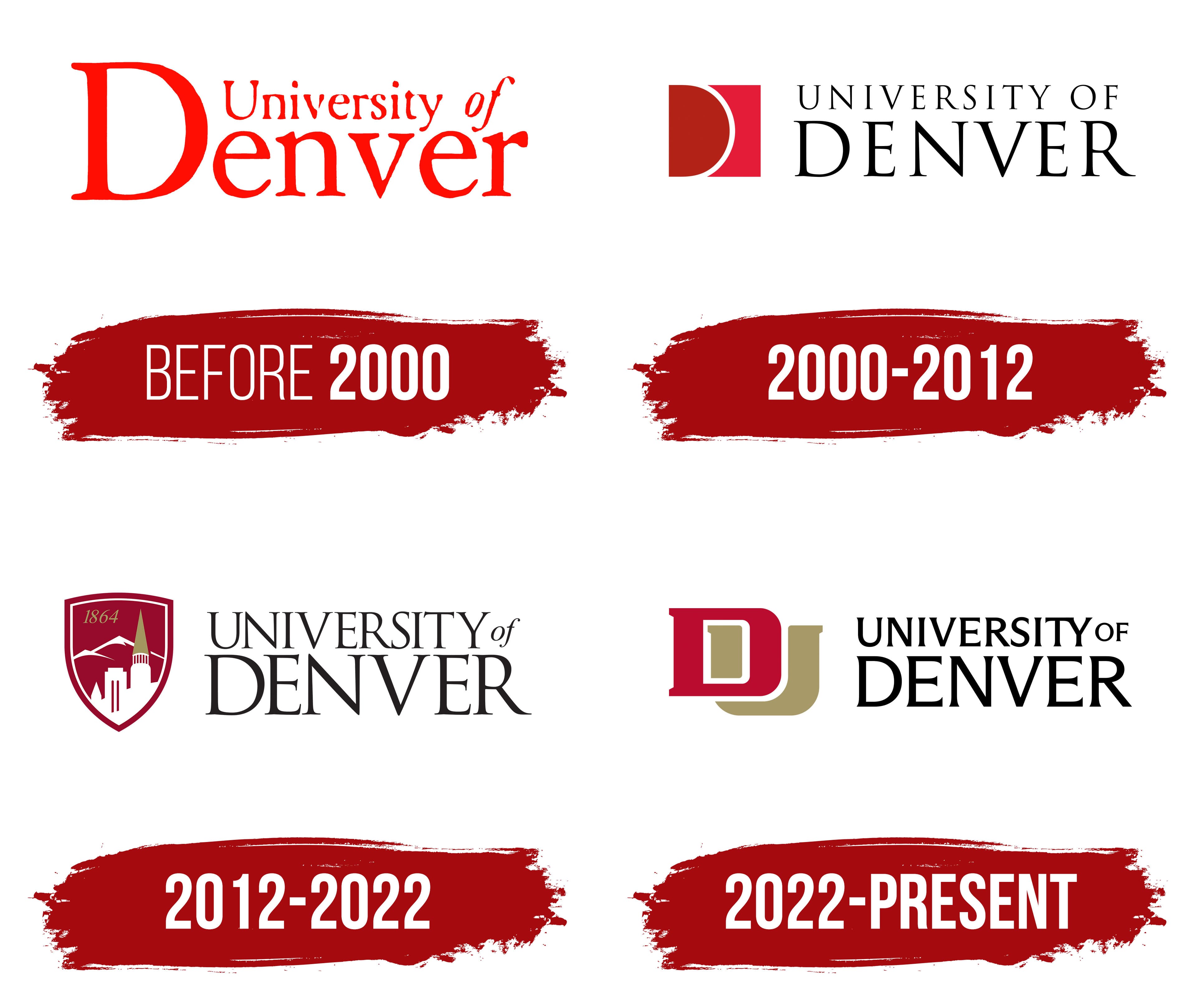
Before 2000

Its logo has undergone four changes throughout the university’s existence, but the most memorable and notable remains the first version. The primary reason for this opinion is its unique color palette. The neat letters in a contrasting pink shade looked elegant on a white background. This logo effectively accomplished its purpose, announcing the presence of a university with great potential for rapid growth. It lasted longer than all subsequent versions and successfully fulfilled its key function.
The logo was minimalist, without unnecessary details or images. All attention was focused on the university’s name, executed in different fonts and arranged in two rows. The designers emphasized the word “Denver,” highlighting the first letter in a bright color and a larger size, drawing attention to the logo’s main element. The remaining letters in the word “Denver” were the same size, while “University” appeared less prominent. Only the two letters “of” were italicized, harmoniously uniting the diverse stylistic elements into a single concept.
2000 – 2012

In 2000, the logo concept was revised, and it acquired completely new features. The new design emphasized the university’s high status through restraint and specificity. The university’s name was shifted to the right and arranged in two rows. The black letters appear elegant on a white background without excessive scale or grandeur. The logo is distinguished by its clarity and precision, without unnecessary details, except for one significant element.
A unique symbol appears to the left of the university’s name. The capital letter “D” stands out in a small multicolored square. Interestingly, it is not rendered in a typical font but created using two shades and a white semi-circular line that separates them. This detail gave the logo individuality and made it memorable.
2012 – 2022
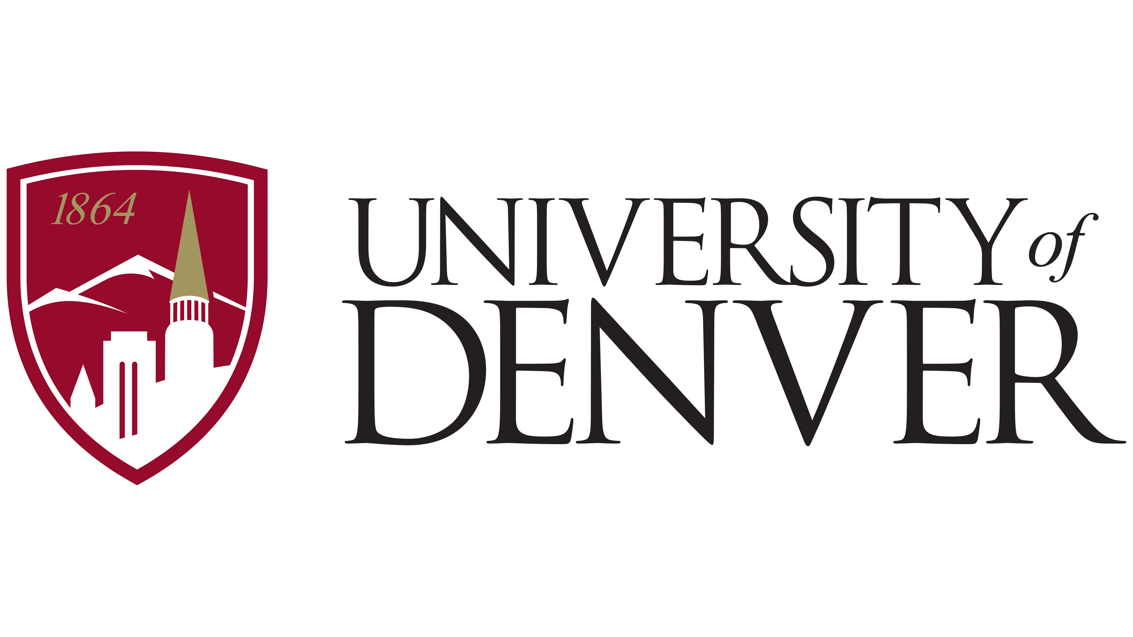
In 2012, the University of Denver’s identity underwent changes that reflected a return to its roots. This approach is noticeable in the choice of font and the way the name of the educational institution is written. Specifically, the italicized “of” reappears on the right side of the logo. The university’s name, as before, is written in capital letters in two rows. The bright color used in previous versions replaced black, with a subtle gradient. All the letters are neat and slightly elongated, and the serifs on the vowels and consonants add originality and individuality to the text.
The logo gains additional expressiveness and information with the image of a shield placed to the left of the university’s name. The shield is perfectly proportioned to the text element and complements it. On the shield’s dark background, mountains are highlighted, along with a key element: an image of one of the main university buildings. This makes the logo unique and easily recognizable. In the upper left corner of the shield, the university’s founding date, 1864, is also displayed, emphasizing its historical legacy.
2022 – today
After more than 10 years, the logo, featuring the shield, landscape elements, and building image, was changed in 2022. The update affected all components. The transformation aimed to create an identity that aligned with the university’s new stage of development, as its popularity reached new heights and the number of students increased significantly. It was time to make the logo more presentable and expressive.
The university’s name was retained but is now presented in a classic format. It is written on a white background, using letters that are uniform in all aspects. Italics were removed, but the word “of” still stands out, though smaller, elegant, and refined.
On the left side, aligned with the text, are two capital letters: “D” and “U.” The letter “D” is in the foreground, while “U” is in the background, both retaining their distinct identities. Two vibrant shades from different color palettes are used in their design: the letter “D” is highlighted in red, and “U” is in gold.
The Seal

The University of Denver’s seal is original in meaning and appearance. It was created in 1880 when the Colorado Seminary was transformed into the University of Denver. The original version of the seal differed somewhat from the current one, and it has changed over time. However, the core idea and meaning have remained unchanged. The seal has existed in its modern form for over a hundred years. Most changes focused on its appearance and aimed to enhance the university’s reputation.
Graphically, the seal is executed with elegance and carefully considered detailing. Ornaments and repeating elements symbolize the university’s high status. Attention is drawn to the outline, representing a sequential interweaving of elements.
On a white background, two key textual elements are written in large black letters: the university’s name at the top and the founding date at the bottom. These inscriptions are united by elegant downward-pointing arrows, creating a sense of compositional unity. The fonts of the words are identical, with smooth, rounded vowels and clear, straight consonants.
The central part of the seal features a meticulously detailed landscape, which appears expressive and attractive thanks to precise strokes and two internal black contours of varying thickness.
Interestingly, the previous seal version included “Pro Scientia Et Religione,” which translates to “For Science and Religion.” This phrase reflected the university’s original philosophical and religious focus when it was established in 1860. These words have been removed today, which makes sense given that the university now offers over 120 educational programs encompassing science, philosophy, mechanics, natural sciences, and other fields.