“Behind the wheel of our electric vehicles, you will leave all road users behind,” the Vauxhall logo promises. The company’s products are the vehicles of the winners. From the sign comes the energy of excitement and vivid emotions.
Vauxhall: Brand overview
| Founded: | 1857 |
| Founder: | Alexander Wilson |
| Headquarters: | Chalton, Bedfordshire, England |
| Website: | vauxhall.co.uk |
Meaning and History
Before becoming a legendary luxury car manufacturer, the company had come far from a pump and ship engine plant. In 1863, it was bought by Andrew Betts Brown, who changed the direction of the business and its name (to Vauxhall Iron Works) but not the logo. The new owner first started assembling bridge cranes and making cars in 1903.
Many years later (in 1925), the American concern General Motors acquired the company. In 1930, he created a subsidiary department of Bedford Vehicles, which focused on producing commercial vehicles – vans, buses, etc. But in the early 80s of the last century, all equipment of this brand was taken off the market everywhere. The only exception was Great Britain. Under this brand, the company even produced cars for rallying and motorsport. But in 2017, Vauxhall moved to Groupe PSA.
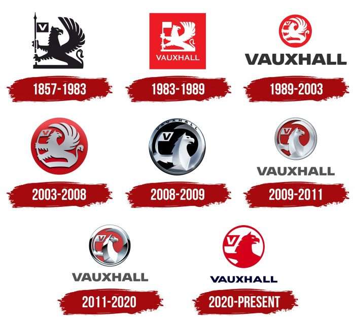
Vauxhall’s iconic retro models include the Cavalier, Chevette, Viva, and Victor series. Modern versions include the Astra, Corsa, Insignia, Crossland X, Mokka, and Grandland X. Vauxhall sells several high-performance cars under the GSi sub-brand. They all bear a sign with a mythical creature—a red griffin. The emblem was approved in the year the company was founded. In total, the emblem has undergone seven modifications.
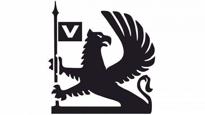
1857 – 1983
For a very long period, the company has been using a griffin from the old coat of arms of Sir Falkes de Breaute. He was a military man who lived in the 13th century. His house was called Vauxhall, which later spread to part of the surrounding area. By the way, it was in that building that the manufacturer of ship motors and pumps, and then cars, was founded. This is how extraneous heraldry laid the foundation for the legendary automotive industry.
The mythological creature consisted of an eagle’s head and a lion’s body. It sat with its two front paws on a flagpole that resembled a spear. On it was a miniature flag with a single letter – “V.” Since the family was military, it could mean the name of the Vauxhall house and the symbol of victory (Victoria). The griffin’s head looked to the right. The gaze was formidable and intimidating, and the tip of the tail and wing were slightly raised.
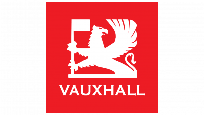
1983 – 1989
The emblem received a red background square with white and gray edging. The upper part of the wing and spears was cut off, making the mark even more geometric. All interior elements were painted white. Under the mythical creature, the designers placed the “Vauxhall” inscription, executed in an uppercase serif typeface.
1989 – 2003
Building on the previous logo, the developers introduced a new symbol. It was round. To emphasize the shape of the disc, the authors returned the missing part of the wing to the griffin and bent the flag in a half-arc. A single “V” appeared on his banner again, but this time in red. It was smooth, flat, and sans serif. The designers separated the trademark name and placed it below the icon, highlighting it in black. All letters were capital and grotesque.
2003 – 2008
The emblem of this period was based on the previous version of the logo. The difference between them was only in three dimensions. To make the sign three-dimensional, the developers enhanced the shadows along the contour of the mythical creature and the flag, which he held with two paws. Light highlights on the logo added a chrome effect to it. The red circle got a gradient from scarlet to burgundy.
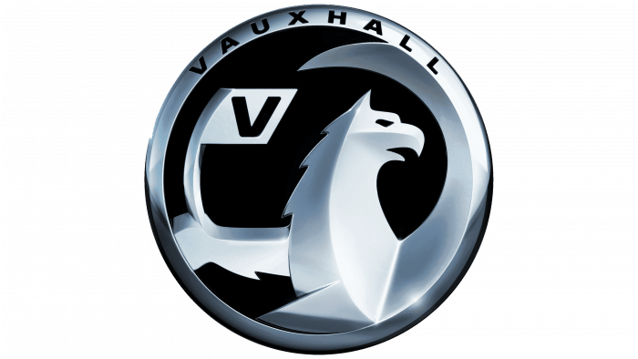
2008 – 2009
After a period of bright colors, it was time for monochrome restraint. The logo changes were required to place it on different advertising media to make it look clear, distinct, and modern. To do this, the designers made the disc black and cut an oblique cut along the edge, which caused a metallic sheen.
They also enlarged the griffin using only its head, neck, right leg, upper wing, flagpole, and V. The authors painted each element in two colors: on the one hand, there was a dark gray, and on the other, white with an admixture of a silvery hue. In the lower right part, the developers added a single bright glare, reminiscent of a reflection, and in the upper, the brand name with wide spacing of letters.
2009 – 2011
The designers replaced black with red, leaving the rest as it is. The only major change concerned the lettering, which has shifted downward, as in the 1989-2003 logo. The font was also kept the same—large, bold, sans serif.
2011 – 2020
Starting from 2011, the brand cars were decorated with a slightly corrected emblem. The authors took the logo of the previous period as a basis but deepened the shadows in it. Black and graphite colors have been added to the bird’s neck and wing. Identical shades appeared at the edges of the “metalized” sign: on the right and left, they were wide, at the bottom – narrow and looked like an inverted arch with sharp ends. The designers have added a lot of white to add even more contrast. They left the V on the flag red. At first, the icon was accompanied by the Vauxhall brand inscription, but after General Motors sold the Groupe PSA brand, the inscription was no longer used (since 2017).
2020 – today
The updated logo comes from rebranding the entire Opel / Vauxhall group. It became flat (two-dimensional) and simple. The developers removed shadows and gray and black colors. They also shifted the focus of the image by adding a portion of the griffin’s back (right) and hiding the flagpole (left). Moreover, the designers redrew the inscription, making it smoother, thinner, and straighter.
Vauxhall: Interesting Facts
Vauxhall Motors, a well-known UK car brand, has a long and impressive history in the car world.
- Early Days: Starting in 1857 in London as a pump and marine engine maker, Vauxhall jumped into car manufacturing in 1903. This makes it one of the first car brands ever.
- First Car: The first Vauxhall 6HP car was released in 1903. Its simple engine steered with a tiller, showed that cars were just starting.
- Joining General Motors: In 1925, General Motors (GM) bought Vauxhall, boosting its car production and technology. This partnership lasted until 2017 and is a major part of Vauxhall’s story.
- The Griffin Logo: Vauxhall’s Griffin logo comes from ancient family symbols linked to Vauxhall’s original location. It represents a strong heritage.
- War Contributions: Vauxhall contributed to the British war effort in both World Wars, making trucks, ambulances, and tanks.
- Famous Cars: Cars like the Vauxhall Astra and Corsa have become very popular in the UK and are known for their reliability and style.
- Motorsports: Vauxhall has a rich history in racing, especially in rallying and touring car races, proving its cars’ performance and durability.
- Leading in Innovation: Vauxhall has always focused on making cars better and safer, being one of the first to use modern car-building techniques.
- Going Electric: Vauxhall is moving towards a more sustainable future by planning to have electric versions of all its models by 2024.
- New Ownership: In 2017, PSA Group (which later became part of Stellantis) bought Vauxhall, starting a new chapter for the brand as part of a global car-making giant.
Vauxhall’s story is about growth, innovation, and adapting to the future, all while keeping its rich history in mind. As it shifts towards electric cars, Vauxhall stays relevant and looks forward to what’s next in the auto industry.
Font and Colors
From the first year of the foundation, the company has been using the original identity associated with the place of origin of the enterprise. Firstly, the very name Vauxhall was borne by the house where the company was formed and spread to the surrounding area. Secondly, the old heraldry of the military dynasty Falkes de Breaute, who lived in that building in the 13th century, was taken.
The logo’s typeface is hand-drawn, similar to the bold version of Helvetica Sans Serif. It resembles the Radiate Sans Bold Expanded and LCT Picon Extended Black fonts. Since 1989, the inscription has had no serifs—all the letters are even and smooth.
The signature palette consists of a combination of red and white. At times, black and gray in several shades—from graphite to light chrome—were also used.

