 Wet n Wild Logo PNG
The Wet n Wild logo surprises with its softness and purity, inviting fans of quality cosmetics to use the products. The emblem conveys delicacy, safety, and excellent qualities, considering the needs of young skin, as this is a brand for youthful, active fashion enthusiasts.
Wet’n’Wild began in 1977, when entrepreneur Vern Steinman opened the first park on Australia’s Gold Coast. It launched with a small group of pools and slides, then expanded through the 1980s as tourism increased. Kamikaze opened in 1984 and was promoted as the world’s tallest and steepest water slide. In 1989, the brand entered the United States with its first international park in Las Vegas.
The Gold Coast site introduced Tornado in 1993, described as the first funnel-shaped water slide. Wet’n’Wild Water World opened in Hawaii in 2001 and was later renamed Wet’n’Wild Hawaii. In 2012, Village Roadshow Theme Parks acquired the brand rights outside the United States. Wet’n’Wild Sydney followed in 2013 as the largest water park in the Southern Hemisphere, with rides such as T5 and 360Rush.
A new Wet’n’Wild Las Vegas opened in 2014 with more than 25 slides and attractions. Halifax joined the network in 2016, and the company marked its fortieth anniversary in 2017. Wet’n’Wild Haikou opened on China’s Hainan Island in 2018. The original Gold Coast park was renovated in 2019 and added Fully 6, a complex of six water slides.
In 2020, the parks introduced water recycling systems and solar panels. A mobile app followed in 2021 for food orders, ride planning, and recommendations. Wet’n’Wild After Dark launched in 2022 with evening swimming, pool parties, and light shows. In 2023, the brand opened its largest park in Dubai, with attractions developed for the region’s hot climate.
Meaning and History
What is Wet’n’Wild?
It is the name of various water parks in the United States, Brazil, and Mexico. Created by SeaWorld founder George Millay, water parks are known for offering a wide range of water attractions, including thrilling water slides, wave pools, lazy rivers, and splash zones for kids. These parks are designed to be fun for visitors of all ages, making them popular destinations for families and thrill-seekers.
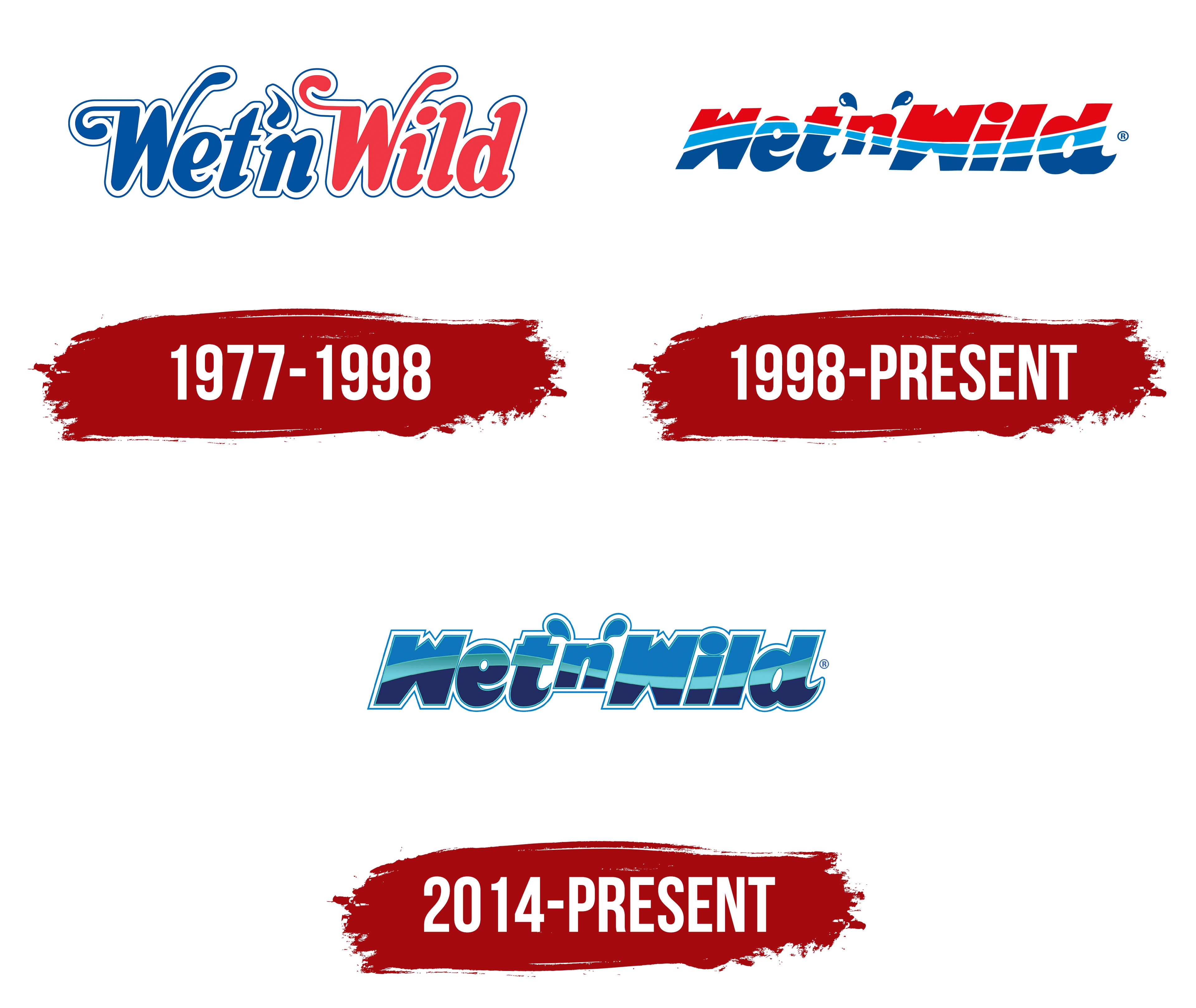
1977 – 1998
The emblem from this period is filled with symbolism, which might not be apparent from its simple design featuring a horizontal inscription. But that’s how it is! It reflects many key elements crucial to the cosmetics company’s concept, which launched a youth-focused product line. The symbolism is conveyed through several components of the logo:
- in the shape;
- in the color;
- in the font.
The key factor in expressing the idea is the color. The first half of the name (Wet’n) is blue, representing the freshness and coolness of the water used in the cosmetics. It highlights the naturalness, safety, and positive results of the ingredients. The second part of the name (Wild) is in red to emphasize the products’ high effectiveness and the beauty they leave behind. Red is also the color of passion, energy, and leadership.
Another significant aspect is the font. It consists of bold, thick letters with curved ends. The soft contours, outlined with a thin line, seem to have a protective layer shielding them from external influences. Between the solid outline and the glyphs is white space, which serves as a protective factor. This suggests that the offered cosmetics address the care of hands, faces, and bodies.
The two “W” s are especially graceful, with their elongated, slightly curled strokes: they look as if they were taken from an old vignette, which disrupts the concept of targeting the youth market. The apostrophe (the comma-like mark before the “n”) is shaped like a drop. The ends of “i,” “l,” and “d” are pointed outward, reminiscent of serifs, although the other letters (“e” and “t”) do not have them. This reflects a combination throughout from color to font, with some glyphs in uppercase and others in lowercase.
1998 – today
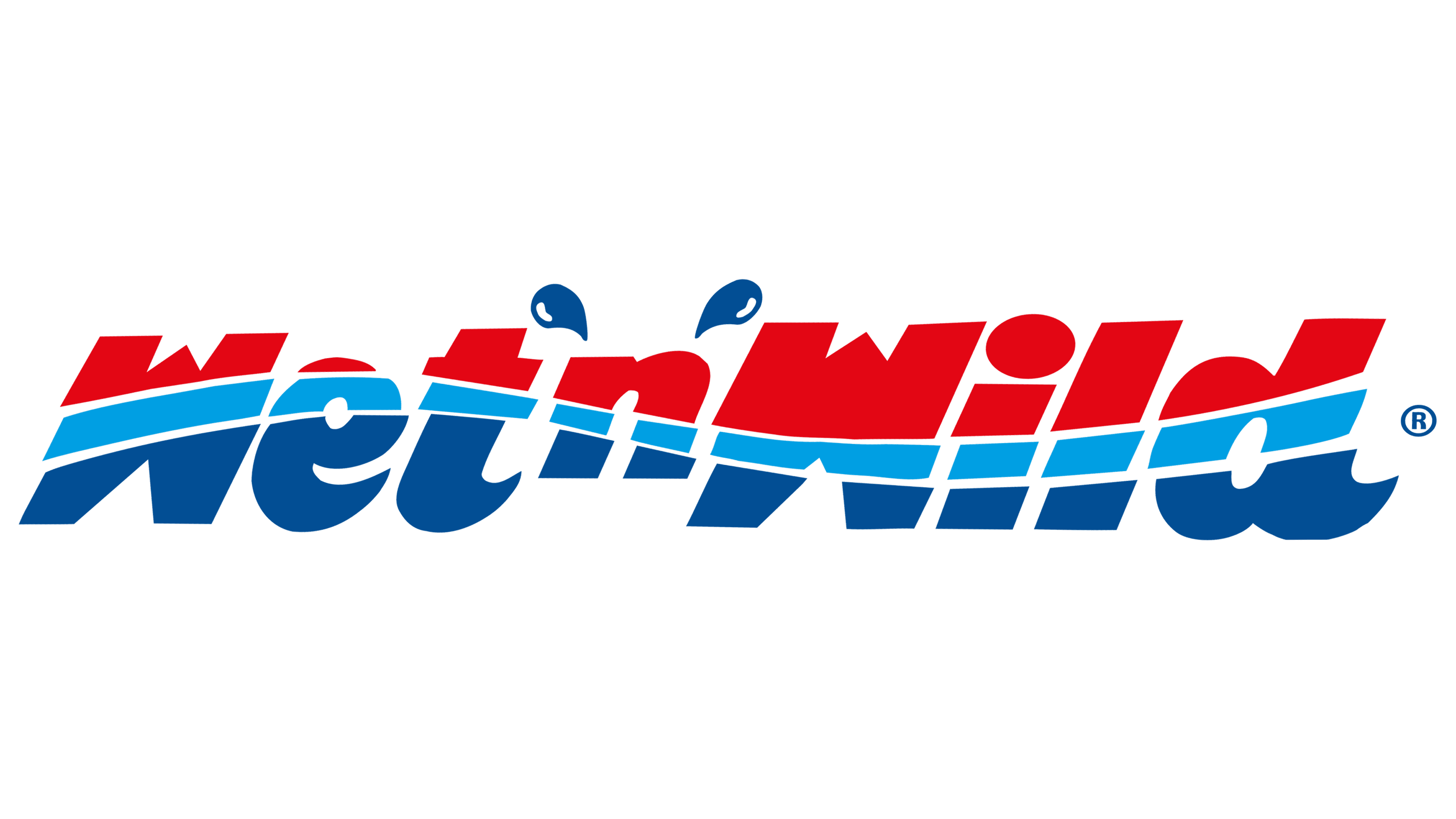
The company decided to redesign to address the ideological inconsistency (cosmetics for young people, but the font is ornate and ancient). As a result, the Wet’n’Wild emblem became lighter and more modern. However, it is not simpler because the lettering now has a triple structure: each letter is divided into three parts. This made the concept clearer and the target consumer segment more engaged.
A horizontal, wavy blue line serves as a divider. It stretches from the beginning of the name to the very end, separating the upper and lower halves. In other words, the designers divided the text into two zones (red and blue) again, but this time lengthwise rather than crosswise. The light curved line running through the middle symbolizes the water component.
The apostrophes on either side of the letter “n” also hint at water because they resemble two drops. This successful stylization allows the brand to convey a lot of useful information to potential buyers. The chosen style is characterized by flexibility, playfulness, and energy, qualities typical of young people eager to try a new product at an affordable price.
The font has also been refreshed: the glyphs are now bold, wide, and italicized, with elegantly curved, sharp tips on the “t” and “d.” The central “n” has shrunk and risen higher, as if it’s suspended in space, hinting at the lightness and airiness of the cosmetics. The thick, strict letters replacing smooth and rounded symbols do not spoil these sensations. They more accurately express the idea of accessible cosmetics and make the emblem memorable.
2014 – today
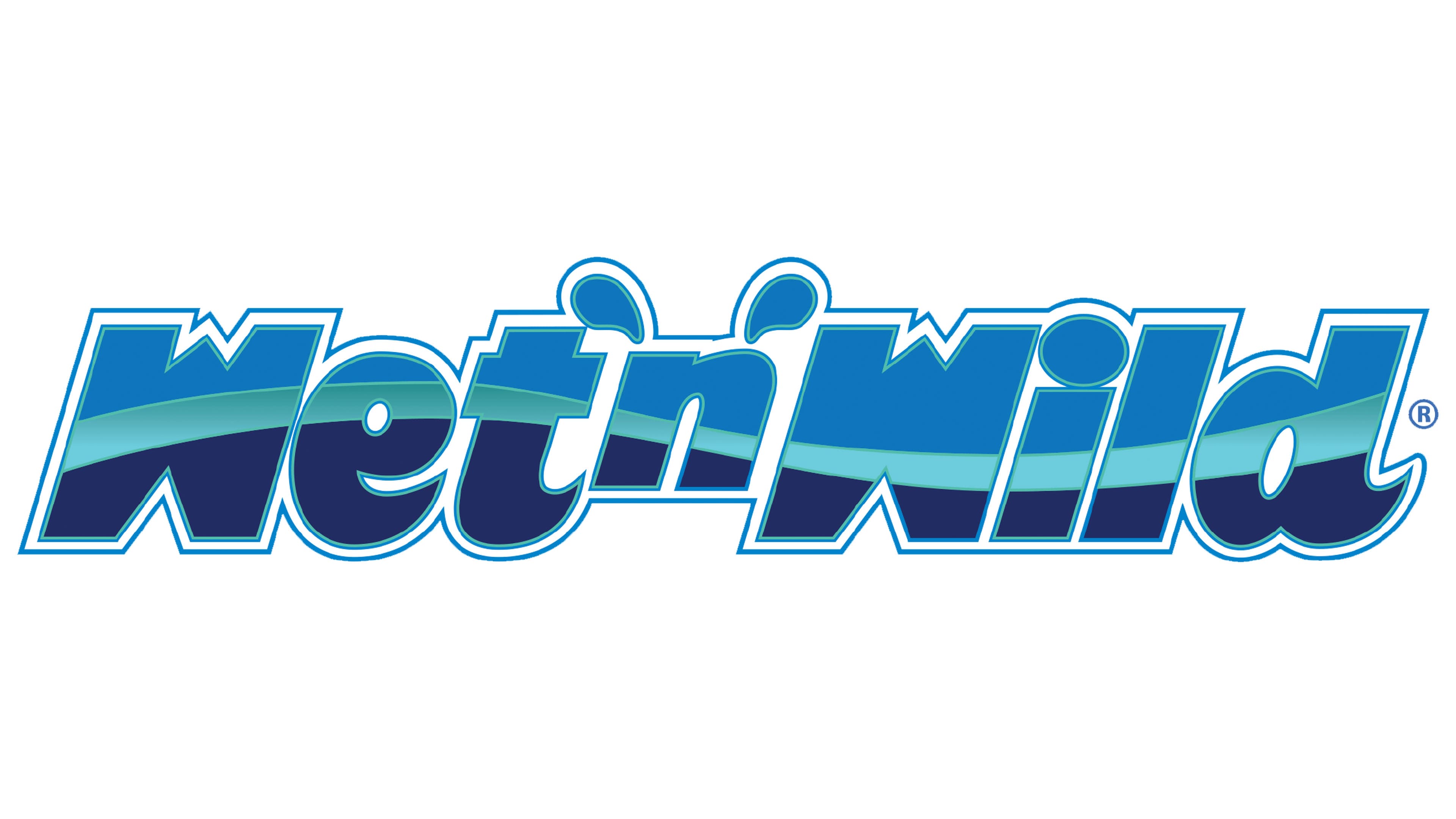
This Wet n Wild logo version is more refined than the previous one. It is subtle yet eye-catching, which is its main design feature. First of all, it is important to note the primary changes that have occurred:
- The outlines of the lettering have been clarified and reinforced.
- Identical drops appeared on both sides of the lowercase “n”;
- The color palette has been reduced to three shades of blue.
- The glyph segmentation has disappeared (they have become solid).
The frame surrounding the entire text is a thin strip that runs along the perimeter of each letter, outlining the contours in a convex manner. This has added texture to the emblem, making it shaped and three-dimensional. Because the frame doesn’t fit tightly to the glyphs, the logo looks airy: white space is preserved between the text and the outline. It is neutral and light.
The designers also corrected the glyphs’ excessive slant, making them barely noticeable, which positively affected the emblem’s style, as it gained charm without losing its originality. But the most significant transformation was the color scheme: red disappeared. Only blue remains in three variations: standard, light, and dark. These are essentially three manifestations of water, each natural, hinting at the cosmetics’ natural qualities.
The disappearance of red is due to the brand’s customer base expanding over time, so there is no longer a need to emphasize that the primary focus is on the activity and emotionality of youth. Now, people of all ages buy the products. Due to the multiple shades of blue, the Wet n Wild logo now looks serious and professional, instilling confidence in customers about the impeccable quality of the products.