The Wheel of Fortune logo captures attention with its bright lights and multicolored spectacle, setting the tone for excitement and anticipation. The emblem promises participants a chance at big winnings, offering hope for good fortune. Its vibrancy and dynamic energy create the feeling of a true celebration, where anyone can try their luck and win coveted prizes.
The spinning wheel, the game’s centerpiece, captivates and mesmerizes viewers, drawing their gaze. It symbolizes fate itself, holding the moment of truth in its hands. Each second of the spin carries the thrill and expectation of that defining moment when luck will deliver a win. The logo emphasizes the spirit of the game, where valuable rewards and unforgettable emotions are at stake.
Wheel of Fortune: Brand overview
The origins of Wheel of Fortune date back to 1973, when Merv Griffin—already well-known for creating Jeopardy!—came up with an idea for a game based on the classic game of Hangman. Griffin pitched the concept to NBC executives, who approved a pilot episode.
The show premiered on NBC on January 6, 1975, with Chuck Woolery as host and Susan Stafford as the assistant. The format differed from today: contestants had to spend the money they earned on prizes displayed in the studio instead of keeping their winnings.
Over the years, the program gained popularity, but by 1980, its ratings started to drop, and NBC considered canceling it. In response, producers revamped it by adding more prizes and changing some of the game’s rules.
A major turning point came in 1981 when Pat Sajak replaced Chuck Woolery as host after a salary dispute. Sajak’s charisma helped draw in new viewers, making the switch successful. Another significant change occurred in 1982 when Vanna White replaced Susan Stafford as the letter-turning assistant, creating a dynamic partnership for over 40 years.
The syndicated evening version debuted in 1983 and quickly became even more popular than the daytime edition, thanks to bigger stakes and prizes. Although the NBC daytime version ended in 1987, the nightly syndicated version continued to thrive, becoming the top-rated syndicated show in the U.S., a position it held for many years.
In the 1990s, the program solidified itself as a beloved part of American culture, with millions tuning in nightly. Special theme weeks and editions were introduced to keep the show fresh and engaging. In 1997, the mechanical wheel was replaced with an electronic version, adding excitement to the gameplay.
Throughout the 2000s, the show continued to evolve. The “Jackpot” puzzle was introduced in 2003, and the “Prize Puzzle” round, where winners also received a trip, was added in 2006. In 2009, the program transitioned to high-definition, enhancing the viewing experience. That same year, the “Million Dollar Wedge” debuted, allowing players to win a million dollars in the bonus round.
2013, the show celebrated its 30th anniversary with special episodes and prize giveaways. In 2016, Pat Sajak was recognized by the Guinness Book of World Records for having the longest career as a game show host for the same program, highlighting the show’s remarkable consistency and success on television.
The challenges of 2020 and 2021 didn’t stop production, as the show adapted to the circumstances and continued while following safety protocols. In 2022, it celebrated its 47th anniversary, cementing its legacy as one of the longest-running television shows in history. Several spin-offs and versions of streaming services were announced.
As of 2023, the program remains a beloved television staple, drawing millions of viewers each night. Despite changes in entertainment and media, its simple yet captivating game format and enduring hosts continue to attract audiences. Over nearly 50 years, the show has grown from a simple game show into a cultural icon, impacting American television and pop culture. The production continues to balance its classic appeal with new technology and evolving audience preferences, ensuring its place as a favorite for generations to come.
Meaning and History
What is Wheel of Fortune?
This legendary game show has captivated viewers with its unique blend of strategy, luck, and word puzzles. Contestants spin a large, colorful wheel that determines their potential cash prizes or penalties before they begin guessing letters to solve puzzles in various categories. The show’s appeal lies in its simple yet exciting mechanics, allowing viewers at home to participate and test their puzzle-solving skills. Each round becomes more intense with the clicking of the wheel and its unpredictable outcomes, making the show consistently engaging for a wide audience.
1974 – today
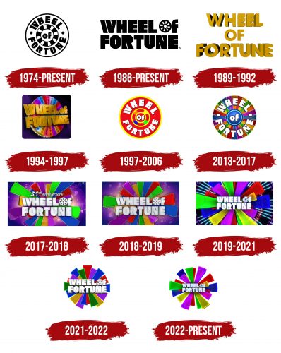
The first Wheel of Fortune emblem accurately captures the game’s atmosphere, resembling a roulette table. The show’s name is placed along the wide outer edge of the wheel, creating a visual analogy to a gaming field. This element sets an exciting tone, evoking associations with a game where luck is the deciding factor.
Closer to the center of the wheel are alternating black and white spaces reminiscent of a chessboard. They symbolize slots for the ball, emphasizing the show’s game elements and heightening the sense of an impending choice, where each spin leads to either success or failure. The word “of” stands out in the center of the circle, completing the composition and focusing attention on the core of the game.
The emblem perfectly conveys the idea of excitement, anticipation, and the desire to test one’s luck, creating an appealing visual image. This logo was specifically designed for the original daytime show on NBC, and its design helped shape the unique atmosphere of entertainment and gameplay that the show is known for.
1986 – today
The show’s visual style changed for the cable broadcast, transforming into a large and noticeable title. The letter glyphs are done in black with thin white slashes, giving them clarity and precision. Angled diagonally, these lines symbolize the game’s dynamic nature, where each new round brings more challenges while increasing the chances of a big win. This design emphasizes the tension and excitement that build as the participants progress.
The letter “O” in the word “of” was modified, turning into a miniature wheel. Its small size and division into multiple segments evoke various associations beyond the game. This approach introduces an intriguing visual element, referencing the theme of spinning and luck while broadening the range of possible interpretations.
1989 – 1992
The broadcast’s resumption after the break was marked by an updated logo, highlighting the program’s fresh approach. The emblem is golden, symbolizing the cash prizes participants can win with each spin of the wheel of fortune. Gold in the design evokes associations with wealth and luxury, adding an atmosphere of grandeur and allure to the game.
The program name is curved as if leaning toward the viewers, visually hinting at the shape of a roulette wheel. This creates a sense of closeness, as if viewers can reach out and touch their luck. The initial letters of the words are painted in darker shades, indicating the gradual increase in prizes as the game progresses—just like in the show, the first prize amounts are always lower than those in the final rounds.
1994 – 1997
The logo became noticeably more stylish and appealing for the game’s launch on ABC channels. The emblem is set against a dark blue background, creating the impression that participating in the game and winning is like a lucky dream. This background symbolizes the night sky, also linked to Wheel of Fortune’s move to evening broadcasts, significantly influencing the design.
The image is turned halfway toward the viewers, a technique often used in news logos to convey movement and the daily updates of events occurring over 24 hours. This highlights the constant motion and changes within the show—like in the game, each episode brings new surprises.
At the logo’s center is an actual wheel with colored segments and cash amounts, giving the design a sense of realism. Above all, this is a golden inscription emphasizing the financial benefits and successful winnings that await the game’s participants.
1997 – 2006
In 1997, the show host was awarded the prestigious Daytime Emmy for Outstanding Game Show Host, and this event inspired a logo update. The new emblem transformed into a bright red wheel with golden edges, facing the audience as if inviting them to join the game. The red color symbolized victory, success, and prizes, perfectly capturing the spirit of the game.
The circle’s center featured multicolored sections resembling a roulette wheel, enhancing excitement and anticipation of big wins. The game’s name, written in white letters, symbolizes honesty and transparency in the game process, emphasizing the show’s openness and the trust it inspires in viewers.
2013 – 2017
According to TV Guide magazine, the “Wheel of Fortune” logo was updated to honor the show’s second place among the greatest games ever. As a sign of this achievement, the emblem changed, becoming even brighter and more attractive. The logo’s colors became more vivid and were divided into real game segments, reflecting the actual shades of the game wheel but without indicating monetary amounts. Each segment symbolizes the dynamics of the game and its variety.
The show’s name became clearer and more expressive. The words “Wheel” and “Fortune” are now separated by two white dots, creating a visual accent and emphasizing the separation of the words for better readability. This design gives the emblem a modern and concise look. Since critics highly praised the show, the logo is closer to the actual image of the wheel, which has already become a symbol of luck and victory for both players and loyal viewers of the program.
2017 – 2018
For the 55th anniversary, the show underwent format updates, including the addition of crossword puzzles and improvements to the logo. The new emblem became more avant-garde and dynamic, reflecting a fresh approach to the game. The familiar game wheel was replaced by sectors of varying lengths, giving the logo the appearance of a paint explosion or a bright sun. This image seems to extend toward the audience, drawing them in and creating a sense of involvement.
At the center of the composition is the show’s name, with the letter “O” transformed into a wheel, as in previous versions of the emblem. This highlights the ongoing connection to the program’s history. The logo is set against a blue-violet background with a glowing effect, emphasizing the celebratory and significant nature of the event. The emblem represents the changes in the program while retaining key elements, creating a vibrant and modern image of the show.
2018 – 2019
The logo was slightly adjusted, with the main change affecting the rays, which became less bright and more uniform. Now, most of the rays are of equal length, forming a more familiar outline of the wheel, giving the emblem structure and balance. This update makes the logo more harmonious and cohesive. The message about the 55th anniversary was removed, shifting the focus to the classic image of the show, maintaining its recognition and stability for viewers who have remained loyal fans over the years.
2019 – 2021
The emblem underwent another transformation, this time transitioning into a 3D format. The overlapping rays create a sense of depth, forming a three-dimensional figure that resembles a flower unfolding before the audience. In the emblem’s background, numerous thin glowing lines reminiscent of swords are directed toward the center. This effect adds dynamism and symbolizes the intense competition between participants for the grand prize. The central inscription has been reduced in size, emphasizing that victory requires effort and must still be reached, much like the pinnacle of the game.
2021 – 2022
In 2021, a spin-off show, Celebrity Wheel of Fortune, was launched, where all winnings go to charity. The emblem of this version is presented without the traditional background and is made in the shape of a circle, created by numerous colorful segments of different lengths. This design technique reflects the variable size of cash prizes that participants can win in each round. The letters of the title remain in the center of the logo, but the added depth is the main feature of the new design. The inscription appears as if it is moving forward, directly toward the viewer, emphasizing the dynamism and significance of the winnings.
2022 – today
The modern Wheel of Fortune logo looks dynamic and vibrant. The iconic wheel is the main symbol, consisting of multicolored segments instantly recognizable to fans. Each segment has a rich color: red, blue, green, yellow, purple, and others. This variety of shades conveys the spirit of the game, fun, and chance — after all, the wheel can stop on any segment, bringing either luck or disappointment. These colors create an atmosphere of celebration and anticipation of something unpredictable, perfectly aligning with the show’s concept, where the contestants’ fate changes every minute. Reducing the number of segments and simplifying their shape creates a sense of lightness and freedom, reminding viewers that the show is an opportunity to relax and have fun.
The program title is at the center of the emblem, displayed in a bold font with bright white backlighting. This element stands out against the vibrant wheel, adding depth to the logo and drawing the viewer’s attention to the essence of the game. The letters in the title “WHEEL OF FORTUNE” appear solid and sharp, almost metallic, which is associated with the reliability and durability of the television show, as it remains one of the most popular for many decades.
Particular attention is drawn to the “o” in the word “of” — it is replaced with a small wheel, symbolizing the spinning process, the central part of the gameplay. This element adds a sense of lightness to the game and serves as a reminder of its core.
