


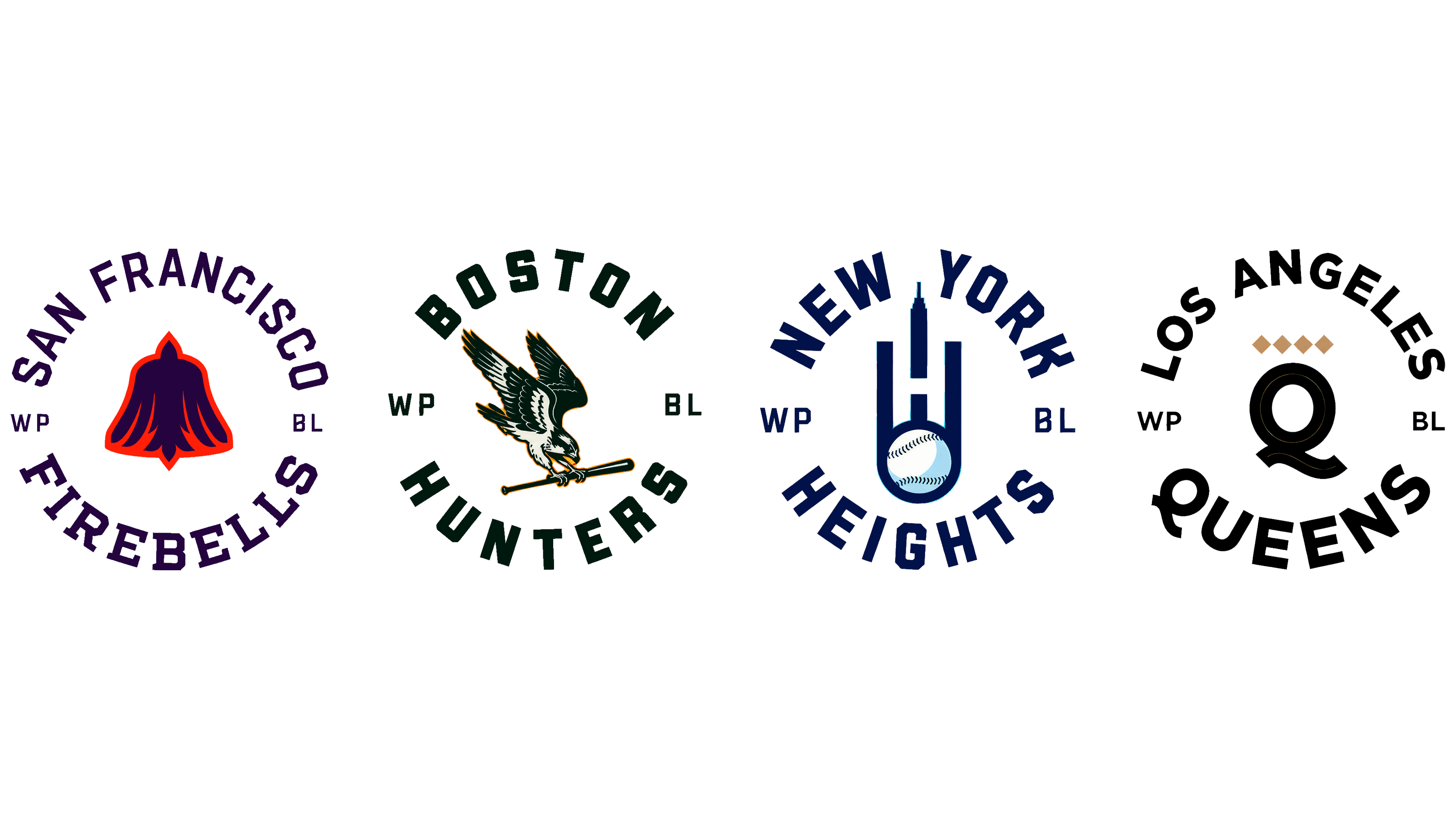
The Women’s Pro Baseball League unveiled its first four teams and their logos on July 8, 2026. The league’s inaugural lineup includes the Boston Hunters, Los Angeles Queens, New York Heights, and San Francisco Firebells. Canadian agency Arrivals + Departures connected the team names to women who made their mark in medicine, civil rights, baseball, and San Francisco’s history. Local imagery and sports traditions helped give each team a distinct identity.
Justine Siegal, the first woman to coach a professional men’s baseball team and throw batting practice for a Major League Baseball team, founded the WPBL in the United States in 2024. The agency began developing names after confirming the four cities. The agency created the identities for the inaugural season, scheduled to begin on August 1, 2026, at Robin Roberts Stadium in Springfield, Illinois.
The Boston Hunters take their name from Harriot Kezia Hunt, a physician and women’s rights advocate. She was among the first women to practice medicine professionally in the United States. Hunt applied to Harvard twice and was rejected both times because of her gender. Her last name gave rise to “Hunters.” The designers connected her persistence with the osprey, a bird of prey found along the New England coast.
The Hunters emblem features an osprey with raised wings and a lowered head, gripping a baseball bat in its talons. The feathers, eye, and hooked beak identify the bird, while its pose suggests readiness to strike. The league associates the image with precision, instinct, and a readiness to act. Beneath it, a slanted “Hunters” wordmark uses connected lettering reminiscent of traditional baseball jerseys. The bat runs above the name and crosses the area around the “t.” A circular version uses angular uppercase lettering. Both versions feature dark green, cream, and orange.
The Los Angeles Queens are named for baseball player Lizzie Murphy, known as the “Queen of the Diamond.” The nickname refers to the diamond-shaped baseball infield. Murphy played against major leaguers when women had few opportunities in professional sports. “Queens” carries forward the royal theme of her nickname.
The emblem centers on a large “Q” with a double outline and a curved tail. Four gold diamonds sit above it, recalling baseball fields and forming a crown. In the full-name version, the diamonds appear above “QUEENS,” set in heavy uppercase sans-serif letters. Black, white, and gold reinforce the royal imagery.
The New York Heights honor Dorothy Irene Height, a civil rights and women’s rights advocate. Her last name inspired the team name. “Heights” connects her legacy with the team’s ambitions and New York’s architecture.
At the base of the Heights emblem is a baseball with visible stitching. Lines rise from it to form an “H” and a skyline with a central spire. The designers connect the elongated shape with the speed of a fastball. The ball anchors the skyline, while the letter references the team name. In the abbreviated version, an “N” and a “Y” flank the emblem. Another version pairs it with the full team name. Narrow uppercase sans-serif letters echo its vertical proportions. The team’s colors are navy, light blue, and white.
The San Francisco Firebells take their name from Lillie Hitchcock Coit. As a teenager, she helped volunteer firefighters battle a fire on Telegraph Hill and later supported the city’s firefighting community. “Firebells” plays on her nickname, “Firebelle Lil.” The emblem honors Coit with a bell and a phoenix.
The outer contour widens toward the bottom to form a bell. Interior lines define the bird’s lowered wings and tail. The bell represents an alarm and the emergency response, while the phoenix recalls San Francisco’s recovery from fires. Purple and orange distinguish the design’s parts. “FIREBELLS” appears in large, heavy-serif letters. In the abbreviated version, an “S” and an “F” flank the emblem.
The team developed circular and semicircular versions for all four teams using a shared lettering layout. The city appears at the top, the team name at the bottom, and the primary emblem between them. “WP” and “BL” sit on either side. Additional variations include “2026” and “Baseball Club.” This shared format unites the league’s future rivals, while individual imagery and typefaces distinguish the teams.
The project team included creative lead Jeff MacEachern; Creative Director Jeff Collins; designers Steven Tasker, Kimberly Pereira, and Ashley O’Driscoll; and illustrator Jeff Mack. Members of the women’s baseball community helped develop it. On the WPBL side, Marketing Director Kelly Gianopulos, Jeremy Berman, and coordinator Paige Thompson supported the project. The logos appeared on uniforms from DICK’S Sporting Goods and PROLOOK. New Era produces the official team caps.