 Woolworths Logo PNG
The Woolworths logo balances simplicity and stability. It reflects the retail chain’s confidence in its future and its products. The emblem exudes reliability, proven by the brand’s continuous development and new store openings.
Woolworths South Africa began in 1931, when Max Sonnenberg and his son Samuel opened the first store in Cape Town after moving to the city. The business was separate from the American Woolworths chain, although that format influenced the Plain Street store. The Sonnenbergs adapted the fixed-price retail model for South Africa. They built the early concept around quality goods at accessible prices.
During the 1930s, Woolworths expanded despite the Great Depression, opening stores in Johannesburg, Durban, and other South African cities. In the 1940s, World War II created supply problems, but the company kept its position by selling food and everyday essentials. In the 1950s, the range widened with clothing and home textiles, giving the chain a broader role in household retail.
The 1960s brought growth in major cities and smaller towns. In the 1970s, Woolworths developed its own food lines, a move that helped separate it from other retailers. The 1980s marked the start of expansion outside South Africa, mainly into nearby African markets. After apartheid ended in the 1990s, the company adjusted to a new social and economic climate. It worked to reach a wider customer base.
The 2000s brought store upgrades, better service, and online retail. In 2007, Woolworths bought Australia’s Country Road Group, then expanded further with David Jones in 2014 and 2015. From 2016 to 2024, the company developed the Good Business Journey, improved digital shopping, launched a mobile app, added healthier food ranges, set packaging goals for 2025, introduced Woolworths Wellness, and tested “stores of the future” with smart fitting rooms, inventory robots, and contactless payment.
Meaning and History
What is Woolworths?
It is a leading retailer known for a wide range of products, including clothing, cosmetics, homewares, and groceries. The company emphasizes quality, sustainability, and ethical sourcing. It is famous for its premium food products, which include fresh produce, ready-to-eat meals, and gourmet items. The brand offers stylish and durable clothing as well as a variety of home and beauty products. The South African company is committed to sustainable development by supporting local communities through various initiatives.
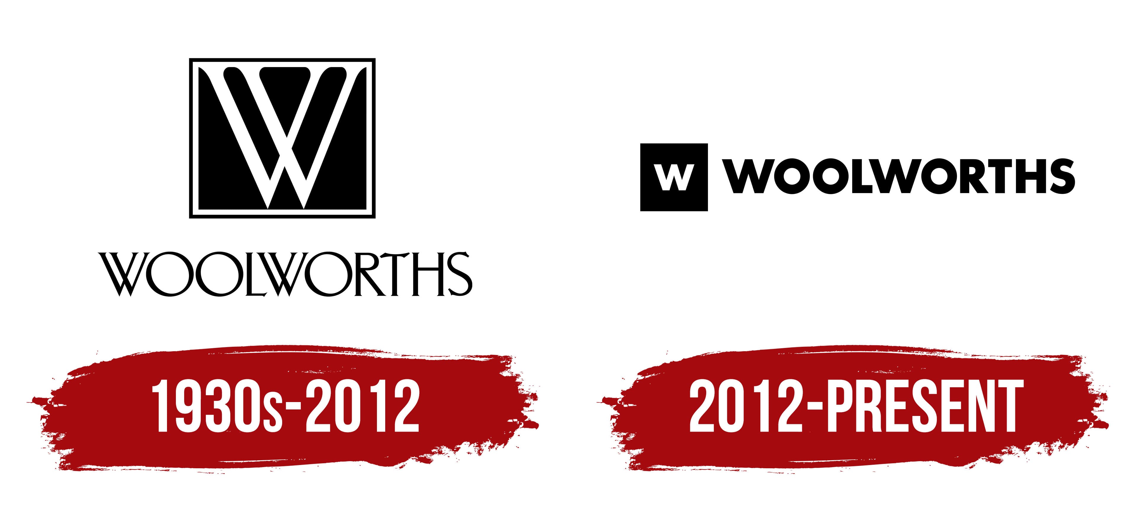
1930s – 2012
Woolworths’ visual identity is not distinguished by vibrant colors or variety, but this does not mean the chain it represents is unprofitable. No, it has long expanded beyond South Africa, where its first stores opened, and now delights customers worldwide. Their attention is drawn to the practicality of the emblem and products on the shelves, as the visual identity reflects a serious approach to business.
This logo has two basic elements: a personal graphic symbol and an inscription. The first represents the second. How? Very simply, the design conveys the brand’s short name, as indicated in the text. They form a unified whole because several aspects connect them:
- Name;
- Color;
- Font;
The capital “W,” which appears in the retail chain’s name, became the basis for the symbol. The main element of the inscription is the full name. This highlights the company’s practicality, as this label makes it easy to mark price tags. This is the first shared factor.
The second distinguishing feature of the logo is its monochrome design. Both the symbol and the inscription are in black and white. The contrast makes all the elements stand out clearly, whether on signs or electronic device displays.
The third unifying aspect concerns the font. The graphic symbol uses the first letter of the word “Woolworths,” placed below. A double structure, sharp ends, thin strokes, and serifs characterize it. The same glyph appears in the text.
The fourth common feature is the unified style. The letters appear elegant everywhere, emphasizing the retail stores’ practicality, simplicity, and stability. The alternation of narrow and wide strokes adds variety, giving the emblem expression and compensating for the lack of color.
The font is uppercase, serifed, and very elegant. Several letters stand out: the “R” with a gracefully extended leg, the “W” with intersecting elements, the “T” with an exquisitely curved top, and the “O” in the shape of a ring. The upper symbol resembles a square with a mysterious black background, with a white glyph, similar to two inverted triangles, visible. Together, they foster a creative atmosphere and help create a unique image for the retail chain.
2012 – today
This Woolworths logo is incredibly businesslike. It features a geometric style and monolithic letters that form a solid horizontal inscription. The brand’s symbol comes first, a black square without a frame, with a white glyph in the center. The sharp, strict edges reflect the company’s high expectations for its employees to adhere to all prescribed standards.
The straight angles and lines of the geometric figure also indicate impeccable customer service, comfortable shopping conditions, a businesslike atmosphere, and discipline. The emblem’s minimalism emphasizes this, with nothing extra, just the unique symbol and the name. This approach perfectly conveys the simplicity and ease of shopping, attracting more customers.
The capital letter “W” is in the middle of the square, equally distant from all four sides. It is also simple, made up of smooth strokes of equal thickness. Despite the monochrome design, the clear symbol is visible from afar. It’s bold and straight and perfectly matches the style of the nearby inscription.
On the other hand, the text is written in black glyphs on a white background. Here, the contrast is also effective: it highlights the retail chain’s name, clearly visible on the sign from any distance. The squat letters give a sense of reliability, steadiness, and stability. The classic sans-serif font suggests ease of use in the stores and Woolworths’ openness to customers.