


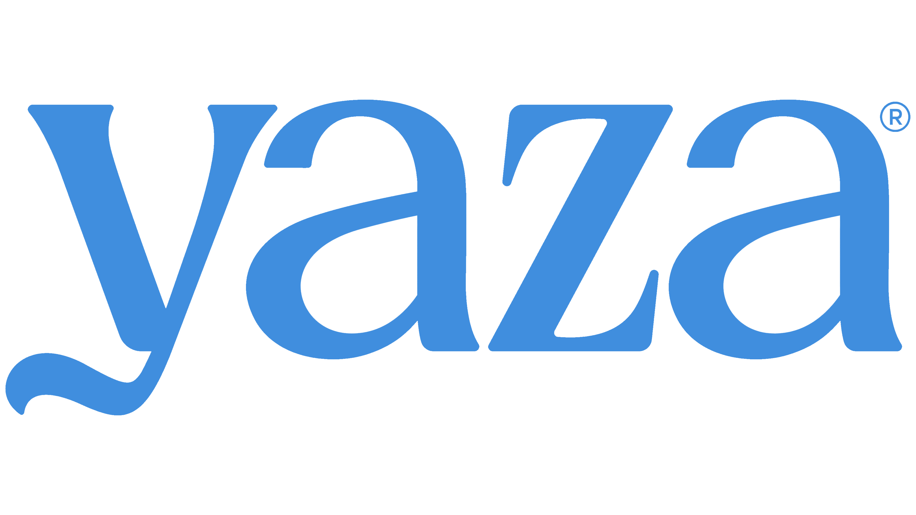
Yaza introduced a new look for its expanded line of Mediterranean dips. San Francisco-based studio Riser brought the products together under a shared logo, using the curve of the “y” to evoke their creamy texture. The company unveiled the redesign in January 2026 as the updated packaging began arriving in stores.
Founded in 2022, the brand started with labneh, a thick cultured dairy product made from strained yogurt. Baba ganoush, muhammara, and tzatziki later joined the lineup. As the business grew, founder Karim Khalil’s team identified weaknesses in the existing identity. The expanding range called for a cohesive look that would unite different recipes and better communicate the food’s quality and Mediterranean roots in a crowded dip category.
Riser grounded the redesign in hospitality and culinary traditions. For Yaza, that connection to traditional recipes begins with production. Its labneh is made by straining yogurt using a traditional method to achieve a thick, creamy consistency. The designers sought to capture that texture in the packaging lettering.
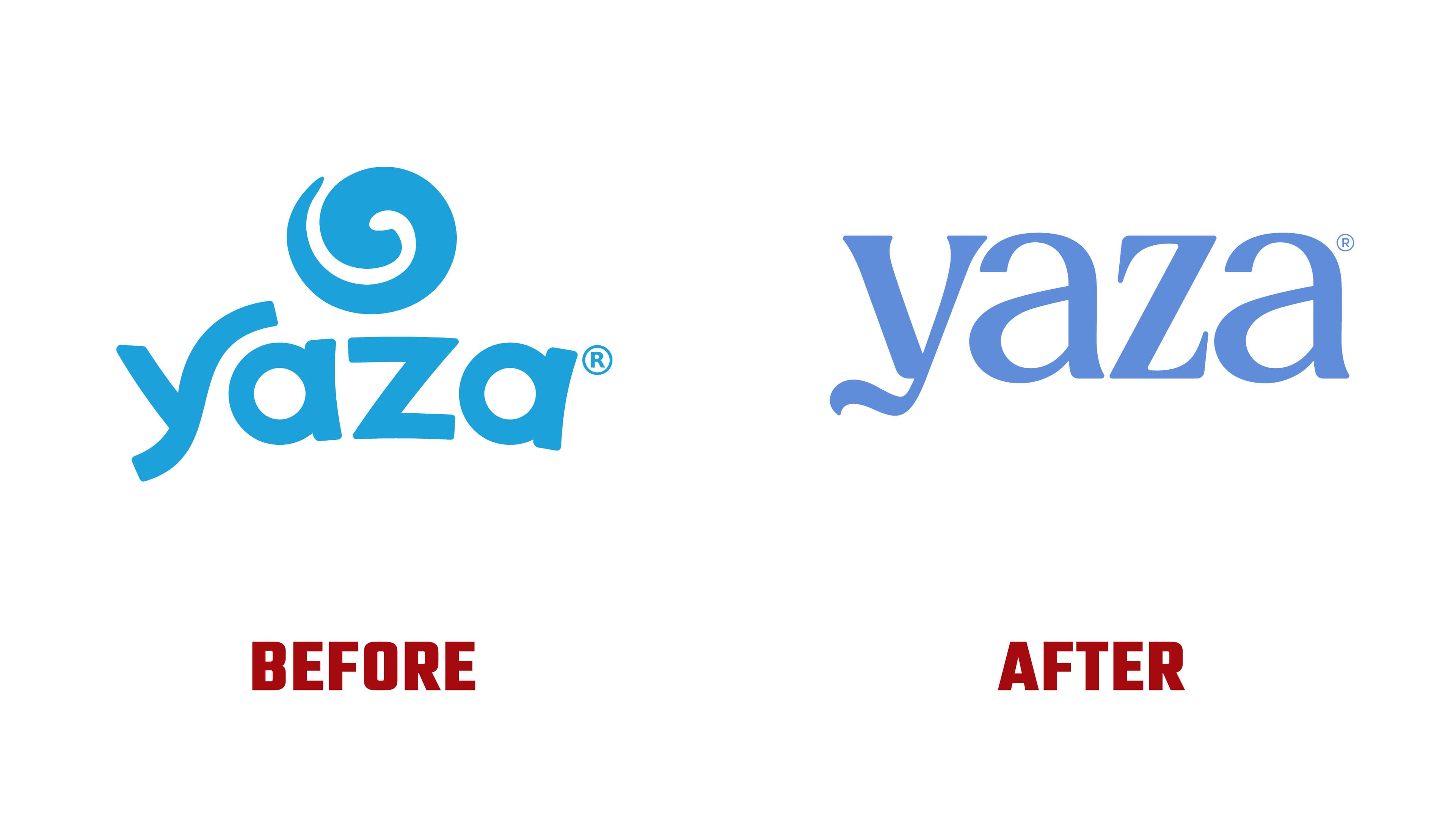
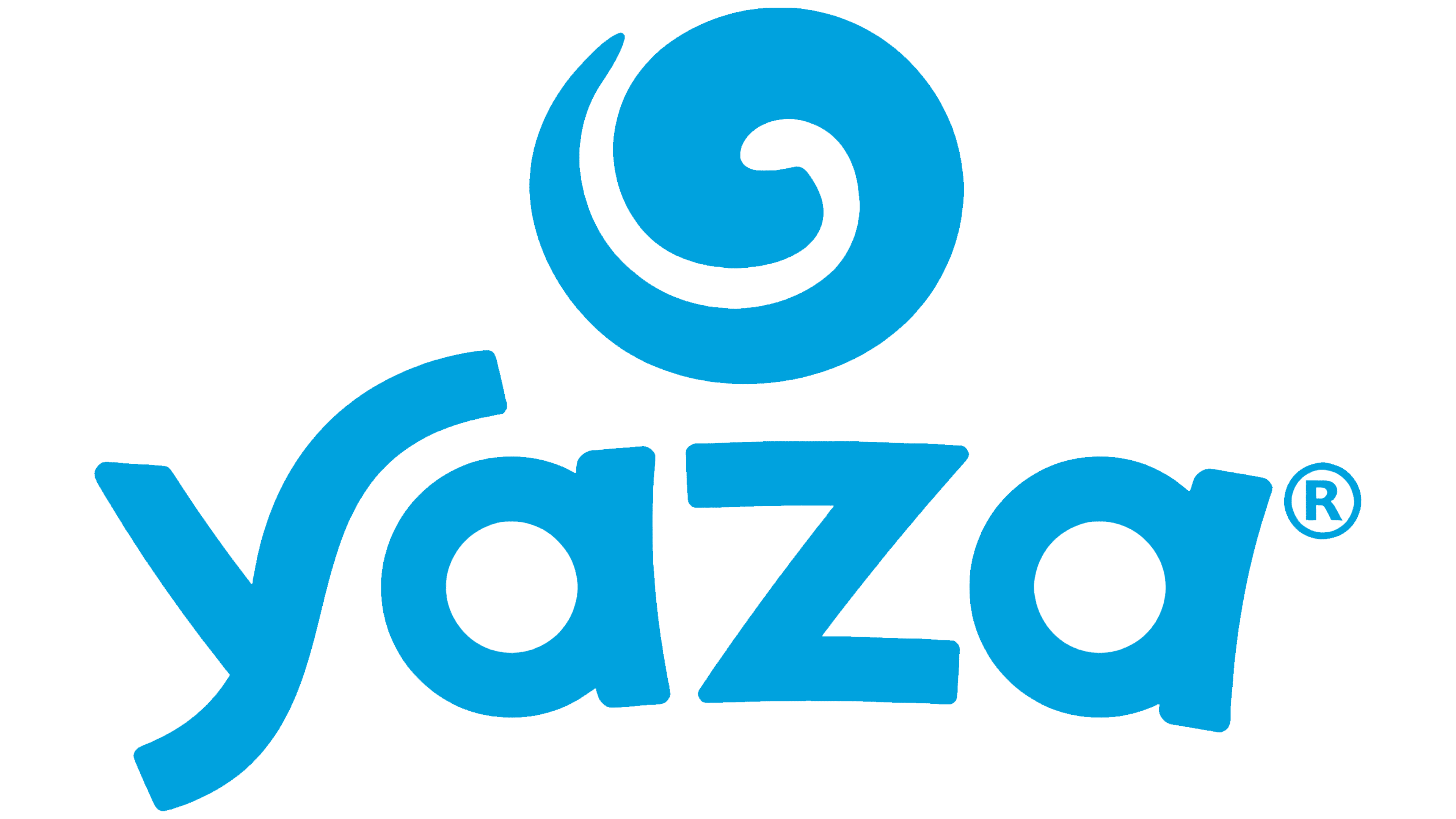
The previous logo featured a large spiral above the name, suggesting a swirl of the product or a spoon mark. The new logo brings that food reference into the lettering. The lowercase “y” has a descender that sweeps to the left and ends in a gentle wave. According to the studio, this curve evokes labneh’s thick consistency. The name now forms a single horizontal wordmark, replacing the earlier arrangement with its separate symbol.
The studio also reworked the other letters. The old logo used bold, rounded sans-serif forms with single-story “a” letters. The right arm of the “y” curved upward, while its descender extended to the left. The updated wordmark retains the lowercase lettering but introduces serifs and contrasting thick and thin strokes. Both “a” letters are now double-story, with open upper arches. Between them sits a narrow “z” with a heavy diagonal and extended terminals. The varied letter proportions and sweeping descender give the short name a distinctive shape.
Blue continues to unify Yaza’s product range. The previous shade was closer to cyan, while the new hue is softer and closer to cornflower blue. The wordmark appears in the same color across the packaging, helping shoppers find the brand on the shelf.
The larger logo sits against a light background, with the product name, flavor, and a brief description below. Color accents distinguish the recipes. Classic labneh features a blue band, roasted garlic and mint uses orange, and za’atar and olive oil uses green. Sandy tones identify the red pepper dip, while lilac shades distinguish the eggplant dip. Yaza officially announced the redesign on January 20, 2026.