


 Yonex Logo PNG
The Yonex logo represents a Japanese brand known for manufacturing badminton and tennis equipment. It symbolizes precision, reliability, and a drive toward victory, highlighting its role in international competitions.
Yonex began in 1946, when Minoru Yoneyama founded a small company in Japan’s Niigata Prefecture. Its first products were wooden floats for fishing nets. Falling demand for traditional floats during the 1950s forced the business to change direction. Yoneyama used its woodworking experience to begin manufacturing badminton rackets.
The company registered the Yonex trademark in 1961. In 1969, it introduced the world’s first aluminum badminton racket, replacing wood with a material that offered different weight, strength and balance. The product supported international expansion, while the corporate name was shortened to Yonex in 1974. The brand entered Europe, North America and other Asian markets through professional players and tournament partnerships.
Yonex later expanded into tennis and supplied rackets to leading competitors. Martina Navratilova became one of its best-known partners. At the same time, Monica Seles won the Australian Open twice using the company’s equipment. In badminton, Yonex developed a strong position among professional players and competed with specialist manufacturers such as the Taiwanese brand Victor.
In 1992, Yonex introduced its isometric racket head. The squarer shape enlarged the optimal contact area without increasing the overall head size, giving players more consistent results on off-center shots. The industry later adopted the construction. It became a defining feature of the company’s badminton and tennis equipment.
Meaning and History
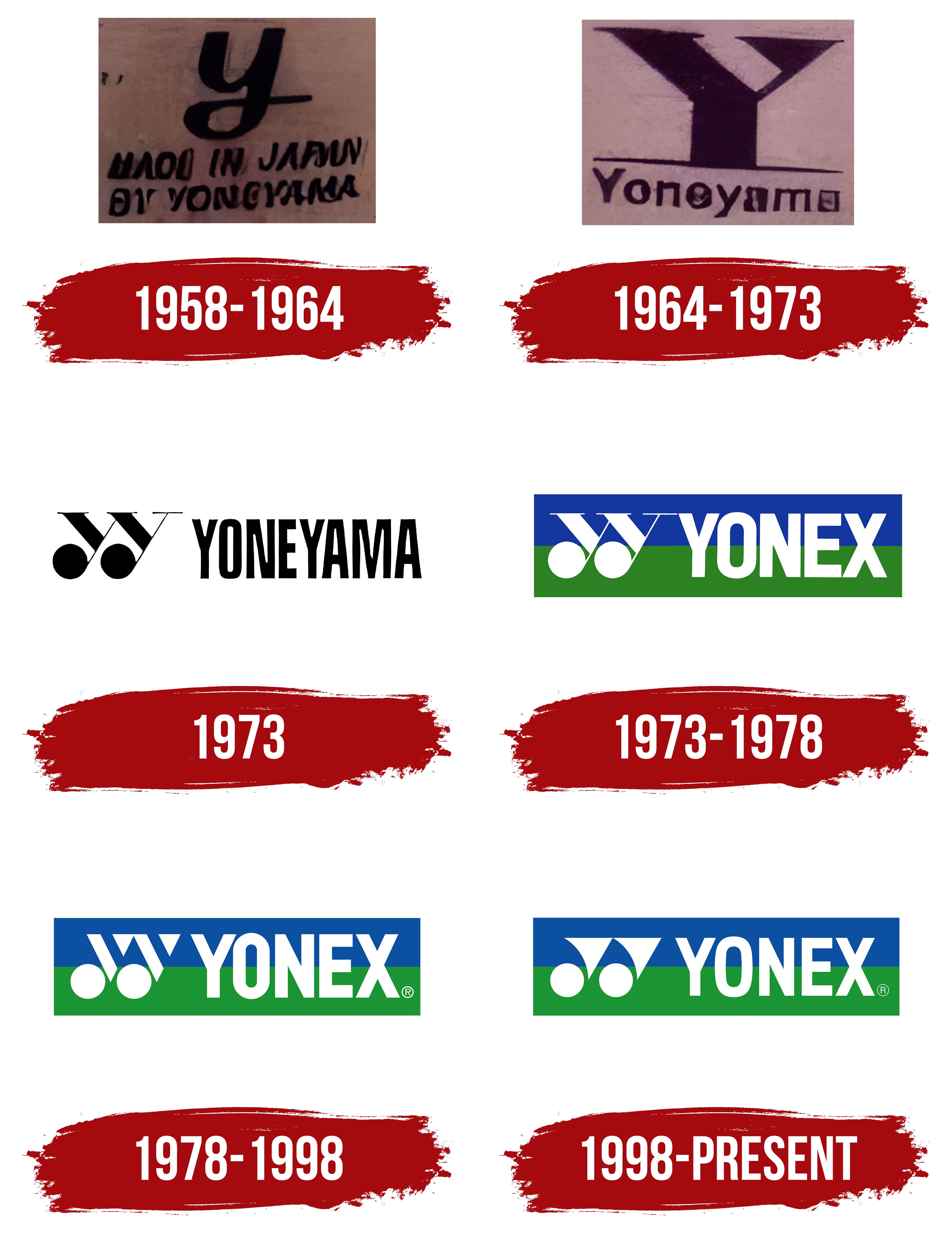
What is Yonex?
A Japanese manufacturer of sporting goods for badminton, tennis, and golf. The company initially produced fishing gear before shifting to sports equipment. Yonex is a leader in professional badminton, having developed innovative square-shaped rackets that increase the sweet spot by nearly 10%. In tennis, it competes with leading global brands and sponsors prominent athletes. Its range covers everything from strings to clothing and shoes.
1958 – 1964

The early stage of Yonex’s visual identity reflected the handcrafted nature of its production and its founder’s personal involvement. The first logo featured a single, bold, smooth “Y” rendered in italicized handwriting reminiscent of a signature. It was executed calmly, reinforcing the sense of professional responsibility for quality.
Below the main letter was the inscription “Made in Japan by Yoneyama.” It was written in a handwritten font with a slight slant, evoking the personal style of Minoru Yoneyama, the brand’s founder. He began his business producing fishing nets, which later became the foundation for his sports equipment manufacturing business.
The minimalist design reflected Japan’s culture of precision and neatness. The simple structure of the logo emphasized the products’ origins and handmade quality, connecting the brand with craftsmanship and the concept of reliable Japanese quality.
1964 – 1973

The company’s transition to a new visual style marked a change in the brand’s character. The elegant signature was replaced by bold, angular geometry. The letter “Y” took on heavy, wide shapes with pointed ends, creating an impression of strength and confidence. The visual emphasis reflected the period when the manufacturer entered the international sports equipment market, seeking to convey scale and reliability.
The word “Yoneyama” became more formal in structure. The letters were arranged in a straight line, with decorative slanted elements removed. The sans-serif geometric font gave the inscription a technical and pragmatic character, consistent with the company’s industrial focus and its orientation toward mass-producing sports equipment.
The updated Yonex logo signaled a shift away from the Japanese aesthetic of craftsmanship toward a universal visual standard aligned with global sports culture. It emphasized the brand’s determination to operate internationally and marked a shift toward a more rational, structured identity.
1973

The reinterpretation of Yoneyama’s visual identity in 1973 became a transitional stage toward the brand’s modern appearance. The emblem achieved a striking contrast through a black-and-white color scheme, characterized by simplicity and purity of form.
At the center were two stylized letters “Y.” They were designed with smooth curves and short serifs at the top, creating a sense of lightness and motion. The contours resembled wings, visually echoing the trajectory of a shuttlecock, the main symbol of badminton, which was the company’s key area of focus.
The inscription “Yoneyama” was placed to the right. It was done in a sans-serif font, dense and wide in proportion, reflecting the technical nature of the products and their connection to professional sports.
The design became the foundation for future versions. It combined traditional Japanese restraint with modern industrial minimalism, setting the course for the brand’s visual development for decades to come.
1973 – 1978

The period during which the company’s name changed to Yonex marked the formation of a new visual identity. The logo was redesigned with a rational structure and a new color scheme. The palette was based on blue and deep green, used in the background, with the name and symbol placed over it. These colors symbolized the sky and the surface of a tennis court, linking the identity to the world of sports and the company’s specialization in tennis and badminton equipment.
The two stylized “Y” letters gained clear geometric outlines and were designed to resemble shuttlecocks. They were placed next to the company name, forming a unified visual composition.
The word “Yonex” was written in a sans-serif typeface with a dense style and even proportions. The structure emphasized the brand’s modernity and technical direction.
The emblem existed for approximately five years, serving as the foundation for future designs. It established the principles that defined the further development of Yonex’s visual identity and ensured continuity across all subsequent logo modifications.
1978 – 1998

The update to the Yonex logo marked the company’s transition to a minimalist geometric design. In 1978, a symbol was created from simple shapes that conveyed technical precision and athletic dynamism. In essence, it was a further development of the previous version.
The emblem was composed of circles and triangles. These elements formed contours resembling a shuttlecock, the brand’s symbol of activity. Two white circles in the lower part represented the feathers of the shuttlecock, and above them were triangles with sharp tops, creating a sense of upward movement.
The background palette maintained continuity. The blue tone represented the sky, and the bright green was associated with tennis courts and playing surfaces. Their combination became a permanent part of the company’s image.
The word “Yonex” was placed to the right of the symbol. It was designed using a geometric sans-serif typeface with a dense, even structure, reflecting the brand’s athletic orientation.
1998 – today

The redesign in the late 1990s marked a step forward for Yonex in refreshing the brand’s athletic image. Designers reworked the logo’s structure, softening the strict geometry of the previous version and adding smoothness to the lines. The shapes became more rounded and fluid, giving the design a more organic character.
The symbolic motif of the shuttlecock remained in the visual structure, but in the new version, the forms resembled a playing set consisting of a racket and a shuttlecock. The two white circles in the lower part grew larger, and the triangles above acquired a slight curve and a small leftward tilt.
The typeface remained sans serif, kept its geometric foundation, and became thinner in outline. The lettering emphasized the brand’s technological character and complemented the symbol’s smooth flow.
The color palette stayed the same. Blue continued to be associated with the sky, and bright green with the playing surface. Their combination reminded viewers of the company’s athletic specialization.
The updated logo established visual continuity and reinforced Yonex’s image as a leading brand in world badminton.
Font and Colors

The visual system of the Yonex brand is based on a balanced combination of typography and color. The inscription uses the geometric typeface Swiss 722 STD Bold Condensed. Its dense, elongated proportions convey a sense of technological precision and align with the company’s athletic specialization.
The color palette was formed in the 1970s and has remained the core since then. It includes blue, green, and white accents. Blue conveys a sense of control and focus, while green is associated with freshness and athletic energy. The white symbols add purity and contrast to the image.
The palette emphasizes the brand’s connection to outdoor sports, such as tennis and badminton. Together with the Yonex visual mark, it ensures the brand’s recognizability among other sports equipment manufacturers.