The 9 Story Media Group logo symbolizes the brand’s connection to the world of puzzles and children’s games, emphasizing the company’s image as a reliable, family-oriented producer. The emblem focuses on providing entertaining and educational content for children of different ages, from preschoolers to school-aged kids. The logo is associated with the creative process and learning through play. It reflects the brand’s primary mission — to create quality programs that entertain and contribute to children’s development and education, fostering their interest in exploring the world.
9 Story Media Group: Brand overview
The company, now known as 9 Story Media Group, was founded on February 2, 2002, in Toronto, Canada, by Vicki Westrup, Stephen Jarosz, and Liliana Gavriliou. Their goal was to create high-quality animated content for families and children. Initially named 9 Story Entertainment, the studio quickly gained a reputation for its creativity and strong industry connections.
One of the early successes came in 2004 with Peep and the Big Wide World, an educational animated series for preschoolers. The show received critical acclaim, including an Emmy, and established the company as a rising player in the animation industry.
The success of Peep and the Big Wide World allowed the company to expand its operations, producing original shows like 6Teen (2004–2010) and Nearly Naked Animals (2011–2013), both of which received positive reviews from audiences and critics.
A major milestone came in 2007 when the company acquired CCI Entertainment. This acquisition brought well-known franchises like Arthur and The Magic School Bus into the company’s portfolio, increasing production capabilities.
In 2010, the studio launched its distribution division, enabling global reach for its content. This decision gave the company more control over its projects and opened up new growth opportunities.
One of the company’s biggest successes came in 2013 with the launch of Daniel Tiger’s Neighborhood. Based on characters from Mister Rogers’ Neighborhood, the series became a favorite among young children and parents, winning multiple awards and continuing to air.
In 2014, ZMC (Zelnick Media Capital) acquired a majority stake in the company, providing additional resources for expansion. The studio rebranded to reflect its broader goals and international ambitions.
In 2015, the acquisition of Irish animation studio Brown Bag Films added popular shows like Doc McStuffins and The Octonauts to its library, further boosting production capacity.
The company’s growth continued in 2016 when it established a New York-based division focusing on creating content for the U.S. market. The following year, it acquired Out of the Blue Enterprises, creators of Super Why! and Blue’s Clues, strengthening its portfolio of beloved children’s shows.
In 2018, the acquisition of Breakthrough Entertainment expanded the content library and international presence. That same year, the studio launched a new division focused on merchandising and licensing, allowing expansion into toys, books, and other products based on its properties.
In 2019, the company signed a deal with Scholastic to produce an animated series based on the Millionaire Dog book series. The company also expanded its presence in the streaming market through deals with Netflix and Amazon Prime Video.
Despite global challenges in 2020, the company continued to grow, launching new projects, including Friendship Island for Disney Junior. In 2021, the company explored new genres with the release of HBO Max’s original series, The Surreal Estate, showcasing its versatility in content creation.
The studio strengthened its global standing in 2022, announcing partnerships with BBC Studios for a new animated series and securing more international distribution deals. By 2023, the company had solidified its position as one of the leading worldwide creators and distributors of family and children’s content.
Over the past two decades, this Canadian studio has grown into a global media powerhouse, with millions of young viewers worldwide. The success is a testament to its commitment to producing high-quality content, making strategic acquisitions, and adapting to the rapidly changing media environment.
Meaning and History
What is 9 Story Media Group?
This is a leading media production and animation studio in the children’s entertainment industry, playing a key role in creating creative and educational stories for various media. It successfully produces, releases, and distributes a wide range of high-quality animated and live-action content. The company is known for its innovative storytelling methods, which combine entertainment and education, adapting important themes for young audiences. Its repertoire covers diverse formats, including animated series, films, and multimedia projects that engage children worldwide. The company has established itself as a reliable source of quality content that entertains and aids in education, addressing important topics such as social skills, friendship, and cultural awareness.
2002 – 2007
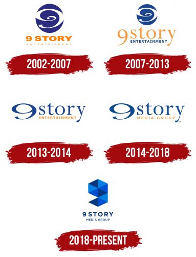
The company’s logo includes an image and inscription, creating a harmonious and memorable emblem. At the center of the composition is a blue circle symbolizing the globe. Inside the circle, a white spiral represents the broadcasting reach across the planet. The spiral elegantly forms the number 9, reflecting the brand’s name.
The name “9 Story” is linked to the company’s first animated series — “Peep and the Big Wide World”. Each episode of the show consists of two nine-minute stories, which led to the choice of the number 9 in the name. Below the image of the globe, the full company name — 9 Story Entertainment — is highlighted in large orange letters. The warm color palette of the logo conveys a sense of friendliness and openness, emphasizing learning and communication made possible by the company’s engaging series.
2007 – 2013
The launch of the international program distribution department led to the update of the corporate logo. The main changes affected the font. The inscription “9 Story” is now presented in a larger and more elegant format, harmoniously complementing image nine inside the globe. The font has become more refined, symbolizing the company’s professionalism and new vision. The color scheme has also changed — the blue shade of the word “Entertainment” echoes the planet’s color at the center of the emblem, creating visual coherence. This updated symbol highlights the beginning of a new era in the company’s history, associated with expansion and entry into international markets.
2013 – 2014
The company’s logo was redesigned after acquiring CCI Entertainment’s children’s program library, bringing new elements and fresh accents. The inscription looks more dynamic, as if it has moved beyond its usual space, shedding traditional boundaries. The large number “9,” positioned at the top, has become a symbol of completeness, representing the extensive and engaging collection of children’s programs assembled by the company. To the right of the number, the words “Story” in bright blue and “Entertainment” in orange are placed on two levels, symbolizing the content’s entertainment and educational focus.
2014 – 2018
The company changed its name to reflect the expansion of ownership and areas of activity, leading to a change in the logo. Instead of the familiar “Entertainment,” it now uses “Media Group,” highlighting a broader range of media projects and opportunities. However, the other key elements of the emblem were retained, preserving the brand’s recognition and connection to past successes. The logo demonstrates the company’s stability while hinting at its drive for growth and the pursuit of new markets in the media industry.
2018 – today
The 9 Story Media Group logo, introduced after the company’s expansion and several acquisitions, symbolizes changes and new directions. The focus is on the number “9,” composed of triangles in various shades of blue. This design resembles a snake puzzle, adding a playful and creative element to the visual perception. The design is an aesthetic choice, referring to the Colorforms brand, which the company had previously acquired.
Colorforms is famous for its sets of vinyl sheets in different geometric shapes that can be arranged into various figures. The emblem respectfully nods to this heritage, emphasizing the importance of play and creativity, especially in children’s content, which is the company’s primary focus.
The color scheme consists of shades of blue, from light to dark. This creates a sense of depth, perspective, stability, and reliability, aligning with the company’s status as a major player in the children’s content market.
Beneath the number “9” is the company name, written in a simple yet confident two-level font. This font appears modern and clear, complementing the sense of professionalism and stability. Overall, the logo highlights playful and creative elements while remaining modern and serious, reflecting the company’s direction after the rebranding.
