The Aigle Azur logo represents the historic link it created between France and Algeria. It’s a tribute to the airline’s role in making flying more available and promoting cultural ties. The emblem shows the company’s focus on connecting distant places and improving travelers’ journeys.
Aigle Azur: Brand overview
On April 13, 1946, Sylvain Floirat, a former fighter pilot and Resistance member in World War II, established Aigle Azur. The company started with charter flights from Paris utilizing Junkers Ju52 aircraft when French aviation was still recovering post-war. Aigle Azur quickly became a pioneer in the industry.
In the 1950s, the airline expanded its services by introducing regular flights to African French colonies like Algeria, Tunisia, and Morocco. This growth was fueled by the growing demand for air travel between France and its colonies. The company upgraded its fleet by adding Douglas DC-3 and DC-4 aircraft.
However 1955, the Algerian War of Independence outbreak resulted in the French government nationalizing all routes to Algeria, causing significant losses for the company. This forced the brand to rethink its direction.
In 1970, the airline was acquired by UTA, leading to significant changes in its operations. It became a subsidiary of UTA, focusing on charter flights and cargo transportation.
In 2001, a group of investors led by Arezki Idjerouidene relaunched the company, focusing on flights between France and Algeria. The brand later expanded its routes to other North African countries and Portugal, targeting the Portuguese diaspora in France.
In 2012, the Chinese HNA Group acquired a 48% stake in the airline, prompting the company to plan for long-haul routes.
By 2014, the brand had successfully launched its first long-haul route to Beijing using Airbus A330 aircraft, marking a new chapter for the company. Over the years, the airline continued to expand its route network, adding flights to Beirut and Moscow and increasing the frequency of existing routes.
Unfortunately 2018, the company faced severe financial challenges due to increased competition and rising costs. The brand initiated a restructuring process to try to improve its financial situation. Despite efforts to find a new buyer, the company declared bankruptcy in September 2019 and ceased all operations, marking the end of its long and storied history.
Meaning and History
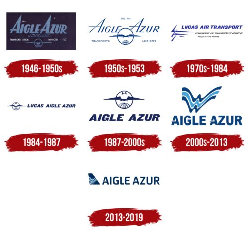
Aigle Azur’s logos tell the story of the airline from the start to its end. At first, the logos showed the excitement of flying into the night sky. As time passed, the designs changed to show the airline’s growth, with pictures of the globe, eagles, and flight. The logos changed with new owners, when money was tight, and when they had a chance to grow. They showed the airline’s skill, its way of connecting places, and how it kept up with the fast changes in flying. Every new design kept the airline’s history in mind, even as it tried to stay ahead in a tough market.
What is Aigle Azur?
Based in France, Aigle Azur held a significant position in the world of aviation. With a base and headquarters at Paris’ Orly Airport, the airline connected France to many countries in Europe, Africa, and the Middle East. Operating a fleet of Airbus A320 and A330 family aircraft, the company operated scheduled flights to 21 destinations, making travel more affordable and comfortable. On September 27, 2019, the airline was liquidated by court order, marking the end of its journey in the aviation industry.
1946 – 1950s
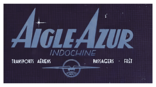
Aigle Azur started in 1946 with a logo that reflected its goals and service areas. The logo, set on a dark blue background, symbolized the night sky and marked the airline’s entry as a bright new player. The deep blue hinted at its African routes and the exciting destinations it offered.
The logo’s lettering was bold and angled upward, showing the airline’s desire to reach new heights. The name was split over two lines, which made the large text feel welcoming. This design suggested that the airline was watching from above, reinforcing its expansive presence.
At the top of the logo, an airplane flying over the globe highlights Aigle Azur’s wide reach and international plans. The plane’s lilac wings represent the airline’s name, “Azure Eagle,” linking the color to its identity and vision. This image promises that Aigle Azur is ready to connect the world.
1950s – 1953
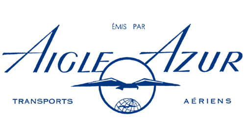
When the dark background was removed, Aigle Azur’s logo became brighter and more inviting. This change matched the airline’s growth, as it was launching new routes to Europe and the Middle East. The globe in the logo shrank, suggesting that the world is closer and easier to explore with Aigle Azur.
The logo now features an eagle, reflecting the meaning of “Aigle Azur” or “Azure Eagle.” With outstretched wings, the eagle looks down on the world, symbolizing a broad view and the freedom of flight. This image represents the airline’s ambitions and its global approach.
The new logo design highlights Aigle Azur’s aim to be a leader in the aviation field. It shows the airline’s wide reach and power to connect different parts of the world. The logo’s eagle and the small globe emphasize Aigle Azur’s expanding network and its role in bringing people together.
1970s – 1984
In 1970, Aigle Azur entered a new era as Lucas Aviation rebranded it to Lucas Air Transport. A new logo symbolized this change. The logo had three pointed shapes on one side, suggesting an airplane’s wing and aiming upwards, next to the company name. This design aimed to capture the spirit of flight and the airline’s progress.
The text in the logo was arranged in levels, matching the wing’s three parts, creating a balanced look. The logo’s blue-violet color was likely chosen to reflect professionalism and a spirit of innovation, traits the airline wanted to be known for with its new image.
Yet, the logo’s varied fonts and small, slightly uneven details gave an impression of speed rather than careful design. It seemed the new owners quickly created this new image, possibly overlooking finer details. While the logo was fresh and showed promise, it lacked the finish often seen with well-known brands, hinting that the rebranding might have been a swift move without much detail work.
1984 – 1987
After some struggles, the airline started improving and renamed itself Lucas Aigle Azur. This new name honored the history of both companies that came together. With the new name came a new logo, too. This logo was simple and modern, showing that the airline was ready for a fresh start but still remembered where it came from.
The logo combined old and new by showing the world and an eagle, important symbols for Aigle Azur, with a sleek, new design that looked towards the future. The airline wanted to show it was moving forward but still valued its past.
They chose a dark blue color for the logo, which made it look strong and professional. Dark blue is often linked with flying and adds a touch of class to the airline’s image. This color helped the logo pop and showed that Lucas Aigle Azur aimed to be a top choice for travelers worldwide.
1987 – 2000s
In 1987, Aigle Azur got back on track and proudly returned to its original name. This signified that the airline was sticking to its roots and important values. They updated their logo to show an eagle with its wings spread wide, flying high. The name of the airline was right below in dark blue. This new look for the logo made the airline seem more professional and eye-catching, making it easier for people to recognize and remember.
They added a circle design above the name to show that Aigle Azur was a big deal in the charter market. This symbolized that the airline was complete and leading in its field. They kept the same font for the logo to stay connected to their history but made it clearer and more modern. The ‘G’ in the logo cleverly changed into the arrow of a speedometer, showing that Aigle Azur was moving fast and making big moves in the industry.
This smart design choice showed the airline’s energy and ambition, capturing its aim to keep improving and reaching for success. The refreshed logo was a bold statement of Aigle Azur’s comeback and its goals for the future. The airline reshaped its image with thoughtful design updates to show reliability, speed, and quality.
2000s – 2013
At the start of the new millennium, Aigle Azur decided to refresh its image, introducing a logo with elegant, multicolored waves that looked like they were moving with the wind. This new design represented the feeling of an eagle taking off into the sky, symbolizing progress and the desire to move forward. The design aimed to show the airline’s focus on growth and moving ahead.
The waves in the logo were meant to show creativity and a commitment to offering top-notch service. They symbolized the airline’s goal to give its passengers a comfortable and unique experience, showcasing the brand’s dynamic and changing character. The design’s mix of movement and creativity reflected the airline’s unique qualities and vision for the future.
The logo’s colors represent the airline’s rich history and connection to flying. Dark blue stripes stand for depth and reliability, showing the strong foundation of Aigle Azur. Meanwhile, a lighter blue wave in the middle represents the sky and the freedom of flying, showing the airline’s main focus and promise of discoveries. These colors make the logo more visually appealing and symbolize the airline’s values and place in aviation.
The design also aimed to convey professionalism and expertise, reassuring passengers that Aigle Azur’s team is highly skilled. This part of the logo was meant to assure customers about the safety and reliability of flying with the airline, emphasizing that every flight is handled with great care and attention by experienced professionals.
2013 – 2019
In 2019, the French airline Aigle Azur stopped flying but left behind a memorable logo. This logo had the company’s name in dark blue with a special font that made the letters look sleek and light. The letter “A” was particularly interesting because it had a gap in its design, adding a modern touch to the logo.
Right next to the airline’s name was an image of an uneven trapezoid. This represented part of a plane’s tail, known as the vertical stabilizer, which is important for controlling the plane. The stabilizer was dark blue, matching the name’s color, and had blue patterns of straight and wavy lines. These patterns added beauty to the design and symbolized flying.
The logo showed Aigle Azur’s focus on looking good, working efficiently, and capturing the spirit of flight. Even though the airline is gone, its logo tells the story of its values and goals. Dark blue was used to show the airline was reliable and professional, while the light blue patterns and sleek letter shapes suggested the beauty and freedom of flying. The logo made a strong impression by expressing what Aigle Azur stood for.
Font and Colors
The Aigle Azur logo has a simple, modern look. The text is bold with rounded letters, making it look friendly and up-to-date. It’s designed to remind you of how smoothly planes fly through the air.
Both “A” s in “Aigle” and “Azur” have a special look with a gap in one side, making them stand out. This gap is like the airline carving its path through the sky. Next to the name is a design that looks like the letter “A.” It has lines that change from thick to thin, creating a picture of an eagle in flight or the trail left by a plane. These lines give the feeling of movement.
The logo’s colors are two shades of blue—the dark blue stands for the trust and professionalism you want from an airline. The lighter blue reminds you of the sky and the freedom you get when flying. Blue is a common color for airlines as it connects to the sky and flying. The two blues together make the logo stand out and look deep. The colors are meant to make you feel calm and safe, just what you’d want when choosing a flight.
FAQ
What is the airline code for Aigle Azur?
Aigle Azur, known by its airline code ZI, was a well-known French airline until it had to stop operating. This code ZI made managing flights, ticketing, and logistics easier.
Starting in 1946, Aigle Azur was the second oldest airline in France and had a long history. It mainly flew people and goods between France and places in Europe, Africa, and the Middle East, helping people from different cultures connect and improving travel options.
The ZI code was important for the airline’s day-to-day work. It appeared on tickets, luggage tags, and scheduling systems worldwide. It helped Aigle Azur communicate and work smoothly with airports, other airlines, and service companies.
