The Air Berlin logo symbolized the airline’s commitment to connecting Germany with the rest of the world, especially after resuming flights in 1978 with a focus on linking West Berlin to other major cities. It reflected the airline’s role as Germany’s second-largest carrier, crucial in enhancing accessibility and mobility for citizens after Germany’s reunification. The logo highlighted the company’s innovative approach to passenger services and efforts to provide comfortable flying conditions, making Air Berlin a preferred choice for international and domestic travelers.
Air Berlin: Brand overview
American pilot Kim Lundgren established Air Berlin on April 28, 1978, as a charter airline in Oregon, USA. Initially, the company flew from West Berlin to popular Mediterranean resorts, taking advantage of the unique status of West Berlin after World War II, which allowed only American, British, and French airlines to operate flights.
During the 1980s, the airline expanded its services, focusing on charter flights from West Berlin to tourist destinations. The company quickly became known for its reliability and affordability among German tourists.
The brand changed ownership after Germany’s reunification in 1990 and the end of Berlin’s special status.
In 1991, it was re-registered as a German entity, and German investors held most of its shares.
In the 1990s, the airline shifted from charter flights to scheduled services, introducing new routes connecting major German cities with popular tourist spots. To stay competitive with the increasing number of low-cost carriers in Europe, the company adjusted its business model in 2002 by offering lower fares and simpler services on some routes while maintaining some traditional elements.
By acquiring the German airline DBA in 2004, the brand expanded its presence in the German domestic market.
The company went public in 2006 through an initial public offering on the Frankfurt Stock Exchange, enabling it to raise funds for further expansion and fleet modernization.
In 2007, it acquired the German airline LTU, allowing it to enter the long-haul market and expand its route network. Joining the global airline alliance Oneworld in 2010 provided the brand with more collaboration opportunities with other major airlines.
However, from 2011 to 2016, the airline faced financial challenges due to fierce competition and rising operating costs. Several restructuring efforts were made to restore profitability, but on August 15, 2017, the company declared insolvency after its main shareholder, Etihad Airways, declined further financial assistance.
On October 27, 2017, the brand operated its final flight, marking the end of nearly 40 years of the airline’s history.
Meaning and History
What is Air Berlin?
It was an airline in Germany offering scheduled and charter flights connecting Germany with Europe, North Africa, and the Middle East. Based in Berlin, it was the second-largest airline in the country. Financial difficulties led to bankruptcy and cessation of operations. Other major airlines, such as Lufthansa and EasyJet, have acquired many routes and assets.
1978 – 1980s
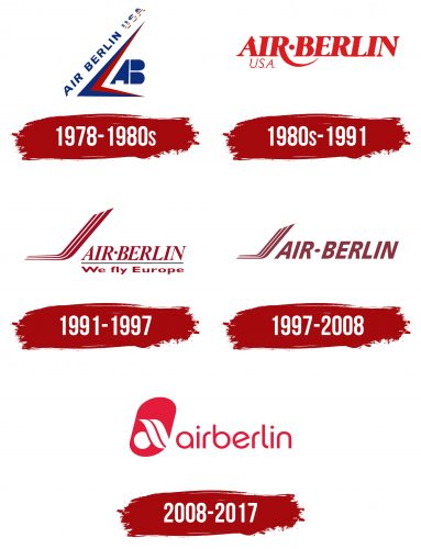
Air Berlin was founded in the United States between 1978 and the 1980s. The logo showed deep respect for America, featuring red and blue colors similar to the American flag. This design choice highlighted the company’s appreciation for the USA’s support during its early days.
The logo’s dynamic design conveyed speed with its sharp angles and pointed edges, resembling a wing or a stylized bird, to emphasize the aviation theme. The company name was elegantly displayed along one of the lines, giving an impression of rising, which added a light and aspirational feel to the logo.
The logo included “USA” written in the colors of the national flag, reinforcing the connection to its American roots and showing respect for the country. This detail made the logo stand out and memorable.
On the right side of the logo, two capital letters from the company name looked like an airplane’s tail, balancing the design and enhancing the aviation theme. Although the logo was bright and detailed, it also seemed to lack harmony, which might reflect the brand’s early experimentation with its design.
1980s – 1991
Since Air Berlin got the green light to fly out of Berlin, it marked a major step in its growth. The company opened an office in Germany, a move that helped increase its global reach. This expansion was also showcased through the design elements of its visual identity.
The logo featured a red emblem representing new achievements and high aspirations. Red is a color linked with energy, passion, and action, and it perfectly captures the company’s dynamic growth and leadership goals.
The logo’s innovative design featured a dot between “Air” and “Berlin.” This made the company name look like an airport display, suggesting departure and destination points and turning the logo into a travel symbol connecting different parts of the world.
Adding “USA” under “Air” shaped the logo’s message into a flight route from “USA to Berlin.” This highlighted the airline’s international reach and ties between the United States and Germany.
A standout feature of the logo was the elongated shape of the letter “R,” which looked like the path of a transatlantic flight on maps. This design symbolized movement and development and the airline’s mission to connect different cultures and peoples through aviation.
1991 – 1997
After the reunification of East and West Germany in the 1990s, Air Berlin began a new growth phase. The airline expanded its routes and updated its corporate symbols to reflect a new chapter in its history. Getting a flight license from Germany’s Federal Aviation Authority was a crucial step that showed the airline met high safety and quality standards.
During this time, the company redesigned its logo to include a boomerang shape of three merging stripes, representing continuity and ongoing movement, growth, and development. Like an airliner’s tail, this shape emphasized Air Berlin’s focus on air transport and highlighted its dynamic and mobile nature.
The new logo design also featured the company’s name next to the boomerang symbol, creating a balanced visual that conveyed additional information. By mentioning European flights, the logo reflected the airline’s growing network and stronger presence in the European air transport market. It showcased Air Berlin’s aim to increase its international visibility and role as a reliable carrier linking Germany with other European countries.
1997 – 2008
Air Berlin sought to stand out in Germany’s air transport market by adopting a low-cost carrier strategy. This strategy was designed to attract passengers looking for affordable and comfortable travel. By significantly lowering ticket prices while maintaining quality, the airline grew its customer base and strengthened its position in the market.
The airline introduced a new emblem to reflect these strategic changes, focusing on affordability and quality. The emblem effectively combined these themes, showcasing Air Berlin’s dedication to high-quality, low-cost services. The logo redesign involved making the graphic elements smaller and the text larger, creating a balanced and harmonious appearance.
2008 – 2017
In 2008, Air Berlin introduced a new logo that was visually striking and remained in use until the company stopped operating in 2017. The logo featured an elongated red oval resembling an airplane window, with images of an airplane wing and the sun inside it. These elements symbolized prosperity and an optimistic future and formed a stylized lowercase letter “a,” the first letter of the company’s name. This design gave the logo a unique and memorable look.
The slim curves in the company’s text created a feeling of lightness and comfort, aligning with Air Berlin’s commitment to providing affordable flights without sacrificing quality or onboard comfort. This logo was crucial in reinforcing Air Berlin’s status as Germany’s second-largest carrier.
Air Berlin was also recognized internationally for its high service standards through its membership in Oneworld, the largest aviation alliance. This affiliation underscored the company’s quality and contribution to global aviation.
The new emblem represented modern style, high technology, and innovation, all central to Air Berlin’s strategy. It symbolized renewal, a commitment to excellence, and ongoing development, highlighting the company’s readiness to face industry challenges and maintain a leading position in aviation.
Font and Colors
The Air Berlin logo features a modern and dynamic custom font. It is hard to name specifically, but it resembles fonts like Futura or Avant Garde with their distinct geometry and clean lines. It is also similar to fonts like Pump Std Light and Expressa Serial Light but with finalized contours and some modernized lines.
The font style is refined, ensuring good visibility and recognition. The letters are straight, not slanted, making them easy to read.
The kerning between letters is even, creating a sense of order and structure. The font plays a key role in creating a recognizable brand image. Due to its cleanliness and simplicity, it is highly legible across various mediums, from airplanes to advertising brochures.
The red logo is associated with energy, passion, and action. It highlights the brand’s dynamism and assertiveness, making it one of the most noticeable and attractive colors. In the aviation industry, the shade of red enhances the logo’s recognizability.
FAQ
Does Air Berlin still exist?
Air Berlin no longer exists. The airline faced financial troubles for several years and declared insolvency in August 2017. It stopped operating in October 2017. Air Berlin was once Germany’s second-largest airline and played a major role in European aviation. After it closed, other airlines acquired its planes and some of its flight routes. This event showed how competitive the European air travel market is.
Why did Air Berlin collapse?
Air Berlin faced serious problems that led to its collapse in October 2017. Here’s a simpler explanation of what went wrong:
- Financial Trouble: For many years, Air Berlin struggled with money. The airline lost money and had a lot of debt. Its approach to offering low-cost and full-service flights didn’t work well, making it hard to keep up with costs and compete effectively.
- Strong Competition: Other airlines that kept costs low and prices competitive, like Ryanair and EasyJet, were tough competitors. Big airlines like Lufthansa were strong competitors on many routes. This competition made it hard for Air Berlin to make money and keep its market share.
- Problems with Growth and Buying Other Airlines: When Air Berlin tried to grow by buying other airlines like LTU International and parts of Niki, it didn’t help as much as expected. These moves made the business more complex and added more debt, which made things harder to manage.
- Economic and Regulatory Pressures: Changes in fuel prices and tough economic times added to the airline’s financial struggles. Strict rules in the European aviation industry made things difficult. Air Berlin couldn’t adjust well enough to these challenges.
- Unsuccessful Investments and Partnerships: The airline tried to update its fleet and expand its network without enough money to support these plans. Investments from Etihad Airways 2011 seemed promising initially but didn’t solve the deeper financial issues. When Etihad stopped supporting Air Berlin in 2017, the airline had to file for insolvency.
These issues combined made it impossible for Air Berlin to keep operating, leading to its shutdown. This was a significant drop from its early days of operations.
What is the revenue of Air Berlin?
In 2016, Air Berlin, Germany’s second-largest airline, earned about 3.8 billion euros from its services and operations worldwide. Despite earning this much, Air Berlin had major financial problems. The company could not handle its debts and the competition it faced. It filed for insolvency on August 15, 2017, and stopped operating on October 27, 2017. This marked the end of the airline’s struggle to stay profitable and stable in a tough market.
