


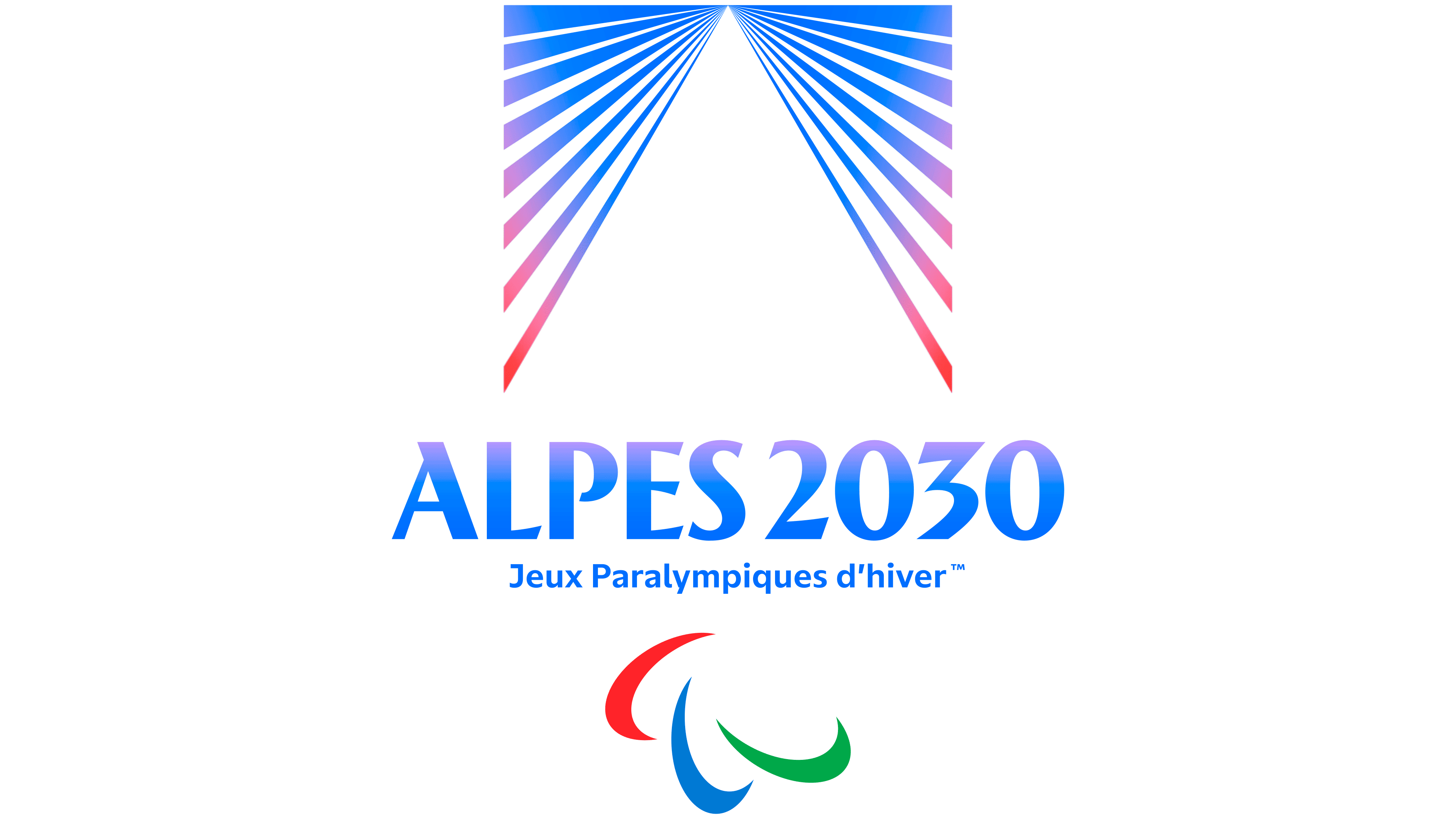
The emblems for the Alpes 2030 Olympic and Paralympic Winter Games were unveiled in Briançon on June 18, 2026. Both depict a mountain emerging from rays of light. Paris studio Saint-Lazare and the organizing committee’s team, led by Brand and Image Director Mathieu Sakkas, created the complementary pair to express the equal standing of the two events and their connection to a shared host region.
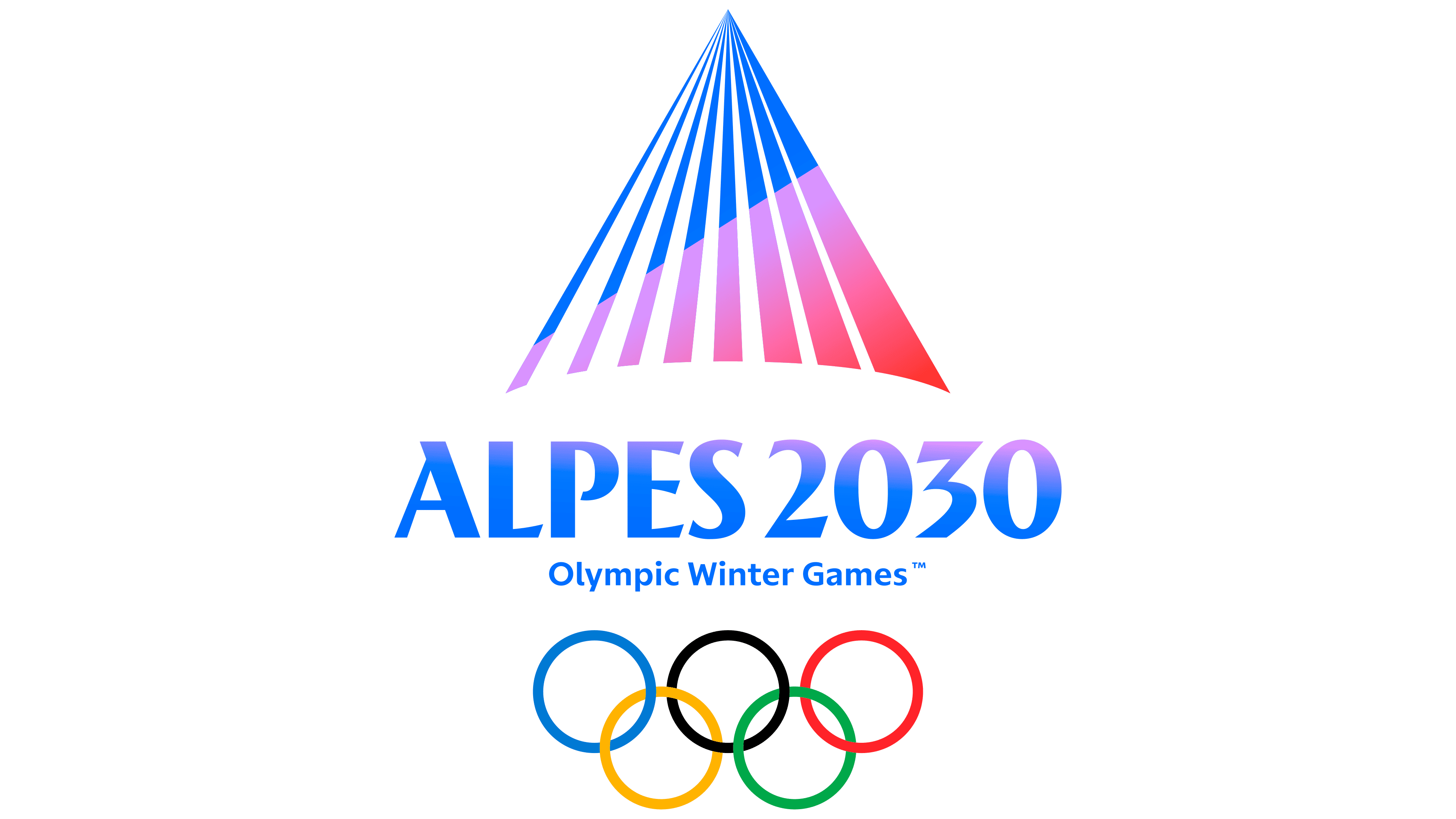
In the Olympic emblem, colored bands of varying widths converge at the peak and spread toward the bottom, with white gaps between them. Together, the rays form a triangular mountain with a slightly curved lower edge. The Paralympic version reverses the relationship between color and negative space. The mountain becomes white, surrounded by rays extending from its peak toward the sides and lower corners.
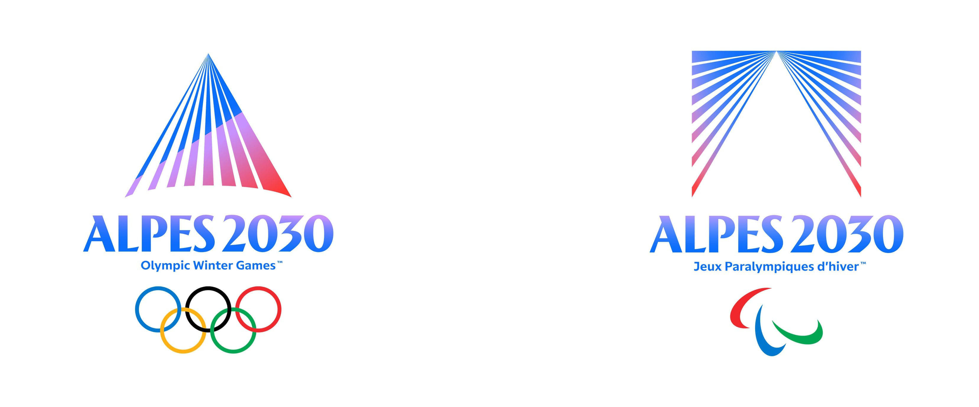
The name ALPES 2030 sits beneath both emblems. The Olympic version includes the words Olympic Winter Games and the five rings. The Paralympic version carries Paralympic Winter Games and the three Agitos. Both logos share the same arrangement, while their different silhouettes distinguish the events.
The idea came from observing light on the mountains of the Aravis range and the Les Confins area in Haute-Savoie. The designers studied how light reveals the peaks’ contours. In the identity, the rays represent warmth and renewal. At the same time, the mountain stands for Alpine sports, challenges, and pushing the limits of human ability. The point where the bands converge represents athletes, residents, and partners coming together for the Games. According to Le Monde, developing the final design took more than six months and involved dozens of variations.
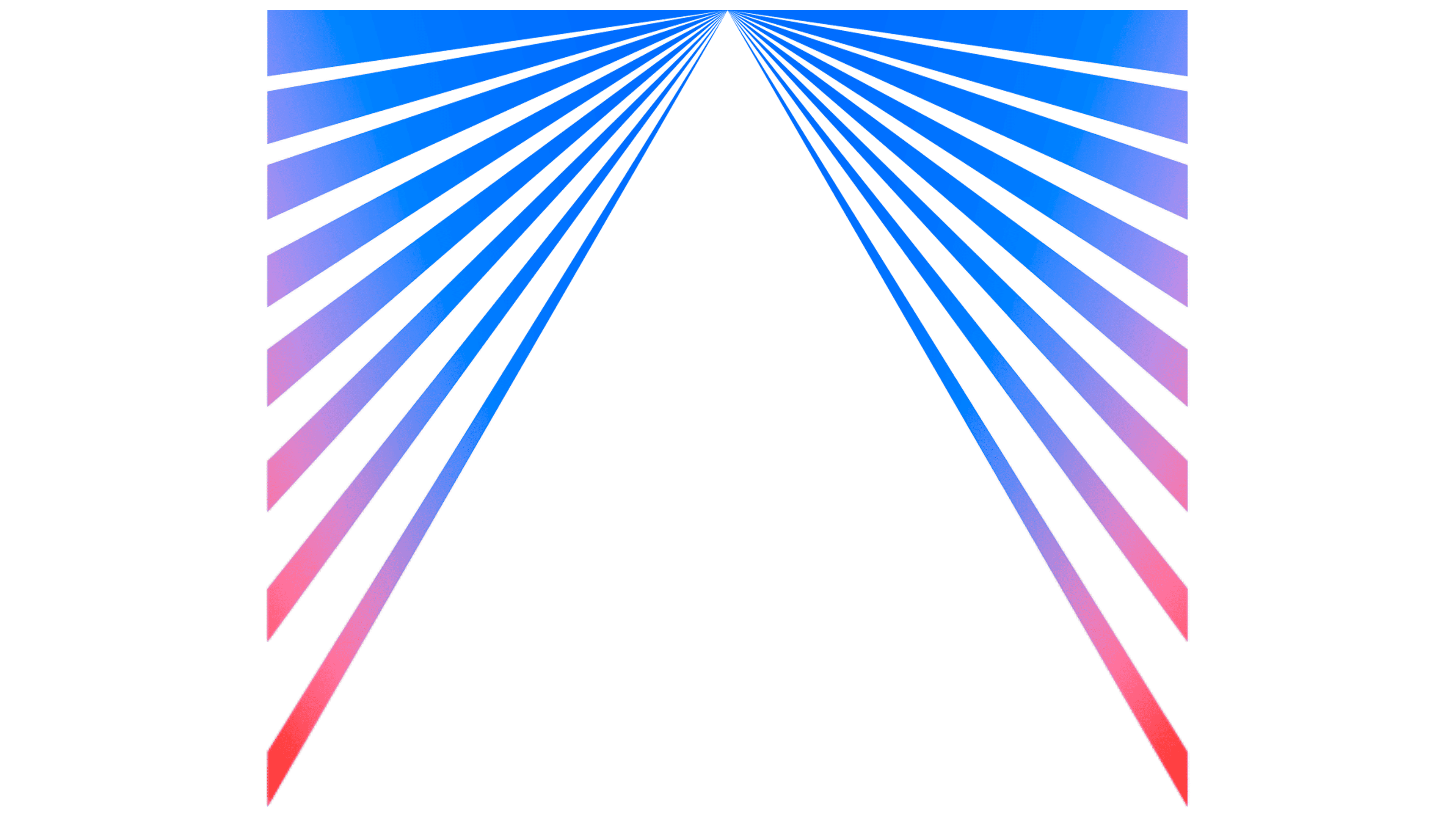
The colors reflect those changes in light. Blue transitions through purple and pink to red, echoing the shift between cool and warm tones in the mountains. The organizers associate azure and dark blue with altitude, ice, and the horizon. Pink and red recall alpenglow, the light that illuminates mountain peaks at sunrise and sunset, and convey the energy of competition. White references Mont Blanc.
The ALPES 2030 lettering also uses a gradient. A custom typeface was drawn by hand, drawing on French typographic traditions. Tall letters echo the vertical lines of the mountains, while strokes leaning in different directions suggest gliding and slalom skiing. Heavy strokes combine with thin connections, flared forms, and angled terminals. The organizers describe the lettering as neo-vintage.
Reviewers at Graphéine compared the letters to Peignot, designed by A. M. Cassandre in 1937. In their view, familiar forms have been given an athletic interpretation. They also compared the repeated rays to Roger Excoffon’s striped sports pictograms for Grenoble 1968. Both comparisons come from the reviewers, while the organizers describe the Alpes 2030 typeface as original.
The Games’ name has also been shortened. Alpes 2030 replaces both Alpes Françaises 2030 and French Alps 2030. International materials retain the French spelling Alpes. According to Sakkas, the shorter form is easier to use outside France. It connects resorts, towns, and sports infrastructure across the Auvergne-Rhône-Alpes and Provence-Alpes-Côte d’Azur regions.
Before the June presentation, a temporary French Alps 2030 logo identified the region as the host and included the rings and Agitos. The new emblems represent the upcoming competitions. For France, the Games will continue a Winter Olympic history that includes Chamonix in 1924, Grenoble in 1968, and Albertville in 1992. At the launch, the organizing committee connected its preparations to the country’s accumulated experience hosting the Games, including Paris 2024.
The rays, peaks, and points of convergence appear in animation and materials for different stages of the preparations. A capsule merchandise collection featuring both emblems was released for the official Olympic store to coincide with the unveiling.