![]() ARK Survival of Fittest Logo PNG
ARK Survival of Fittest Logo PNG
The ARK Survival of the Fittest logo refers to brutal trials where battles are about survival. The wild landscape is characterized by ruthless competition, where instincts matter just as much as strategy. Emerging from a popular game universe, the project quickly established its identity, adding intense battle royale dynamics and making every second of combat decisive.
ARK: Survival of the Fittest began as a multiplayer spin-off by Studio Wildcard, released independently in March 2016 as a free-to-play Multiplayer Online Survival Arena (M.O.S.A.). Initially conceived as a competitive version of the original ARK: Survival Evolved, it soon evolved into a distinct title emphasizing faster, battle royale-style gameplay.
The game quickly gained attention within the esports community, notably through tournaments organized by Studio Wildcard, which offered a $50,000 prize pool and attracted thousands of viewers on Twitch. Throughout mid-to-late 2016, major updates introduced customizable matches, new arenas, and faster dinosaur-taming mechanics, enhancing competitive intensity.
Despite these innovations, active updates slowed considerably in 2017, as developers refocused on the main ARK game. Elements from Survival of the Fittest, however, were later integrated into the primary game by 2018, underscoring its lasting influence within the franchise.
As of 2023, although active support has largely ended, Survival of the Fittest continues to maintain a dedicated player community and remains recognized for its unique blend of dinosaur-taming, survival, and battle royale mechanics.
Meaning and History
![]()
What is Ark Survival of the Fittest?
This multiplayer battle royale game was developed as a spin-off of the popular survival project. Players are placed on an island where they must fight each other, gather resources, build shelters, and tame prehistoric creatures, including dinosaurs. Battles take place in an ever-shrinking zone, forcing participants into direct encounters. Tactical decisions, teamwork, and tamed creatures in combat define the gameplay dynamics. The last surviving player or team, having best adapted and utilized the game world’s opportunities, emerges as the winner.
2017 – today
![]()
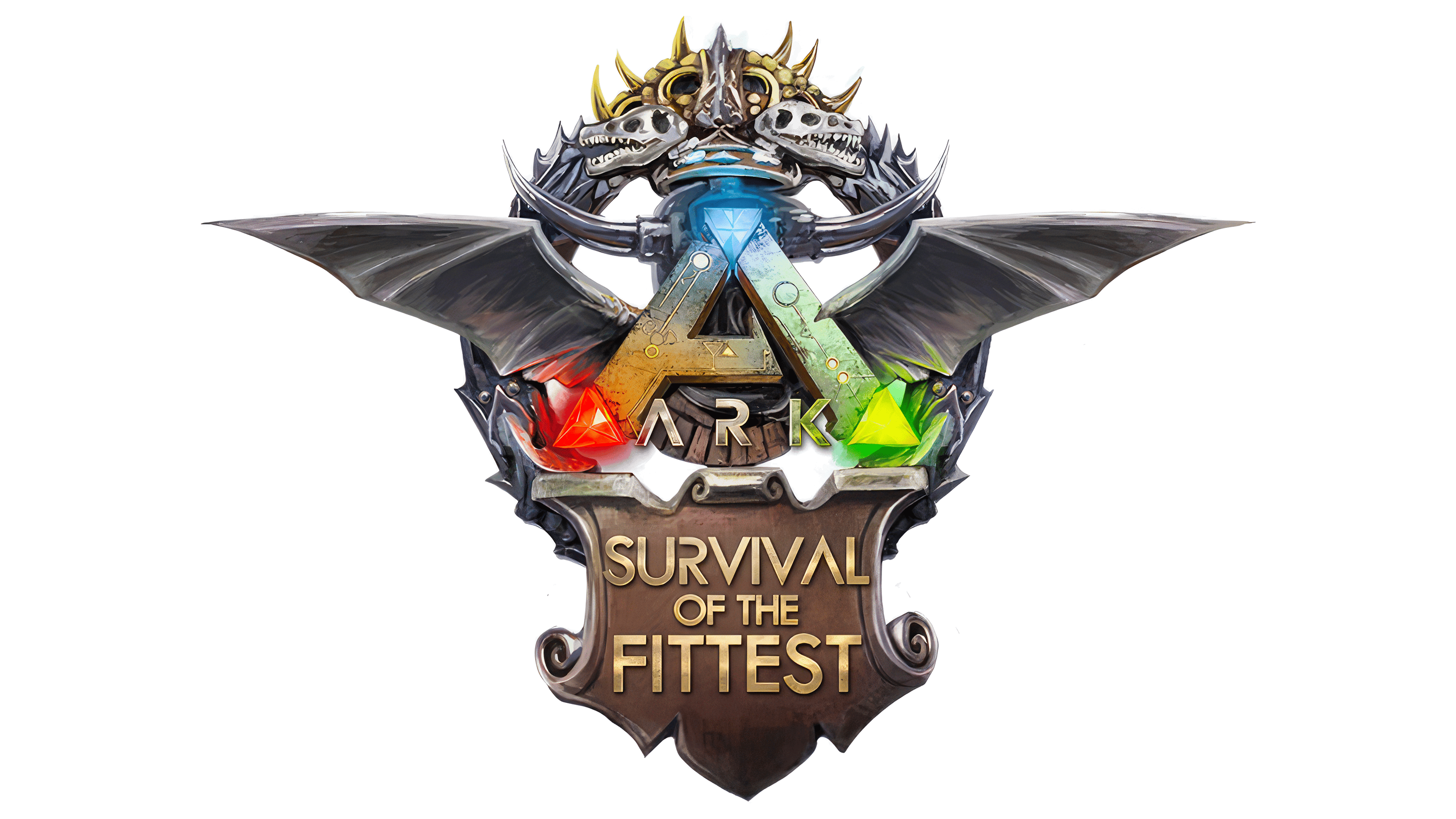
The ARK: Survival of the Fittest logo first appeared in November 2015 in the official media section of the developer’s website, accompanied by the caption “By Jatheish.” Later versions published in April 2016 confirm the designer’s involvement in shaping the project’s visual identity. The game was conceived as an arena with a competitive atmosphere, which was reflected in the emblem.
The composition is built symmetrically and features multiple layers. In the center is a triangular metallic construction processed to show scratches, chips, and traces of oxidation. At the vertices are three bright crystals: red, blue, and yellow-green. They glow from within, enhancing the illusion of an energy source. In the lower part of the triangle is the word “ARK,” set in a spaced, geometric style, with the letter lines highlighted by a neon glow that matches the crystals’ color.
The second layer of the composition consists of metal mechanical elements resembling wings or feathers. Sharp protrusions create the impression of a techno artifact, emphasizing the game’s aggressiveness and combat character. The effect is strengthened by the massiveness and cold gray shades that give the background weight and contrast.
The lower part of the logo is assigned to the inscription SURVIVAL OF THE FITTEST. The typeface is massive, with a texture that imitates embossing or engraving. The letters are colored in gold with patinated edges and highlights as if they were carved into a metal plate. The inscription is integrated into a shield-shaped frame, beveled with additional elements of the same material as the triangle above.
The background layer is decorated with a glowing turquoise halo. It softens the contrast between the heavy metallic forms and adds a plasma glow effect. The color palette is built on the combination of gray metallic textures, gold lettering, and acidic accents from the crystals.
The visual concept falls within the “sci-fi metal tribal” direction, characterized by symmetry, crystalline inserts, brutal surfaces, and artificial lighting. The emblem acts as a sign of the arena, embodying combat and the game of survival.