The Arm & Hammer logo is confident and strong. The emblem demonstrates the originality and personal style of the company. The symbol offers users reliable and effective assistance through its products.
Arm & Hammer: Brand overview
| Founded: | 1846 |
| Founder: | Church & Dwight |
| Headquarters: | United States |
| Website: | armandhammer.com |
Arm & Hammer is a brand of products containing baking soda, officially registered in 1886 but produced since 1846. It is sold in 100 countries and is most popular in the United States. It is one of the trademarks of the Church & Dwight company.
Meaning and History
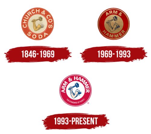
Despite three rebrandings, the owners could not come up with a better idea than the one developed in 1846. The brand’s emblem can be considered one of the oldest in the industry. Each update only affected the change of shades. The overall concept remained unchanged. The rebrandings themselves were related to the change of brand owners. The commitment to the image of an arm and a hammer is a desire to retain customers, as information about the brand’s products was passed down from generation to generation, and the symbol inspires trust.
What is Arm & Hammer?
An American brand owned by the chemical company Church & Dwight. The brand produces baking soda, toothpaste, laundry detergents, and cleaning products based on or containing soda.
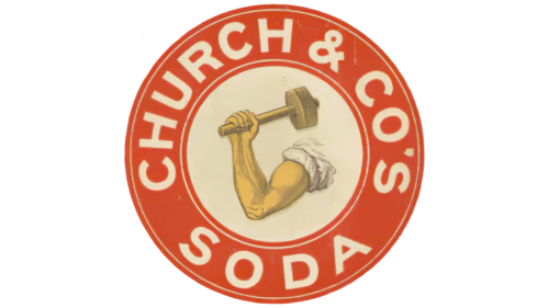
1846 – 1969
The emblem is designed as a circle. Around the edge, there is the inscription “Church and Co” and the name of the product: Soda. In the center is an image of a muscular arm in a shirt holding a hammer.
The Church brothers invented the first logo. They used their father’s idea and his partner John Dwight’s for the production of soda and released the product as the company Church and Co.
The history of the appearance of the arm with a hammer is quite complex since the image is not directly related to the soda. Before the soda business, one of Church’s sons was involved in spices, managing Vulcan Spice Mills. The arm and hammer belong to the Roman god Vulcan, in whose honor the shop was named. The name was chosen because of the sharpness and strength of the spices, although the deity patronized fire, volcanoes, blacksmiths, and metalworking.
When the idea of producing soda emerged, the emblem of the hand was transferred to the logo of the new product, and to somehow link the image and the trademark, over time (1867), it was named Arm & Hammer.
The drawing is vaguely reminiscent of the following:
- Obtaining soda at a plant using the Leblanc method. The worker’s hand symbolizes hard work.
- The powerful action of soda, which helped to remove stains.
- The impeccable quality and purity of the product.
Interestingly, the brand was often associated with the name Armand Hammer, who also owned a chemical business. The magnate even wanted to buy the company to get rid of constant questions. He acquired many shares in the soda brand and remained one of its owners until his death. However, the name has nothing to do with his name.
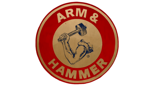
1969 – 1993
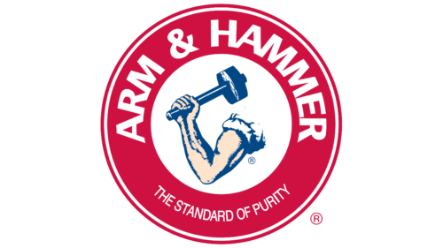
1993 – today
Church & Dwight began active advertising campaigns to maintain commitment and loyalty to soda-based products. Among the comprehensive promotion measures were rebranding. The logo was made bright and light.
White letters and a white background for the corporate image increased the clarity of the picture, so it was better remembered in detail. With this decision, the owners practically demonstrated the whitening action of soda. The color also evoked associations with the product itself.
In the lower part of the circle, there was a slogan indicating the main advantage of the company’s products: the standard of cleanliness.
The round shape is a symbol of harmony. The company’s product is perfect and has multiple applications. With the arrival of soda in the house comes cleanliness, safety, and the smell of baking in the kitchen. The circle is a symbol of a seal as a sign of quality.
Font and Colors
The two main colors of the logo are red and white, symbolizing strength and fast action.
- White – the color of purity, whitening, and purified soda. It indicates both the action and the appearance of the product.
- Red – conveys strength, effectiveness, and chemical processes. Hints at consumer love for the brand. The shade symbolizes temperature, as the action of soda in baking and washing powders is related to heating.
The font is smooth and even in uppercase. The lower parts of the letters are connected. The technique conveys the idea of multiple products connected by one main action – cleaning and disinfection due to the common ingredient.
Arm & Hammer color codes
| Rich Carmine | Hex color: | #ce1141 |
|---|---|---|
| RGB: | 206 17 65 | |
| CMYK: | 0 92 68 19 | |
| Pantone: | PMS 192 C |
| Almond | Hex color: | #fee4cd |
|---|---|---|
| RGB: | 254 228 205 | |
| CMYK: | 0 10 19 0 | |
| Pantone: | PMS 475 C |
| Dark Cerulean | Hex color: | #004885 |
|---|---|---|
| RGB: | 0 72 133 | |
| CMYK: | 100 46 0 48 | |
| Pantone: | PMS 301 C |
