The Ashok Leyland logo is high-tech and modern. The brand offers passenger and commercial vehicles that can travel on high-speed highways and off-road. The emblem displays the diversity of products characterized by technical excellence. The logo has dynamics and a desire to achieve the goal with its developments; it is aimed at the consumer, indicating high-tech products and customer focus.
Ashok Leyland: Brand overview
Ashok Leyland is an Indian engineering flagship founded by the British Hinduja Group. The Ashok Leyland logo can be seen on trucks, passenger vehicles, and special vehicles. Up to 83 thousand cars are produced per year.
The plant was opened in Chennai, south of India, with the Prime Minister’s assistance. Initially, it was called Ashok Motors. After the merger with Leyland Motors, a wide range of cars began to be released. Now, the company has six factories in India, the Czech Republic, and the UAE and employs 12,000 employees.
Meaning and History
The emblem demonstrates the connection between the company and its customers. All company developments aim to serve and improve people’s lives, facilitating their work.
What is Ashok Leyland?
It is an Indian automobile manufacturer headquartered in Chennai. It is one of India’s largest commercial vehicle manufacturers, producing many products, including trucks, buses, military, and light commercial vehicles. Known for its quality, it supplies reliable and durable vehicles to various industries. The company emphasizes advanced technology in the development of its vehicles.
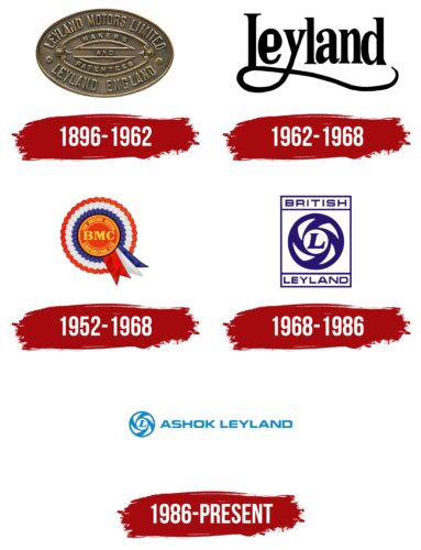
1896 – 1962
The logo of Ashok Leyland, which the company uses today, does not directly link to the mid-20th-century period when the company was formed. The original name, “Leyland Motors,” is associated with a British company known for its cars and buses. This name remains a symbol of quality and reliability in the automotive industry.
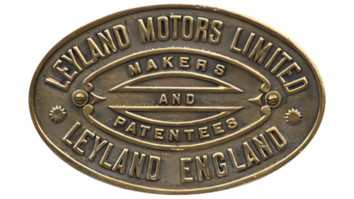
The current logo of Ashok Leyland features an oval metallic plate reminiscent of a quality seal. This design element symbolizes the company’s commitment to high standards in its production. The logo asserts that the company engages in assembly and patenting, highlighting its innovative approach to vehicle manufacturing.
The elegantly engraved and forged details in the logo illustrate the company’s professionalism and attention to detail, key aspects of the automotive industry. At the bottom of the logo is information that the manufacturer is located in Leyland, England, adding historical significance to the logo and emphasizing its origin.
Ashok’s collaboration with the manufacturer began when the British company was British Leyland. After the dissolution of this corporation, Ashok Leyland continued to use the Leyland brand, which remains associated with quality and reliability in vehicle production.
1962 – 1968
In 1962, Leyland Motors strategically merged with competitors, marking a significant turn in the company’s history. This move was accompanied by a logo change, in which the company name was shortened to “Leyland.” The new logo was designed with calligraphy principles in mind, which lent it a special elegance and beauty. This design reflected a new era in the company’s life and emphasized its commitment to excellence technically and in the design of its products.
Leyland Motors vehicles are recognized for their technical excellence and appealing appearance, making them attractive to consumers. The elegant black color of the logo symbolizes dominance and superiority over competitors, emphasizing the company’s status and reputation as a leader in the automotive industry.
The letters in the logo are designed to appear as if reaching up to the sky. This is a stylistic choice, a visual expression of the company’s ambitions to achieve new heights and constant growth.
1952 – 1968
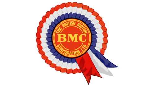
The emblem of the British Motor Corporation Limited (BMC), a leading car manufacturer in the UK, was designed to symbolize and emphasize the company’s uniqueness and British identity. The logo, shaped like a rosette of honor and painted in the colors of the English flag, clearly indicates the company’s origins. Using an honorary emblem in the logo design was a strategic choice to highlight the company’s pride in its British heritage and high product quality standards.
The rosette symbol in the BMC logo carries deep significance. Consisting of many petals, the rosette symbolizes unity and cohesion, which is particularly important for BMC, given its history. The company was formed by merging several car companies, and this logo was intended to reflect the unified character and strength of the new corporation. Each petal of the rosette can be seen as an individual component of this union, forming a strong, cohesive organization.
The logo design aims to convey that BMC cars are worthy of the highest praise, as indicated by the rosette symbol. This creates an impression that each vehicle produced by the company is a product of the highest quality and innovative technology, and each customer acquires a symbol of prestige and reliability.
1968 – 1986
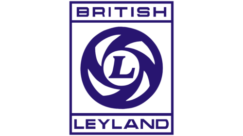
The logo of British Leyland (BL), introduced after the merger and nationalization of several automotive companies in 1968, visually reflects this significant historical period for the British automotive industry. It features a rectangular symbol with a purple border, adding a sense of rigor and formality. This design highlights the official status of the conglomerate under state ownership.
The logo prominently displays the word “British” at the top, paying homage to the roots and history of the preceding organization, the British Motor Corporation (BMC). At the bottom is the word “Leyland,” emphasizing the company’s new identity following its merger with Leyland Motors and other manufacturers. These elements together form the full name under which the company was initially known—British Leyland Motor Corporation.
Soon after nationalization, the name was shortened to the more concise and modern “British Leyland,” shown on the logo. At the center of the new emblem is a symbol resembling a commercial vehicle’s wheel, signifying collaboration. This element has a deep symbolic meaning, reflecting the company’s industrial strength and engineering expertise. The letter “L” on the wheel disc stands for Leyland and symbolizes leadership and reliability—key attributes the company aimed to highlight in its products.
1986 – 2011
The logo consists of an elegant emblem followed by the company’s name.
The picture reminds:
- Camera shutter. The lens is slightly opened, and the letter L, representing the company, is at the center of attention. The composition demonstrates the stardom and popularity of the company. Indicates that everyone pays attention to the corporation. She is at the center of the news, and competitors look up to her.
- The wheel is the main symbol of movement and machines. It is not simple but has impressive carved discs, indicating the car’s style and modern and fashionable design.
- The spinning wheel is part of the Indian flag as a sign of independence and the ability to produce the necessary goods for life. It was chosen in honor of the country where the company is based.
- The two parts of the tornado, spinning, mix and form a conglomerate, indicating the enterprise’s emergence through the merger of Ashok Motors and Leyland Motors in 1955. A new firm has taken over the round badge from Leyland.
- Target in a target. The company always hits the target with its developments. They fully meet customers’ needs, are well thought out, and are functional.
The combination of white and blue elements indicates the manufacturer’s two branches: ACCL and PLHT (machines and components).
Font and Colors
The main color of the logo is light blue. It alludes to the expanse of heaven and the movement towards a dream. The logo indicates the great heights that the firm has reached.
The inscription font is unique and designed specifically for the logo. The style is light and free, with unusual roundings at the ends of the letters, reminiscent of streamlined car bodies and perfect parts fit.
