The BA Connect logo warmly invites you on board. The emblem conveys comfort, lightness, and tranquility thanks to the drawn smooth curve in the air. The color scheme highlights a commitment to the homeland and a connection with the giants of British aviation.
BA Connect: Brand overview
British Airways launched British Airways CitiExpress on March 1, 2002. British Regional Airlines, Brymon Airways, BA Regional, and Maersk Air UK were among the regional airlines that combined to become this. With over 100 aircraft in its fleet and almost 3,000 personnel, the merger was a well-planned creation that made it the largest regional airline in Europe.
The company expanded its route network in London in 2002–2003, linking UK regional airports with the airline’s primary hubs, Heathrow and Gatwick. The airline performed about 1,000 flights a week on more than 100 routes. The aircraft in the fleet were mostly Dash 8-300, Avro RJ100, Embraer ERJ 145, and BAe 146.
The company streamlined its operations in 2004 by eliminating roughly 200 positions and canceling several unproductive routes. These actions were required to raise financial performance and operational effectiveness.
British Airways’ management decided to rename the regional airline in December 2005. Following a thorough examination of the market and discussions with marketing specialists, they determined to make a more obvious division between the primary British Airways brand and its regional operations.
The formal announcement of British Airways CitiExpress’s rebranding to BA Connect was made on January 16, 2006. The new brand was given a different livery from British Airways’ standard. The repainting procedure took many months to finish by the middle of the year.
Between February and October 2006, the company added flights to Newquay (Cornwall), Milan, and Paris, among other destinations, as part of its ongoing route network expansion. Despite its expansion, the business experienced financial challenges, reporting losses of 6.9 million pounds sterling for the 2006 fiscal year.
Unexpectedly, on November 3, 2006, British Airways announced that it would sell the regional airline to Flybe. This decision was taken after carefully evaluating the airline’s development potential and financial status. As per the terms of the agreement, British Airways was to receive a 15% share in the enlarged Flybe.
Transferring the regional airline’s assets to Flybe started in November 2006 and ended in March 2007. Most of the crew, route network, and fleet were transferred during this procedure. Nevertheless, British Airways continued to oversee operations at London City Airport, which were later given to BA CityFlyer, a new company.
The sale to Flybe was finalized on March 25, 2007. The regional airline was formally dissolved as a distinct business on this day. Some staff were transferred to Flybe, and the company took over the management of the majority of routes and aircraft.
Meaning and History
What is BA Connect?
It was a British regional airline owned by British Airways. It operated short-haul flights within the UK and to various European destinations. Known for providing regional connectivity, it served routes linking smaller cities with major hubs. The airline offered travel options for both business and leisure travelers. The company was eventually sold to regional airline Flybe, which integrated its routes and operations into its network.
2002 – 2006
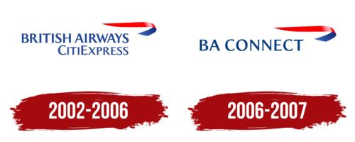
BA Connect was founded in 2002 and operated until 2006 as a regional carrier within the British aviation group. The airline emerged after British Airways acquired Brymon Airways, marking a significant event in the UK aviation industry. As a result of this merger, the first emblem of BA Connect included the name British Airways CitiExpress, highlighting their direct connection with the leading national carrier.
The company specializes in domestic flights, providing fast and convenient connections between major cities in the UK. This was crucial for meeting the needs of both business passengers and tourists seeking to optimize their travel time.
A distinctive feature of the BA Connect brand was the logo with a curved red and blue ribbon in the upper right corner. This element symbolized the speed and efficiency offered by the company to its clients—quick access to any part of the country. The shape of the ribbon, suggesting movement in both directions, visually demonstrated the carrier’s principle of operation: frequent and fast flights serving the needs of passengers traveling across the country.
The logo’s color scheme—red and blue—was aesthetically appealing and held deep symbolic meaning, emphasizing the company’s connection to the UK. These colors are part of the national flag and are widely associated with the British state and cultural symbols, reinforcing BA Connect’s image as a reliable and recognizable national carrier.
2006 – 2007
The BA Connect logo prominently features the British Airways acronym, with the first two letters starting the one-line text. The airline’s name uses a Roman script with small, spike-like serifs. All letters are uppercase, bold, and geometrically proportioned. To the right of the text is a curved red and blue ribbon, which complements the second part of the name and suggests a connection. A light reflection on the red band adds a dynamic touch.
The Roman font with small serifs conveys sophistication and professionalism. The curved red and blue ribbon introduces color and evokes a sense of cohesion and flow, reinforcing the “Connect” aspect of the name. The light reflection on the red band enhances the logo’s dynamic feel, suggesting movement and energy.
The uppercase, bold letters emphasize strength and reliability, essential qualities for an airline. The geometrically proportioned font adds to the logo’s clarity and readability, ensuring it stands out prominently.
The gentle curve of the red and blue ribbon adds visual appeal and symbolizes unity and connection. The interplay of red and blue, traditional colors associated with British Airways, maintains brand continuity while adding a fresh element to the logo.
The light reflection on the red band gives the logo a lively and modern touch. This subtle detail suggests dynamism and progress, aligning with the airline’s mission to connect people and places efficiently.
