Bentley, whose image has long been associated with the tradition and luxury of British automotive excellence, has taken a bold step by introducing an updated version of its emblem featuring the legendary winged letter B. The carmaker chose not to abandon its historic heritage, clearly infusing its symbolism with the freshness and dynamism of a new era.
Since the initial appearance of the Bentley logo, originally designed by F. Gordon Crosby over a century ago, changes have been rare and cautious. The current version was developed by a team led by Robin Page with input from Yeon Nam, a talented automotive interior designer. The appearance of the new emblem has become more elegant and minimalist, completely shedding the heaviness of the past.
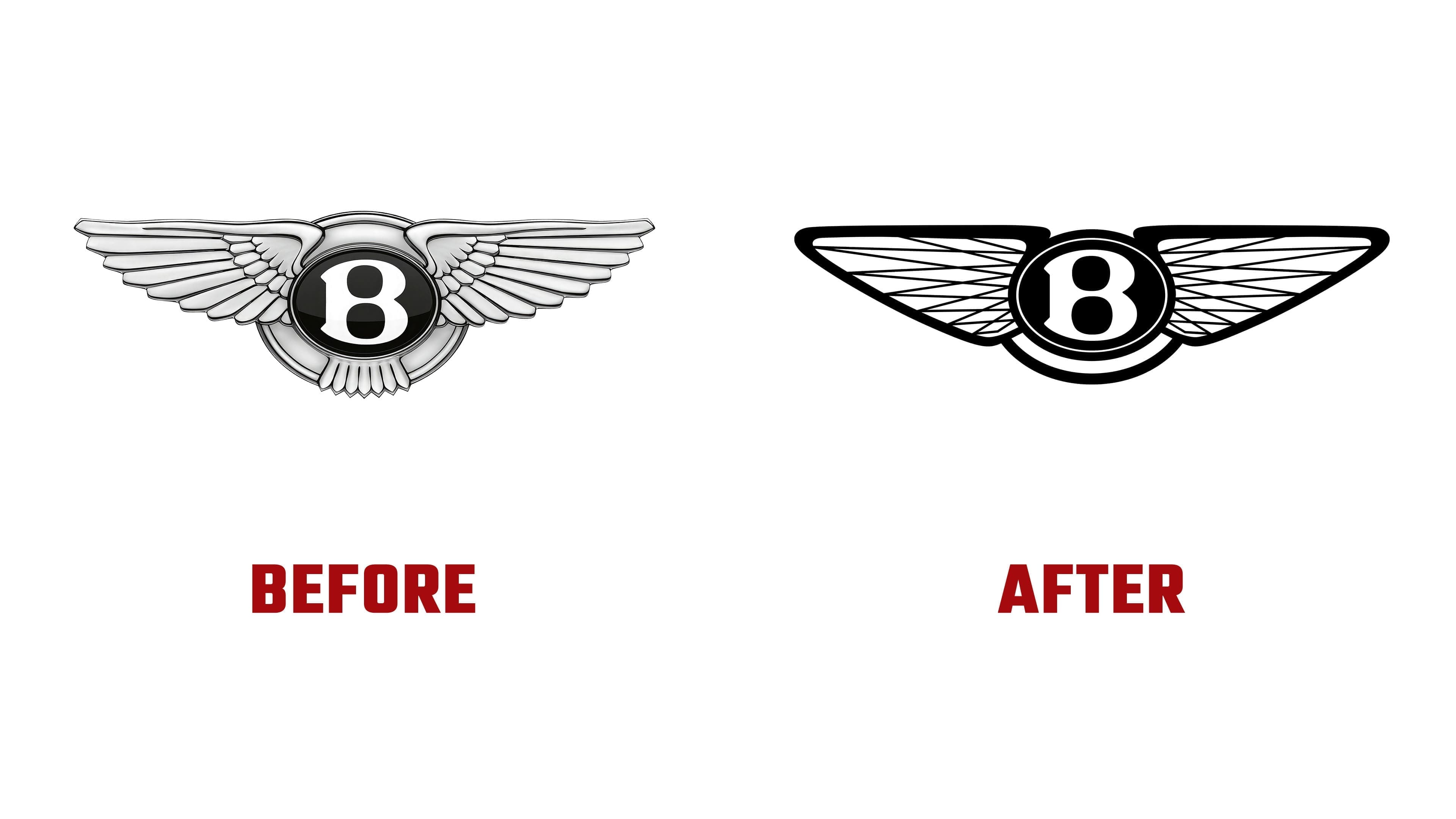
The wings have become sharper and adopted a diamond-shaped structure reminiscent of a swift and predatory peregrine falcon’s wingspan. This alludes to the speed and character of new models soon to be unveiled. Decorative feathers under the central letter B have been completely removed, simplifying the composition and making it more contemporary.
The central part of the logo is now encircled by a thin, beveled ring, creating a metallic finish effect, allowing the letter B to be used independently of the wings in the company’s branding and graphics. This innovation gives Bentley’s emblem sophistication and visual impact, maintaining the brand’s recognition and authority.

This new symbol coincides with an important milestone for the company, the presentation of an electric car concept, marking the beginning of a new chapter in luxury. The emblem reflects the brand’s ambition to remain relevant without abandoning its roots.
In addition to the main emblem, the company introduced a flat version of the symbol designed for digital use and various communication platforms. It fits perfectly with modern minimalist trends that have already influenced other car manufacturers such as Audi and Aston Martin.
The updated winged letter B serves as a bridge between Bentley’s heritage and modernity, demonstrating how the brand can adapt to change while staying true to its identity.