![]() BlackBerry Logo PNG
BlackBerry Logo PNG
The BlackBerry logo shows the small size and versatility of the company’s gadgets. It hints at a long search for its niche in the market and a test of the pen in several related directions. The emblem encodes the gradual growth and maturation of the brand.
BlackBerry: Brand overview
| Founded: | January 19, 1999 |
| Founder: | BlackBerry Limited |
| Headquarters: | Canada |
| Website: | blackberry.com |
Meaning and History
![]()
The BlackBerry brand was developed by the American marketing corporation Lexicon Branding. She closely linked its logo and name, depicting a multifilament fruit and the inscription “BlackBerry” on the trademark. This word was not chosen by chance: the company’s specialists thought that the black device with many small buttons is very similar to the famous forest berry.
What is BlackBerry?
It is a mobile device brand owned by BlackBerry Limited. It started as a pager startup but gradually moved to full-featured communicators. His technique belongs to the category of business smartphones.
1996 – 1999
![]()
Initially, the logo was a large inscription “Inter@ctive.” It was cursive, white, with an imitation of calligraphic handwriting. The first letter in it was uppercase; the rest were lowercase. At the same time, they were at some distance from each other and had a free location. An interesting typographic technique was the replacement of the classic “a” with a non-standard “@.” In this way, the designers emphasized the electronic focus of the brand. The text was light, so it stood out clearly against a dark background.
1999 – 2004
![]()
The debut emblem consists of a balanced combination of graphic and text elements. At the top, there is a stylized envelope with a thin wavy line twisting from the left corner. It is connected to the contour of the letter and continues it harmoniously. At the bottom is the one-piece trademark name – “BlackBerry.” The word is written in capital letters and divided by color into two fragments: the left zone is red, the right one is black. Above each of them is one of the graphic elements: above “Black” is a curved strip, above “Berry” – an envelope. The main background for all elements is white.
2004 – 2022
![]()
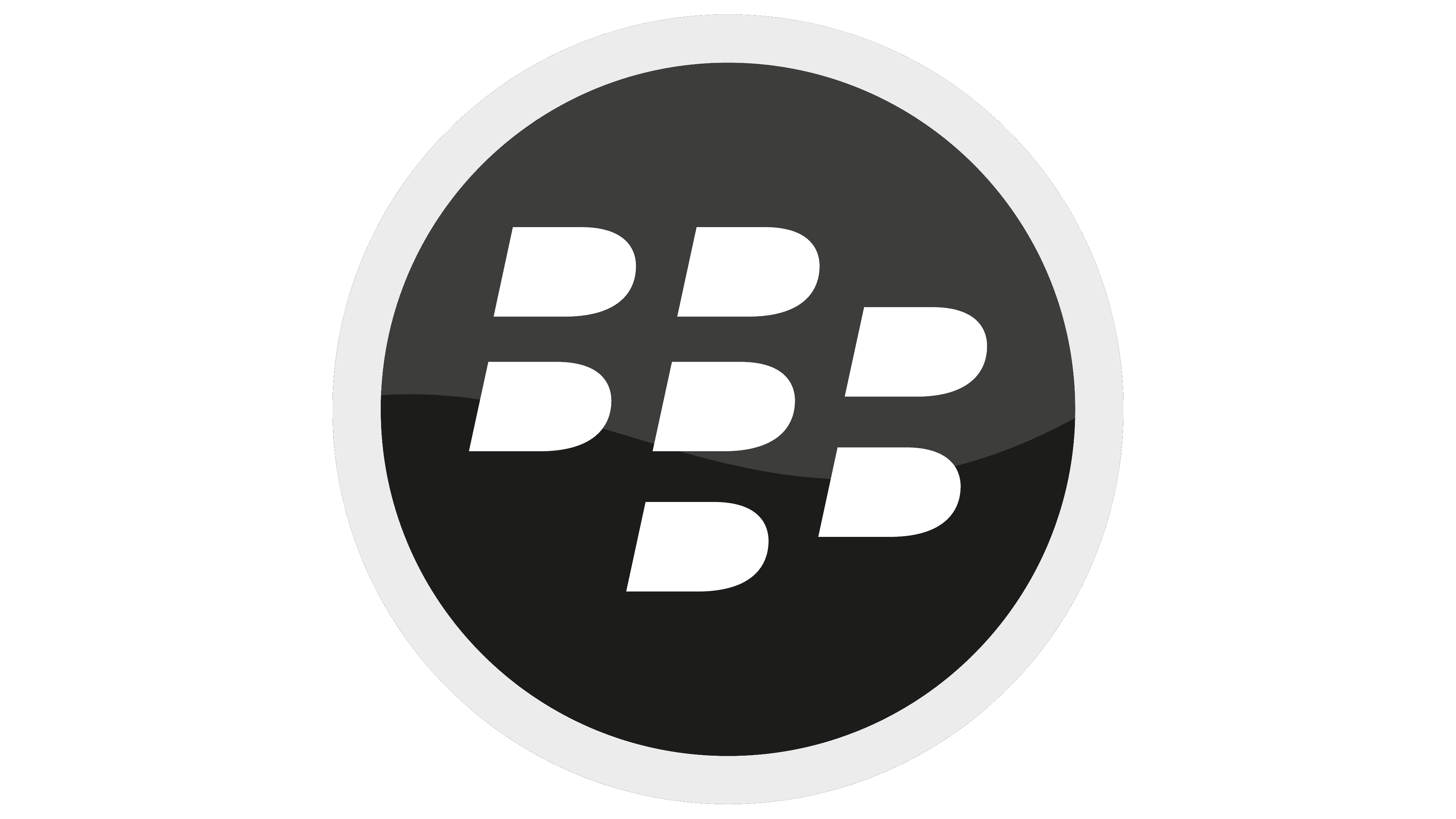
The emblem consists of seven semi-ovals, which coincide with the in-letter gaps “B” in shape and size. To create these elements, the designers used the original negative space art technique. Even though the graphic sign components are arranged chaotically, their proportions and style are strictly prescribed in the brand documents.
BlackBerry: Interesting Facts
BlackBerry, once a smartphone’s top name, has an interesting story filled with ups and downs.
- Canadian Roots: Founded in 1984 by Mike Lazaridis and Douglas Fregin in Waterloo, Ontario, BlackBerry started as Research In Motion (RIM), focusing first on wireless tech before moving into mobile phones.
- The First BlackBerry: The BlackBerry 850, launched in 1999, was the brand’s first device. It was a two-way pager that could send emails and messages, starting BlackBerry’s move into mobile communication.
- QWERTY Keyboards: BlackBerry got popular thanks to phones with full QWERTY keyboards. These were a hit with business folks who needed to email and text on the move.
- BBM: In 2005, BlackBerry Messenger (BBM) was one of the first instant phone messaging apps. It lets BlackBerry users chat in real time, which is why people love BlackBerry.
- Loved by Governments and Businesses: BlackBerry phones, known for strong security, were chosen by government agencies and corporations for safe communication. Even the White House used them.
- Peak and Fall: By 2012, BlackBerry had over 80 million users worldwide. However, the iPhone and Android phones took over, and BlackBerry’s popularity dropped as people switched to these new options.
- Switch to Software: As phone sales went down, BlackBerry started focusing on software and services, like cybersecurity and automotive software, instead of making phones.
- BlackBerry OS: BlackBerry made its operating systems, including the modern BlackBerry 10. Although well-received, it couldn’t compete well with Android and iOS.
- Licensing the Brand: Recently, BlackBerry began licensing its brand to other companies. This led to new Android-powered BlackBerry phones made by firms like TCL Communication, combining BlackBerry’s security with Android’s features.
- Automotive Impact: BlackBerry’s QNX software is big in cars, used for entertainment systems, and helps cars drive safely.
BlackBerry’s story is about starting strong in the phone market, facing tough times, and then changing to focus on software and other services. Despite the challenges faced by smartphones, BlackBerry is still pushing forward and finding new ways to grow.
Font and Colors
The copyright holder of the logo prohibits distorting the image. It only allows changing the color palette – and then within certain limits. The main shades of preference are classic white, black, Obsidian Blue, Blackberry Blue. Also, additional blue tones are allowed: Indigo, Space, Ocean, Regal, Azure, Brilliant. Accent colors can be turquoise and satin.
In the new logo, the two “Bs” give the brand name a distinct sonic expression. In writing, they are originally stylized and converted to upper case. Their uniqueness is emphasized by the Roboto typeface, invented by Christian Robertson for Google products. Bold, italic, and sans serif letters.
FAQ
What is the meaning of the BlackBerry logo?
The logo is designed to look like a blackberry fruit. It has eight ‘bits,’ with seven visible and one missing as if someone took a bite out of it. This plays on the word “byte,” connecting the logo to the tech world.
The negative space in the logo forms multiple letter B’s, representing the brand name “BlackBerry.” This dual symbolism highlights the brand’s identity and creativity, linking it to technology and the fruit.
The logo’s simple and clever design makes it easy to recognize and remember, showing the brand’s innovative and tech-savvy nature.
What are the BlackBerry company colors?
The company colors are blue and black, which are used consistently in their branding to create a strong, recognizable visual uniqueness.
The specific shade of blue is Pantone® 285 C, with the hex code #1475DC. This vibrant blue, paired with black, gives a professional and sleek look, reflecting the brand’s focus on innovation and technology.
Using these colors helps convey BlackBerry’s image as a reliable and cutting-edge tech company, reinforcing its brand identity across various platforms and marketing materials.
What font is the BlackBerry logo?
The logo uses a custom grotesque typeface similar to Nimbus Sans Bold. This italicized font adds elegance and sophistication. Its bold, clean lines reflect the brand’s commitment to innovation and professionalism. The italicized design conveys a sense of forward movement and modernity, aligning with BlackBerry’s image as a cutting-edge tech company.
This unique typeface makes the brand wordmark distinct and easily recognizable, contributing to a strong brand identity across various media and marketing materials.
What does the BlackBerry symbol mean?
The symbol comprises seven D-shaped figures arranged in three columns (2-3-2). This design creates two letter B’s in the negative space of the first and third columns, symbolizing “Black” and “Berry.”
The D-shaped figures resemble the texture of a blackberry fruit, linking the logo to the brand’s name. The logo’s simplicity and ingenuity make it easily recognizable and memorable, reinforcing the brand’s strong identity in the tech industry.
How many dots are on the BlackBerry logo?
The logo has seven elements that look like small buttons, similar to those on BlackBerry devices. These elements resemble seeds of a blackberry fruit, tying into the brand’s name.
This symbolism links the logo to the brand’s identity, reflecting both the design of the devices and the fruit. The seven elements are arranged to create a unique and recognizable logo, reinforcing the brand’s image and heritage.
What is the BlackBerry logo supposed to be?
The logo symbolizes the brand’s identity and heritage. It has seven elements that look like small buttons, similar to those on its devices. These elements resemble seeds of a blackberry fruit, tying into the brand’s name. This links the logo to the devices’ design and the fruit.
The logo features the brand’s name in italic type with smooth curves, giving it a sleek and modern look. To the left of the name is a seven-piece pattern that forms a shape like an uppercase “D” without an inlet space. This pattern makes the logo unique and recognizable. The main color is black, adding to its sophistication and timeless appeal. This design keeps the logo distinctive and memorable, reinforcing the brand’s image in the tech industry.
Is BlackBerry a Chinese company?
No, it is not a Chinese company. It is based in Canada, with its main office in Waterloo, Ontario. The brand has long been a developer of mobile and wireless communication solutions. Originally known for its smartphones, it now focuses on software and services, specializing in cybersecurity and the Internet of Things (IoT).
The company is a significant player in the tech industry. It operates independently of any Chinese ownership or influence. Its Canadian roots and headquarters in Waterloo are key to its identity and operations.