


 BNSF Railway Logo PNG
The BNSF Railway logo reflects the company’s power and reliability, which are hallmarks of its leadership in rail transportation. The sharp lines and contrasting colors convey a commitment to innovation, highlighting a progressive approach to developing the United States’ transportation infrastructure.
BNSF Railway was formed on September 23, 1995, after the merger of Burlington Northern and Santa Fe Pacific Corporation. Its background reaches into several older American railroads, including the Great Northern Railway, the Northern Pacific Railway, the Chicago, Burlington and Quincy Railroad, the Spokane, Portland and Seattle Railway, and the Atchison, Topeka and Santa Fe Railway.
Great Northern was founded by James J. Hill in 1889 and became known as “Hill’s Empire.” Northern Pacific received a congressional charter in 1864, while ATSF, founded in 1859, helped develop the American Southwest and operated the Super Chief between Chicago and Los Angeles. After the 1995 merger, BNSF served 28 U.S. states and two Canadian provinces, creating one of North America’s largest freight rail systems.
The early years focused on integrating dispatching, operations, and procedures across two large networks. In 1996, BNSF ordered 350 locomotives from General Electric and Electro-Motive Diesel, one of the largest single locomotive orders in U.S. railroad history. In 1999, the company opened its Network Operations Center in Fort Worth, Texas. In 2006, it announced $2.4 billion for signal upgrades, route capacity, and network modernization.
In 2010, Warren Buffett’s Berkshire Hathaway acquired BNSF for $44 billion, the largest deal in Berkshire Hathaway’s history. BNSF later invested $4.1 billion in network expansion in 2013, tested liquefied natural gas locomotives in 2014, and marked its 20th anniversary in 2015 with more than 32,000 miles of track. From 2016 to 2023, it expanded Positive Train Control, intermodal projects, alternative-fuel tests, AI-based route planning, training programs, and locomotive modernization.
Meaning and History
What is BNSF Railway?
It is one of the largest freight railroad networks in North America. It operates approximately 32,500 miles of track in 28 states and three Canadian provinces. The company is a critical component of the U.S. transportation infrastructure, moving a wide range of goods, including agricultural products, coal, manufactured goods, and consumer goods. It is a Berkshire Hathaway, Inc. subsidiary owned by Warren Buffett.
1996 – 2005
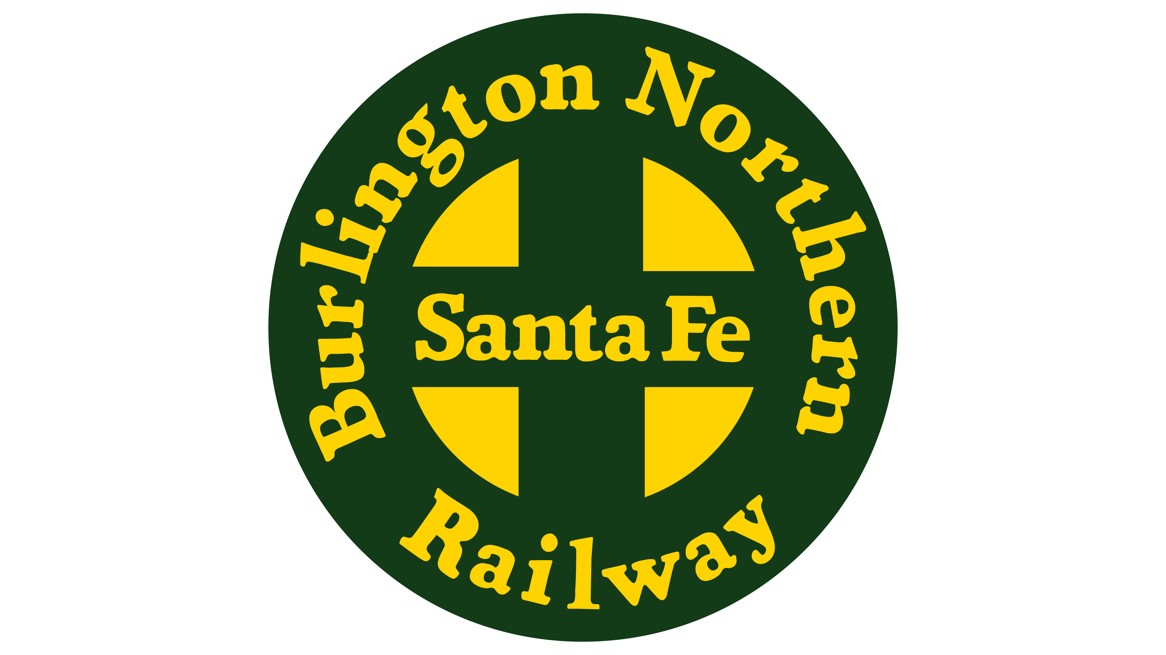
The early BNSF Railway logo was based on the Atchison, Topeka, and Santa Fe Railway emblem, from which designers borrowed the round shape, central cross, and the bold serif “Santa Fe” lettering. There are several differences between them, of course.
In the new version, the circle has a wide border containing the text “Burlington Northern Railway.” The words are arranged in a ring and use the same font as the central inscription. Slanted tops on the letters “r,” “l,” “i,” “n,” and “t” add dynamism to the emblem, showing its connection to rail transportation. This embodies the energy of freight trains traveling along the three transcontinental routes linking the western and eastern United States.
The long serifs enhance visual movement, drawing attention to the logo and making it more recognizable. At the same time, rounded lines and softened letter corners create an illusion of safety, encouraging customers to entrust their cargo to BNSF with confidence.
The negative space between four yellow triangles forms the central cross, creating a circle-like shape. The two perpendicular lines may signify the intersection of rail tracks or the crossing of railways and roads. This symbol emphasizes the importance of the transportation infrastructure, which connects cities across North America like arteries. The cross thus represents the integrity of various parts of the railway system.
The round shape resembles a wheel, another nod to the brand’s connection with trains. It can also represent a heraldic shield, highlighting BNSF’s roots and traditions. The shield, as a symbol of protection and reliability, indicates that the carrier ensures the cargo’s safety.
The emblem’s base is dark green, associated with professionalism, stability, and reliability. The lettering uses yellow, symbolizing energy and optimism. These colors are taken from the logos of the railroad companies that merged in 1996 to form BNSF Railway. Historically, yellow has represented the Atchison, Topeka, and Santa Fe Railway, while dark green has represented the Burlington Northern Railroad.
2005 – today
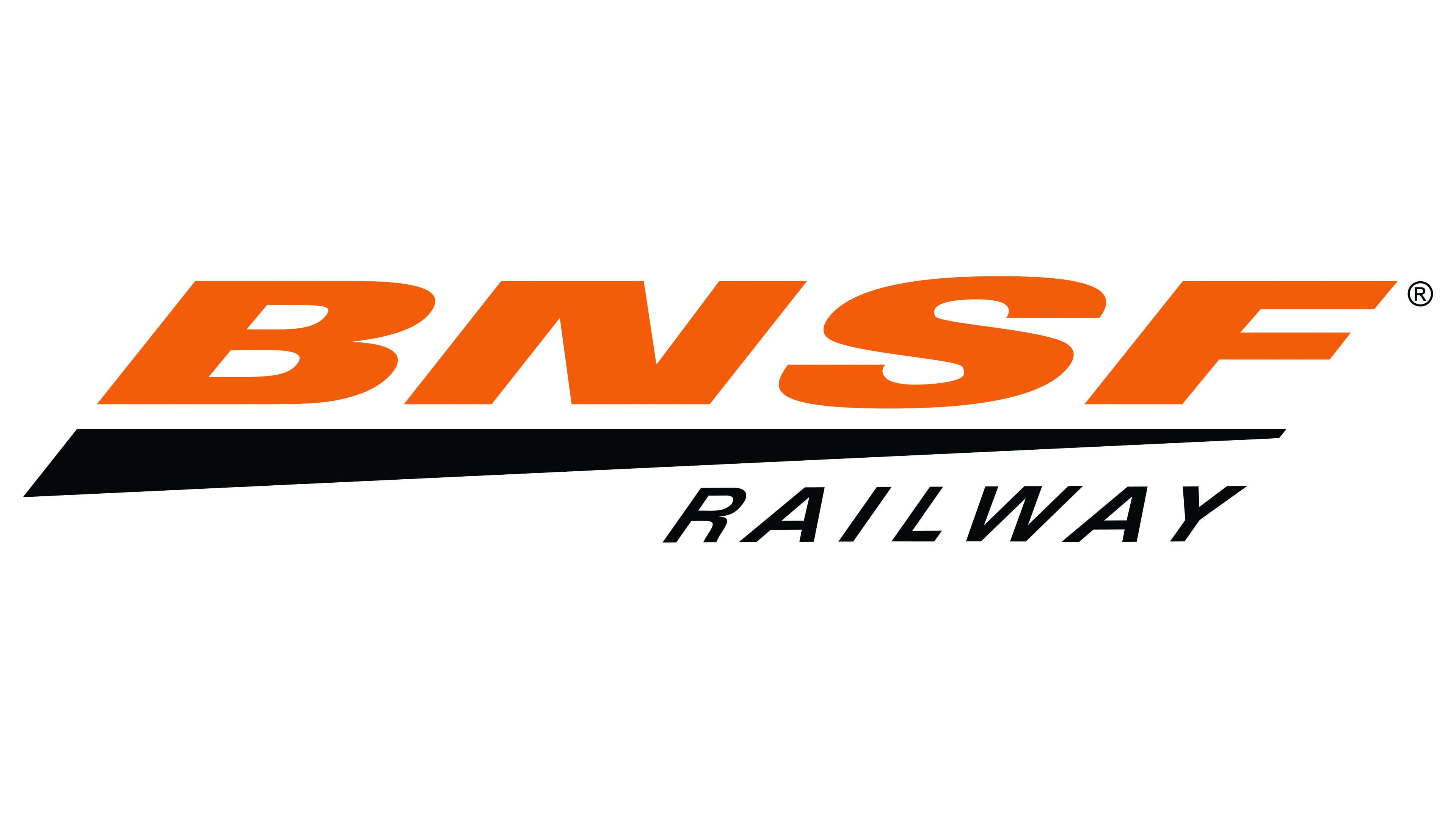
As part of its tenth-anniversary celebration, Burlington Northern and Santa Fe Railway changed its name to BNSF Railway and updated its logo to reflect its progress over the years. Moving away from the round shield, the company opted for a sleek, geometric style with a predominant emphasis on straight lines and angles.
The central element of the new identity is a tapering black stripe resembling a long horizontal triangle. Due to its elongated pointed shape and angled edge, it appears dynamic, like a flying arrow. The speed line symbolizes several concepts:
- The swift movement of trains speeding along the tracks.
- The efficiency of the railways in providing fast delivery of goods across the country.
- The company’s ongoing development is aimed at improving service quality.
The line highlights the orange abbreviation “BNSF,” and below it, in the bottom right corner, is the black word “RAILWAY.” Both inscriptions use a modified Univers family font, with the first in bold and the second in thin. The elegant italic reflects the freight carrier’s pursuit of excellence and order. The slightly compressed, slanted letters enhance the logo’s dynamism, emphasizing the importance of rail communication in delivering coal, oil, grain, and other goods quickly.
Orange is used as a color accent to draw attention to the keyword in the company’s name. Its presence adds a burst of energy to the logo, reflecting BNSF’s active stance in the transportation industry. Black creates an attractive visual contrast, as it is associated with strength, authority, and a classic style.