


 Bottega Veneta Logo PNG
The Bottega Veneta logo embodies perfection and prestige from the brand’s inception to today. Its design has always showcased elegant restraint and unique charm, remaining true to tradition while staying relevant in the modern era. Every element of the identity reflects motifs of luxury and sophistication, which have not lost their strength over the decades.
The modern logo retains traditional symbols but stands out with a stylish graphic quality emphasizing the brand’s relevance. Three key aspects stand out: the font, the classic color scheme, and the overall impression of sophistication. These elements have become the foundation of the company’s recognizable, distinctive image.
The logo resembles an open book, with a captivating story revealed through elegant letterforms and subtle complexity. Each year of Bottega Veneta’s existence is like a new chapter full of discoveries. The mind conjures images of luxurious leather goods, unique collections, and the range of brands the house has created over the years. The Bottega Veneta emblem is not merely a symbol; it reflects history and chic captured in every detail of the Italian fashion house’s products.
Bottega Veneta was founded in 1966 in Vicenza by Renzo Zengiaro and Michele Taddei as a maker of leather goods. Its name means “Venetian workshop.” The house developed intrecciato, a woven-leather method used to strengthen softer hides, and built its image around products without visible logos. In 1980, the first New York store opened as the range grew into footwear, jewelry, and home goods.
During the 1990s, changing tastes and experiments with prominent branding weakened demand. Gucci Group acquired the company in 2001 and appointed Tomas Maier as creative director. He returned the focus to materials, leatherwork, and intrecciato. The first women’s ready-to-wear collection appeared at Milan Fashion Week in 2005, followed by a 40th-anniversary bag collection in 2006 and a Madison Avenue flagship in 2009.
Bottega Veneta entered fragrance in 2011 and opened Scuola della Pelletteria in Vicenza in 2013 to train leather artisans. Maier left in 2018 after seventeen years. Daniel Lee, formerly of Céline, succeeded him and introduced revised classics, including the clutch bag and square-toe shoes released in 2019. Virtual shows and digital projects followed in 2020.
Lee departed in 2021, and Matthieu Blazy took over after earlier work at Maison Margiela. In 2022, he presented new intrecciato interpretations while the company expanded across leather goods, clothing, footwear, jewelry, interiors, and fragrance. By 2023, the brand remained part of Kering and operated internationally.
Meaning and History
What is Bottega Veneta?
This Italian luxury fashion brand is known for its refined elegance and exceptional craftsmanship. The company became famous for its unique “intrecciato” weaving technique, which creates a recognizable leather mesh pattern used across its products. The brand offers a wide range of premium products, including jewelry, leather goods, ready-to-wear clothing, footwear, and home décor items. Fashion enthusiasts who appreciate exquisite details and elegant color schemes have embraced the brand for its high-quality materials and craftsmanship. The company has established itself as a leader in the luxury market, skillfully blending traditional handcraft techniques with modern design, attracting those who seek timeless style and exclusivity.
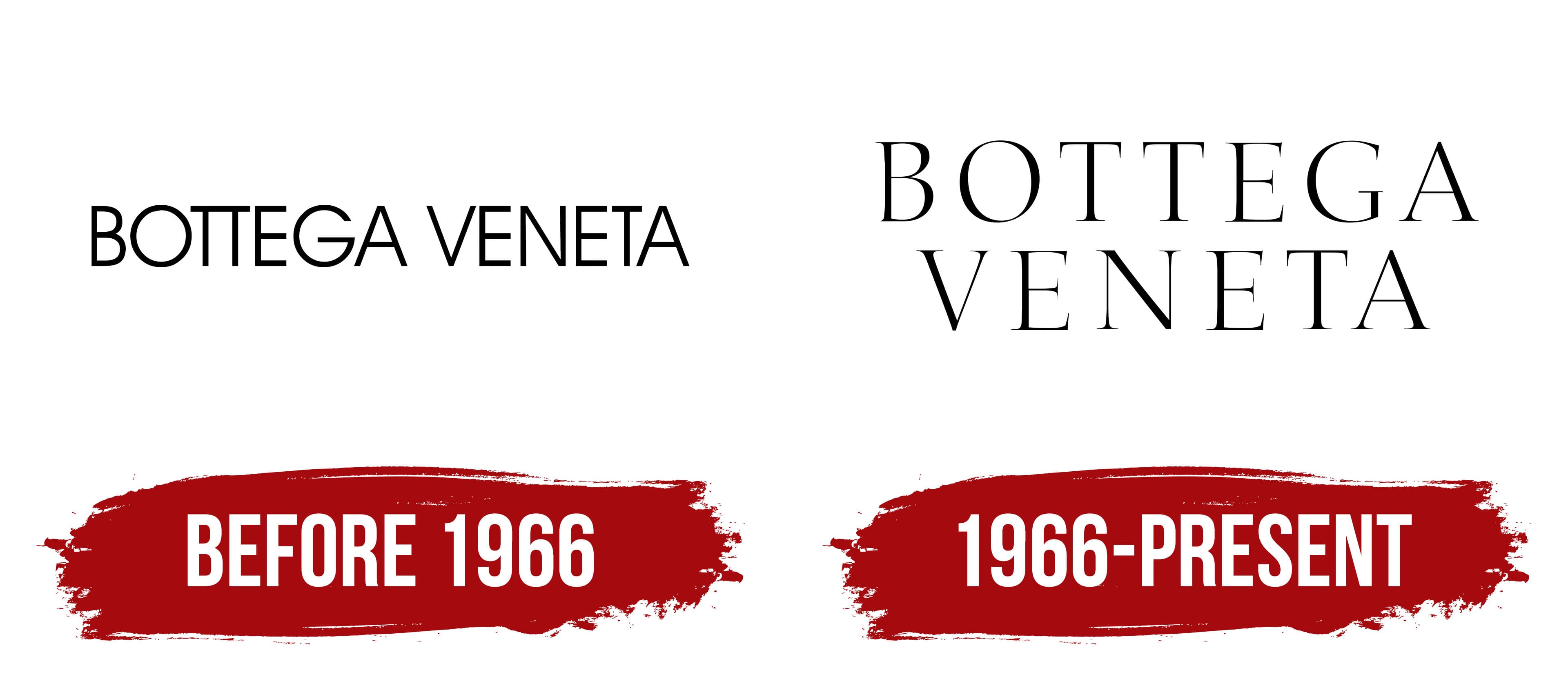
Before 1966

Michele Taddei and Renzo Zengiaro once founded a modest company that resembled a workshop more than a full-fledged production. The brand “Bottega Veneta” emerged with the idea of creating leather goods that stood out for their high quality and beauty. Notably, the company originally made all these products exclusively for “Giorgio Armani,” which gave the brand strong development potential from the start. That same year, the company created a distinctive logo.
The logo always featured a classic color scheme, favoring black and white, a common choice among many production companies at the time. Only the brand name “Bottega Veneta” stood out on a simple, smooth white background. These two words seemed to glow against the background, like the moon in the night sky or flames in the dark.
The black color gave each letter a refined charm, emphasizing the brand’s style and reliability. Arranged in a neat row, the letters were easy to read and striking. Special attention was drawn to the two capital “TT” letters, which merged into a single graphic element, creating a sense of harmony and uniqueness. This visual technique enhanced unity, making the logo more memorable and highlighting the brand’s individuality.
1966 – today
In 1966, a new logo emerged, gradually transforming and becoming more refined as the company developed. This logo reflected the brand’s elevated status, both in Italy and on the international stage. The brand had become widely recognized, and this popularity was expressed in every element of the updated identity. The letters became larger and more expressive, now shimmering impressively, as if to emphasize the company’s significance. Thin lines in each letter smoothly transitioned into thicker ones, creating the illusion of depth. Serifs and smooth curved lines complemented the overall design, making the logo more elegant and modern.
Interestingly, the updated logo no longer featured the doubled “TT” letters, which had previously been a hallmark of the brand’s identity. Instead, all the letters received more space, creating a harmonious visual effect. The increased spacing between the letters gave the composition a sense of refinement and lightness, making the logo even more attractive.
The brand name, the first to introduce the famous Intrecciato weaving technique, was now arranged in two rows. The second word was neatly centered beneath the first, adding symmetry and elegance to the composition.