


![]() Browning Logo PNG
Browning Logo PNG
The Browning logo symbolizes high mountains, fast rivers, and impenetrable forests. The emblem indicates the protective equipment necessary for hiking in nature. From A to Z, the store has everything tourists and hunters need.
Browning began in Ogden, Utah, in 1878, when John Moses Browning and his brother Matthew Sandefur Browning opened a small firearms workshop. The company first operated under its name, but its reputation was built by John Moses Browning, who had learned gunsmithing from his father, Jonathan Browning. In 1879, Browning patented a single-shot rifle. In 1883, Winchester Repeating Arms bought the rights, starting a long partnership.
For Winchester, Browning designed models including the Model 1886, Model 1892, and Model 1894, all of which are among the most successful rifles in US history. The relationship ended in 1902 after Winchester rejected Browning’s royalty terms for a semi-automatic shotgun. Browning then worked closely with Colt to create the M1911 pistol, which was adopted by the US Army in 1911 and served as a standard sidearm for more than 70 years.
In Europe, he partnered with Fabrique Nationale de Herstal after visiting Belgium in 1898. FN produced his designs, including the FN Model 1900 and later pistols from 1903 to 1910. In 1905, Browning created the Auto-5, the first mass-produced semi-automatic shotgun. Another major design, the .50 BMG M2 machine gun, entered service in 1933. John Moses Browning died on November 26, 1926, at FN’s workshop in Liège while working on the pistol later known as the FN Browning Hi-Power.
His son, Val Browning, continued the business, and in 1927, Browning Arms Company became a separate US trading company. FN Herstal took control in 1977 and became the sole owner in 1983. Browning remained based in Morgan, Utah, while expanding into hunting gear, knives, bows, fishing equipment, bikes, and gun safes. Remington Arms and Winchester later became major competitors in the hunting and firearms market.
Meaning and History
![]()
The organization’s primary task was to promote the development of the sport of the inventor of firearms. The Browning brothers (John Moses and Matthew Sandefur) opened a shop selling non-military goods they manufactured to maintain their technical skills and find practical uses for them. It was John Browning, recognized as the key and prolific weapons developer, who innovated. Almost all of the products were produced by other licensed manufacturers. Among them are such iconic companies as FN Herstal, Miroku, Remington, Colt, and Winchester.
In the 20th century, the company greatly expanded its range. So, in 1968, hunting and fishing ammunition was added to the list of products. Special emphasis was placed on footwear of a special design. It was produced and sold through third-party enterprises until 2001. Then, the brand agreed with the HH Brown Shoe Company to produce ankle, mountain, rubber, and leather boots.
What is Browning?
Browning is a brand of firearms manufactured by the Browning Arms Company. In addition to pistols, rifles, and shotguns, the company produces hunting knives, shoes, bicycles, sports bows, fishing reels, fishing rods, and other products for outdoor activities. Herstal Group SA currently owns the brand.
At the same time, the brand introduced two lines of edged weapons: folding knives and fixed-blade knives. Over the years, the lineup has expanded, and the company has joined the American Bladesmith Society. But she is mostly known for her eponymous firearm. Moreover, the logo affixed to it has never changed and remains widely recognized worldwide.
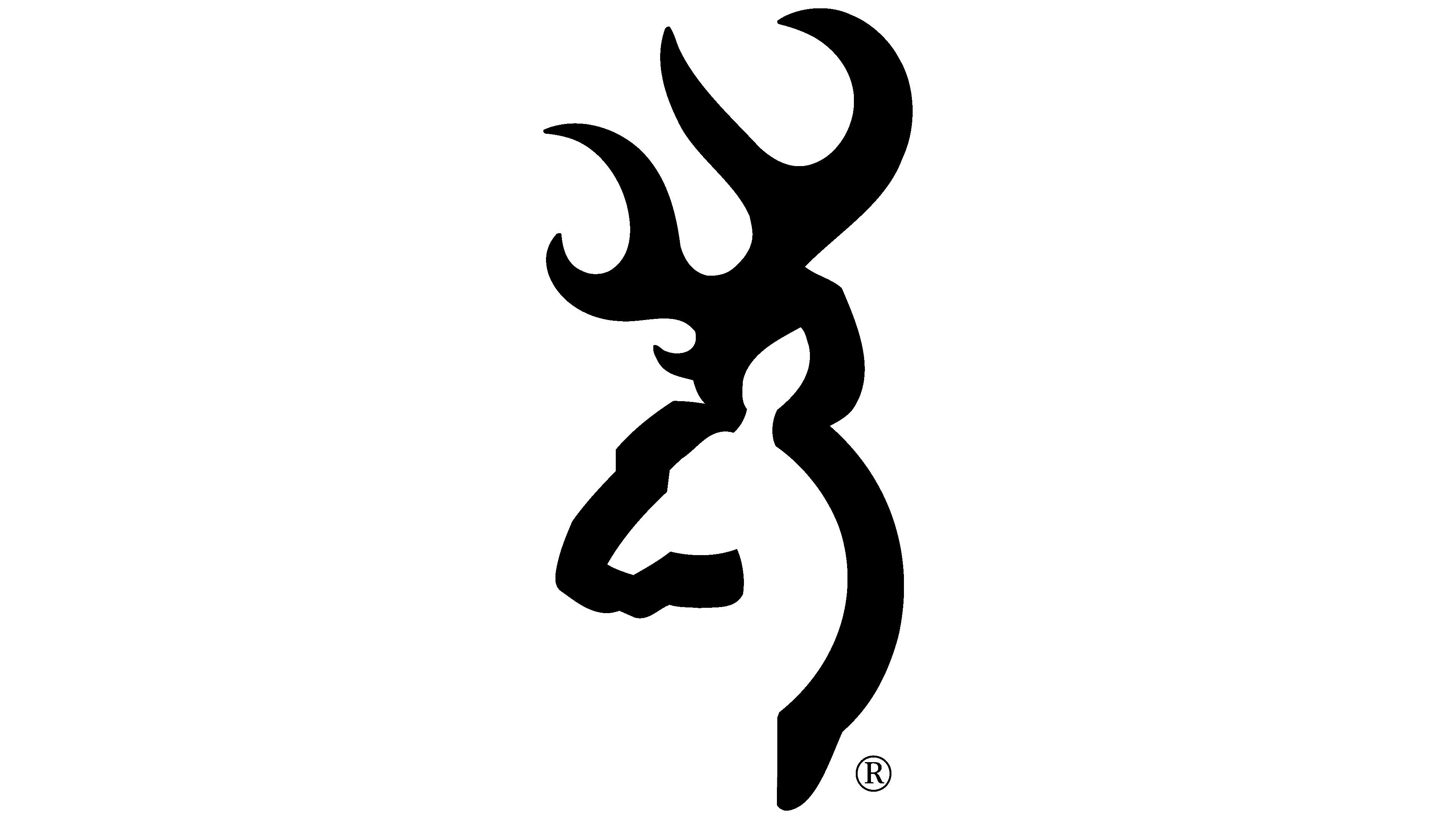
The creator of the brand identity is Art Director Don Bailey. Today, the symbol he invented is Buckmark. The emblem features an outline of a deer head with branched antlers, underscoring the company’s focus on hunting. The author chose this image for several reasons:
- Utah, where the firearms manufacturer comes from, has many deer.
- This is a valuable fishing object, and getting it is a great success.
- Something noble about these animals sets them apart from other big game.
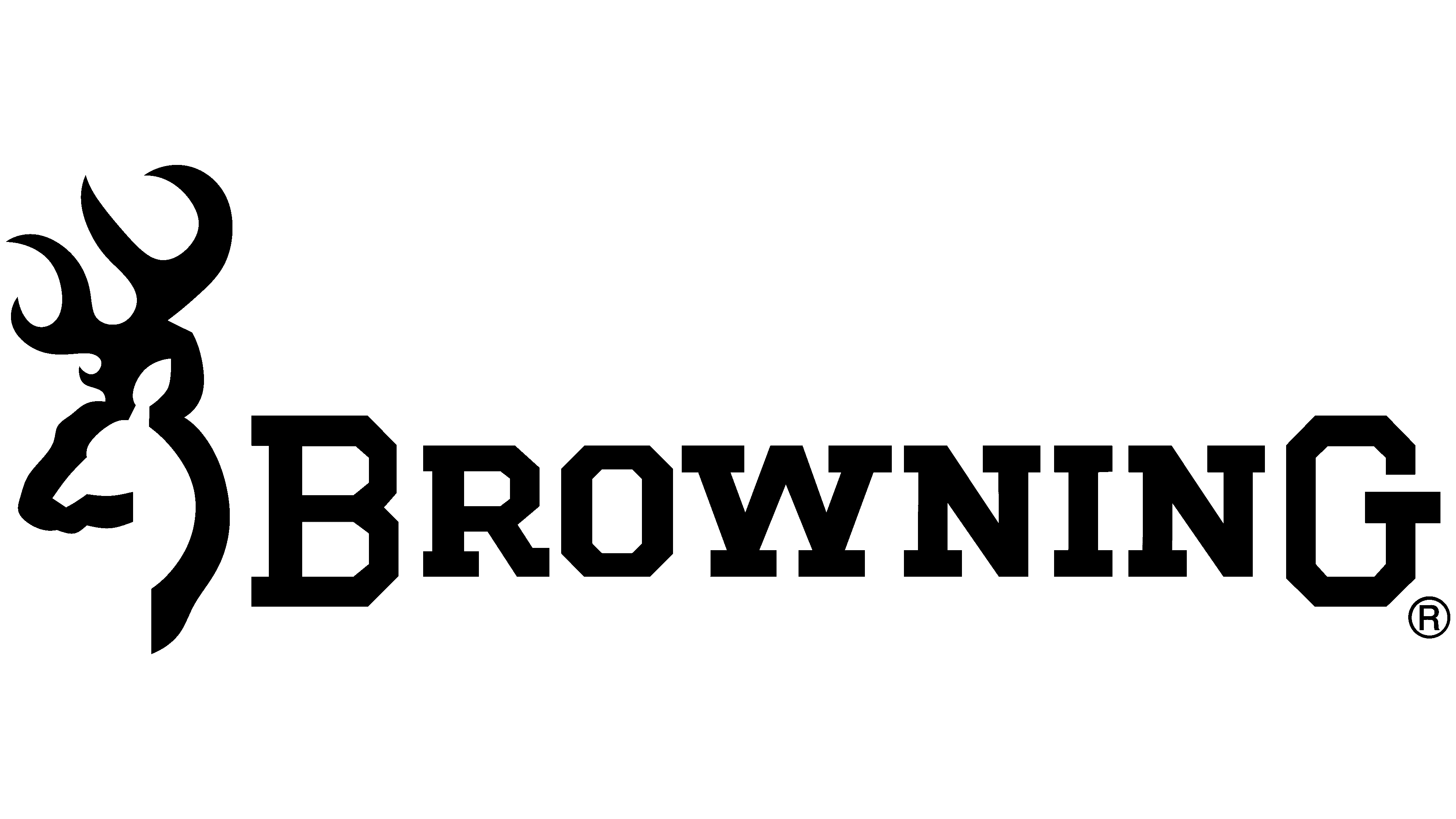
The logo first appeared on the cover of the Centennial Catalog and was later featured in Shooting, Hunting, and Outdoor Trade. The deer depicted on it is made in a single wide line. The only parts of the image shown are the start and end points. The stripe confidently passes from the animal’s neck to the ear, horns, and muzzle, highlighting every detail. Thanks to this technique, not one deer is represented on the emblem, but two: the outer one, outlined in black, is a male, and a white female is visible in the negative space.
To the right of the icon is the company name in the corporate design. The word is in a geometric serif typeface. The serifs are very wide and rectangular. Thanks to their increased size, the serifs balance out the massive antlers well, preventing the inscriptions from getting lost in their background. The first and last letters are larger than the others, although they are all uppercase.
Font and Colors
The developer used the LHF Full Block typeface for the bold, even, strict text, with each letter framed by very large serifs. The “O” is a vertical rectangle with corners cut off. Chuck Davis is the font’s author, and Letterhead Fonts is its first publisher.
The logo’s color scheme is monochrome, with black elements on a white background, emphasizing the company’s seriousness and its products.
FAQ
Is the Browning logo a buck and a doe?
The logo, famous among hunting and outdoor sports enthusiasts, features a stylized outline of a deer. This design uses negative space to form the silhouette of a doe. The logo connects the brand with wildlife and hunting.
The deer and doe designs reflect a love of nature and sport. Founded in the late 19th century, the brand has a long history of producing firearms and outdoor gear. The logo embodies the spirit of nature and the brand’s dedication to hunters and outdoor enthusiasts.
Is the Browning logo copyrighted?
Yes, it is protected by copyright. The logo and related marks are registered trademarks of the brand. This legal protection means that unauthorized use of the logo is prohibited.
The brand has protected its intellectual property by registering trademarks for its logos and other elements. These trademarks protect the brand’s identity and reputation from misuse. With registered trademarks, the brand can take legal action against anyone who uses its logo without permission.
What does Browning make?
The company produces a wide range of firearms and outdoor equipment. Since 1897, when Browning’s first pistol was manufactured, the brand has produced millions of shotguns and rifles for hunting and target shooting. These firearms are known for their quality and reliability, making them popular among hunters and shooting enthusiasts.
The brand produces pistols designed to meet the needs of different users, whether for hunting or sport shooting. It offers outdoor gear and accessories, including hunting clothing, gun safes, knives, and flashlights. Their hunting clothing is durable and comfortable, suitable for a range of weather conditions. Gun safes provide secure storage for firearms. Knives and flashlights are essential tools for outdoor activities.
The brand’s products enhance outdoor enthusiasts’ hunting and shooting experiences with reliable, high-quality tools.
What does the Browning symbol mean?
Browning’s symbol, the Buckmark, resembles a deer silhouette. The image of a mule deer was first created for embroidery on clothing, but later became the brand’s calling card. Bailey, the designer, depicted a moss-covered deer walking away from the hunter and briefly turning around.
It connects the brand with nature and hunting traditions. The deer turning back shows the connection between the hunter and the wild, emphasizing respect for nature. This symbol is iconic in the hunting community. It reflects the brand’s commitment to quality and connection to outdoor sports.
Who designed the Browning logo?
Don Bailey designed the original Browning Buckmark. He was the art director at Mountain Green Advertising, a company Browning founded in Salt Lake City. Bailey created the symbol as a stylized deer silhouette, which became the brand’s iconic logo.
David Zeigler, a former advertising executive, contributed significantly to the creation and distribution of the logo. His work helped Buckmark become widely recognized and associated with the brand. Zeigler’s efforts were instrumental in promoting the logo and securing its place in the hunting and outdoor sports community.