


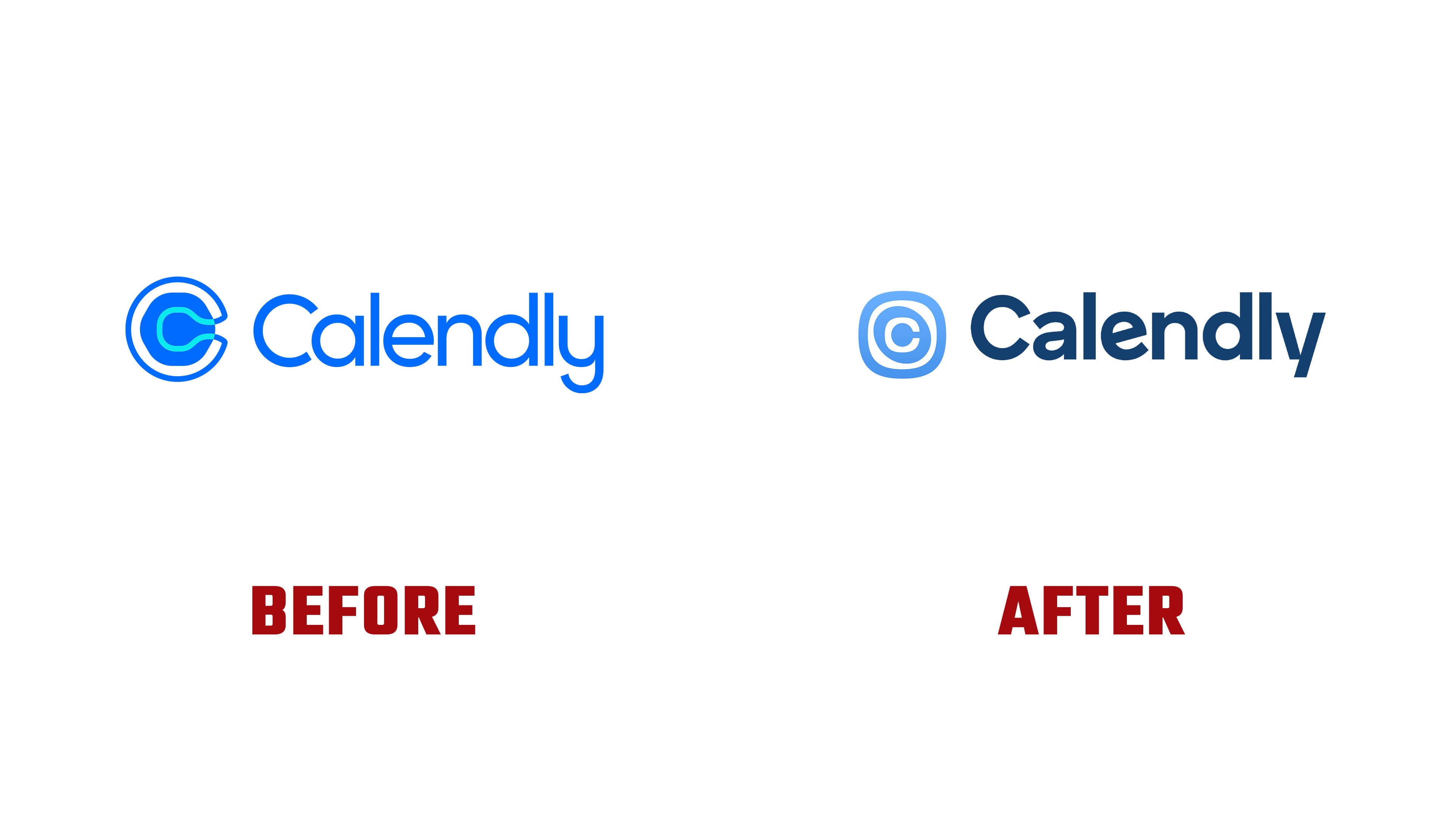
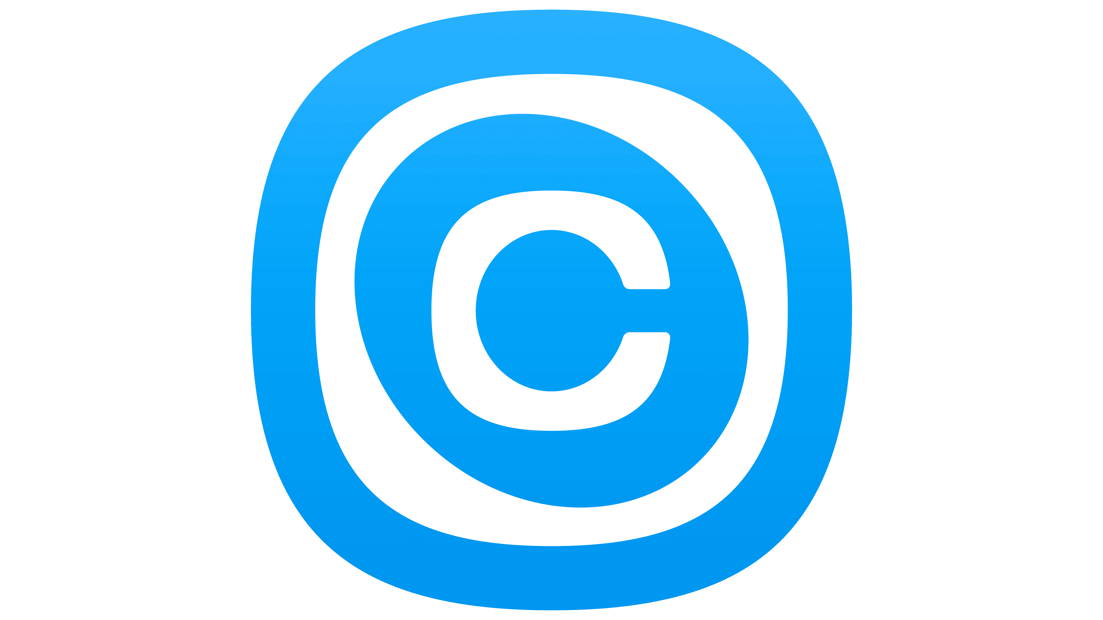
Calendly is expanding its services and updating its logo to reflect platform changes. Unveiled in August 2026, the new version by Philadelphia studio Smith & Diction features a “C” inside an asymmetrical ripple. The designers connected it to an initial meeting that can lead to new contacts, events, and business relationships.
Launched in 2013, the service helps people schedule meetings around available calendar slots. Over time, it added payments, contact management, note-taking, and follow-up communication. Callie and Notetaker began rolling out to English-language accounts on August 19, 2026. The update communicates the opportunity to hand organizational tasks over to the service and free up time during the day. The team retained the name Calendly to preserve the recognition it had built over 13 years.
While exploring a new emblem, Smith & Diction considered a sunrise, an hourglass, and a sequence of changing images. The team ultimately kept the name’s initial letter to represent the expanded platform. Early sketches surrounded the “C” with several rings. Following discussions with Calendly, the designers adjusted their number and shape, gradually arriving at a single ripple. Its outer contour combines the roundness of a circle with the shape of a rounded square.
The “C” also appeared in previous logos. Before 2021, it sat inside a light gray frame resembling a calendar. A Pentagram team led by Eddie Opara then developed an outlined emblem with a rounded hexagonal shape inside. It represented finding overlapping availability and bringing people together. In the advertising, colorful shapes within the outline extended the intersection theme. The wordmark used Radomir Tinkov’s Gilroy typeface, retaining an uppercase “C” and lowercase letters with tighter spacing.
In the new version, the standalone emblem is still paired with a sans-serif wordmark. We thickened thin letter sections to reduce stroke contrast. We refined spacing and terminals to suggest connections between people. The terminal of the “C” points toward the “a,” and the “e” tilts toward the “n.” The letters remain separate, but their strokes suggest a continuation into neighboring forms.
Blue connects the identity to the product’s history and the familiar appearance of hyperlinks. The emblem is now light blue, while the wordmark is dark blue, distinguishing the two parts of the logo. Supporting materials introduce pastel gradients inspired by morning light on a desk, sunset clouds, and turquoise water. The designers also considered print reproduction, since the previous pink and blue had been difficult to reproduce.
Chara Smith led creative direction and copywriting, and Mike Smith served as art director. Tully Ryan, Dayan D’Aniello, and Gavin Potenza worked on the emblem and wordmark. Potenza developed early versions of the Calendly lettering, while Ryan explored the standalone symbol.
The product offerings received icons enclosed in a shape that echoes the main emblem’s outer contour. An hourglass represents Scheduling, a feather represents Notetaker, an abstract human figure represents Contacts, a star represents Callie, and payment cards represent Payments. The hourglass helps distinguish the scheduling feature from the platform as a whole. The icons share rounded transitions developed under the working name “gloop.”
Calendar-block patterns and rounded containers called “flex bubbles” appear on the website, in the interface, and in advertising. They hold labels, times, statuses, and images. At Calendly’s request, the studio explored Midjourney to create workspace scenes and abstract light images. During development, their role was reduced to backgrounds and color references. The resulting combinations helped inform the identity’s gradients.