


 Canadian Army Logo PNG
The Canadian Army logo expresses the ideals of the military unit that is part of the Canadian Armed Forces. The emblem showcases the armed forces’ patriotism, strength, and unity, and is ready at any moment to defend their homeland and maintain peace and stability.
The Canadian Army traces its formal origin to the Militia Act of May 19, 1855, which organized volunteer land forces in the Province of Canada. Fenian raids in 1866 exposed weaknesses in training and command. After Confederation in 1867, a national force took shape, followed by the Royal Military College in 1883 and the North-West Rebellion in 1885.
More than 7,000 Canadians served in the South African War from 1899 to 1902. The General Staff was created in 1904. During World War I, about 600,000 Canadians served, and roughly 60,000 died, with major fighting at Ypres and Vimy Ridge. World War II brought another mass mobilization, including Dieppe, Normandy and the liberation of the Netherlands.
Canada joined NATO in 1949 and sent more than 26,000 personnel to Korea from 1950 to 1953. Troops later served in UN missions during the Suez Crisis, in Cyprus and across the Middle East. In 1968, the army, navy and air force were unified under the Canadian Armed Forces. Later deployments included the Gulf, Somalia, the Balkans and Afghanistan from 2001 to 2014.
The land force regained the Canadian Army name in 2006. Since 2014, it has supported operations against ISIS and trained Ukrainian forces through Operation UNIFIER. Operation REASSURANCE placed Canadian troops in Latvia from 2016. From 2017 to 2023, priorities included Arctic exercises, new armored vehicles, air defense, cyberwarfare, electronic warfare, and continued training support for Ukraine.
Meaning and History

What is Canadian Army?
This is the Canadian Army, the country’s primary ground combat force, serving as the land component of the Canadian Armed Forces. The army is known for its adaptability and operates in various climates and terrains, including Arctic tundra, dense forests, and urban areas. It consists of soldiers from regular and reserve forces, divided into infantry, armored, artillery, and special operations units. In addition to defending the country, the army’s responsibilities include disaster relief efforts, peacekeeping missions, and emergency assistance to civilian authorities. They undergo intensive training that prioritizes cultural sensitivity, physical fitness, and tactical skills. The army’s arsenal includes everything from modern artillery and armored vehicles to advanced communication technologies.
1855 – 2024
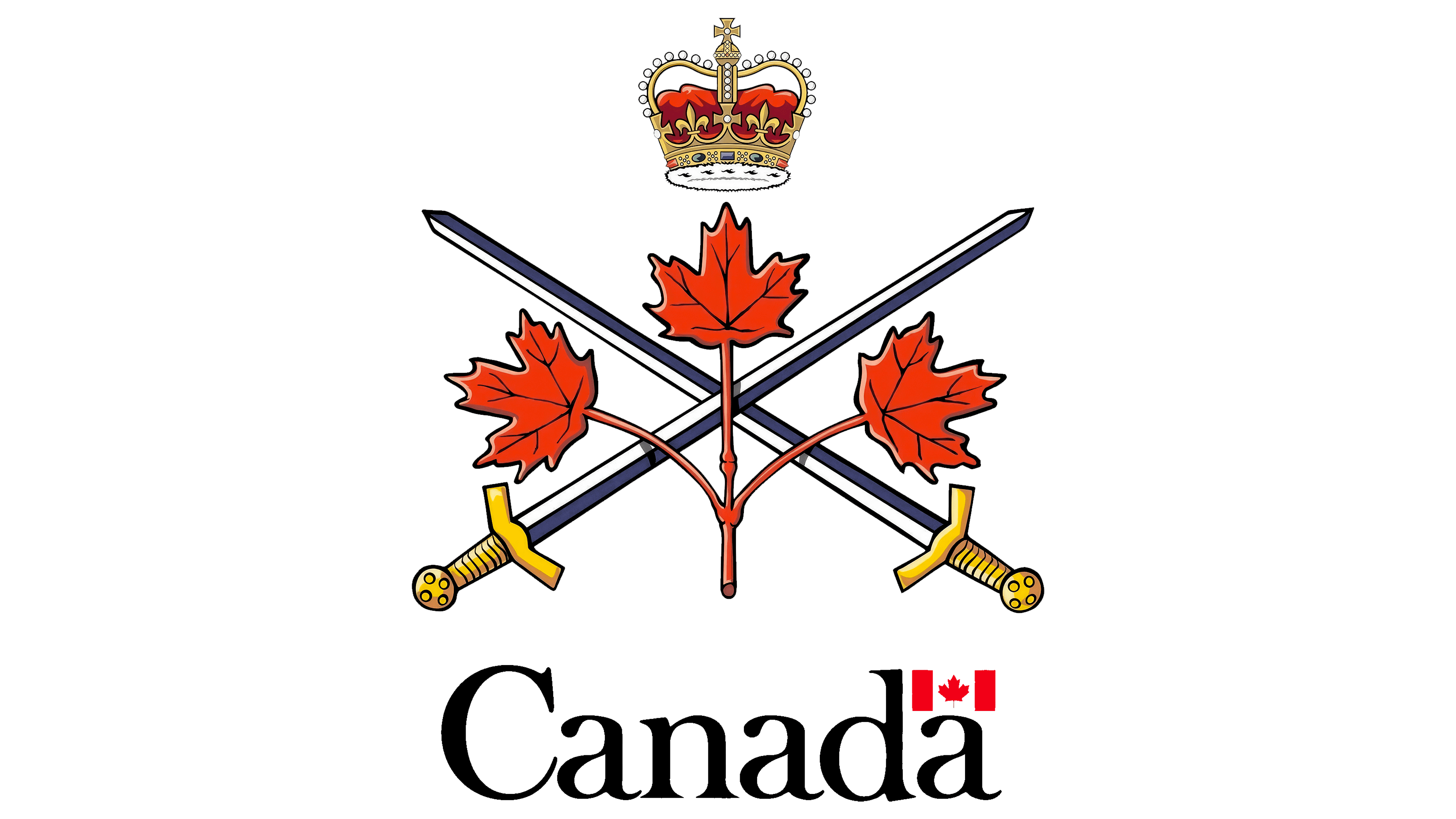
The Canadian Army logo is designed in a heraldic style, paying tribute to centuries-old traditions. It looks patriotic because it is steeped in the armed forces’ heritage and contains symbols of national pride.
At the top of the emblem is an ornate crown. It serves as a reminder that Canada is a constitutional monarchy, with the King of Great Britain as the formal head. The crown emphasizes the country’s historical ties to the British Empire and implies the military’s loyal service to the reigning monarch.
At the center are two crossed swords, a symbol of teamwork. They represent the armed forces, their combat power, and their commitment to defending Canada. The sharp blades signal readiness for decisive action, while the golden hilts hint at loyalty and leadership.
In front of the swords is a branch with three red maple leaves. These represent the three primary commands that make up the Canadian Armed Forces: the Royal Canadian Air Force, the Canadian Army, and the Royal Canadian Navy. Their connection signifies the cooperation among the units and their shared goal of protecting their homeland.
The maple leaf was chosen because it is Canada’s most recognizable national symbol, reflecting its natural wealth, cultural heritage, and history. Red is the color of the national flag, patriotism, and sacrifice.
The flag itself (or rather, a smaller version of it) is depicted just below: two red rectangles flanking a white square with a maple leaf. It symbolizes pride in the country and serves as a reminder of the nation to which the armed forces belong.
The small flag fits above the final letter “a” in the word “Canada” at the bottom of the logo. The text is presented in a clear, elegant font with contrasting stroke thickness. The ends of the glyphs are adorned with drops and long, sharp serifs, in the best heraldic tradition. The classic font style underscores the reliability, stability, and professionalism of the Canadian Army, while its elegance and simplicity speak to the orderliness of the military system.
2024 – today
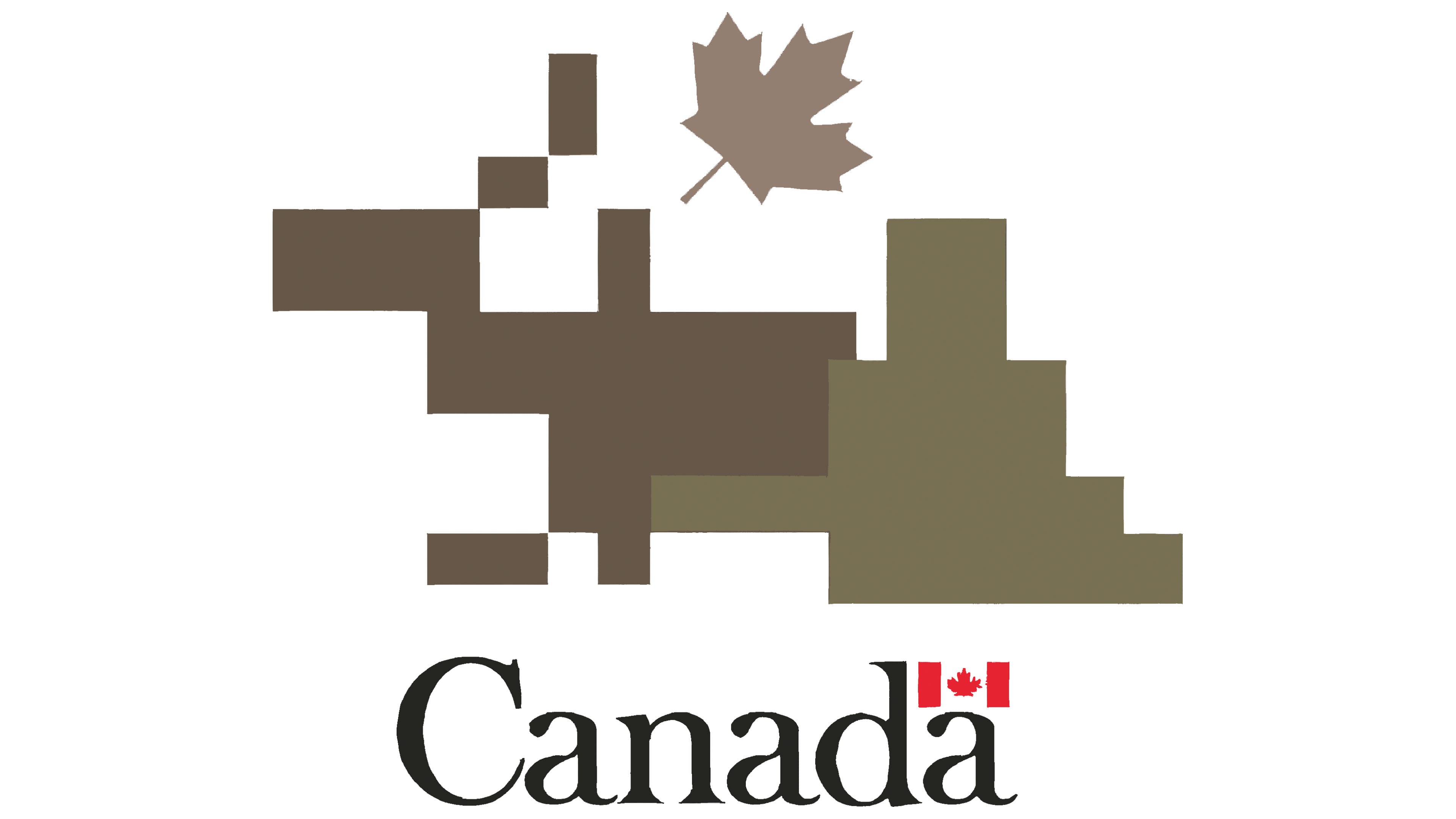
Due to a sharp decline in recruits, it was decided to create a new logo for the Canadian Army to motivate young people to join the land forces. It targets the current generation and does not include heraldic elements or references to the country’s historical past. The only national symbol retained is the maple leaf, but even it has been shown unusually gray and turned sideways, as if it had dried out and fallen from a tree. These are not the best associations for a military unit seeking to attract recruits.
The leaf is positioned above a pixelated pattern with two large gray spots of numerous quadrangles. The abstract geometric composition means nothing; it is a fragment of the new camouflage called Canadian Disruptive Pattern Multi-Terrain. This pattern has adorned military uniforms since 2024. The appearance of CADPAT (MT) prompted the Canadian Army to adopt a logo that matches the style. It conveys the colors used in the camouflage: several shades of gray-brown.
The division’s leaders hoped to earn the trust of young people, but the opposite happened: immediately after its unveiling, the new emblem caused a stir. Social media users began comparing it to a failed game of Tetris, Minecraft figures, and even a Lego moose, with some even seeing an inappropriate subtext in the abstract pattern.
Fortunately, after the wave of online ridicule, National Defense representatives apologized for the confusion and clarified that the old logo is not going anywhere; it remains the official visual mark of the Canadian Army. The new emblem will only be used as a supplementary one in social media content, presentations, and video animations. The original idea was to build trust in the command and aid in communication with the public. No one expected this initiative to fail.
The camouflage pattern is accompanied by the word “Canada,” taken from the previous logo. It is still done in a contrasting font with long, sharp serifs that give the inscription a special neatness and elegance. The symmetrical letters with strict lines create an impression of stability, reliability, and accessibility. The small Canadian flag above the last “a” again emphasizes the military unit’s national affiliation. This demonstrates patriotism and readiness to defend the country from external threats.