


 Cetelem Logo PNG
Shoppers often encounter the Cetelem logo when discussing payment options for a purchase. The consumer lending brand brings the buyer, retailer, and financial institution together in a single transaction. The purchase price is spread across scheduled payments, and the relationship with the lender continues after the buyer receives the product.
Entrepreneur and financier Jacques de Fouchier founded Cetelem on May 6, 1953, in postwar France. Its full name was Compagnie pour le Financement des Équipements Électroménagers. The company appeared when household appliances were still rare: in 1952, only 7% of French families owned a refrigerator or washing machine. Cetelem introduced a three-party credit model linking the buyer, the store, and the finance company.
The first loan was issued in its first month, with early records kept on punch cards. In early 1954, Cetelem’s stand at the Paris Salon des Arts Ménagers was opened by French President René Coty. By 1963–1970, the company had built a regional network of 13 branches across France.
In 1965, Cetelem issued France’s first credit card, Le Crédit en Poche. In 1966, it listed on the Paris Stock Exchange, and in 1978, the French government granted it official banking status. By the early 1980s, it controlled about 30% of the French consumer credit market. After the 1982 launch of Minitel, 3,000 retail outlets connected to the system within two years, and over 80% of Cetelem’s retail business later passed through it.
Cetelem expanded through partnerships and international growth. In 1982, it created Cofidis with 3 Suisses for mail-order credit. In 1985, it partnered with Carrefour on the Pass card. In 1984–1985, Findomestic opened in Italy, then expanded to Spain, Belgium, and Portugal. In 1998, Cetelem joined Paribas, and in 1999, BNP Paribas. In 2007, it merged with UCB to form BNP Paribas Personal Finance.
Meaning and History
What is Cetelem?
This BNP Paribas Personal Finance subsidiary specializes in consumer lending. It offers a range of financial services, including purchase financing, credit cards, and personal loans. The company partners with retailers to offer customers convenient point-of-sale financing options. Thanks to its online presence, customers can easily apply for loans and manage their finances online.
1953 – 1962

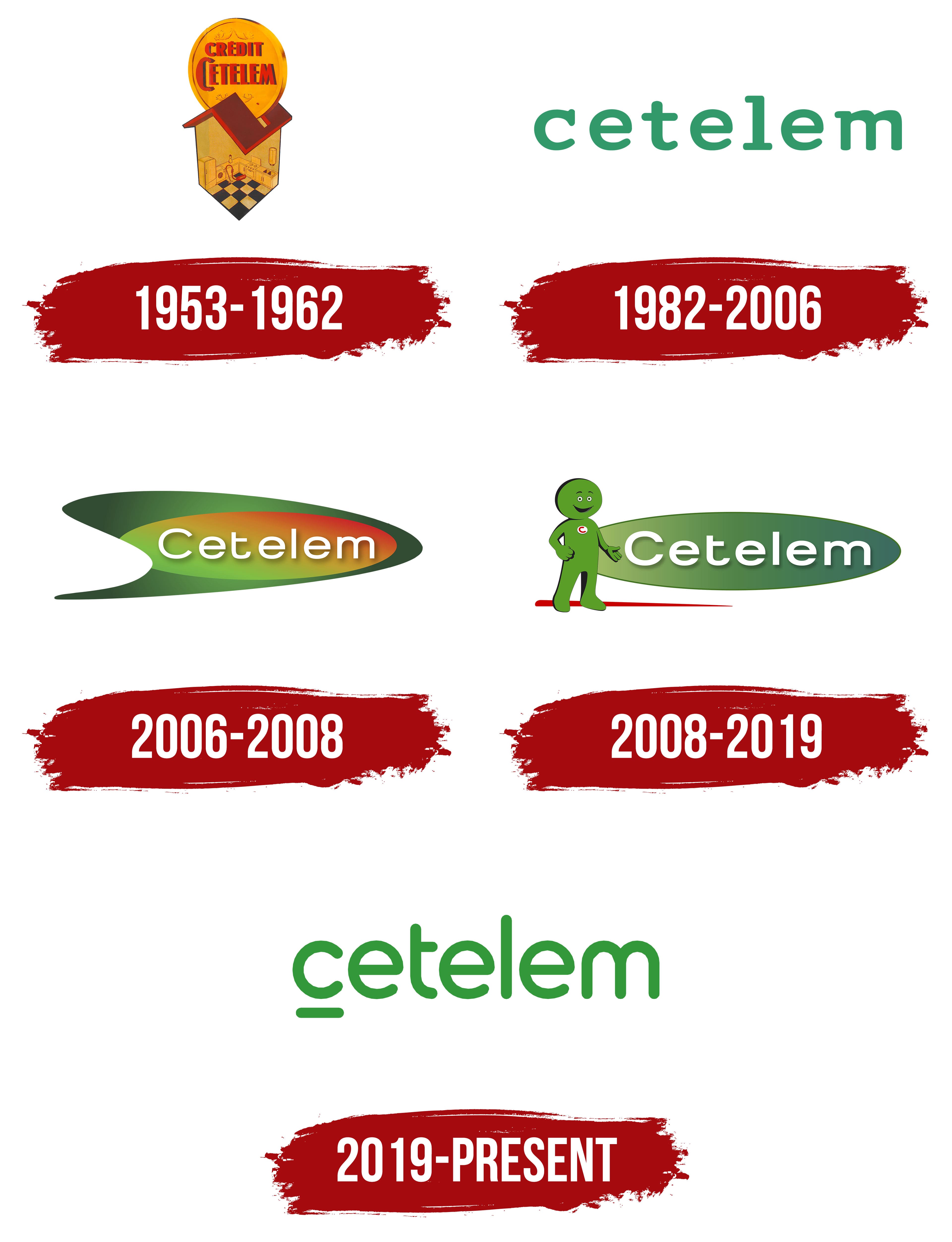
Cetelem’s first logo in 1953 featured a house-shaped coin bank. The company helped French families buy household appliances on installment plans, and the house linked consumer credit to furnishing a home and to the company’s role as a “partner in home comfort.” Financier Jacques de Fouchier founded Cetelem in France on May 6, 1953.
Both the company’s full and abbreviated names described its services. Compagnie pour le financement des équipements électroménagers translates to “Company for Financing Household Appliances.” The shorter name Cetelem derives from Crédit à l’équipement électroménager, or “Credit for Household Appliances.” In 1968, the expanded wording changed to Crédit à l’équipement des ménages, or “Credit for Household Equipment,” while the familiar name remained.
In the original logo, the house served as both a home and a coin bank. A large gold-colored coin bearing the words “Crédit Cetelem” slipped into a slot in the gabled roof. The house’s open front revealed a kitchen with appliances, cabinets, and a floor covered in contrasting square tiles. Yellow walls and the gold-colored coin were paired with a reddish-brown roof, while dark outlines defined the building and its contents. The coin’s lettering used narrow uppercase letters, with the initial “C” extending above and below the adjacent letters.
1982 – 2006

The next version of the Cetelem logo replaced the detailed illustration with the company name. The green “cetelem” lettering appeared against a white background in wide, rounded lowercase letters with generous spacing.
An alternate version used a different color arrangement. The name appeared in white inside a green rectangle, with a small red square on the left. Both versions used the same lettering.
2006 – 2008

Cetelem introduced its “Arrow” logo in 2006 to bring its international operations under a single brand. French agency A&Co designed the logo. The design was selected from over 100 concepts submitted by five agencies. The proposals were tested in eight countries, including six in Europe.
The outer green shape extended to a point on the right and had a rounded indentation on the left. Its arrow-like form symbolized renewal. An oval inside represented professionalism, with colors shifting from green through yellow and orange to red. The company associated green and organic shapes with ethical practices and transparent customer relationships. At the same time, the rounded forms and warm colors conveyed approachability.
The Cetelem name appeared in white over the oval, with an uppercase “C” followed by lowercase letters. It used a rounded sans-serif typeface with a drop shadow. Color gradients gave the design depth. The emblem was also intended to be reproduced as a three-dimensional object. A version with the line “Groupe BNP Paribas” identified Cetelem as part of the banking group. For the Spanish market, the logo removed the word “Banco” but retained it in the company’s legal name.
2008 – 2019

A green character joined the Cetelem logo in 2008. The friendly figure represented responsible lending. Positioned to the left of the name, it replaced the previous arrow-based design. An elongated green oval with a light-to-dark gradient replaced the complex outer shape behind the white lettering. The name retained its uppercase “C,” rounded sans-serif typeface, and drop shadow.
The character dates to 2004, when it was developed with TBWA Paris. It made its public debut on August 23 of that year. The brief called for a character that would appeal to people of any age or gender. The design team explored hundreds of silhouettes, with employees and customers evaluating some of the proposals. The final character had a round head, a smile, a soft body, and short limbs. It had four fingers on each hand and a red “C” on its chest.
In the logo, the smiling character partially overlapped the oval’s edge. It extended an arm toward it, visually connecting the figure to the name. A red stroke beneath its feet tapered toward the right, echoing the color of the letter on its chest. Cetelem used this logo until its 2019 update.
2019 – today

By 2019, Cetelem’s visual identity varied by country. Different logo and character versions were in use across its international markets. The agency Carré Noir was commissioned to unify them and adapt the identity for digital use. The redesign centered on lettering developed for Cetelem and related consumer brands within the group. The rounded letterforms matched the character’s silhouette, so the name conveyed the same friendly tone.
The green name was now set entirely in lowercase against an open background, replacing the lettering on the oval with its gradients and shadows. A short horizontal stroke with rounded ends appeared beneath the first “c.” Letter spacing was tightened, and the stroke endings, curves, and joins were rounded. The character received a redesigned three-dimensional form while retaining its smile and green color. It remained a distinct part of the brand’s identity and could appear on its own or alongside the lettering.
The new identity was introduced in stages. In Belgium, for example, the transition took place throughout 2019. The company used up its existing supplies of materials bearing the old logo as it introduced the updated design. Further revisions appeared in the 2024 guidelines, which Cetelem developed with teams from eight countries. These changes covered the color palette and the character’s range of poses. Animated images and emojis featuring the character were introduced for digital communications.