 Cinemark Logo PNG
The Cinemark logo evokes anticipation and excitement before an upcoming movie. The stylish, modern design highlights the company’s innovation, continually introducing new developments in the theater industry to deliver audiences an unprecedented audiovisual experience.
Cinemark grew out of Mitchell Theaters LLC, a Texas business started in the 1960s by brothers Lee Roy and Tandy Mitchell. In 1984, Lee Roy Mitchell and a group of investors founded Cinemark USA, Inc. in Plano, Texas. The company began by buying and operating small cinemas in Texas and nearby markets, then expanded through new builds and acquisitions in small and midsize cities.
A key change came in 1989, when Cinemark opened its first multiplex, offering a wider film schedule in one location. In 1993, the company entered Latin America with a theater in Santiago, Chile, followed by Mexico in 1995. In 1997, Cinemark opened its first Hollywood USA theater in Dallas, using upscale decor and advanced cinema equipment. In 1998, it entered Asia with a theater in Taiwan.
During the 2000s, Cinemark invested in digital projection and larger formats. Digital projectors began appearing in its theaters in 2005. In 2006, the company bought Century Theatres, adding more than 80 locations in the western United States. In 2007, Cinemark held its IPO on the New York Stock Exchange. In 2008, it launched XD, a premium format with larger screens and improved image and sound.
From 2009 to 2019, Cinemark opened theaters in Colombia, added 3D, launched the Connections loyalty program, introduced Movie Club, installed recliners, and added D-Box motion seats. By its 35th anniversary in 2019, it operated more than 500 theaters in the United States and Latin America. From 2020 to 2023, Cinemark added digital tickets, smartphone ordering, private screenings, studio agreements, alternative content, upgraded XD, solar panels, LED lighting, new Latin American theaters, and dine-in cinema formats.
Meaning and History
What is Cinemark?
It is one of the world’s largest and best-known movie theater chains. Headquartered in the United States, it operates movie theaters throughout North and South America. The company is known for providing high-quality moviegoing experiences through state-of-the-art amenities, including digital projection, 3D capabilities, and luxury seating. To enhance the entertainment experience, it offers loyalty programs, advance ticket reservations, and various concessions.
1984 – 1998

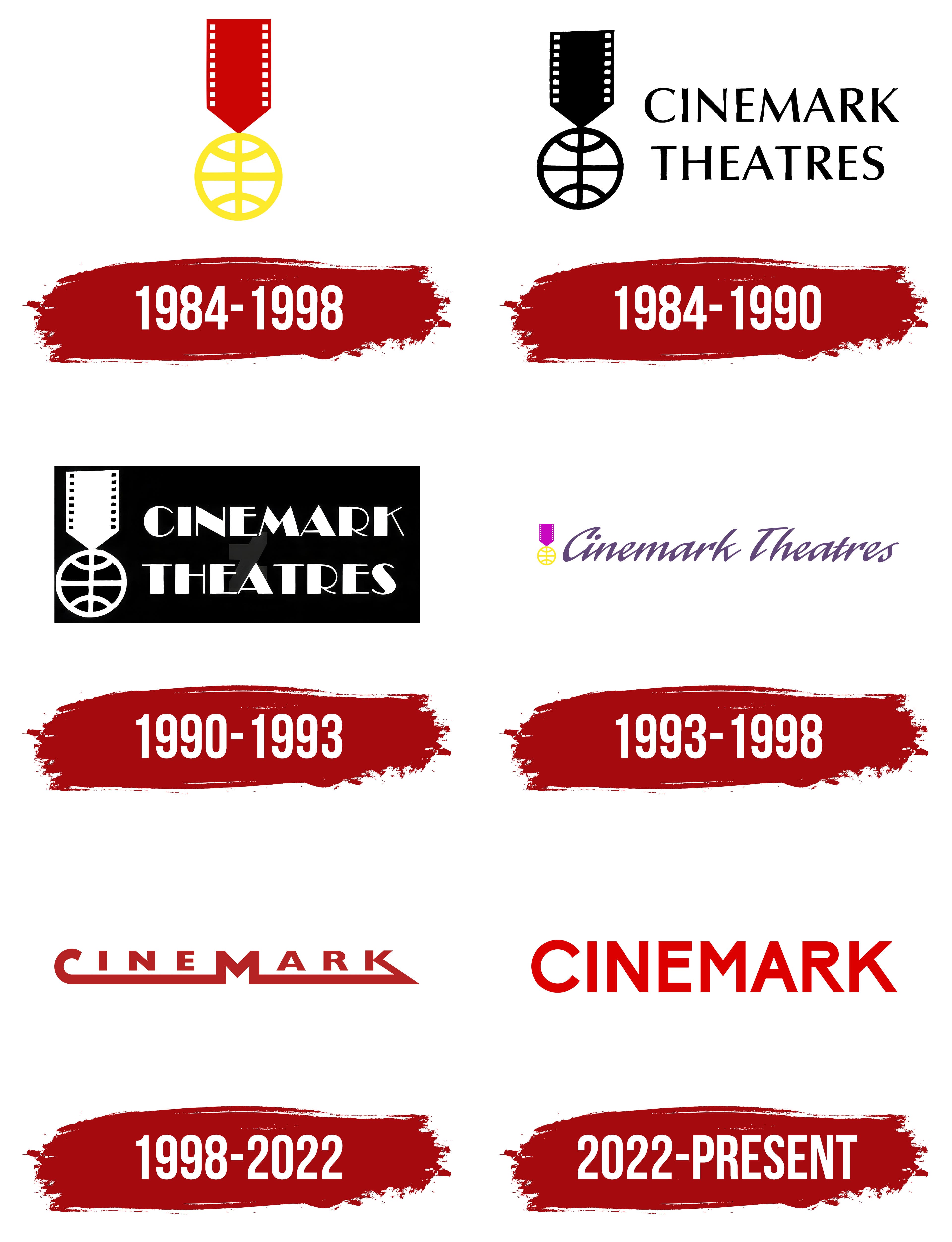
Rumor has it that the oldest Cinemark logo was borrowed from its parent company, Cinemark Corporation, founded in 1977. The emblem reflects the retro aesthetic of that era, very simple yet somewhat rough around the edges. The symbol for the theater chain was a stylized medal formed from a piece of film strip and a round globe. Each element holds a special meaning.
- A portion of the unfolded film strip appears as a vertical rectangle, with edges adorned by small white squares, emphasizing the company’s connection to the film industry.
- At the bottom of the film strip is an unusual triangular protrusion. This creates visual balance and directs the viewer to the logo’s main element, the yellow globe. Additionally, the triangle enhances the association with a medal on a ribbon, as without it, the characteristic shape wouldn’t be achieved.
- Attached to the film strip is a white circle with a yellow outline, divided into segments by thin lines representing a grid of parallels and meridians. This stylized globe symbolizes the theater chain’s global reach and significant expansion plans.
- The central part of the globe resembles a target. This suggests determination, precision, and foresight.
Overall, the emblem looks like a medal on a ribbon, a mark of distinction that signifies the company’s prestige and leadership. It aimed to become one of the world’s top theater chains by 1984. The medal symbolizes recognition of achievements and instills trust in Cinemark among audiences.
The colors were also chosen purposefully, as they help create an emotional connection with the audience. Red is associated with energy and passion, while yellow represents joy and optimism. Together, they evoke the positive feelings typically experienced when watching movies.
1984 – 1990

In this version of the logo, the film strip has been shortened, making the stylized globe appear more prominent. Despite these changes, the symbol’s meaning remains the same: it still represents the company’s connection to the film industry, its global presence, and its pursuit of public recognition.
Next to the stylized medal is the inscription “CINEMARK THEATRES,” where the first word represents the brand name and the second its purpose. The text is split into two lines and centered for visual balance. This symmetry highlights the meticulousness of the cinema operator, who prioritizes the comfort of its audience. The designers used a uniquely shaped font characterized by:
- Contrasting thickness between the primary and secondary strokes
- Slight indentations at the ends of the glyphs
- Unevenly tapering and widening lines
- A combination of sharp angles and rounded edges
The expressive font style gives the text a dynamic quality, sparking interest in the forward-looking brand. This visual representation embodies the energy that drives Cinemark to expand and build new theaters with large auditoriums and vibrant interiors. However, the logo does not appear overly bright; it is rendered solid black. The monochrome emphasizes the company’s serious commitment to its work, ensuring audiences are satisfied with the films and the comfortable viewing experience.
1990 – 1993

The designers inverted the colors, turning the film strip, globe, and text white. A black base shaped like a horizontal rectangle was added to ensure the logo could be used on a light background. This creates the impression that all elements are now depicted in negative space. The strong visual contrast makes the emblem recognizable, which was precisely the goal of the theater chain.
The brand’s primary symbol remained unchanged because its elements convey the essence of Cinemark:
- The film strip fragment reflects the connection to movie screenings.
- The stylized globe symbolizes international presence.
- The medal on a ribbon signifies the desire to be a leader.
While keeping the graphic part intact, the designers completely reworked the wordmark to make the company name more memorable. The logo still features the two-level inscription “CINEMARK THEATRES,” but now the lines are left-aligned and approximately equal in length, achieved through balanced letter spacing.
The new font appears uneven due to the stark contrast between strokes: some look like massive quadrilaterals, while others resemble thin lines. This difference in thickness draws attention to the capital glyphs, whose bulkiness creates an imbalance. The asymmetrical form aligns with the aesthetic of retro fonts used in old films. Examples of this style include Better Book Regular, VI Mai Anh H, and CF Metro Parisien Regular.
1993 – 1998

This logo opposes the previous version, lacking strict geometric shapes, dark color schemes, or sharp angles. The designers removed everything that hindered Cinemark’s perception as an entertainment brand. However, they retained their primary visual symbol: an award medal associated with leadership and great ambition. But now it has been given vibrant colors:
- The film strip is now light purple with a lilac hue.
- The globe’s outlines are recolored in yellow, as in the original emblem.
The new color palette creates a positive atmosphere, reflecting the theater chain’s effort to provide the best movie-watching experience. The bright colors embody the audience’s positive emotions when they leave the theater after a screening.
The phrase “Cinemark Theatres” is rendered in an elegant script font, creating a sense of lightness and ease. The letters appear wave-like because smooth transitions connect the slanted lines. This design enhances visual dynamism, reflecting the brand’s activity as it gradually expands its network beyond the United States. The text’s soft form conveys comfort and high-quality service, while the muted purple color underscores a commitment to innovation.
1998 – 2022

In 1998, the company underwent a major reorganization, adopting an Art Deco style for its theaters, associated with the era of cinema’s rapid development. This allowed Cinemark to immerse its visitors in a retro atmosphere that became a widespread trend in the late 1990s. The brand’s logo also acquired some Art Deco characteristics to align with the new concept. These include:
- Clear and symmetrical shapes
- Minimalism with an emphasis on simplicity
- Numerous angles and straight lines
- A strict geometric structure
The first thing that stands out is the classic Art Deco-style font used for the letters “I,” “N,” “E,” “A,” and “R.” This font is characterized by wide, sharply defined strokes, giving the inscription a strong visual impact. The other letters have a unique design.
A long horizontal line extends from the “C” to the left side of the “M,” making the “C” resemble an inverted umbrella handle. A similar line extends from the “K” to the right side of the “M,” but with an angular edge. The contrast between rounded and sharp forms highlights the dynamism and variety of cinema. The line formed by the three letters symbolizes unity, including the continuity of the film strip. This is the only hint at the now-missing Cinemark emblem, which depicted an award as a film strip and a globe.
2022 – today
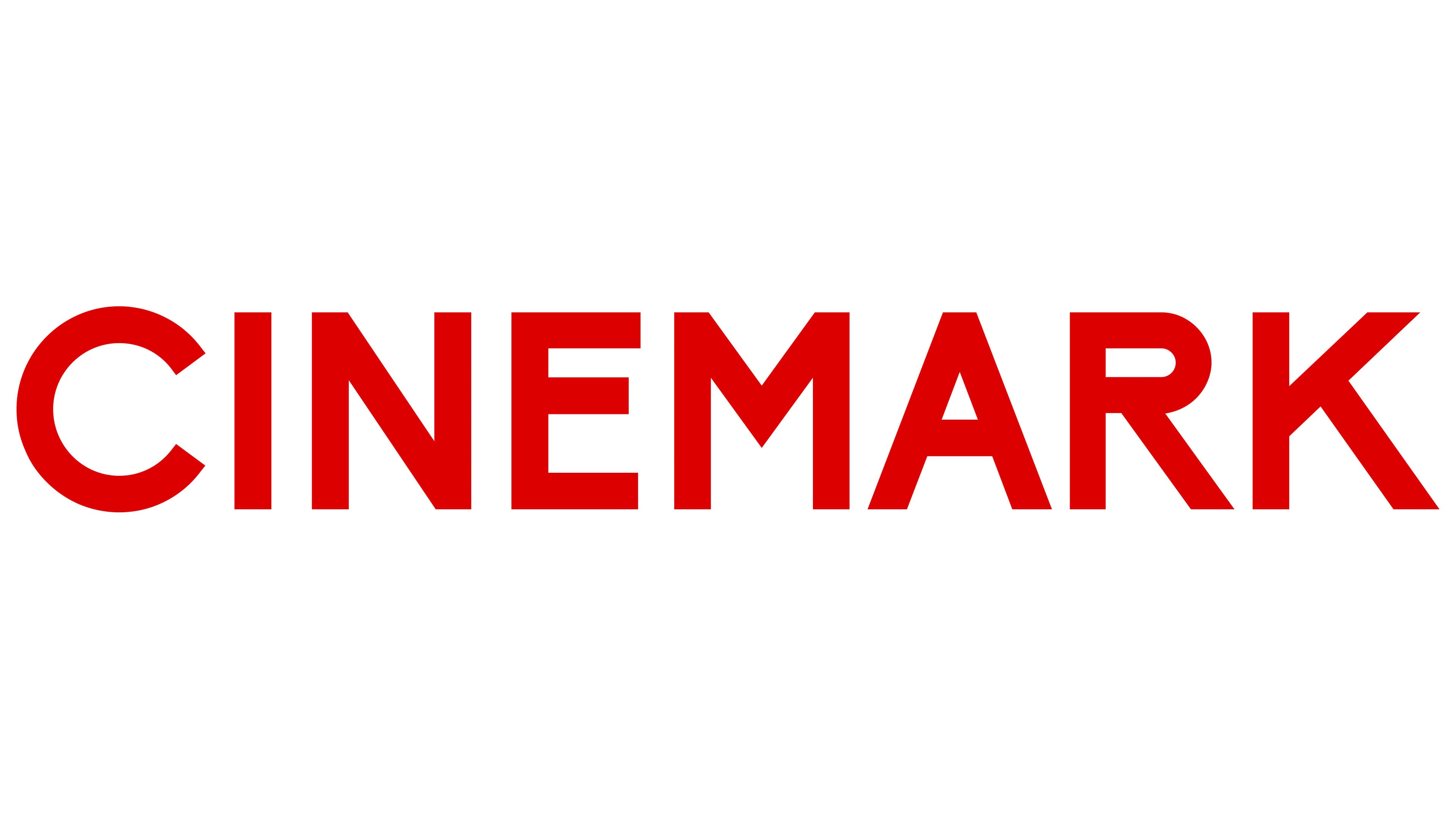
By 2022, the theater chain had become one of the largest in the United States and Latin America, necessitating a new logo that reflected its status as an international leader. Designers completely revamped the wordmark, as Art Deco had fallen out of fashion, giving way to modern minimalism.
Simplicity, clarity, and dynamism were the key principles guiding the creation of the new emblem. These are evident in the strict geometric font, where each letter consists of clean lines of uniform thickness. Visual dynamism is achieved through subtle nuances, such as:
- Raised horizontal strokes in the middle of the “E” and “R.”
- The circular shape of the “C.”
- The pointed center of the “M.”
- The consistent angle of the diagonals in “N,” “R,” and “K.”
While the designers completely changed the text’s style, it still retains some elements from the previous logo. This includes the absence of serifs and the cleanly cut tops of the “N,” “M,” and “A,” which enhance the dynamic feel. Thus, the new wordmark combines tradition and modernity to reflect the brand’s gradual evolution.
The bright red color symbolizes a drive for innovation, as Cinemark continually enhances its theaters, offering audiences standard conditions and amenities, as well as giant screens, premium seating, and immersive sound. The red logo evokes associations with the thrilling experiences that the world of cinema and entertainment provides.