


 Cole Haan Logo PNG
The Cole Haan logo conveys the spirit of craftsmanship and quality that form the foundation of the company’s history. Starting as a small shoe workshop, the brand has become a style standard, combining tradition and bold ideas to create footwear that blends comfort and elegance.
Cole Haan was founded in Chicago in 1928 by shoemaker Trafton Cole and businessman Eddie Haan. The company first produced handcrafted men’s footwear using premium leather and strict quality checks. It survived the Great Depression, then broadened its catalog during the 1940s with more casual styles and new manufacturing methods.
In the 1950s, Cole Haan opened its first branded stores, gaining direct contact with customers and greater control over presentation. Production expanded during the 1960s, while new materials and techniques entered development. A women’s footwear line followed in 1975, extending the business beyond its original male audience.
Nike acquired Cole Haan for $80 million in 1988. During the 1990s, the company combined cushioning systems and other comfort technologies with its traditional designs, creating dress shoes intended for longer wear. In the 2000s, the range expanded into bags, accessories, and outerwear, while new stores opened in the United States and overseas and an online shop was launched.
Apax Partners bought the company for $570 million in 2012. From 2013 to 2015, Cole Haan developed the “Grand.OS” comfort platform. Between 2016 and 2018, investment shifted toward mobile services, online sales, and connected retail channels. From 2019 to 2023, the company expanded its store network and partnered with major retailers. It introduced additional technology-focused footwear lines in international markets and broader retail channels.
Meaning and History
What is Cole Haan?
This brand creates footwear and accessories that blend classic style with modern comfort. Its products suit business meetings and everyday life alike, offering elegant solutions for a range of occasions. The collection includes dress shoes and oxfords with sporty cushioning for all-day comfort, as well as bags and accessories that combine style with practicality. It appeals to those seeking comfort without compromising on design. The brand’s stores provide customers with a convenient and enjoyable shopping experience, fostering an atmosphere of high quality and refinement.
Before 2014

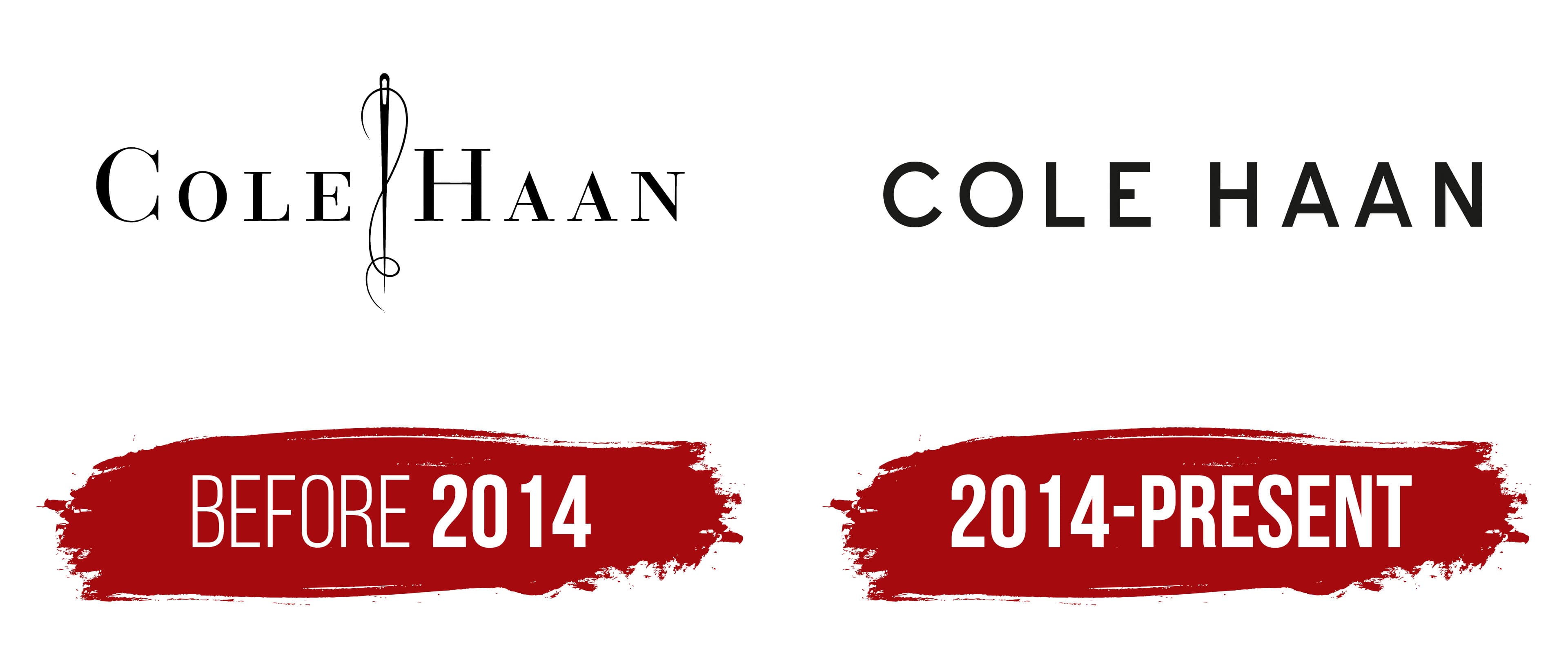
The Cole Haan logo was created early and conveys elegance and minimalism. The central detail is the serif-font inscription “Cole Haan,” which lends the text sophistication and a sense of tradition. After all, craftsmanship and attention to detail are the brand’s heart.
The font resembles Bauer Bodoni SC D Regular and Walbaum Antiqua Pro DemiBold, but has unique features in its line proportions and shapes. Smooth, clear letter lines create confidence and emphasize a classic style with a modern interpretation. The name is associated with family values and heritage, reflecting a traditional artisanal approach.
One of the main details was a harmoniously inscribed needle-and-thread motif. It symbolizes the brand’s commitment to craftsmanship and quality, recalling its roots in high-end footwear. Needle and thread add depth, linking the logo to the product creation process.
Black enhances a sense of conciseness and luxury. It is versatile and suitable for all materials and media, from packaging to signage. The black shade emphasizes the brand’s confidence and focus on the premium segment.
The Cole Haan emblem expresses the brand’s message of combining traditional craftsmanship with a modern design. It is strict but not boring, elegant but restrained, emphasizing the quality and uniqueness of its products.
2014 – today

The Cole Haan logo, updated in 2014, shows the brand’s desire for modernity and minimalism. A new emphasis is placed on the text in capital letters.
The sans-serif font with increased letter spacing creates a feeling of lightness. It resembles the Expressway SemiBold or Liebling Medium in style but features unique proportions. Clear lines and uniform symbol thickness give the logo rigor and reliability, reflecting the brand’s character.
Black symbolizes luxury, durability, and status. It’s versatile and suitable for everything from packaging to digital platforms. The shade emphasizes sophistication and focuses on creating products suitable for different occasions.
The emblem’s minimalism reflects the brand’s principles of functionality and relevance. Removing decorative elements, such as the needle, emphasizes practicality and substance. The design demonstrates respect for tradition and an openness to change, attracting an audience that appreciates quality and a modern approach.
The updated logo symbolizes a new stage in Cole Haan’s history, emphasizing the brand’s confidence and status in premium fashion.