 Dave and Buster’s Logo PNG
The Dave and Buster’s logo highlights the venue’s progressive nature, where guests can enjoy gourmet restaurant dishes, relax at the bar, and play bowling, billiards, or arcade games. The emblem captures the fun atmosphere, attracting those who love a great time.
Dave & Buster’s began in Little Rock, Arkansas, in the late 1970s, when David Corriveau and James “Buster” Corley saw customers moving between Corley’s restaurant, Buster’s, and Corriveau’s arcade, Cash McCool’s. They built a new format around that habit, combining a restaurant, bar, arcade, and adult entertainment venue under one roof.
The first location opened in Dallas in 1982. The 40,000-square-foot space offered full-service dining, drinks, arcade machines, and simulators. A second site opened in Houston in 1985 with a larger layout, darts, billiards, and more games. In 1989, Edison Brothers Stores, Inc. acquired a controlling stake, giving the company funding for national growth. In 1991, the first branch outside Texas opened in Philadelphia, proving that the concept could work in other U.S. markets.
In 1995, Dave & Buster’s held an IPO on NASDAQ, raising capital for expansion. The brand entered England in 1997 with a Birmingham location. However, international growth showed the difficulty of adapting the model to different markets. In 2000, the D&B Million Dollar Midway program updated game rooms with newer attractions. Wellspring Capital Management bought the company in 2006 for $375 million, and Oak Hill Capital Partners acquired it in 2010 for $570 million.
Digital development began with a mobile app in 2011. The company returned to public markets in 2014, added virtual reality attractions in 2016, launched national TV advertising in 2018, and reached 130 locations in 2019. From 2020 to 2024, it tested smaller suburban formats, upgraded mobile ordering, bought Main Event Entertainment for $835 million, added augmented reality games, introduced AI-based loyalty tools, and prepared franchise expansion in Asia and Europe.
Meaning and History
What is Dave & Buster’s?
It is an American restaurant and entertainment business that combines dining with arcade games, sports viewing, and various entertainment activities. Each venue features a full-service restaurant serving a variety of food and beverages and a large gaming area with a wide selection of video games, interactive simulators, and redemption games, where players can win tickets to redeem for prizes. The company offers a sports bar with multiple screens for watching sporting events. The brand is known for creating a fun and exciting atmosphere for adults and families alike.
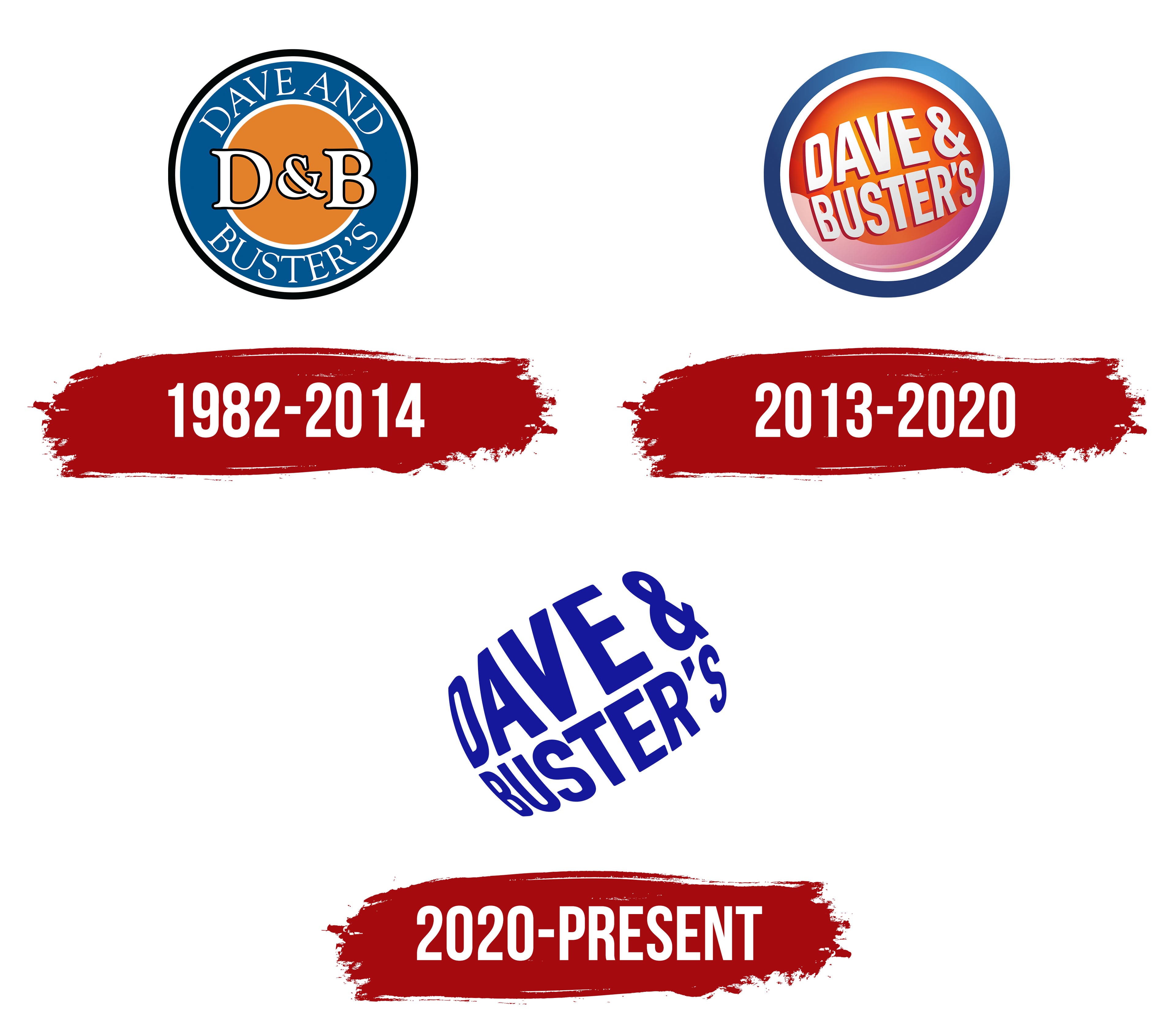
1982 – 2014
This classic logo evokes nostalgia among long-time fans of Dave & Buster’s. Its design resembles a rondel: a large orange circle within a blue ring. A thin white line separates the two parts, creating visual balance. The outer edge is outlined in black, making the emblem bold and noticeable against any background.
The white abbreviation “D&B” is centered, representing the brand’s shortened name. The designers intentionally made it wider than the orange circle to illustrate that Dave & Buster’s goes beyond the usual boundaries. It’s an unconventional chain that combines restaurants, bars, and arcade game rooms under one roof.
The company’s full name is in a thin font with long, pointed serifs in the wide blue ring. Its white color and dynamic shape create an illusion of lightness, reflecting the comfortable atmosphere of restaurant-entertainment complexes, where you can enjoy a great meal and play your favorite arcade games.
The contrast between the two distinct typefaces makes the emblem appealing. The emphasis is on the abbreviated name, as it feels more informal and better conveys the concept of Dave & Buster’s. Every detail of the logo, from the distinct fonts to the varied color palette, reflects the company’s connection to leisure and entertainment.
2013 – 2020
This logo debuted in 2013, adorning the exterior of a D&B venue in Dallas. It wasn’t until the end of 2014 that it became the brand’s official symbol, fully replacing the old two-dimensional logo and marking a new chapter in the history of the entertainment centers.
To ensure that customers could easily recognize the company by its emblem, the designers retained several original elements, including the blue ring, the light lettering, and the large orange circle. However, these elements now feel entirely different due to their altered shape and texture.
- The orange remains only at the circle’s center, while the edges feature a red gradient. This palette has made it emotionally rich, echoing visitors’ vivid experiences at Dave & Buster’s. The gradient gives the circle a three-dimensional appearance as if it were a sphere. A pale pink wave that wraps around the entire lower portion further enhances the sense of depth. The sphere evokes associations with the variety of games found at D&B locations.
- The blue border, in the form of a wide ring, also features a smooth gradient, giving it a shiny appearance. This texture reflects the modernity of the entertainment centers and their desire to appeal to a younger generation of customers who enjoy a casual style. The logo’s dynamism reflects the energy of the entertainment centers and emphasizes their ongoing growth.
- The phrase “DAVE & BUSTER’S” is now placed not in the blue ring but within the red-orange circle. The name is positioned diagonally, showcasing the brand’s playful nature. The designers enlarged the central letters to create the impression that they are written on the side of a large sphere. The text color isn’t pure white but has a slight gray tint, making the circle and lettering glossy.
The imitation of a glossy texture highlights the chain’s modernity, while the letters’ uneven size enhances the three-dimensional effect. Each glyph has a one-sided burgundy outline, which creates a sense of depth. This design best reflects the company’s connection to the entertainment industry, as every D&B venue includes a game room. The round emblem with a three-dimensional center and flat edges resembles a button, another reference to arcade games.
2020 – today
In 2020, the designers significantly simplified the logo to align with a modern minimalist style. They removed all elements except the lettering, Dave & Buster’s primary identifier. Despite the changes, the designers retained the emblem’s iconic spherical shape. The text is inflated in the middle, creating the illusion of depth and giving the impression that it’s on the convex side of an invisible sphere, as the background has no borders.
The absence of clear boundaries signals the brand’s informality, indicating that it doesn’t conform to dull standards. Its goal is to bring together fans of delicious restaurant food and exciting entertainment in one place and give them what they want. The spherical shape evokes a sense of lightness and flight, contrasting the heaviness of everyday life and inviting guests to relax in D&B’s laid-back atmosphere.
The lettering is infused with invisible energy thanks to its inflated appearance and diagonal placement. Yet, it remains highly legible, as the designers used a bold font from the FF DIN family for the company’s name. This is a clear industrial-style grotesque based on DIN 1451.
The logo predominantly features a pleasing dark blue color, one of the pillars of Dave & Buster’s visual identity. On its own, it seems calm, but the entertainment center chain typically pairs blue with orange to create a striking visual contrast. This challenges conservative traditions and attempts to mimic the neon lights of arcade games.