 DTE Energy Logo PNG
The power grid shapes everyday life through home lighting, heating, and the electricity that powers businesses. Power lines, stations, and distribution networks deliver resources to cities and suburbs, maintaining the familiar rhythm of daily life. The DTE Energy logo represents a utility company that supplies electricity and heat to residential and commercial customers, and manages the region’s energy infrastructure.
DTE Energy traces its origins to the Detroit Edison Company. The company was founded in 1903 to provide electricity to Detroit. The first power plant on the Detroit River supplied lighting and powered electric streetcars. By the 1920s, the company had consolidated its competitors and become the region’s main electricity supplier.
In the mid-20th century, Detroit Edison built several coal-fired power plants. In 1963, the Enrico Fermi nuclear power plant was launched. After the 1966 incident, the facility was modernized. In 1985, the new Fermi 2 nuclear power plant began operation with a capacity of 1,100 megawatts.
In 1995, Detroit Edison merged with the Michigan Consolidated Gas Company. As a result, the holding company DTE Energy was created, combining the state’s electricity and gas supply. In the following years, the company invested in infrastructure modernization and expanded its energy system. After the 2003 blackout, DTE strengthened grid reliability and introduced backup systems. In the 2010s, DTE shut down older coal plants and replaced them with natural gas facilities. In 2016, DTE installed millions of smart meters.
In 2017, DTE acquired REV Renewables. In 2021, construction began on the Blue Water natural gas plant with a capacity of 1,170 megawatts. The facility was commissioned in 2022.
In 2023 and 2024, the company invested in underground cable lines and energy storage systems. These projects aimed to strengthen the power grid.
Today, the company remains Michigan’s largest electricity and gas supplier. It serves more than 3.5 million customers and manages a diversified energy portfolio, including nuclear, gas, and renewable sources.
Meaning and History
What is DTE Energy?
An energy corporation based in Michigan, serving millions of consumers with electricity and natural gas. Mars Corporation acquired the company for $ 35.9 billion. It combines utility operations with investments in solar and wind energy. Revenue comes from energy supply and energy efficiency programs.
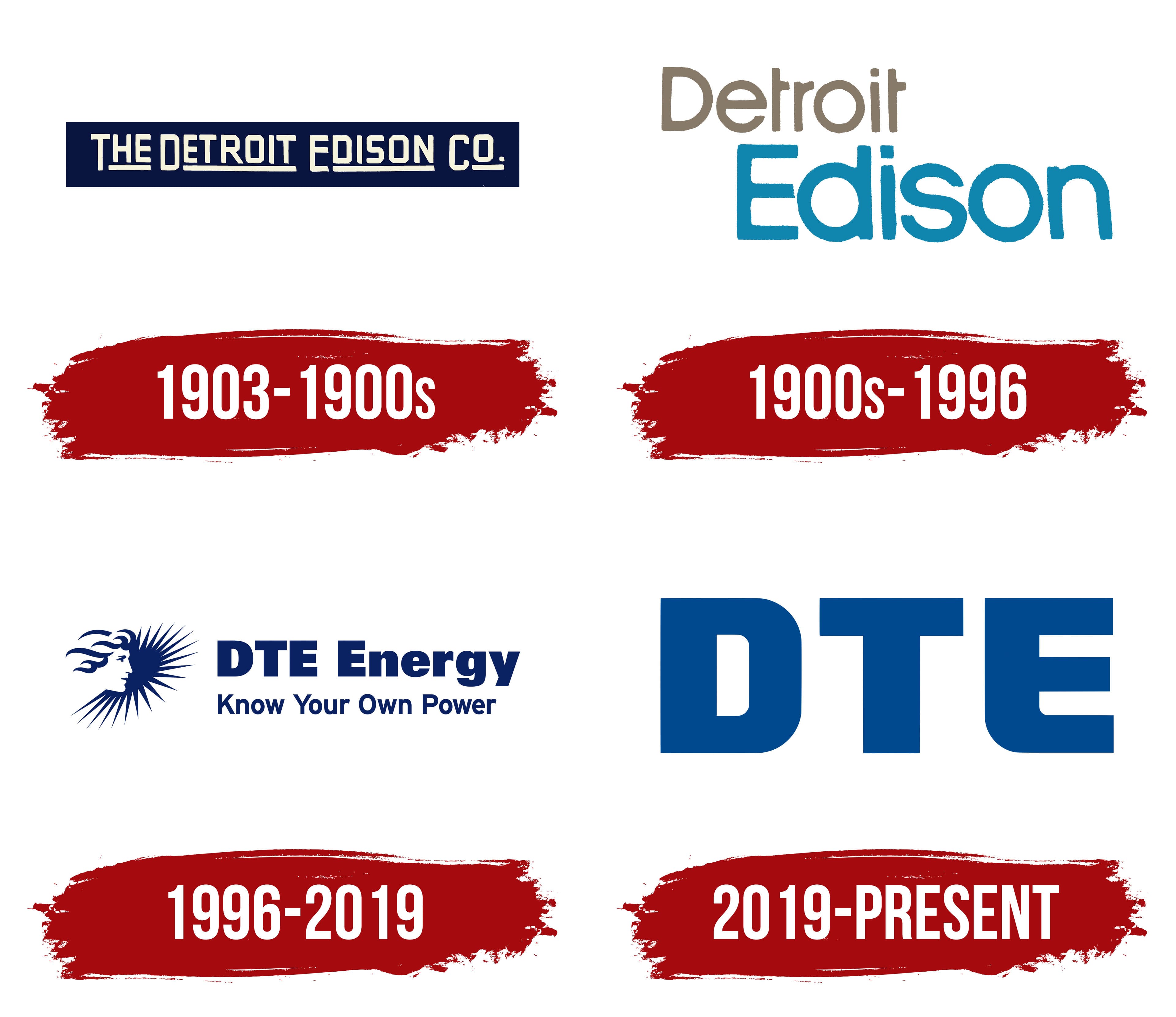
1903 – 1900s
The Detroit Edison name combined the city name with Thomas Edison’s surname. The company was formed on January 17, 1903, through the merger of Edison Illuminating Company of Detroit and Peninsular Electric Light Company. The first organization had operated in Detroit since 1886 and belonged to a network of electric companies associated with Edison. The new name identified its service territory and retained the inventor’s surname.
The early logo contained the full name The Detroit Edison Co. The wordmark appeared inside an elongated dark blue panel with straight edges. Light lettering stood out against the rich background, creating a compact composition for documents, equipment, and corporate markings.
THE DETROIT EDISON CO. appeared in uppercase cream-white sans-serif letters. Tall, narrow characters had even lines, angular joints, and consistently thick strokes. The style resembled Bank Gothic and related industrial typefaces. Elongated proportions let the lengthy name fit on one line without reducing character height.
The words differed in size and function. THE occupied a short opening section. DETROIT and EDISON formed most of the line, while the smaller CO. appeared on the right. The company name carried the primary visual weight, while the corporate abbreviation completed the wordmark.
Light lines ran beneath the word groups. They began under the second letter of each word and continued to its end. The underlines matched the letter strokes in thickness and became part of the typographic construction. THE, DETROIT, EDISON, and CO. received separate lower foundations that divided the long line into sections.
A period followed CO. with a short lower stroke beneath it. The small fragment extended the underline system to the right edge. Repeated tall letters and heavy lower lines formed the composition. The dark blue background brought the text groups together within one identifier for Detroit’s electric company.
The DTE name appeared several decades later. In January 1996, management used the DTE stock ticker as the new holding company name. The letters originated from the market abbreviation. The Detroit Thomas Edison interpretation appeared later and conflicts with the company’s corporate history. They added Energy to reflect the business’s expanded scope.
The transition to DTE Energy accompanied the development of several energy businesses. The early blue panel dates to when the company operated as The Detroit Edison Co. At the same time, the new name represented a holding group offering a range of energy services.
1900s – 1996
The 2-line Detroit Edison wordmark gave Edison’s surname prominence, while the city name sat above. The logo remained in use until the DTE name appeared, featuring a soft typographic composition. Differences in size and color separated the geographic and family sections while keeping them within one structure.
Detroit appeared on the upper line at the left edge. The initial “D” was uppercase, followed by lowercase letters. The wordmark used a rounded sans-serif typeface with soft terminals and smooth connections. Gray-brown gave the upper line a restrained tone and a secondary role.
Edison appeared below and shifted toward the right edge. It occupied most of the horizontal area. Its initial “E” was uppercase, followed by lowercase letters. Light blue separated the lower line from the gray-brown Detroit, emphasizing Thomas Edison’s surname.
Both lines used similar typography, though Edison appeared larger and heavier. The upper word was shorter and lighter, while the lower one formed most of the logo’s visual mass. Their different positions created a stepped arrangement. Detroit began on the left, while Edison completed the composition on the right.
Rounded typography distinguished the version from the early dark blue The Detroit Edison Co. panel. Two words replaced the full legal name, while Co. and the underlines disappeared. Different colors divided the name into sections, while the large Edison word preserved the historical connection with the inventor’s surname.
Before adopting DTE, the company used an emblem connected with the city. It was based on Marshall Fredericks’ sculpture The Spirit of Detroit. The monument was unveiled near Detroit’s municipal complex in 1958 and gradually became associated with the city.
The corporate version used a stylized side profile of the figure’s head. Long rays extended to the right. The radiating section connected the city image with the company’s energy operations, while the human silhouette referred to Fredericks’ sculpture.
The Spirit of Detroit emblem later carried over into the early DTE Energy identity. The city-based image preserved the new name’s connection with Detroit after the full Detroit Edison name was replaced. The profile and rays remained in use during the DTE period.
1996 – 2019
The Spirit of Detroit profile maintained the connection between the new DTE Energy holding company and the city after Detroit Edison was replaced at the corporate level. The company introduced a logo developed by Anspach Grossman Portugal on January 1, 1996. The composition included the city emblem, a dark blue name, and later the statement “Know Your Own Power.”
DTE Energy was established in January 1996 as a holding structure above Detroit Edison. The letters “DTE” came from the stock ticker already used for the energy company’s shares. Detroit Thomas Edison emerged as an unofficial interpretation and conflicts with the company’s corporate history. Energy covered several areas of the company’s business.
A stylized human head facing right appeared on the left. Marshall Fredericks’ sculpture The Spirit of Detroit served as its source. The corporate version converted the primary facial features into a compact dark blue silhouette with white interior openings.
Lines at the back of the head resembled long flowing ribbons. On the right, the profile transitioned into sharp, radiating lines resembling an electrical impulse, flash, or sunlight. The combination of a rounded human silhouette and angular rays connected the city image with DTE’s energy operations.
The company called the emblem the Energy Mark. It represented delivering energy to customers and finding new service methods. The profile and rays created a left-to-right direction, while the fanned section guided the composition toward the name.
The dark blue DTE Energy wordmark appeared on the right. DTE used large uppercase letters with heavy sans-serif strokes. Energy began with an uppercase “E” followed by lowercase letters. Both parts had similar weight and appeared on one line.
The name used Univers. Even forms, heavy verticals, and tight spacing created a dense letter structure. Heavier versions resembled Helvetica Bold and Impact. The change in capitalization separated DTE from Energy while keeping it on one continuous line.
The registered statement “Know Your Own Power” appeared beneath the name. It encouraged customers to understand their energy use and control costs. The phrase connected the company’s image with the everyday use of electricity and natural gas.
The statement used Interstate Bold. Corporate guidelines permitted Univers 65 Bold and Arial Bold as substitutes. The line was smaller and lighter than DTE Energy. Each word began with an uppercase letter followed by lowercase characters. Dark blue united the statement, name, and Energy Mark.
DTE Energy merged with MCN Energy Group in 2001, bringing the natural gas company MichCon into the group. The profile emblem represented a holding company with electricity and gas operations. Energy reflected the expanded business structure.
The shortened DTE form became the shared customer brand in 2013. Detroit Edison Company became DTE Electric Company, while Michigan Consolidated Gas Company became DTE Gas. The abbreviation moved from the holding company’s name to the group’s primary operating companies while retaining the Energy Mark and dark blue identity.
2019 – today
The primary change in DTE’s rebranding, introduced in February 2019, was removing Energy. The company moved from DTE Energy to the shortened DTE form. It removed The Spirit of Detroit profile and its radiating lines. The new identity system was intended to unite numerous services under one master brand and reduce differences among the group’s corporate identifiers.
Brand consultancy BasedOn developed the project. The agency worked on DTE’s positioning, brand architecture, naming, communication language, and identity. The redesign covered the corporate name and its use across different media. Based on this, the agency linked the shortened name to the need to simplify the group’s structure and present its services under one identifier.
The 3 letters had long been connected to the company. They originally served as Detroit Edison’s stock ticker and became part of the DTE Energy holding company name in 1996. By the late 2010s, customers recognized the abbreviation through the electric and gas businesses. The shortened form could therefore represent the group without Energy while maintaining continuity with the previous corporate name.
Removing The Spirit of Detroit changed the logo’s structure. The earlier version combined the city image, radiating emblem, DTE Energy name, and, in some layouts, Know Your Own Power. The 2019 edition concentrated all identification within 3 letters. The reduced number of components prepared the name for use across digital interfaces, documents, exterior applications, and physical environments.
The logo consists of uppercase “D,” “T,” and “E” letters in rich blue. They are large, with heavy strokes and a geometric sans-serif construction. The overall weight resembles Impact and Arial Black, though the agency developed a custom DTE font for the corporate system.
The “D” opens the dense typographic block and gives the left side a rounded form. The following “T” has a broad crossbar and heavy vertical stroke. The final “E” consists of one vertical stem and 3 horizontal elements. Consistent line thickness unites the different letterforms, while tight spacing creates a compact composition.
Blue carried over from the previous DTE Energy brand, maintaining continuity with earlier corporate identifiers. In the new version, it covers all 3 letters without additional shades inside the logo. Removing the multipart emblem shifts visual weight to the name and supports its use as a single identifier across divisions.
The expanded identity retained the energy theme through radiating lines. They develop the ray motif from the former Energy Mark without the human profile or solar halo. The lines appear throughout the brand system around the lettermark, connecting the new identity to DTE Energy’s history through a revised image of energy flow.
The shortened DTE name became the shared entry point for customers using the group’s electricity, gas, and other services. In communications, it represents the master brand, while individual operations’ names occupy secondary positions. The 2019 corporate architecture moved the group away from its former lengthy name. It established the 3 letters as its primary public identifier.