![]() Elemental Logo PNG
Elemental Logo PNG
The Elemental logo represents the automotive brand’s technological and engineering approach. Its minimalist design emphasizes the company’s focus on quality and high manufacturing standards.
The British Elemental Motor Company was founded in 2012 by Formula 1 engineers John Begley and Mark Fowler, who aimed to create a lightweight sports car with a carbon-fiber monocoque, similar to those used in racing. In 2014, the first Elemental RP1 prototype debuted at the Goodwood Festival of Speed.
The RP1 featured a turbocharged Ford EcoBoost engine producing up to 320 horsepower, a lightweight 620-kg structure, and a unique driver-seat position reminiscent of race cars. At 240 km/h, the car generated 400 kg of downforce, thanks to its sophisticated aerodynamics and powerful diffusers.
Production of the RP1 began in 2017, with customers able to choose engines ranging from 180 to 320 horsepower. In 2021, the RP1R version with 375 horsepower and the electric RP1 EV prototype (560 horsepower) were introduced. Elemental collaborated closely with Apex Motors on electrification and composite-material consulting.
By 2024, the RP1 had gained popularity among track-day enthusiasts, and in 2023, it debuted in the video game Forza Horizon 5. Today, Elemental produces limited-edition vehicles at its Hampshire facility and provides engineering services to other manufacturers.
Meaning and History
![]()
What is Elemental?
It is a British manufacturer of sports cars, founded by engineers from the racing industry. The company produces lightweight two-seat sports cars suitable for track use and everyday driving. Cars weigh slightly over 600 kg and accelerate to 100 km/h in under three seconds. Advanced aerodynamics provide strong downforce and stability at high speeds.
2012 – today
![]()
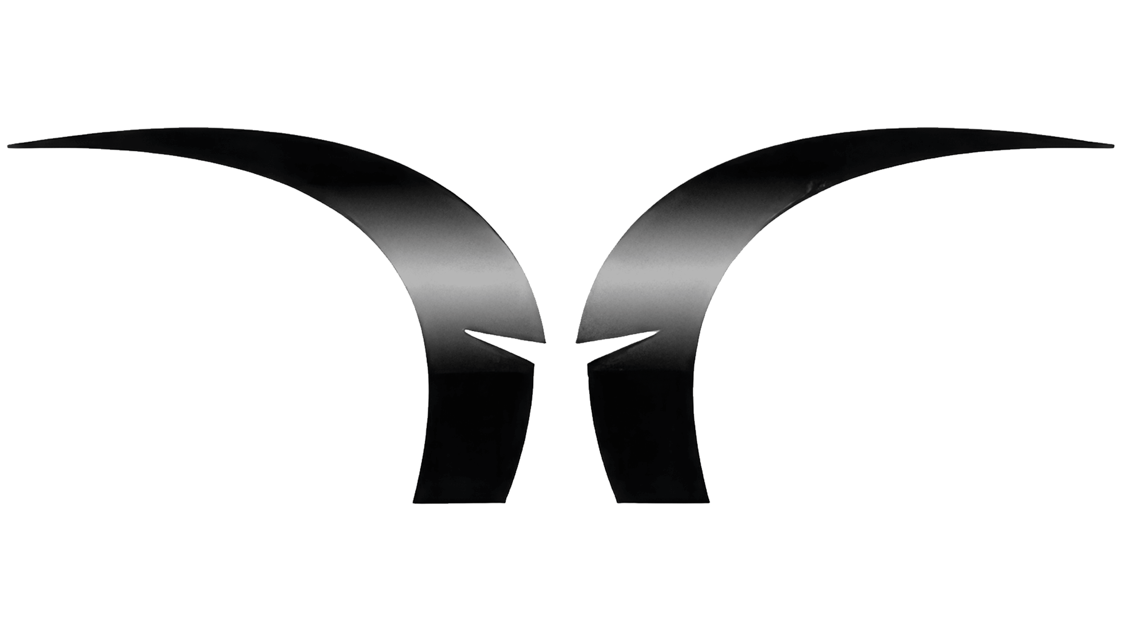
The Elemental logo embodies a minimalist, abstract approach, emphasizing technological precision and visual simplicity.
The graphic symbol consists of two symmetrical shapes with smooth, curved lines that can be interpreted as stylized wings, horns, or abstract technological flows. The elements are balanced along a vertical axis, forming a tense, dynamic composition with a narrow gap between them. This arrangement creates an illusion of upward movement, evoking associations with growth, progress, and innovation.
A metallic gradient is applied to the symbol, shifting from gray to a light silver tone. This palette emphasizes the company’s technical nature and symbolizes high engineering standards and modernity. The metallic sheen of the shapes adds visual depth and volume, enhancing a premium, technological aesthetic.
The lower part of the composition features the word “ELEMENTAL,” set in a light, geometric sans-serif typeface with straight, thin lines and wide letter spacing. The typeface is similar in style to Gotham or Eurostile but rendered in a lighter, more elongated form. The use of thin glyphs with even strokes and increased spacing provides the text with visual clarity, drawing attention to the emblem.
The logo’s color scheme is monochrome in silver-gray shades, reflecting the company’s engineering discipline, modularity, and versatility. The absence of bright colors and additional graphic elements reinforces the visual style’s minimalism and professional rigor.
The entire design relies on associations and abstraction, avoiding literal imagery and leaving room for interpretation, aligning with brands in technology, digital media, and innovative infrastructure projects. Its abstract style and elegant simplicity make the symbol modern and timeless, ensuring it remains relevant and effective in the long term.