![]() Emily in Paris Logo PNG
Emily in Paris Logo PNG
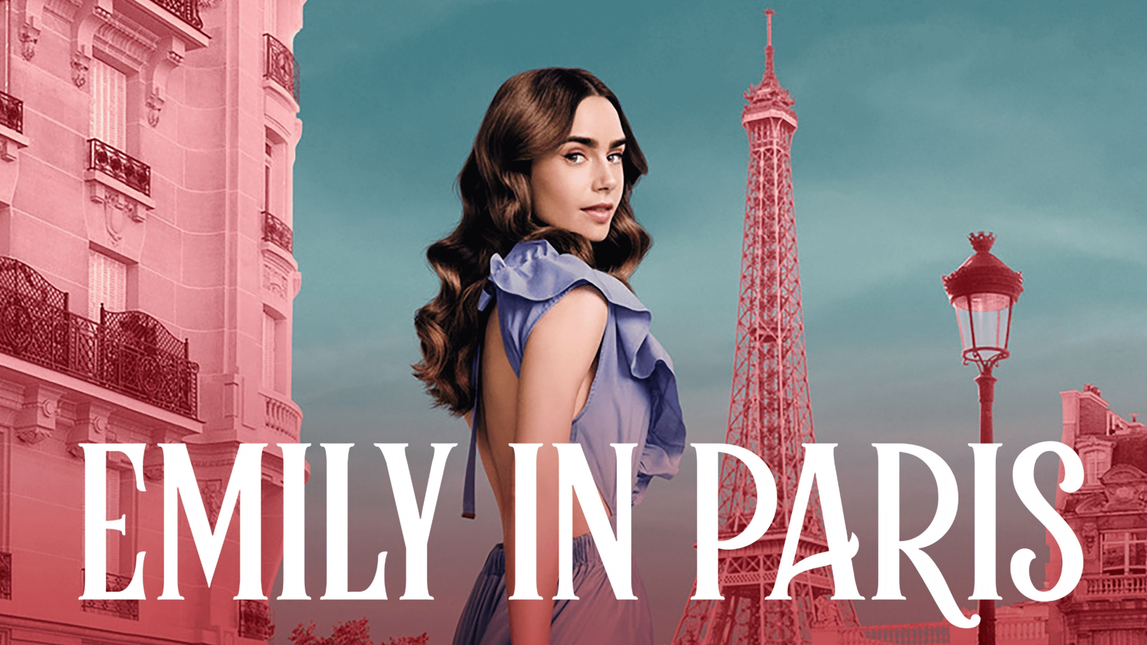
The Emily in Paris logo is a ticket to a world of romance, style, and unexpected twists. The protagonist finds herself at the center of a vibrant yet contrasting life, where Paris serves as a guide to a new reality full of surprises, challenges, and charm.
Emily in Paris entered development in 2018 and was created by Darren Star, known for Sex and the City. Originally intended for the Paramount Network, the series shifted to Netflix in July 2020.
Filming started in Paris in August 2019, with Lily Collins cast in the lead role and also serving as a producer. The cast featured international actors, including Lucas Bravo and Philippine Leroy-Beaulieu, adding authenticity to the portrayal of French culture.
After its Netflix premiere in October 2020, the series rapidly gained global viewership. The second season, filmed in 2021, expanded locations beyond Paris, showcasing settings on the French Riviera.
In 2022, filming for the third season continued across various French cities, exploring deeper cultural aspects. Released in 2023, this season solidified the series as one of Netflix’s leading productions.
By early 2024, production remained active, continuing the narrative, further developing characters, and enhancing its international appeal.
Meaning and History
![]()
What is Emily in Paris?
This comedy-drama series follows a young American woman who relocates to Paris to work at a marketing agency. The story showcases her professional challenges, romantic experiences, and the clash of two cultures. The series’ vibrant visual style captures the atmosphere of the French capital, combining picturesque streets, exquisite cuisine, and elegant fashion. The main character’s costumes, designed by well-known designers, have become one of the project’s distinctive features, while the story attracts viewers with its lightness and engaging plotlines.
2020 – today
![]()
The creation of the “Emily in Paris” logo is attributed to designer Kay Kyungjoo Lee. She designed the logo and directed the project’s overall art direction, including the television intro. In its early stages, the series was developed for Paramount Network, and later it was moved to Netflix, where it premiered on October 2, 2020.
The basis of the sign is a reworked version of the Rumble Brave typeface from Alit Design studio. The original letter outlines were modified. They acquired refined curls, and the serifs were strengthened, which gave the letters lightness and playfulness. Such an adjustment brought the lettering closer to the story’s romantic mood and emphasized its emotional tone.
The structure of the inscription is two-level. The upper line is given to the word “EMILY,” the lower contains “PARIS,” and the raised element “IN” is aligned with the top edge of the lower row. Uppercase letters are used. The vertical proportions are elongated, and the strokes range from thin to thick, giving the letterforms elegance. The letter “R” in the word “PARIS” stands out with an extended smooth curl.
The entire palette is reduced to a black shade. The monochrome emphasizes the sharp transitions of line thickness and the silhouette form. The absence of additional colors reinforces the impression of classical typography with a light decorative accent, aligning with the story’s romantic content and the atmosphere of Paris.
The Emily in Paris emblem demonstrates harmony between strict serif typography and light decorative techniques. It combines the functional basis of typography with a refined play of details, reflecting the series’ storyline.