The Endemol logo is made in a minimalistic style. The company wanted to show its seriousness despite being in the business of producing entertainment content. And she succeeded: all emblem elements look restrained and create a visual balance.
Endemol: Brand overview
Endemol is a joint-stock company in the Netherlands that produces entertainment content, including games and videos. Founded in 1994, Endemol was abolished in 2015 due to a merger with the Shine Group. Since 2020, it has become a component of the Banijay media company. Endemol was headquartered in Hilversum, the Netherlands. In addition, project branches were located in 23 states, where analogs of the cult Endemol projects were produced.
In 1994, Joop van den Ende and John de Mol, two successful television producers, merged their companies in the Netherlands, creating Endemol. The name “Endemol” was derived from the combination of their surnames, “Ende” and “Mol.”
Van den Ende began his career in theater in the 1960s before moving into television, while De Mol had experience in radio and television dating back to the 1970s. Their combined resources and expertise created a powerful force in the entertainment industry.
From the start, the company focused on developing and producing engaging television shows. It quickly gained recognition for its innovative reality TV and game show formats.
One of its most successful shows, Big Brother, premiered in 1997. This reality show, where contestants lived together in a house under constant video surveillance, gained international fame and was adapted into numerous languages.
In 2000, the Spanish telecommunications company Telefónica acquired the production firm for 5.5 billion euros. This acquisition provided the company with additional resources for global expansion.
Over the following years, the company grew by acquiring production companies in various countries and launching popular new shows like Deal or No Deal and Wipeout.
In 2007, a consortium led by Italian media magnate Silvio Berlusconi and co-founder John de Mol bought the company back from Telefónica for 3.4 billion euros.
The company continued to expand and reorganize, and in 2012, it merged with Apollo Global Management, which helped manage its debt.
In 2014, the production firm announced its merger with the Shine Group, owned by 21st Century Fox, and Core Media Group, creating one of the largest independent production companies in the world.
A significant moment in its history came in 2015 when the merger was completed, and the new entity was named Endemol Shine Group. Although this marked the end of the original company’s independent existence, its formats and legacy continued under the new organization.
Throughout its history, the company was known for its innovative approaches to television programming, creating formats that revolutionized the medium in many countries. Its development of interactive television content and the reality TV genre profoundly impacted the television industry.
Meaning and History
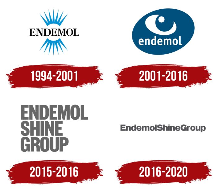
Four logo versions were presented to the target audience during the project’s existence. Even though Endemol has become one of the components of Banijay since 2020, the logo of this media company cannot be considered one that refers directly to the Dutch project.
If we consider Endemol an independent company producing unique projects, its lifespan can be from 1994 to 2015. This is before the merger with a major market representative, the Shine Group.
The history of the brand’s development can be divided up to 2015 and since then. The Endemol logo was quite bright and attractive at all stages. If we talk about the company’s emergence in more detail, it also appeared in merging two local television studios, which belonged to Joop van den Ende and John de Mol. As a result, the new company’s name was formed to combine the owners’ names.
What is Endemol?
This is a Dutch cult project that has been operating on the European and world market since the end of the 20th century. More than a dozen projects have been released that have received cult status and are popular today.
1994 – 2001
The first version of the logo was presented in 1994, almost immediately after the project’s launch. It existed for almost seven years and, during this time, succumbed to only minimal changes that were not noticeable to the masses. The logo looked stylish and elegant. It consisted of the word “ENDEMOL” in classic bold serif type. They were black capital letters with thick lines. In addition to the brand name, the logo featured two mirror arcs with oblong rays. These elements were made in blue but visually associated with the sun. Each of the arcs had seven rays. In addition, some of the company’s customers associated the emblem with an eye, which directly alluded to the company’s main task: video content production.
2001 – 2016
The only redesign as an independent company took place in 2001. The changes were global. The Endemol logo has become more modern and confident. While the stylized eye remains unchanged, the emblem has been redrawn in an updated style. Inside the dark blue oval, made diagonally, was the verbal name of the brand. Unlike the previous version, these were lowercase letters. The font also succumbed to changes; it became more attractive but, at the same time, quirky. A little higher from the name was a white circle that resembled an eye. Beneath it was an arcuate line that had pointed ends.
2015 – 2016
At this stage, the company merges with the Shine Group, which is also displayed on the logo. The emblem, stylized as an eye, was completely removed, and instead, it remained an exclusively verbal inscription in three lines, each of which contained one of the words “Endemol Shine Group.” All symbols were executed in bold geometric sans-serif. A shade of gray approaching brown made the inscription bold and brutal. It should also be considered that the 2001 logo continued to be actively used despite the merger with the Shine Group until the end of 2016.
2016 – 2020
The 2016 redesign kept the color palette of the previous version of the logo. Interestingly, the well-known company Pentagram was engaged in updating the logo. One of the key changes was word placement. Now, they were located not in three lines but in one. At the same time, it was one continuous element without spaces globally. For the target audience to understand where a new word begins, the first letters in them were made in capital letters. The font itself has been slightly modified. He looked more classical. All symbols had a smoother and rounded shape, making the logo more sophisticated. There were no emblems or other additional elements on the logo. Since 2020, the company has become part of Banijay, and the new logo of this media group has nothing to do with Endemol.
Font and Colors
Each new logo redesign added new features in the style of writing word names. However, in the latter version, the classic sans-serif is closest to the Bauhaus Akzidenz Grotesk. Thus, the logo looks more confident and clear.
Whereas Endemol’s indie days favored a bright color palette of blues, cyan, and more, the company’s latest designs have settled on pale greys. Despite the monotony, it looks confident and progressive; the target audience has no problems reading the inscription.
