


 Big Brother Logo PNG
The Big Brother logo tells the story of life under constant surveillance, where viewers can glimpse into the house’s inner world and its inhabitants. The emblem contains a subtle reference to the place that becomes the central stage for all events and episodes of the show. The house, as a key element, takes center stage. This house symbolizes the foundation of each episode, where important moments unfold, intrigues develop, and relationships between the participants are revealed.
Big Brother was developed in 1997 by Dutch media executive John de Mol and his production company Endemol. The concept placed strangers in an isolated house under continuous camera and microphone surveillance. Its name referred to George Orwell’s novel 1984. The first season premiered on Veronica in the Netherlands on September 16, 1999, drew millions of viewers, and triggered rapid sales of the format abroad.
By 2000, local editions had launched in Argentina, Germany, Spain, Britain, and the United States. The American version premiered on CBS on July 5, 2000. It changed the eviction process by giving contestants voting power, encouraging alliances and tactical play. The British edition began on Channel 4 in 2000, stayed there until 2010, and later moved to Channel 5.
Australia, Russia, and other countries joined in 2001, taking the format into more than 50 markets. Celebrity Big Brother appeared in Britain in 2002 and was later adapted elsewhere. The US game added the Power of Veto in 2003 and an All-Stars season in 2006. Nadia Almada’s 2004 victory prompted debate about gender identity, while the 2007 British celebrity season drew record complaints after accusations of racism involving Shilpa Shetty.
Later changes included the Have-Not system in 2009, Canada’s instant eviction in 2013, an online US edition in 2016, and an American celebrity version in 2018. From 2020 to 2023, national adaptations continued revising casting, tasks, alliances, and voting rules.
Meaning and History
What is Big Brother?
This innovative reality show has captured viewers’ attention worldwide thanks to its unique social-experiment format. A group of strangers lives together in a specially designed house, completely isolated from the outside world, and is under constant surveillance by cameras and microphones. The show captures the participants’ interactions, friendships, rivalries, and strategies as they compete for a large cash prize. The show’s name is inspired by George Orwell’s novel “1984,” alluding to the continuous surveillance of the participants. A distinctive feature of the program is its interactive element, allowing viewers to influence the events by voting on tasks or creating unexpected twists.
2000
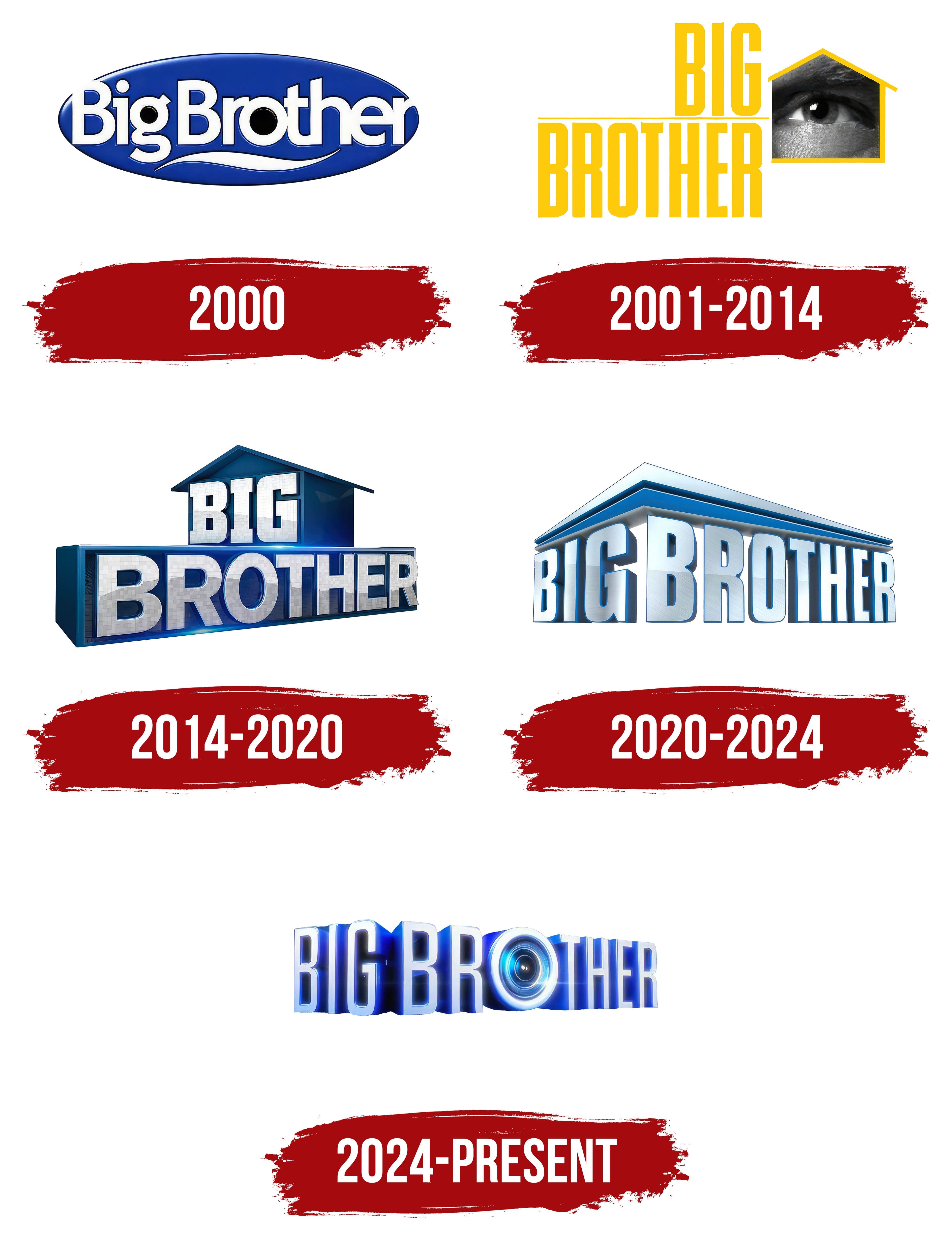
The reality show in America debuted in 2000, and its first logo looked quite harmonious. The oval’s smooth edges symbolize the aim for peaceful coexistence among a group of people in a confined space. Inside the oval is the show’s name, written in white letters. This color signifies the program’s novelty and its first broadcast. The inner spaces of the letters, especially those with round elements, are left empty. This creates the impression of eyes, behind which observers are hidden. After all, the show’s main point is the constant filming of participants 24 hours a day, with privacy only granted in the bathroom. The hollow spaces within the letters hint at the camera lenses that track every move of the participants.
The show’s name is chosen as an analogy for authorities watching over people. In America, “Big Brother” often refers to organizations such as the government, the CIA, or the FBI. This term dates back to the famous work of the author George Orwell, in which the idea of total surveillance gained widespread recognition.
The smooth line at the bottom of the logo resembles either the profile of a sheet of paper or a feather. This element symbolizes the signing of the contract that participants enter upon joining the house. The contract includes the possibility of winning a large sum if they succeed.
Additionally, the text is somewhat cramped in the allotted space and almost extends beyond the oval’s boundaries. This intentional design choice highlights the gradual elimination of participants who failed to fit into the house.
2001 – 2014
By the second season, the logo was updated to a more modern, expressive look. The central element became a yellow line outlining the shape of a house, within which the observer’s eye is depicted. This element perfectly conveys the essence of the reality show, in which the participants’ lives are under constant surveillance, as if they exist behind glass. The eye within the outline emphasizes the constant observation, symbolizing the all-seeing presence of cameras that capture every movement.
The show’s name is written in large capital letters to the left of the image. This design uses two levels of text to highlight the presence of multiple floors in the house where the show’s events unfold. This division reflects the house’s spatial structure and adds visual balance to the composition.
The bright yellow color in the logo gives the show a light, entertaining tone, creating a sense of fun and liveliness. It hints at improvements to the program’s format, especially after the first season, which drew criticism from both critics and viewers. The updated design symbolizes an effort to transform the show, making it more attractive and dynamic, highlighting its new energy and vibrancy.
2014 – 2020
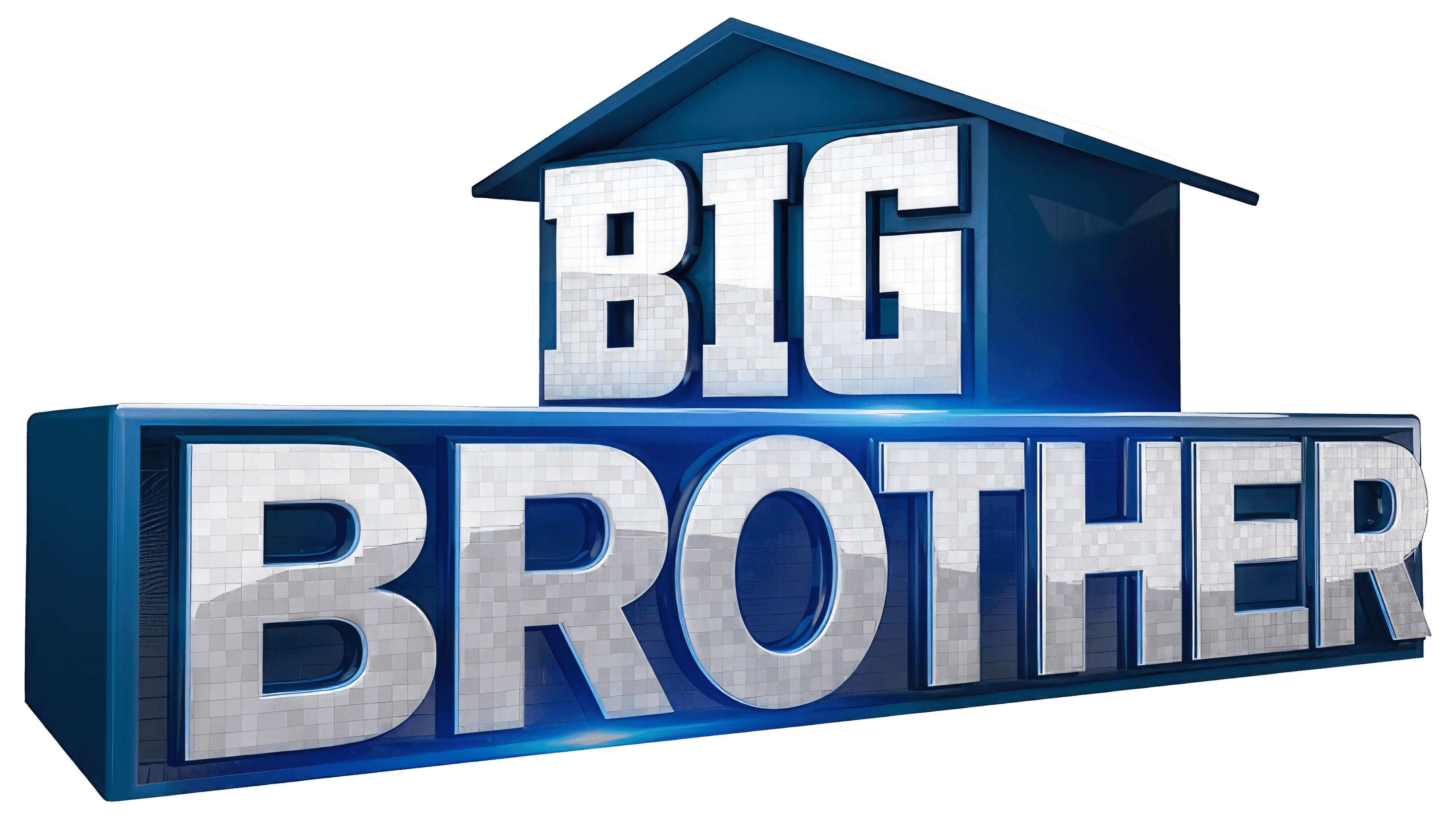
After the release of the 500th episode and by the 16th season, the emblem was updated, undergoing significant changes. The logo now appears as a three-dimensional house, which has become the show’s main symbol. Under the roof, the word “Big” is placed in the upper part, and on the lower level, “Brother.” Both parts of the name are in three-dimensional silver letters that look as if they are cut from precious metal. This design choice gives the logo a sense of weight and significance, reflecting the show’s prestige and its many years on the air.
The silver letters, as if made of metal, symbolize the program’s resilience and longevity, as well as the substantial monetary prize awaiting the winner at the end of each season. This emphasis on the material aspect makes the prize’s value more apparent.
The emblem focuses on the house as the central event arena, highlighting its key role in the show’s structure. Unlike previous versions, there is no clear analogy to observation, suggesting a shift in focus from external surveillance to events inside the house. The updated logo conveys the project’s long history, emphasizing its popularity and viewers’ love over the years.
2020 – 2024
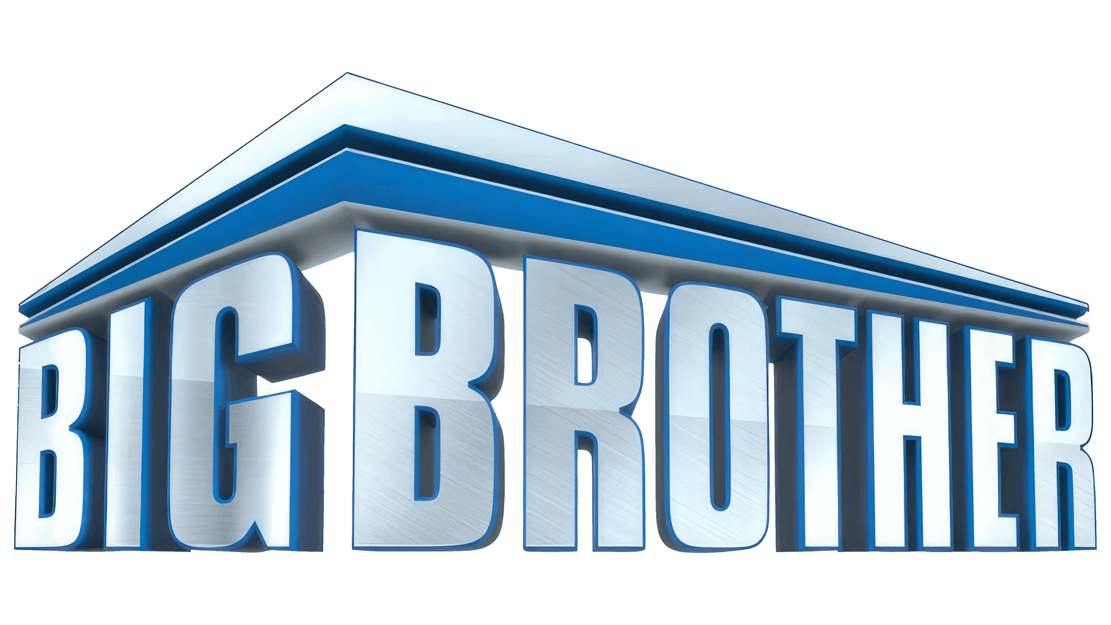
The new logo has become a symbol of change, and its design instantly captures attention. The house on the visual emblem is angled toward the viewers, allowing them to see two of its walls as if offering a new perspective on something familiar. Each wall contains one word of the title, creating a sense of structure and unity. This element emphasizes the show’s solidity, which has been on air for 20 years. The composition is topped with two roof panels, giving the image a complete and monumental feel.
The logo conveys a sense of significance, as the project has become iconic over the years. The shades of silver dominating the color scheme highlight the rule changes and a fresh chapter in the program’s evolution, lending the identity a sense of prestige and stability. Blue in the design remains an important accent, complementing the main palette and making the overall look more stylish and modern.
2024 – today
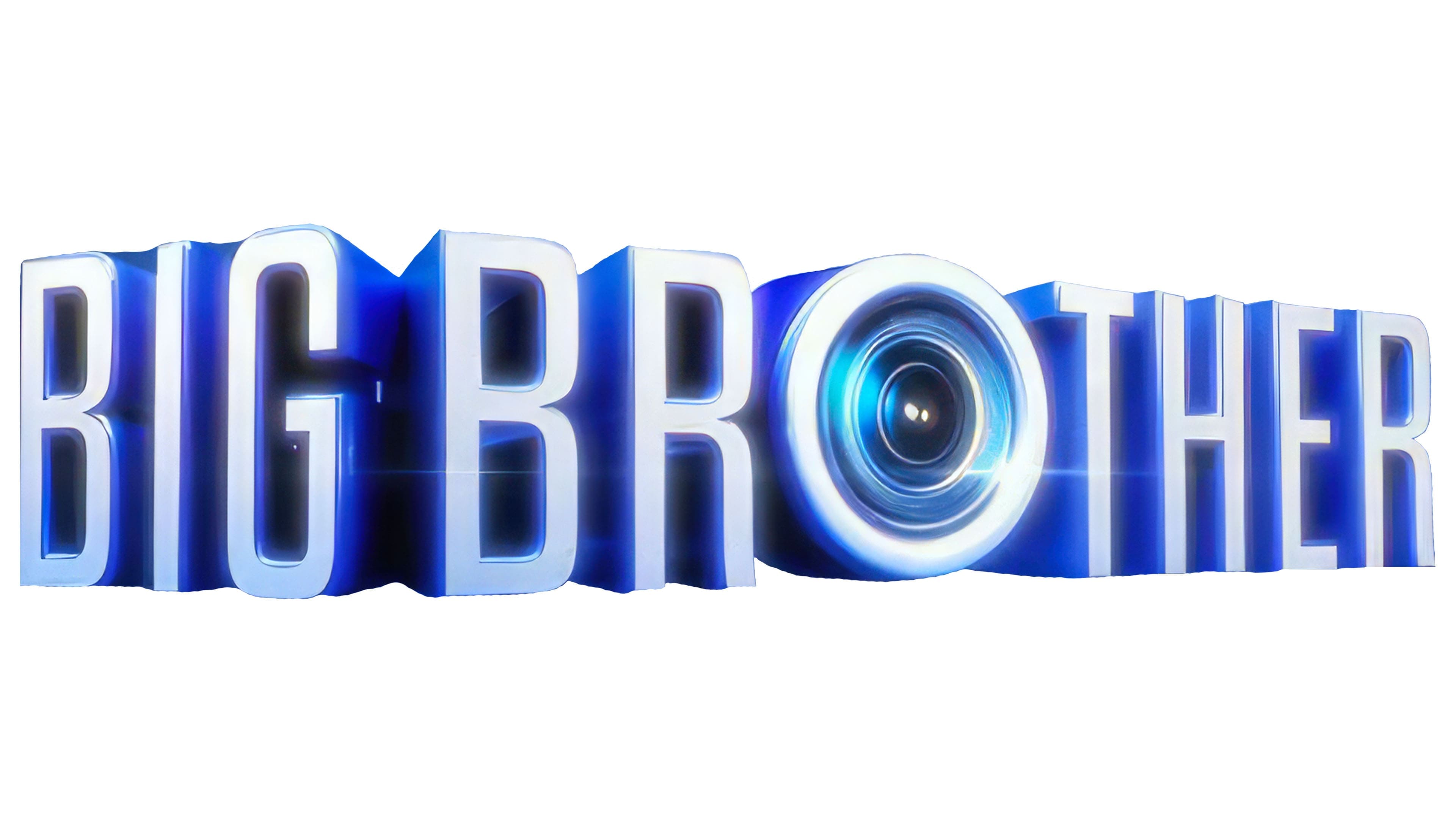
The modern version of the Big Brother emblem has undergone significant changes and acquired a futuristic look that captures attention. This new design clearly emphasizes the show’s long-term plans and its drive for innovation. The logo hints at the incorporation of technology and the role of artificial intelligence, as if smart machines actively contributed to the design of the house and the games themselves. It suggests even more possibilities for the show’s future development.
The show’s title on the visual sign is now angled, which interestingly echoes the lines of the house’s walls, though the house itself is not depicted directly. The letters appear metallic, adding a sense of strength and technological sophistication to the logo, creating an impression of high status and durability. They seem to be cast in steel, reflecting light and emphasizing the project’s significance. The words are illuminated by bright light, as if spotlights are directed at them, enhancing the sense of focus and close attention from viewers and participants. The emblem signals that the show is always in the spotlight.
The most notable feature is the letter “O,” which has been transformed into a symbol resembling a camera lens. This subtle detail symbolizes surveillance and constant observation, perfectly reflecting the show’s essence, where the participants’ lives are under the cameras’ watchful eyes. This element adds dynamism and highlights that every moment of the show is carefully recorded and transmitted to the audience.
The updated logo maintains tradition while sending a clear message about the future and technological progress, emphasizing the importance of using the latest technologies in the game.