


Spanish construction company Enerblock has brought its technologies and services under a single brand and updated its logo. Bilbao-based agency Workoholics developed the 2026 project. For Enerblock, part of the Viuda de Sainz group, the update helps communicate its full scope of work, from architectural concepts and engineering to component manufacturing and installation.
As the company grew, individual technologies acquired their own names and descriptions. Employees understood them through experience, but architects, developers, investors, and public-sector clients struggled to see the full offering. Workoholics proposed explaining the business through its construction organization. The positioning centers on predictability, supported by operational control, progress tracking, and measurable results.
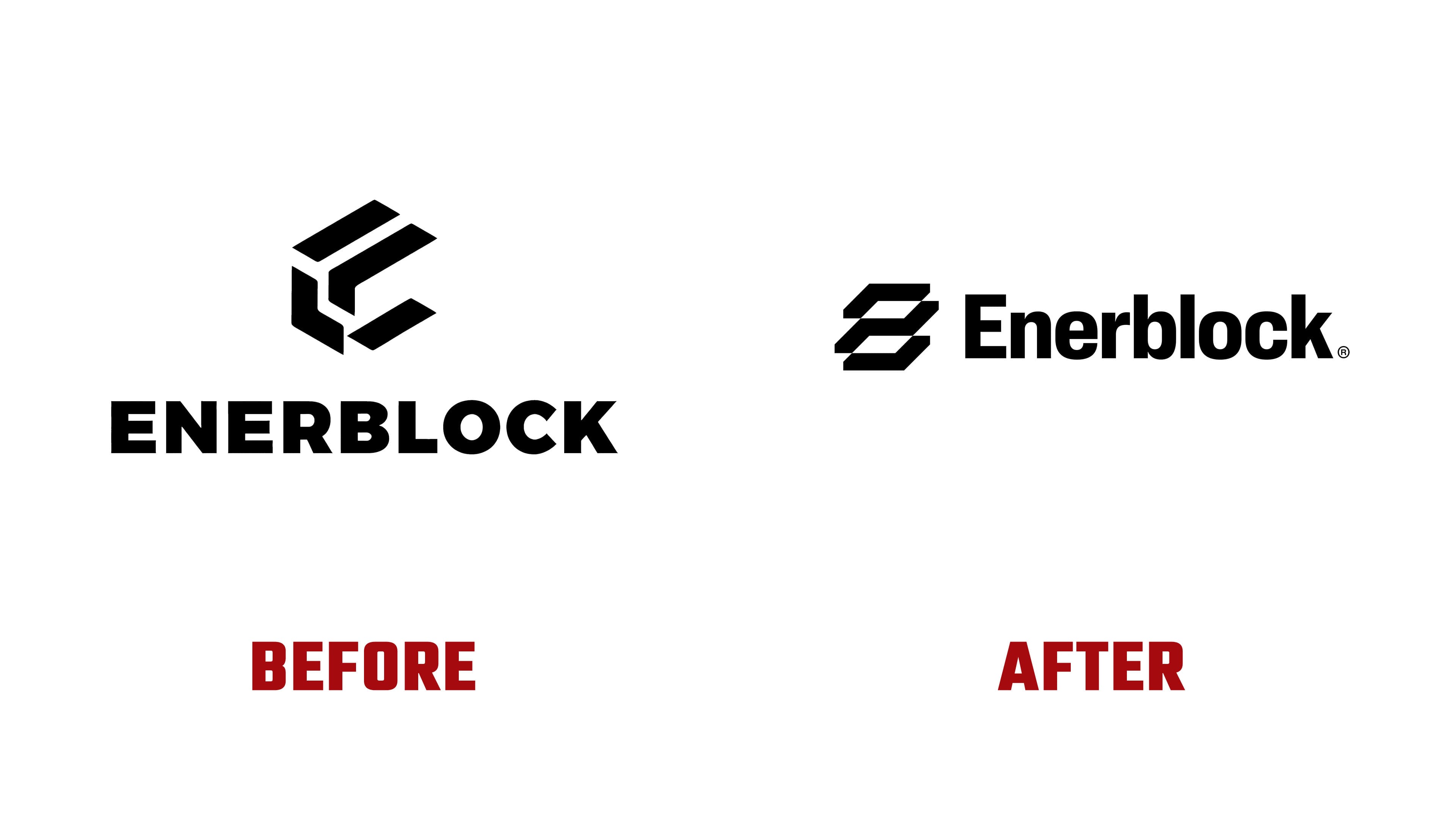
The new emblem consists of horizontal bands joined by diagonal sections. Two elongated, parallelogram-shaped openings sit between them. The upper and lower sections mirror one another, while the middle section runs diagonally. A modular grid determines the band thickness and the angles of their ends. The overall shape resembles overlapping slanted frames or layers of a building structure.
This construction expresses the principle of assembly and the coordination of design, engineering, manufacturing, and installation. The connected bands reinforce the idea of a unified process. The agency links the emblem’s geometry to Enerblock’s precision and industrial approach to construction.
The previous logo conveyed the construction theme through a three-dimensional, E-like shape. Black faces with sloping upper surfaces and vertical sides formed a block divided by white gaps. A heavy uppercase ENERBLOCK wordmark sat beneath it. The new version replaces the dimensional block with a compact band arrangement. The emblem has moved to the left of the name, placing both parts of the logo on a single horizontal line.
Only the initial “E” remains capitalized in the Enerblock wordmark. The lettering retains its bold sans-serif style, but the letters are narrower and taller. The “b” and “o” have small counters, the “e” has a short crossbar, and the “k” has sharp diagonal strokes. The top of the “E” aligns with the tops of the “b,” “l,” and “k.” The team carefully spaced individual letter pairs to create a tightly set wordmark. The emblem and name can both be reproduced in a single color.
The update also renames the company’s product lines. Previously, it used PanelBlock, RobotBlock, HormaSteel, and HormaBlock. The website now presents Enerblock Panel, Enerblock Robot, Enerblock Frame, and Enerblock System. The shared name ties the technologies to the company and helps clients understand them as parts of one offering. The new structure was developed with future partnerships, licensing, and business expansion in mind.
Laura Carazo and Erik Zarraga are listed among the project leads. Danilo Triana handled the branding, while Oscar Gesuraga oversaw creative direction and client communication. The identity pairs large typography with dark backgrounds and coral-red accents. The website, developed with Banila Studio, organizes its content around work stages, components, certification, and system applications. It received an Awwwards Site of the Day award on May 16, 2026.