


 Fossil Logo PNG
The modern Fossil logo is characterized by its restraint and simplicity. It is clearly and confidently perceived, without complex additional elements or excessive design features. The logo conveys reliability while maintaining the brand’s style, as introduced in the original identity. At the same time, it remains aesthetically appealing and visually balanced.
This emblem possesses its own individuality and refined charm. The predominance of static over dynamic elements gives it a sense of stability. The classic color palette reminds us that the brand exists beyond time, emphasizing its durability and resistance to fleeting fashion trends. Many years have passed since the company’s founding, but each year has been marked by growth and significant achievements. Today, Fossil is rightfully considered one of the leading global brands, and its luxury watches are the perfect addition to any stylish look, reflecting a blend of tradition and modern approach.
Fossil began in 1984 in Richardson, Texas, when brothers Tom and Kosta Kartsotis founded Overseas Products International to import designer watches from the Far East. In 1985, the company adopted the Fossil name, taken from a family nickname for their father. It released its first watch collection with affordable retro styling. Leather goods followed in 1987, and the first retail store opened in Dallas in 1989.
International expansion started with a German office in 1990. Fossil went public on NASDAQ in 1993, using IPO funds for growth and product development. Sunglasses and the acquisition of Lyceum, Inc. followed in 1995, while jewelry entered the range in 1997 and became another business category.
The company bought Zodiac Watches in 2001 and entered a licensing agreement with Michael Kors in 2004. Watch Station International was acquired in 2007, followed by Skagen Designs for $236.8 million in 2012. In 2015, Fossil paid $260 million for wearable-tech startup Misfit, marking its move into smartwatches and fitness trackers.
Fossil Q smartwatches launched in 2016, followed by a rapid prototyping lab in 2017. New models added GPS and NFC payments in 2018, while later releases improved battery life and health tracking. During 2020 and 2021, the company expanded e-commerce and digital marketing, then added more health-focused wearables in 2022. By 2023, its portfolio covered watches, jewelry, leather goods, licensed brands, and connected devices.
Meaning and History
What is Fossil?
This American lifestyle brand became known for its unique blend of modern utility and vintage style. The brand is most famous for its watches but has expanded its range to include accessories such as jewelry, wallets, and even smartwatches. The brand’s designs often reference mid-20th-century America, giving the products a timeless appeal that resonates with a wide audience. The brand has established itself as a leading producer of stylish and functional accessories and is renowned for the high quality of its products. The company’s products are available worldwide.
Before 1985
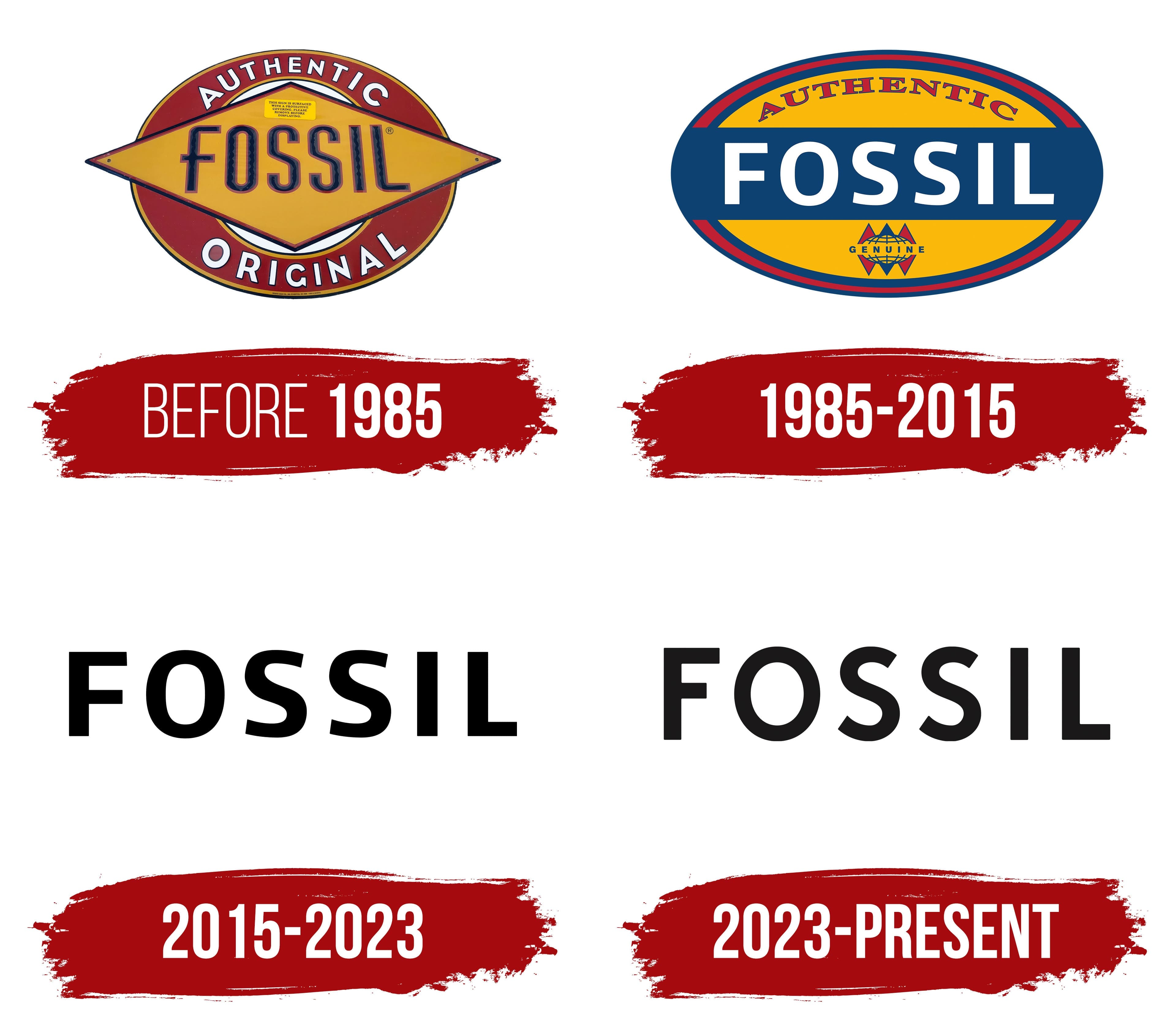
One must not forget the main point: Fossil’s brand identity has gone from complex to simple. While many competitors sought to add new elements with each logo update, Fossil moved in the opposite direction, gradually simplifying its visual identity.
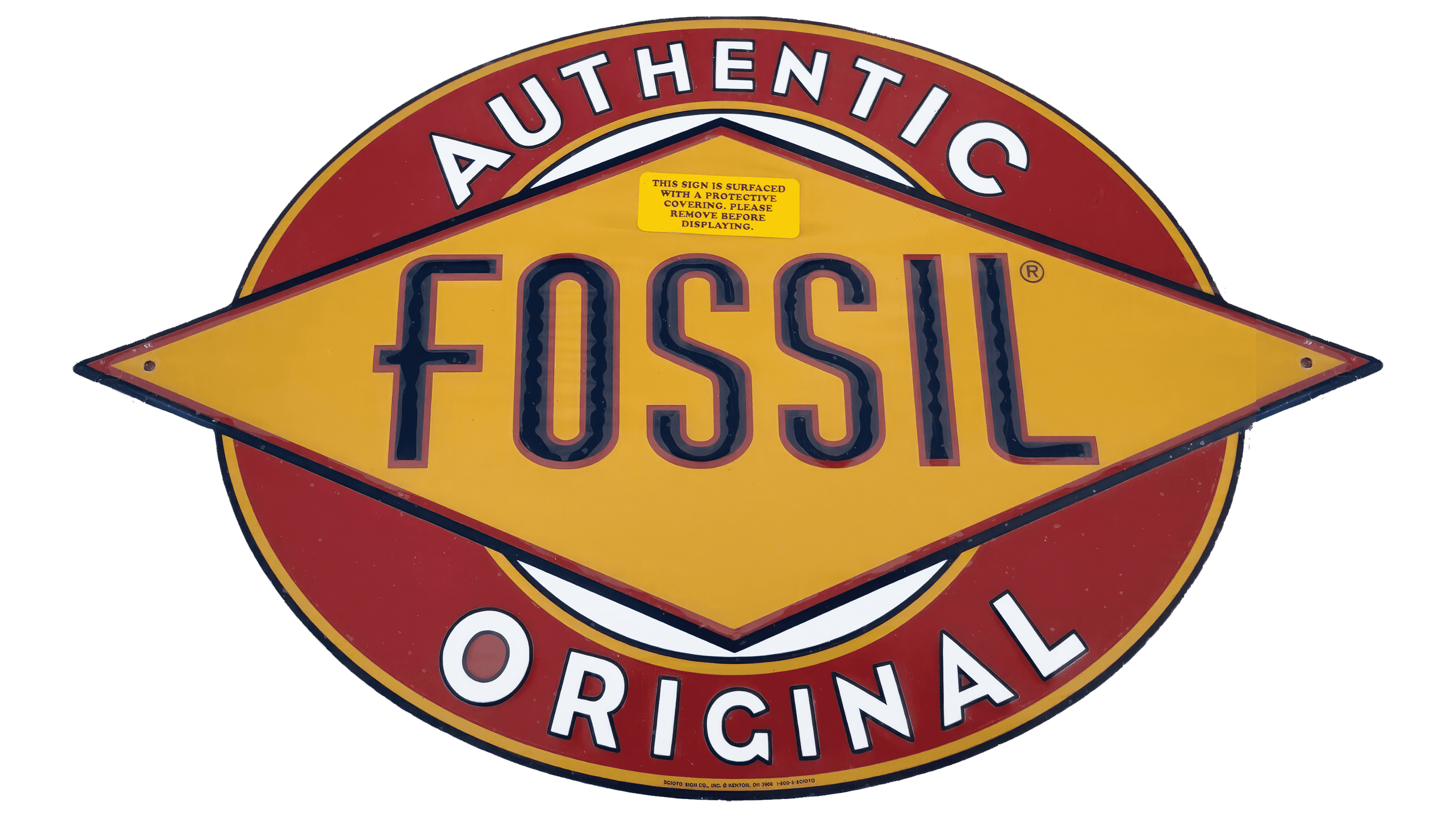
The first logo was rich in color and design, representing a multifaceted, diverse element with its unique concept. Geometry played a key role: the logo combined two figures, each with an important meaning. The informational blocks stood out thanks to the rhombus, which emphasized the brand’s name, while the circle crossing the first figure highlighted the product’s authenticity and originality.
The bright and rich color palette gave the logo charm and refined elegance. The red leaned toward burgundy, and the orange was muted, creating a harmonious combination. Each word in the logo was written in its original way. The text framed by the circle was white, while the one inside the rhombus stood out in black with light graphic highlights. The logo featured more than four contours, making the letters easy to read and emphasizing their importance.
1985 – 2015
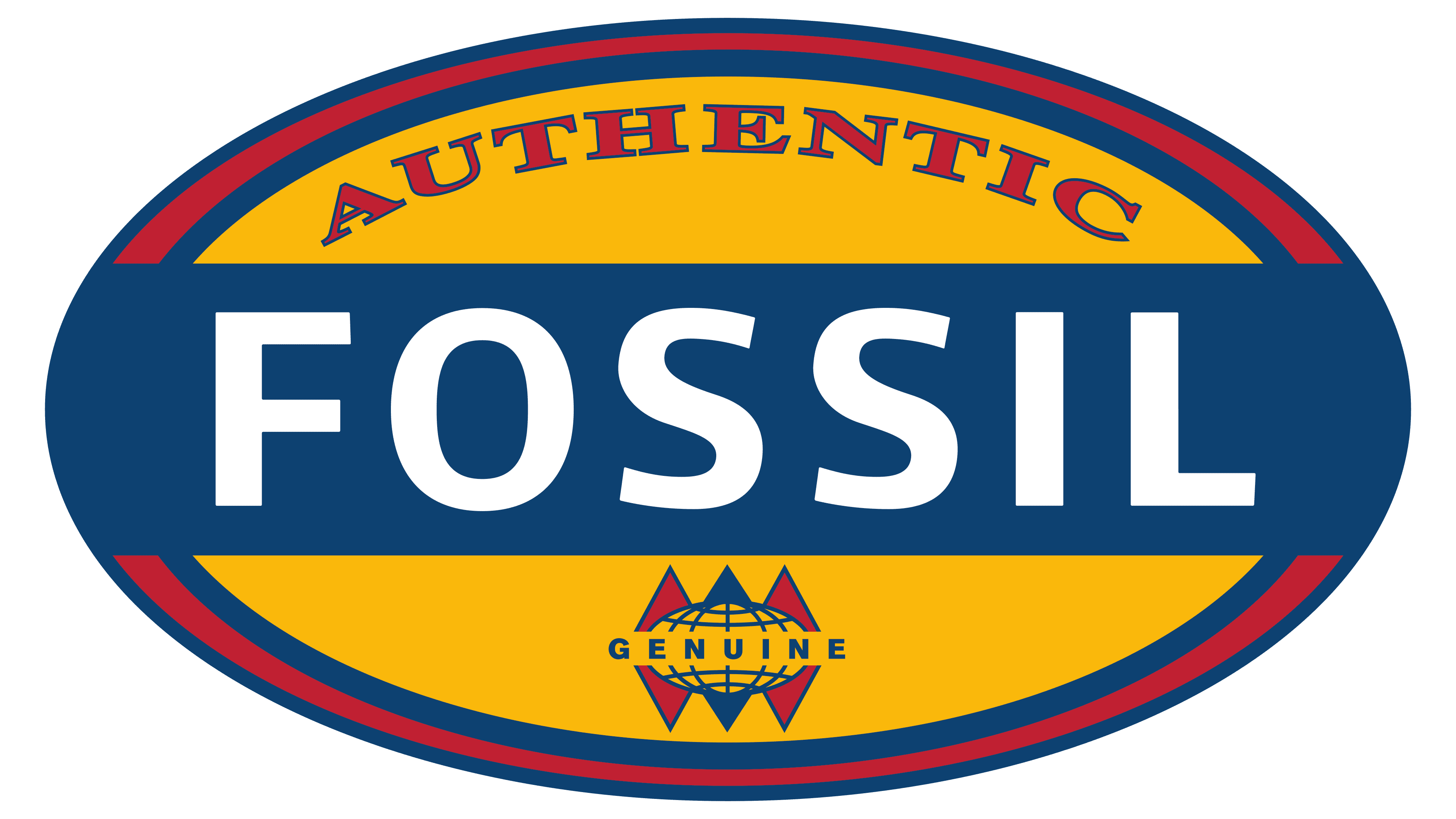
The logo also changed at a new stage of the company’s development. Initially, the company planned to sell watches made in the Far East, but eventually started producing them. It became more restrained and concise. Previously present in the brand identity, the rhombus disappeared, giving way to a single figure, the circle. The circle now served as a frame, uniting all the logo’s text elements.
The brand name, written in strict, precisely aligned letters, was centered in the circle. Against the blue background, the white capital letters looked original and attractive. This technique ensured the brand name was easily readable and memorable, leaving a lasting impression.
2015 – 2023

2015 marked a turning point for the Fossil logo as it underwent significant changes. The new design lost its complexity and ceased to be an object for prolonged attention or detailed study. One of the key reasons for this transformation was that Fossil’s luxury watches no longer required active advertising; the brand’s products had become well known to a diverse audience that was fully aware of their high quality. For this reason, the logo was simplified to a minimalist design: the only main element left was the six letters that make up the company’s name.
The background remained the classic white, while the smooth black letters stood out for their simplicity and clarity. The font was bold, with capital letters retaining the display technique known from previous logo versions. However, the letters became taller, wider, and more expansive, giving the logo a more impressive and confident appearance. The spacing between letters was increased to about two spaces, making each vowel and consonant stand out as independent, significant units and creating a sense of orderliness and stability.
2023 – today
After 2020, many companies reevaluated their logos in response to external factors, and Fossil was no exception. The brand introduced an updated version of its stylish and modern identity a few years later. However, this new logo wasn’t radically different from the previous one; it simply became more contemporary and lost some elements that had given it an excessive grandeur.
On a white background, slightly elongated capital letters now stood out elegantly. The brand name was centered on a single horizontal line. The first and last two letters were distinguished by their clarity and straightforwardness, without serifs or curves. At the same time, the letters “O” and both “S” had rounded outlines, creating an interesting visual effect that hinted at infinity.
The new logo confidently communicated the reliability of a brand that had successfully established itself since its founding in 1984 and continued to strengthen its reputation. The unity of meaning was precisely reflected in the identity. The name “Fossil” became synonymous with concepts like “quality,” “trust,” and “respect.” The modern logo is perceived as a symbol of a long-term warranty on luxury products, guaranteeing beauty and elegance in every style.