


 Gain Logo PNG
The Gain logo symbolizes quality, setting the brand apart from competitors. The emblem is based on the association with soap bubbles that accompany the cleaning process, representing the crystal-clear cleanliness and freshness of the brand’s products.
Gain began in 1969, when Procter & Gamble (P&G) launched a new laundry detergent in the United States. The brand was built around fragrance at a time when many laundry products were promoted mainly through cleaning performance. Its first image centered on a light scent that stayed on clothes after washing. During the 1970s, Gain gained recognition through print and television advertising, including the line about a fresh smell that lasts a long time.
In 1981, the brand introduced liquid laundry detergent, meeting demand for a more convenient format. In 1995, Gain Ultra appeared as a concentrated detergent designed to clean with a smaller amount of product. The next stage moved the brand beyond basic detergent. Fabric softeners were introduced in 2004, followed by air fresheners in 2006, using the brand’s connection with fragrance in home care.
During the 2010s, Gain expanded into a full scent-based laundry range. Fireworks scent booster beads launched in 2011, allowing users to control fragrance strength. Flings arrived in 2013 as laundry pods combining detergent, stain remover, and scent. Botanicals followed in 2015 with plant-based extracts and scents such as White Tea & Lavender and Orange Blossom & Vanilla. AromaBoost was introduced in 2016, and Ultra Flings came in 2017 with a stronger concentrated formula.
After 2018, the line grew through new fabric softeners and antimicrobial laundry products in 2020. EcoBoost launched in 2021 with recyclable packaging and biodegradable ingredients, while keeping popular scents. In 2022, the Luxe Collection added perfume-inspired options such as Black Orchid & Vanilla and White Jasmine & Amber. The Scent Studio app appeared the same year. In 2023, Smart Dose added a liquid detergent container with automatic measuring for load size and soil level.
Meaning and History
What is Gain?
It is a brand of laundry detergent and fabric care products manufactured by Procter & Gamble. Known for its vibrant fragrances and effective cleaning power, it has established itself as a leader in the laundry care market. The brand offers many products, including liquid and powder detergents, fabric softeners, dryer sheets, and fragrance enhancers. The brand has expanded beyond traditional laundry detergents, including dish soaps and other cleaning products with distinctive scents. The company appeals to consumers who place a high value on cleanliness and pleasant scents when doing laundry. Through colorful packaging and marketing, the brand has gained a loyal audience.
1969 – 2002

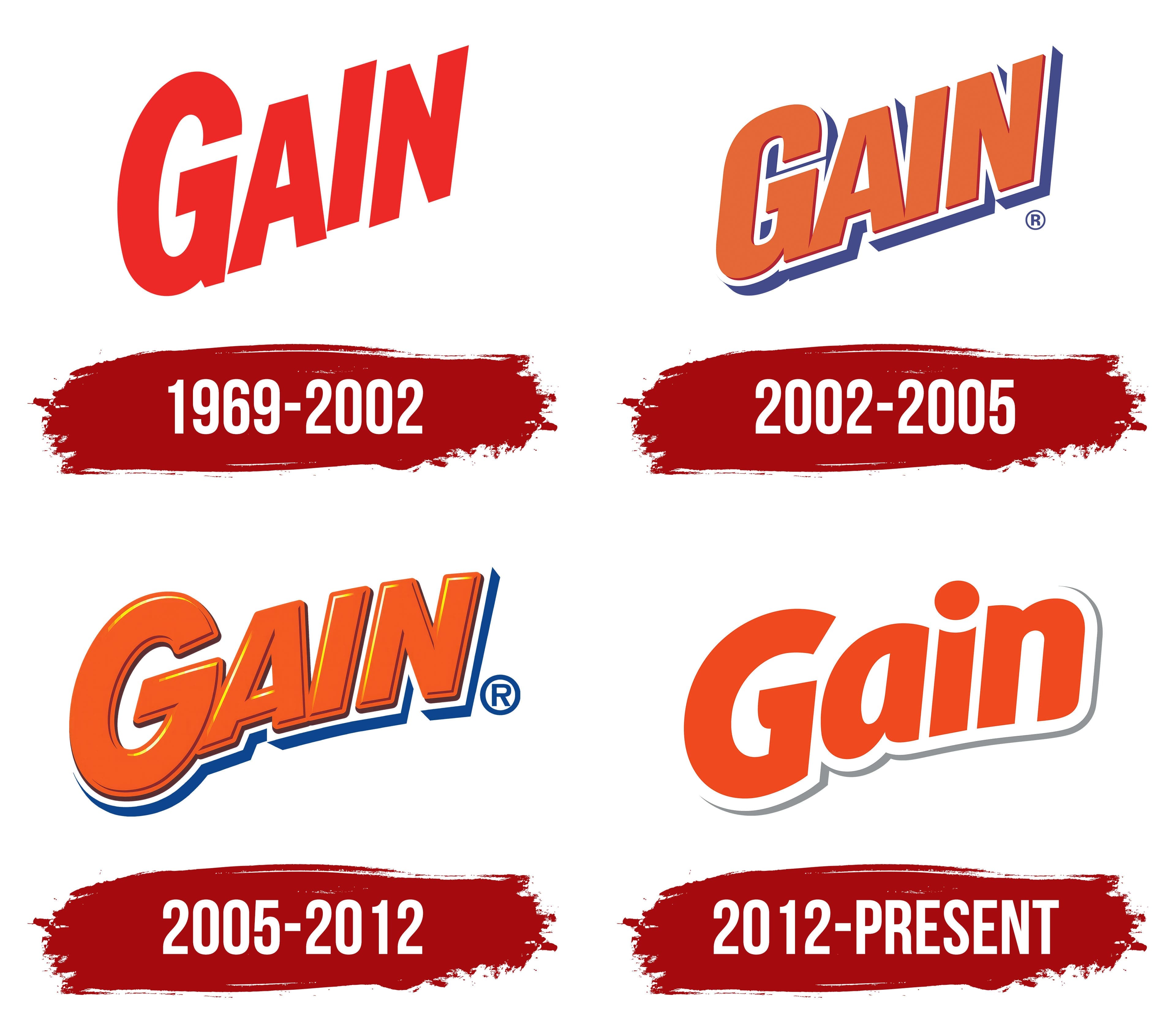
The first Gain logo appeared dynamic and ambitious. It featured red lettering that soared upward, emphasizing the growth and progress embedded in the brand’s name. The silhouette of the letters, slightly “dancing” and rising as if in water, conveyed the primary element in which the product operates. This approach highlighted the product’s key ability to remove even the toughest stains. The red hue of the lettering symbolized the detergent’s powerful effectiveness and the quick results delivered by the brand’s products.
2002 – 2005
The Gain logo underwent changes that made the lettering sleeker and more dimensional. The letters were outlined in white with blue shading along the edges, symbolizing cleanliness and soap suds. This shade hints at the effect of Gain’s brilliant whiteness on fabrics.
The detailed imagery and three-dimensional elements emphasize the product’s high selectivity and effectiveness. The expanded logo functionality showcases the detergent’s ability to tackle a wide range of stains, reinforcing Gain’s position among premium cleaning products.
2005 – 2012
The 2005 Gain logo symbolizes the product’s three-step effectiveness. The lettering on the emblem takes on a triple-dimensional form, reflecting the process of cleaning items treated with the detergent. Gain products effectively remove stains, eliminate dirt, and infuse fabrics with a distinctive scent, addressing multiple laundry tasks simultaneously.
The logo design creates a sense of texture that the touch can feel. The viewer sees the symbol from a low angle, with the curved lower edges of the letters resembling a rainbow, highlighting the brand’s rise to the top. Gain has a strong position in the U.S. market and is regarded as one of the best stain-fighting products.
2012 – today
The new logo’s simplification by removing unnecessary three-dimensional elements has made it more modern and easier to perceive. This approach reflects the company’s desire to stay relevant and connected to consumers, demonstrating its readiness for change and improvement in line with new market demands.
The first thing that stands out is the rich orange-red color. This color choice carries deep meaning: it is associated with energy, determination, and passion. In the context of a brand that produces cleaning products, the vibrant color symbolizes activity and efficiency, emphasizing that its products quickly and effectively get the job done. The orange-red color evokes warmth and coziness, which is important for a product intended for home use.
The bold and slightly slanted font gives the text a sense of dynamism and movement. This creates associations with progress and improvement, as well as with the company’s constant drive for innovation. The slanted font adds a sense of speed and determination to the brand, highlighting its active role in the market.
The logo’s visual simplicity symbolizes the product’s accessibility and ease of use, bringing the brand closer to the consumer. The subtle shading beneath the text adds a sense of depth and three-dimensionality.
The slight curve in the logo, with the first “G” positioned slightly lower than the others, emphasizes the cleaning process. This small tilt visually supports the idea that items retain their original appearance after use. It also adds an association with the care process, where each step is thoughtful and effective.
An interesting emblem element is its resemblance to a tag on new items. This design choice creates a symbolic link between the logo and the product’s sense of freshness and newness. The subtle three-dimensional elements beneath the text enhance the association with a soap bar, directly linking the brand to cleanliness and freshness.