


 Bounce Logo PNG
The Bounce logo symbolizes softness and elasticity, highlighting the key properties of the company’s products. The emblem emphasizes the products’ primary purpose: fabric care, making them soft with a pleasant texture, smoothing out wrinkles, and eliminating static electricity.
Bounce began in the 1960s, when Procter & Gamble (P&G) started research into fabric care and laundry products. The company focused on static electricity, a common problem after clothes were dried in tumble dryers. After several years of testing, Bounce was launched in 1972 as the first dryer sheet fabric softener designed for use during the drying cycle.
The first products came in Outdoor Fresh and Regular scents. Bounce reduced static, softened fabric, and left clothes with a cleaner scent after drying. During the 1970s, the brand built its position in the United States through mass advertising. One of its main slogans described clothes as “soft as a cloud,” linking the product with comfort and everyday laundry care.
In the 1980s, Bounce expanded its scent range with Spring Fresh and Downy Freshness dryer sheets. In 1993, the brand introduced a version without fragrance or dyes for people with sensitive skin, allergies, or a preference for milder laundry products. In 2001, Dryer Bar was released as a fabric-softening bar attached to the dryer drum, removing the need to add a sheet to every load.
The line continued to grow in the 2000s and 2010s. In 2008, Bounce added dryer sheets with Febreze Freshness, combining odor control with anti-static care. In 2014, Free & Gentle reflected rising interest in natural products and wind-powered production. In 2020, Pet Hair and Lint Guard targeted pet owners dealing with fur and lint on clothing. In 2022, Scent Booster granules added stronger fragrance during washing, followed by the Laundry Guide mobile app with fabric-care tips and product reminders.
Meaning and History
What is Bounce?
It is a popular brand of fabric softener and dryer sheets manufactured by Procter & Gamble. Known for reducing static electricity, softening fabrics, and giving laundry a fresh scent, it has become a well-known brand in the United States. The brand’s main product is dryer sheets, added to laundry in the dryer to add softness and fragrance. The company has expanded its product line to include liquid fabric softeners, dryer bars, and fragrance enhancers, offering consumers a range of soft, fresh, and fragrant laundry options. The brand is known for pleasing scents, from classic fresh linen to more complex scents. The products are designed to be compatible with various fabrics and washing machines, making them a versatile choice for many households.
1973 – 1984
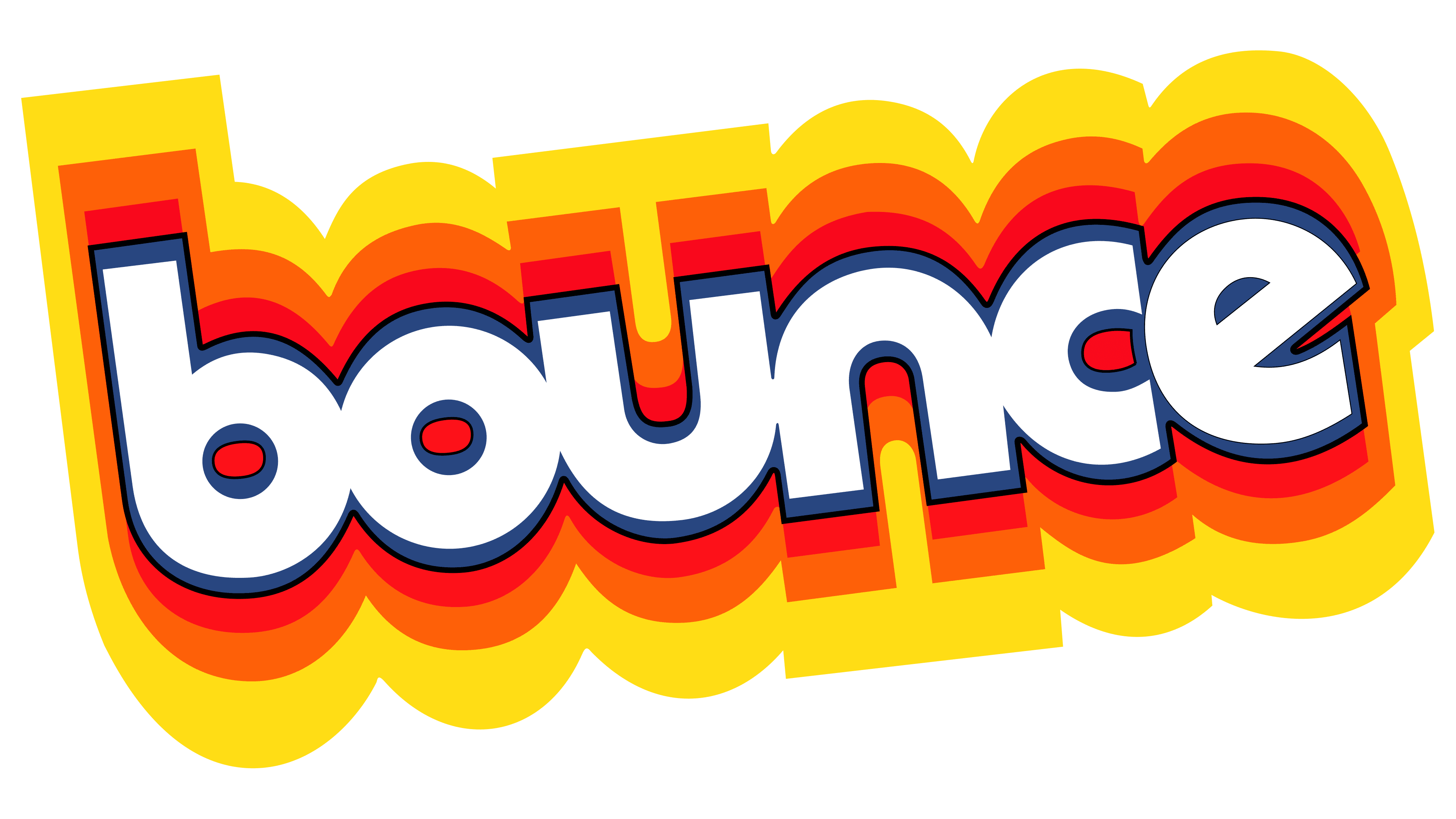
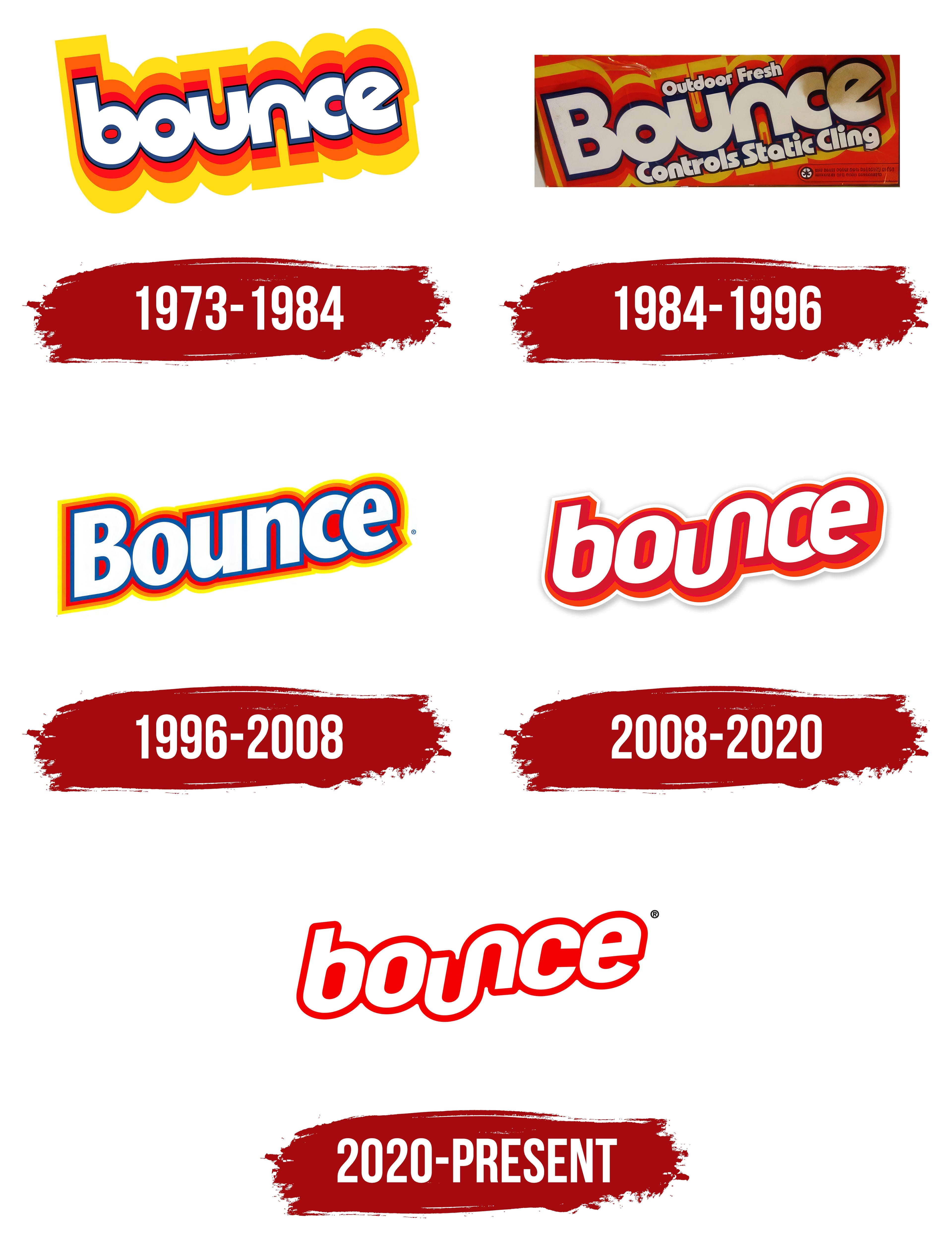
The first Bounce emblem gives the impression that the lettering is floating on the water’s surface. Reflections and shadows spread outward as if the word has been cleansed and now rises, radiating freshness. The upward slant of the letters enhances the bounce effect, reflecting the essence of the brand’s name. This image perfectly suits a fabric softener with a smoothing effect. The red, orange, and yellow shadows emphasize the product’s effectiveness, evoking a sense of fragrance, warmth, and comfort.
1984 – 1996
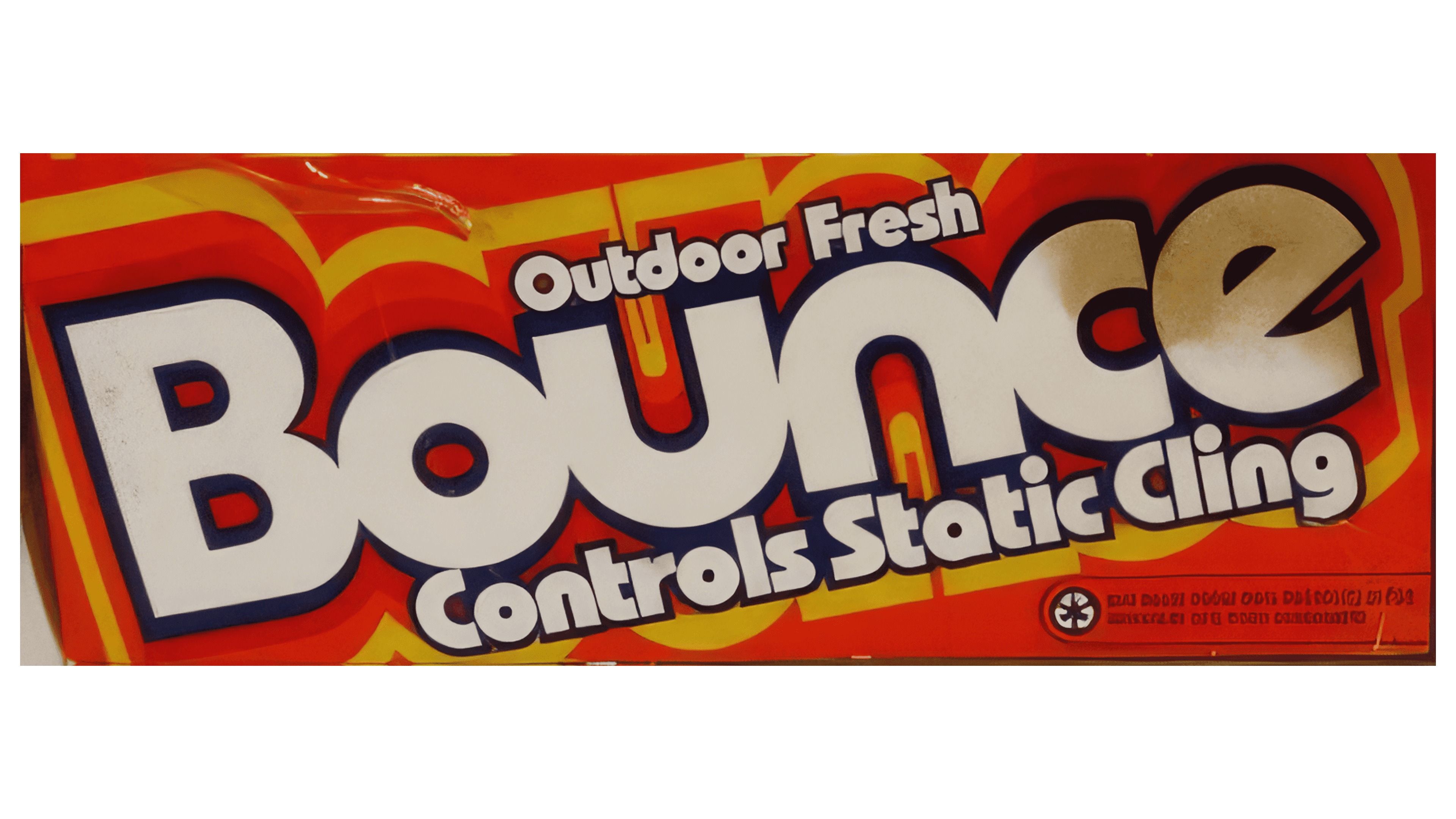
The logo update addressed a key issue of the previous design by adding explanatory captions that informed consumers about the product’s purpose. References to freshness and eliminating static electricity on fabrics highlighted the main benefits of using Bounce. The importance of the brand was emphasized by transitioning to an initial capital letter, while the rest of the font remained unchanged.
1996 – 2008
The logo adopted cleaner, more refined lettering with thin outlines, focusing attention on the name. Each layer and color of the outline symbolized one of the brand’s actions. Blue represented washing; red indicated smoothing and static electricity removal; orange emphasized softness, and yellow highlighted fragrance. Overall, the design reflected improved fabric quality and condition, underscored by a warm, vibrant presentation.
2008 – 2020
The 2008 logo gained originality, allowing the product to stand out among competitors. The merging of the letters “n” and “u” into a single wave symbolized the washing process and the smoothing of wrinkles on clothing. This element became a trademark of the product. The maroon side sections of the letters added volume and depth to the text, while the red background emphasized the importance and effectiveness of Bounce. The white outline of the logo created the effect of a sticker that could easily be removed from the fabric, enhancing the sense of cleanliness and safety when using the product.
2020 – today
The emblem’s modern design successfully retains the elements that make the brand recognizable while adapting it to contemporary visual communication standards, emphasizing the product’s key benefits. The logo has become more streamlined while maintaining its energy and appeal, helping the brand remain relevant in the market and attract new consumers.
The Bounce logo embodies a minimalist design while retaining dynamism and brightness. The red outline around each letter draws attention and highlights the product’s premium quality and market significance. This vibrant color stands out, creating a sense of energy and action that aligns with the product’s main effect, smoothing fabrics without ironing.
The original merging of the letters in the emblem is preserved and continues to highlight the product’s key feature. This design choice underscores the consistency and completeness of the product’s effect on fabrics, making the emblem more memorable. To the viewer, the lettering seems to “bounce” in place, evoking the lightness and flexibility the product provides.
The unchanged font supports brand stability and recognition. However, compared to previous versions, the modern emblem lacks the depth and three-dimensional highlighting of the letters, making it flatter and more contemporary. This decision reflects the trend toward simplification and minimalism, which is becoming increasingly popular in identity design, especially among brands striving for clarity and straightforward communication.
The name “Bounce” implies action and movement, also reflected in the logo’s visual representation. This word is associated with lightness and speed, which perfectly aligns with the idea of a product that simplifies fabric care, allowing users to avoid the hassle of ironing.