


 Manscaped Logo PNG
The Manscaped logo has become a brand symbol, creating a new niche by offering grooming solutions for men with limited options. The founders focused on their audience’s real needs, and their first product quickly gained popularity thanks to its practicality and straightforward concept.
Paul Tran and his father, Steve Tran, founded Manscaped in San Diego in 2016. They entered a market with few products designed specifically for male grooming. The company’s first release was the Lawn Mower trimmer, created for sensitive areas and sold directly to customers.
In 2017, Manscaped launched its website and built an online sales model around social media and humorous advertising. A major break came in 2018 through Shark Tank, where Mark Cuban and Lori Greiner invested $500,000 for a 25 percent stake. The television appearance brought national attention and helped the brand reach a much larger audience.
During 2019, the range expanded with new trimmers, skin-care products, and grooming accessories. The brand added a subscription service for repeat deliveries. International expansion began in 2020 with launches in the United Kingdom, Australia, and other markets, supported by partnerships with sports teams, athletes, and public figures.
In 2021, the company announced a merger with Bright Lights Acquisition Corp. at a valuation of about $1 billion. In 2022, the company launched additional products and expanded into new markets. Product updates followed customer feedback, while direct online sales remained central to the business. By 2023, Manscaped sold in more than 30 countries and had developed from a direct-to-consumer startup into an international grooming company built around e-commerce, subscriptions, digital promotion, and brand partnerships across several regions.
Meaning and History
What is Manscaped?
This company develops men’s grooming products, with a focus on below-the-belt care. Its range includes waterproof trimmers, body washes, and other specialized care products. The brand’s approach combines practicality with a sense of humor, helping to make men’s hygiene a more open and approachable topic. The primary focus is on creating convenient, high-quality, safe products that help men care for themselves and feel confident. Unique packaging and thoughtful solutions have made the company a leader in its niche, addressing previously unmet needs.
2016 – today
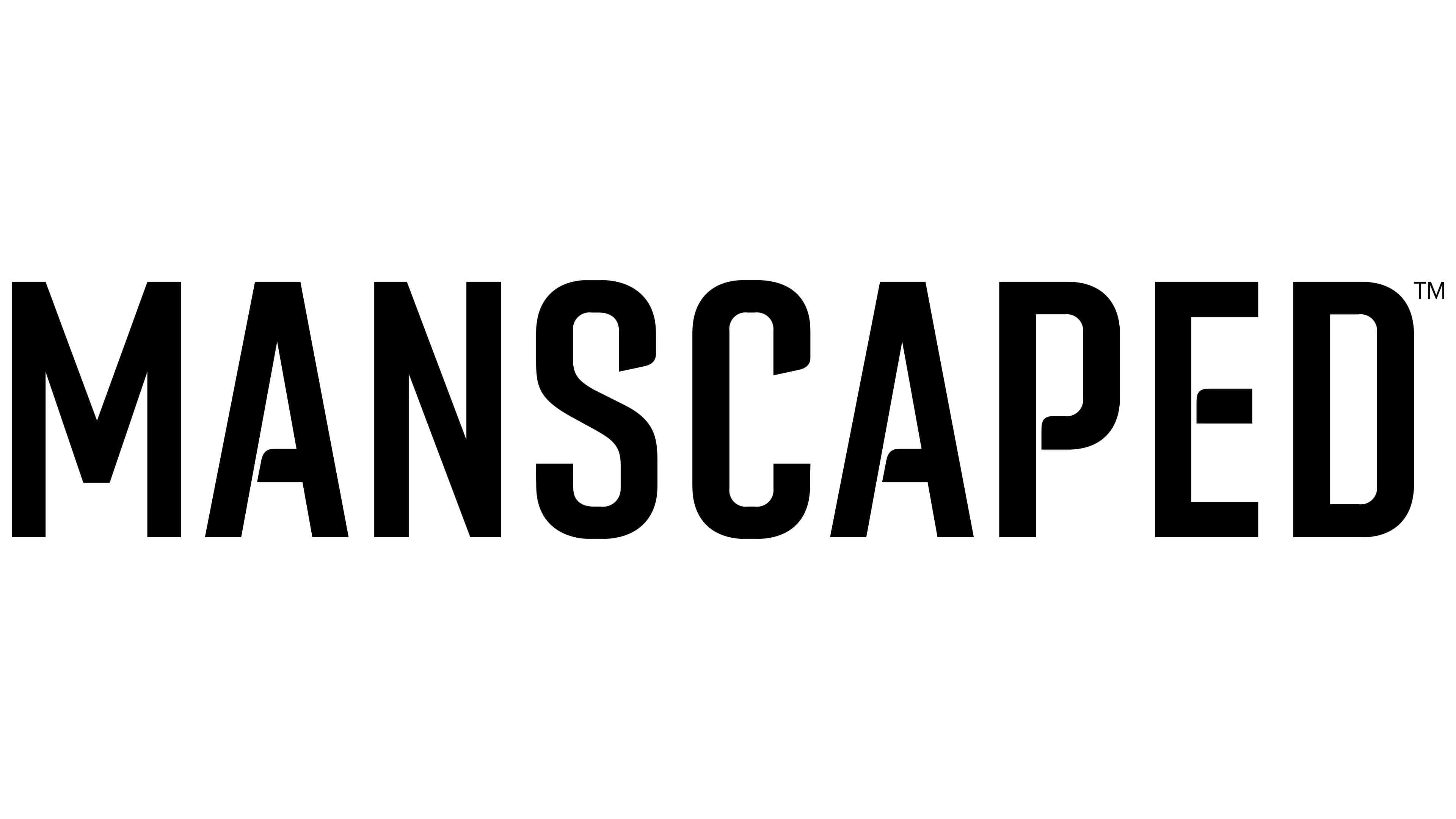
The Manscaped logo combines minimalism, austerity, and symbolism to convey the brand’s professionalism in men’s care. It consists of a text inscription and a symbol, creating a holistic image.
The text is made in bold capital letters in a narrow sans-serif font. The font resembles TS Kirt or TT Lakes Neue but features unique details. Rectilinear letters with clear lines convey confidence and reliability. The laconic design provides good legibility, and the black color adds austerity and a professional look.
The Manscaped symbol stands out for its originality. Its shape resembles an inverted heart or a drop, symbolizing precision and direction. In the center is a stylized diamond, a sign of the product’s quality and sophistication. Hand-like elements surround the diamond, evoking care and protection, as well as the company’s desire to provide customers with comfort and reliability.
The emblem is gold, always associated with premium quality and elegance. Smooth lines and symmetry create a neat, thoughtful look emphasizing high quality.
The name Manscaped is derived from the words “man” and “landscaped.” It reflects the company’s mission to help men care for themselves while maintaining confidence and style. The simple name complements the minimalistic logo, emphasizing the brand’s professional approach.